If designed correctly, a logo can make future
branding efforts a walk in the park
Home » Logo Maker » What is a Logo?
Logos are images, texts, shapes, or a combination of the three that depict the name and purpose of a business – to put it simply.
However, a logo can and should be more than a symbol of identification.
If designed well, it also tells a company’s story, by conveying your brand message
in a way that helps to establish an emotional connection with your target audience.
This vague-yet-nonetheless-inspiring definition of a logo can be broken down by the following question:
Answer: Most of the heavy lifting.
A logo is important for a number of reasons, mainly being that it:
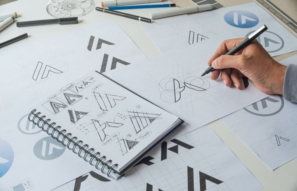
So, creating a logo should clearly be high on your list of priorities when starting a business – but what are the elements that you can use to make it happen?
If designed correctly, a logo can make future
branding efforts a walk in the park
Colors go way beyond aesthetic appeal – they’re the core communicators of your message. They tell your audience if you’re playful or serious, innovative or wholesome, cutting-edge or timeless and stable.
Your logo color palette can be made up of a single color or several (although we recommend staying within a two- or three-color combination). The colors you pick will later seep into other branding materials you create as well, so choose wisely!
(Check out this post for more about what your logo colors mean)..
This is basically what all of us non-design folks think of as a font; typography includes
the letters you’d see in a logo, arranged in some kind of consistent design.
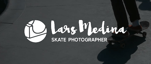
You’ll find logos built around a single letter, a monogram, or even the full name of a business.
An image can range from the simplest arrow to a detailed rendition of an abstract orangutan. It can be an icon, a symbol – perhaps a picture that represents something you sell or a value you stand for.
If you’re choosing to go with an image, remember that your logo will likely need to be resized depending on where it’s being placed; try to use something that looks clear and scalable.
Situated under a logo, a tagline typically comprises of a sentence or catchphrase designed to hook your audience, or clarify what your company does.
Logos don’t necessarily need to be accompanied by a tagline, but it’s something to consider if, say, your logo image alone is an abstract interpretation of the concept of Harmony – while it may communicate your values, it doesn’t actually tell your customers anything about your business.

Obviously, this depends on the company, audience, intended message, and logo design – logo effectiveness can be pretty subjective and variable across industry or business. However, regardless of how you create a logo, be it with a logo maker like ours or from a freelance designer, there are four broad goals you should aim for when creating a logo:
The best logos aren’t the flashiest, but rather those that resonate with their target audience. Logos represent not only your company, but also the people to whom you speak. For example – you wouldn’t use bright and peppy colors (read: bright yellow) for a funeral home, in the same way as you wouldn’t use depressing grays for a children’s party planner.
This is particularly true for wordmark logos (logos that consist of text only) but applies to every design style. If your target audience is forced to decipher what your logo means, they’ll be gone faster than you can say “conversions.” Make sure your logo can be easily understood from just a glance.
Drawing inspiration from industry trends is always a good starting point, but remember that the goal of a logo is to differentiate your brand from the competition.
Distinct = memorable, and that’s what will remind customers why your brand is the one in the industry that they should be loyal to.
We mentioned this above, but it’s important enough to emphasize again. Your logo will be placed prominently across several media channels, and in varied sizes; because of this, the best logos are versatile logos ones that can easily be scaled to fit any branding need you may encounter.
First rule of branding: Logos should be placed anywhere your product, company, and brand are represented.
Displaying your logo at the top of your site increases your brand visibility and instantly tells consumers who they’re visiting.
Your branded (read: with logo) business cards are an excellent way to get your name out there and give your customers a tangible way to remember you.
Ads, brochures, product packaging, social media posts, newsletters – any time you create a marketing tool or material, your logo should be standing at attention.
On the business side, your presentations should always include a clear indication of the brand you represent – symbolized by your logo.
Including logos in letters, emails, memos, and other communications reinforces your brand – not only for customers, but also for your employees – ultimately connecting your company culture with the brand representing it.
Let’s take a few examples of iconic logos and discuss how they get the job done.
What do you do with Twitter? You Tweet – and so does this bird.
The logo is simple and easily understood – everyone can tell it’s a bird – and communicates what you can do with Twitter in a single image. Its size and color make it attention-grabbing, while its simplicity subtly reminds the audience that using Twitter is easy and straightforward.
These yellow arches would be recognized from a mile away – which is the point. Originally meant to capture the attention of passers-by, McDonald’s built their stores around these arches, which they later incorporated into their logo.
The colors are bright and happy, and the shape of the “M” reminds you of those famous, Mickey D’s fries – the ones you just can’t wait to get your hands on.
The name of this retail giant was inspired by the Amazon river (the longest in the world), which is why it makes a great basis for their logo.
While adding a little zest to the logo, the arrow underneath the name also implies that Amazon sells every product from A to Z – in the curved shape of a smile, because they keep their customers happy.
We couldn’t not mention our favorite techies, whose classic yet simple logo has become globally recognized as a symbol of innovation and panache.
Like Twitter’s logo, the Apple icon is uncomplicated – but rather than representing an action, it stands for the name of the digital corporation. Its black and white palette is sleek, and the bite taken out of the fruit both invites customers to “eat the apple” (engage with the brand) and plays on the word “byte” – a foundation of computing. Not bad for a mere icon!
Now that you have a clearer understanding of what a logo is and the role it plays in your brand image, it’s time to start your own brand journey and design your logo with Tailor Brands Logo Maker
Products
Resources
@2024 Copyright Tailor Brands