There are but a few toys that seemingly never go out of style, like the slinky, the yo-yo, the spinning top and LEGO. These sources of entertainment delight children and adults of all ages and capture a magic that the fanciest of modern-day toys can’t.
Legos invite a world of imagination. While you can follow the instructions and build according to the set, you’re also free to create something completely unique. It can be simple or complex; it can take minutes or months.
In other words, legos break down the barriers of what a toy is, and that’s one of the many reasons they have stood the test of time—as has their logo.
The LEGO Group was founded in Denmark by Ole Kirk Kristiansen in 1932. Since the 1958 release of the current style of simple toy bricks that click into each other, they have, in essence, stayed the same. However, the sheer scope of LEGO’s offerings has exploded throughout the years. Their logo has also morphed to convey different aspects of the company’s character and adapted to the time periods. Let’s take a look at the logo throughout the years.
This first logo reflects the early foundation of the company. A uniform black color, all caps, and a gently ornate but relatively plain font show that Kristiansen was focused more on making his products high quality rather than colorful or eye-catching.
The name LEGO comes from the two Danish words “leg godt,” which means “play well.” Interestingly enough, Kristiansen didn’t know that “Lego” means “I put together” in Latin; he serendipitously chose a fitting, double-entendre name.
The text on this logo is in a simple font—black, capitalized and italicized—while 3 different font sizes are represented. “Lego” is the largest and centered. “Fabriken” (“factory”) and “Billund” — the factory’s location in Denmark — are next in size and are on the left and right of “LEGO.”
“Fabriken” and “Billund” each have a black bar above and below. Centered and below this text is the tagline “Fabrik for trævarer og legetoj,” which translates to “Factory for wood products and toys.” A dash is present on both sides of this phrase.
In this time period, the LEGO Group was focused on making wooden toys. Only in 1946 did Ole Kirk Kristiansen order his first plastic injection molding machine. This wood-centric production is specifically emphasized in the logo’s text.
During this period, Ole Kirk Kristiansen began to dream for a global reach. He saw the possible massive success of plastic bricks and said to his sons, “Have you no faith? Can’t you see if we do this right, we can sell these bricks all over the world?”
The first version of the LEGO bricks, called “Automatic Binding Bricks,” was launched in 1949.
These global aspirations are reflected in the logo, as “Denmark” is included with its English—rather than its Danish—spelling.
This logo also includes numerous drastic shifts from the previous iterations. It’s the first logo to include multiple colors, having “LEGO” with a light orange and burgundy red shadow.
“LEGO” is also three-dimensional, giving a more playful feel and almost looking like a wooden toy train. “LEGO” sits in front of a black background outlined in orange and atop a black platform. Underneath is the company’s location, written in 2D black against a burgundy background. Once again, all text is capitalized.
While the first type of LEGO brick had already launched, the company started really finding its footing in this new realm. In 1953, the “Automatic Binding Bricks” were renamed “LEGO Bricks,” and every brick had the name “LEGO” on it.
Another drastic logo shift occurred during this era, reflecting the identity-searching period the company was in. This version is a circular logo with a thick black border, and the company’s location curves in thin white at the top and bottom of the border.
Interestingly enough, “Denmark” is now written in its Danish spelling: Danmark. “LEGO” is smack dab in the center of the logo, in bold red and stretching vertically as you get closer to the center of the circle. While not as playful as the previous logo, this iteration sought to be more attention-grabbing.
At this point, the LEGO Group found itself in its initial modern fashion and began its rapid growth. The company expanded into Germany, marking the beginning of its international growth, and the modern-day LEGO brick was patented. Ole Kirk Kristiansen’s son Godtfred also took over the day-to-day management of the company in 1957.
This logo was also evidently the first form of the present-day logo. “LEGO” is off-white, capitalized and in a bubbly font that is essentially the precursor to the present-day Legothick font. The modern-day staple red background is also present, albeit slightly darker and in an elliptical shape.
The early 60’s were a time of further identity solidification and growth for the LEGO Group. In 1960, a fire burned down the wooden toy warehouse, leading the company to discontinue the production of wooden toys. In 1962, the LEGO wheel was released, and in 1963, the first instructions for a LEGO building were also released.
Emphasizing the structured system of products and the combinable nature of LEGOs, the word “System” is added to the logo in yellow and cursive. The red background is also brightened and changed to a rectangle.
Two highlights for this time period were the opening of LEGOLAND Park in Denmark and the introduction of the twice-as-big LEGO DUPLO bricks.
The logo, in large part, remains the same, with some noticeable and subtle changes. The red background is changed to a square, the color of “LEGO” is switched from off-white to white, and the cursive text of “System” is made a bit more freehand and sloppy.
The most significant change to the logo is the addition of a second square comprised of multi-colored vertical bars. This points to the colorful options of LEGO bricks and stimulates imagination and play.
And, this was also the first logo version to have the registered trademark symbol for “LEGO.”
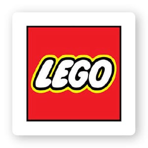
During this time span, the LEGO Group enjoyed widespread growth and innovation, becoming a household name in the process. Themes—including Space and Castle—were launched in 1978, and LEGO Minifigures made their debut in the same year. 11 years later, the very popular pirate minifigures, which displayed multiple facial expressions, hit store shelves.
The second multi-colored square and the word “System” are dropped from the logo. A thin yellow shadow is added around the black outline of the text, and the font is tweaked to be more unified and a little less bulbous. Overall, the logo is simple, eye-catching and to the point.
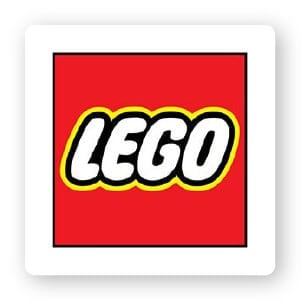
The modern era marks numerous milestones for the LEGO Group. The LEGO brick is named the toy of the century in 1999. LEGO factories and retail stores open internationally, a wider variety of products such as film-licensed characters as minifigures hit shelves, and LEGO movies open in theaters.
The present-day logo is very similar to its predecessor, with some minor tweaks.
The font is firmly now the Legothick font, which is a bit deeper in its indentations and a little taller. The text itself is bigger in relation to the red square. The yellow shadow has become thicker and is now solely a border; it no longer appears in between letters. Lastly, the black border of the square is slightly thicker.
LEGOs have been around for decades and will continue to bring smiles to the faces of kids and adults for years to come.
While the logo has undergone numerous transformations throughout the years, its essence was captured in 1953 and has been with us ever since. However, even before this particular logo, “LEGO” was a unique, simple and catchy name that just about anyone of any age could say.
That simplicity backing up an exceptional product paved the way for an effective logo that has stood the test of time.
Looking to create your own timeless logo? Try our online logo creator! It will help you get inspiration for your design, and you can tweak your font, colors and icon to match your brand’s message and industry.
Products
Resources
@2024 Copyright Tailor Brands