The New Year means new beginnings and new logo design trends! We’ve rounded up the top 10 logo design trends making their mark on the web.
The most important thing a logo can be is timeless. Keeping up with the latest trends will help you keep your logo looking fresh and relevant.
So, if you’re using a logo design tool but want your result to stand out from the competition, or you just want some inspiration beforehand, here are the top 10 logo design trends of 2022.
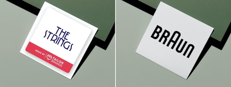
After reviewing tons of different logos, I noticed a clear trend among many logotypes. (A logotype is a logo centered around a business name or initials.)
The logotype design creatively played around with the characters in the text. To clarify, this method is when a letter in the name is replaced with a symbol to create a unique and unusual idea that stands out from the others.
As it’s the main element of a business, a logotype has to form a lasting impression, differ from all others, and express an idea. But most importantly, the logo has to be readable. So take note: Play around with characters in a logotype all you want, but rein it in so the text doesn’t become a scrambled mess.
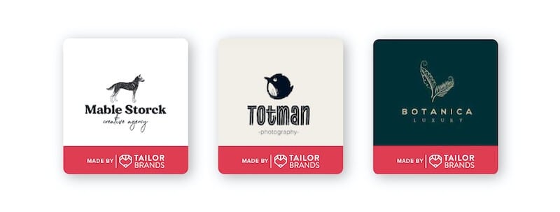
From sketches, scribbles, and doodles, freeform drawing is a design trend that you’ll see plenty of in 2022. What’s so fun about this approach is that it perfectly captures the brand’s personality. And there’s nothing that does that quite like a sketch drawn in a unique way.
Hand-drawn logos tell everyone that the brand is bold, unpretentious, transparent, and maybe even unapologetically quirky! If you love an unfinished look, this is your year to deliver that aesthetic in your logo.
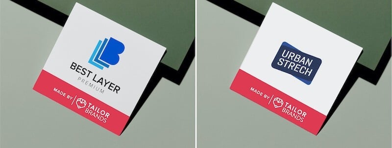
Another trend we’ll see in 2022 is logos with layered elements. Overlapping elements is a design method using different patterns, shapes, textures, and colors to add depth, balance, and create contrast. Layering a logo pulls together a cohesive and styled look while capturing the eye.
Layering can be applied to letters, colors, shapes, symbols, and patterns in any combination. The abrupt changes in colors and patterns break up other elements within a design. You can also play with varying line thickness and splashes of bright color.
Last year, muted tones were in. But this year, we’re saying hello to vibrant color schemes! Going into 2022, we’re all ready to add brightness and positivity to our lives, and there’s no better way than doing that with a brightly colored logo!
Sure, black and white logos will always have a place in design trends, but if we look at what’s trending in 2022, we’re going to see vivid, bright colors in logo design. Having a vivid color palette allows for a vibe that speaks to a younger audience, signaling that the brand is fun, dynamic, and trendy.
While designers may turn up the volume on color, they’ll also tone down other details. It’s important to select one or two details, otherwise, you might end up with a messy logo.
Also known as lettermarks, monograms are logos made up of only typography. These logos consist of 2 to 3 letters (one-letter logos are considered letterforms). Usually, the letters will be your business’s initials. Monograms rely on the type of font you use to convey your message.
Monograms reached the height of their popularity in the 19th century, and seeing this revival proves classic never goes out of style. From wedding planners to interior designers to construction workers, monograms stand as a symbol of trust, professionalism, and class.
Geometric shapes are the building blocks of design, and it’s important that you understand what each shape means in order to incorporate them into your logo.
A modern logo design often plays upon elements of symbolism. This year we’re taking it up a notch by using classic shapes to form a great logo design.
Think of emblems as your go-to for this design style, but not something too regal or busy.
This trend will emphasize the soft and simple aspects of design while giving a logo the structure it needs. Think of how a logo could translate onto a stamp. In order for it to maintain structure within the soft texture of the stamp ink, a geometric shape is a must to hold together the design.
Another trend I’m excited to see more of is the use of negative space, which is the “unused” space in a design. It’s a fun way to help form a shape that reflects a critical aspect of your brand. Think of the FedEx logo where there’s an arrow in the negative space between the ‘E’ and ‘X’.
Negative space logos highlight your business’s creativity and ability to think outside the box. It can include hidden messages and images within the logo, which is a great way to engage customers and reel them in.
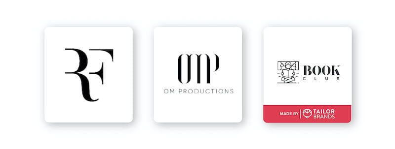
Wordmark logos are sturdy and make sure that your customer knows exactly which brand they’re interacting with. With developments in graphic design and the freedom to create your own font, text has a new purpose.
This year we’re seeing minimalism effect wordmarks with the cool look of negative space and disappearing text.
The missing parts of the letters or words give the impression of mystery and help grab the attention of your audience. Just make sure not to take it too far where your logo is illegible.
As much as each of us may hate to admit, 2020 lead us down the rabbit hole of TikTok, and with that, the glitch trend.
So why not take on 2022 by fully embracing the fact that the glitch is cool. It sends us back to grainy TV but also launches us into the future with a feeling and excitement for uncharted frequencies.
Whether your industry is classic photography or the future of hi-tech, the glitch can work for you because of its versatility.
Let your customers feel the vibrations of your message and brand by designing your logo with static movement in mind.
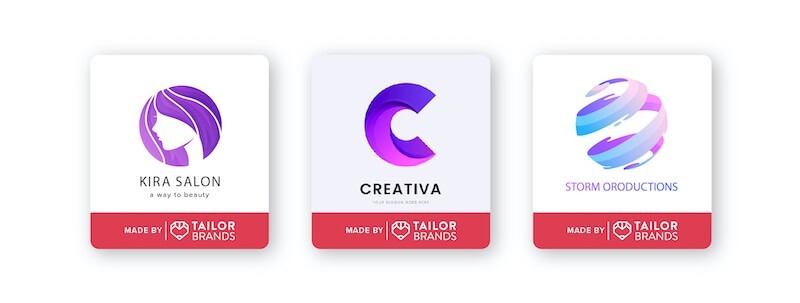
When we talk about gradients in logo design, I want you to get the image of single-shade gradients out of your head. When using gradients this year think of bright colors that blend to give off a soft and safe but eclectic vibe.
And to help elevate your gradient logo even more, how about trying a 3-D design? Use the help of shadows and highlights to make your gradient really pop.
You don’t need a logo design with a billion colors, but take two that speak to you and your brand and blend them together to create the perfect visual for your new website, t-shirt, or bucket hat.
If this style suits your needs, have fun with it! Let your inner-rainbow shine on in your next logo design.
From vibrant color schemes to negative space, there are many exciting design trends to try on your logo and give it a fresh look for the new year. Which of these trends do you think will last past 2023?
The information provided on this page is for information, educational, and/or editorial purposes only. It is not intended to indicate any affiliation between Tailor Brands and any other brand or logo identified on this page.
Products
Resources
@2024 Copyright Tailor Brands