A logo icon is the center of your brand. An icon is the main focal point of your logo, representing who you are as a business and what you do.
That’s why, whether you’re using a logo maker like Tailor Brands (that’s us!) or designing a logo icon yourself, it can be tough to choose an icon that is best for your new business.
To help you get started, I’ve outlined everything you need to know about logo icons.
While it might seem overwhelming right now, by the end of this guide you will be on your way to choosing the best icon for your brand.
Let’s get started.
The simple answer is: You don’t.
Established companies like Kleenex and Coca-Cola have grown their businesses to such heights that their name alone has come to stand for the name of the products they sell.
But, as a new business owner, chances are you’re still laying down the foundation to build a strong brand identity.
Think of it this way: An icon logo can pack more punch than just your business name alone. It can attract people’s attention and elicit emotional reactions associated with your brand.
There are a few different types of icons, including abstract, geometric, pictorial, crests and emblems, interactive, and custom. Each type has its own meaning and purpose. Let’s break it down so you can understand which one is right for your logo.
As its name suggests, an abstract image conveys multiple concepts and various emotions in a single symbol.
These icons include geometric shapes to represent your brand, such as line-drawn symbols, shapes, patterns, and illustrations. Usually, it is paired with a wordmark for clarity and flexibility.
This type of logo icon suits brands that have a lot to say. Let’s say your company’s brand value is exceptional customer service. An icon of a smiley face might be fine, but an abstract design with the right mix of color combinations and shapes could take it to a whole other level.
If you want to create a truly unique logo that is distinct from other brands, an abstract logo is a great option.
Keep in mind that abstract logos are often used by companies who have lots of advertising bandwidth (I’m talking TV-level) and already have an established name. So, if your brand identity and reach is still in its infancy, you may struggle to convey the feelings and emotions that you want your audience to associate with your brand.
Take Pepsi, for instance. Their current logo is in the shape of a circle, with waves of red and blue interrupted by a central white band arcing at different angles. To add more depth, the globe is tilted on its side, purposefully using negative space to evoke a smile.
As with most abstract designs, there is a method to the madness. Pepsi designers explained that they used what is known as the Golden Ratio to determine the perfect angle for the globe (they even compared it to the Mona Lisa!). While that comparison is up for debate, the Pepsi logo continues to deliver the brand experience people have come to know and love.
Huawei’s logo is abstract in the sense that even the company doesn’t specifically mention what it’s based on.
Some people compare the logo to the sun and its rays; others think the logo could be electromagnetic radiation being emitted from an antenna. And still, others see a flower-shape logo that symbolizes the Hua word, which means ‘petals’ or ‘lavish’ in Chinese. The second syllable in the company name means achievement or action.
When an icon is up for interpretation, it has achieved the concept of an abstract design.
The Nike logo is recognized worldwide, and yet, it doesn’t include any graphic representation of sports equipment. The logo is so unique that it doesn’t need to rely on a sports icon to get its message across.
The now famous swoosh was a risk when Nike was created. The brand put their faith in a design that was outside the box. An abstract logo takes time to become recognizable, and the Nike icon was no different.
From circles to squares to more complex shapes, geometric logos are a popular choice across all industries.
The mathematical precision of geometric shapes can convey a sense of stability without feeling cold and calculated. A circular shape, for example, can give a brand an eternal, fluid feel.
The sports product brand has seen several logo design changes over the years.
In 2014, the company featured a red delta icon for the first time. The 3 lines that form the triangular icon represent the 3 major challenges every athlete experiences when they reach their limits: Physical, mental, and social.
But in 2019, Reebok returned to the original logo icon created in 1993. The 4 trapezoids under the Reebok wordmark appear to be a deconstructed version of the previously used red delta icon.

The popular music app uses a simple circle to contain sound waves in its icon.
To appeal to their target audience, Spotify’s neon green logo is modern and pops right off the screen. Its single color, shape, and typeface qualify it as a minimalist logo, which connects well with its listeners.
Since its introduction in 1997, the National Geographic icon is one of the most instantly recognizable television channel logos.
The rectangular yellow portrait frame icon is often said to represent the sun, symbolizing the channel’s global reach.
A pictorial icon is sometimes called a brand mark or logo symbol. Basically, it’s an image that illustrates a real object. It’s probably the image that comes to mind when you think of a logo.
This type of graphic-based icon can reinforce your brand name and help it stick in the minds of your customers.
It might be easy to create a literal image from your business name, in which case a pictorial logo could be appropriate.
Companies like Apple use a pictorial icon to literally represent their company name.
By using a pictorial icon, Apple has the flexibility to inject their own brand personality to the image (picture that bite mark in the apple), something they can’t do with their name alone.
Although slightly less obvious than Apple, Twitter created its iconic bird icon to represent tweets- an accurate portrayal of what the brand is used for.
You might have noticed that the design does not include the company name, reason being that the bird itself is enough to instantly identify the brand.
The iconic jumping cat logo was first introduced in 1948 and is almost the same image we all recognize today. The earliest design features the cat leaping through a letter “D,” which stands for the company’s founder, Rudolf Dassler.
The Puma design conveys movement, strength, and power. Any sports fan and athlete can connect with the characteristics of the Puma cat.
Historically, crests and emblems are 2 of the most original forms of a brand mark. Given their historical usage, crest and emblem logos convey a feeling of trustworthiness and prestige.
Both crest and emblem icons incorporate a symbolic image and fuse it seamlessly with the text. These companies do it very well:
The beloved beer brand holds the title as one of the oldest logos in the world. Founded in 1366 in Leuven, Belgium, the logo was first used when the brewery was established. Despite the hundreds of years that have passed, the original horn icon has not changed.
The emblem icon speaks for the brand’s 600 years of brewing heritage. An ornamental frame surrounding the company name is representative of the architectural style in the city of Leuven. Composed of white, gold, black, and red, the color palette conveys elegance and class.

Prestige goes with the territory of being a top-tier university.
Harvard’s logo is a shield painted a deep red exuding excellence, while the shield’s angular shape conveys strength and authority.
The shield contains 3 open books that spell out the university’s motto. And, the Latin word for truth is written across the open books to highlight the importance of learning.
You don’t have to be a motorcycle owner to recognize the classic Harley Davidson logo. Now one of the biggest motorcycle manufacturers in the world, you might be surprised to learn that Harley Davidson was established in a shed in 1903.
Its orange and black color combination creates a logo that is as bold as its iconic motorbikes. The shield itself is meant to communicate the feeling of power and authority you get from riding a motorcycle.
As with most artwork, an interactive icon is a symbol that is up for interpretation. Sometimes an icon can have a few different meanings depending on who is observing it. That’s what makes an interactive icon so captivating!
An interactive icon is a dynamic interaction between a symbol and text, like the Amazon logo.

The word Amazon means “massive,” and that is exactly what the e-commerce giant wants its icon to portray.
The orange arrow in the Amazon logo serves a double purpose. First, it’s shaped to look like a smile, subtly referencing satisfied customers’ grinning faces after receiving their package.
The second purpose of the icon is the orange line that connects the letters “A” and “Z,” implying that you can find everything you need – from A to Z – on their site.
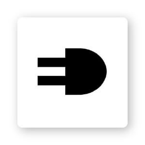
This brain puzzle icon is a great use of negative space to make a logo truly memorable. Using the first 2 initials of the electric supply company side by side, the design appears both as an electrical plug and the initials ED.
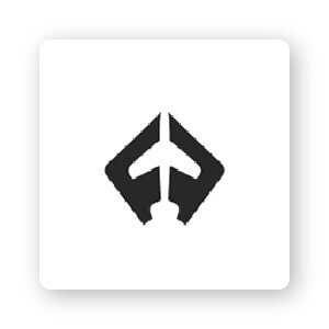
Flight Finder’s minimalist icon is another logo that makes great use of negative space. The icon combines the first 2 initials on an angle to create the shape of an airplane in the center.
This kind of icon forces customers to look at a logo for a beat longer to figure out what exactly they are seeing.
A custom icon is a design that is tailored to your business. This means that the logo icon includes the business owner’s input and customization.
If you have a certain vision you would like to see incorporated in your logo design, a custom logo might be for you.
It’s important to stay cautious about designing icons that are too detailed or complex, because they will be difficult to see when resized (think business cards or mobile screens). And, make sure to get others to weigh in on your custom design before you commit, so that you can be sure it will have the right impact on your audience.
As a logo design tool, it would only be right if we created a custom icon logo. The icon itself consists of symbols that capture our brand: A heart, pencil, and a diamond.
The Anglo Dutch consumer goods company has a seemingly simple logo design. The brand’s logo is a “U” shape, but if you zoom in closely, you will see that the design is made up of 25 distinct symbols, each representing Unilever’s sub-brands.
There is a DNA double helix icon symbolic of bioscience; a bee symbolic of hard work; and a spoon icon for nutrition.
In 1997, when aerospace company Boeing merged with its competitor McDonnell Douglas, they combined symbols to create the logo we see today. The McDonnell Douglas symbol of a sphere with a ring around it was added to the Boeing logo.
Within the logo, Boeing is written in a modern typeface, its letters colored in bright blue to embody the sky. The logo itself suits the company’s determination to reach new heights while maintaining a sense of balance.
Now it’s time for you to choose your very own logo icon. Here are a few steps to make sure you pick the right icon for you.
Determine your brand’s core message
Your icon is going to function as the main visual focus of your brand. Regardless of what your audience knows beforehand, they’re going to instantly make judgments about your business within seconds of seeing your logo.
So, it’s important to think about which traits you want to get across. Is your brand professional, trustworthy, traditional, playful? Decide what the core message of your brand is, and only then start to search for icons that can convey that message.
Stick with simplicity
If your icon design is too complicated, or it’s hard to tell what it is (is it a bird, is it a plane?), it’s going to lose your audience. They’ll have a tough time understanding what your brand is about and they’ll move on as a result.
Plus, simple designs are easier to scale up and down to use across all of your marketing mediums, both online and offline.
Keep it relevant to your industry or company name
Apple’s famous icon works because it’s a literal representation of the company name. By itself, an apple doesn’t have much to do with computers. That brand association only happened after Apple established itself as a leader within the computer and technology industry.
If your brand is still unknown, you can reinforce your brand’s niche by using an everyday item in your industry, or what you think your best-selling product will be. If you are, let’s say, a sporting goods store that’s best known for its high-end rock-climbing gear, you might consider a harness icon.
Don’t be afraid to ask for feedback
It may seem tempting to take on the task of designing your logo by yourself.
But once you have some ideas, ask your friends and family for feedback before you commit. You may be surprised by some of their comments, and it’s important to get an objective opinion on how the icon will go over with your audience.
However, it’s important to keep this next tip in mind.
Remember who your target audience is
One of the most important questions all new business owners should remember is this: What does your icon logo mean to your target audience? Does your icon appeal to your target audience in a way that drives them to take action, visit your website or channel, and buy your product?
If you’re not sure where to discover icons, here are several places to get you started on your search.
1. Tailor Brands. With our logo maker, you’ll gain access to thousands of incredible icon designs that you can use, spanning every industry and niche. Start creating your logo, use our search bar to browse through keywords, and play with different icons until you find the perfect one to match your vision.
2. A professional graphic designer. While there are advantages to hiring a graphic designer to create custom icons, their services are usually on the expensive side. And, you’re restricted to receiving a small number of designs, based solely on the ability of your hired designer.
3. Icon websites. There are a number of different sites out there that offer a range of icons, depending on your industry and style. Sites like Iconfinder offer tons of free icons that you can use commercially, though you will need to attribute credit to the original designer.
Or, you can pay a monthly fee (usually around $10 a month) to use the premium services of sites like Flaticon, who give you access to thousands of editable icons that don’t require attribution.
You don’t necessarily need to pay for a subscription, but remember that if you’re downloading an icon for free, anyone else in the world can use the same icon. If you want your logo to be unique, you’re probably better off biting the bullet and purchasing the icon you want (which will also give you customizable files)
Designing a logo is one of the most fun and creative parts of starting your own business. Although it might still seem like a lot of work, use this guide to help steer you towards creating your own logo icon.
Remember: While you don’t necessarily need to have a logo icon, it could definitely help you establish your brand identity, especially if you are just starting out.
A lot of new business owners feel pressure to get it right the first time around, but remember that picking an icon for your logo is an ongoing process, and like we’ve seen with even the biggest companies, it’s okay to go through multiple iterations.
So get your creative juices flowing and start your logo icon design with the Tailor Brands Logo Maker to bring your brand to life!
Products
Resources
@2024 Copyright Tailor Brands