Starbucks is a wildly successful company that fought its way to the top of the coffee shop industry.
They’re the powerhouse of coffee, with over 30,000 stores across the globe. They operate in close to 80 countries and are showing no signs of slowing down.
Part of how Starbucks brewed their own success lies in its branding. Their name, product, and logo are so popular and successful that they’ve become synonymous with coffee.
You know a company has nailed their branding when its name springs to mind, instead of the product or service:
Let’s stir the coffee cup of history and explore the Starbucks logo evolution, from their humble beginnings in 1971 to the global coffee giant they are today.
But before we take our first sip….
We humans have been drinking coffee since the 9th century. The story goes that shepherds noticed their goats ‘dancing’ after eating part of the Coffea plant. A nearby monk took that plant and created the first cup of coffee, which kept him up all night.
So, in a sense, we should be thanking goats for helping us discover and enjoy cups of coffee.
But coffee wasn’t always so popular. On top of praising goats for their help, the British also had a hand in popularizing coffee. They’re known for their love of tea, and in the buildup to the Revolutionary War, it was patriotic to drink coffee instead of tea.
When discussing Starbucks’ history, it’s essential to realize that most coffee retailers at the time were scooping low-quality coffee out of cans and serving it to customers.
The three Starbucks founders, Gordon Bowker, Zev Siegl, and Jerry Baldwin wanted to do better. They dreamed of creating a safe space in Seattle, where people could come and enjoy coffee, teas, and spices. In a way, they revolutionized the way we drink coffee.
Fast forward to 1987, and the company was sold to a group of investors who rebranded with the name Starbucks Coffee and began to expand. Today, they’re the largest coffeehouse chain!
The Starbucks logo and packaging have a striking look and feel that stands out and catches your eye. (Which is a smart move, as your logo is the face of your company.)
Having a memorable and recognizable logo helps to increase loyalty and brand awareness—a double whammy for Starbucks, who have nailed both.
Starbucks’ current logo is minimalist compared to previous designs. It helps them advertise on websites, print their logo on products like coffee cups and t-shirts, and other promotional materials to spread their message of inspiration and nurturing across the world.
Let’s take a look at how the logo came to be.
Starbucks wasn’t always called Starbucks. The original founders first named their company Pequod, after the whaling ship in the story of Moby-Dick. They quickly realized this wasn’t a catchy name and switched it to Starbuck, who was the ship’s chief mate.
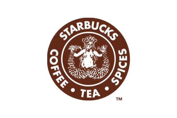
It’s this naval theme that led them to their very first logo design of the twin-tailed mermaid. In Greek mythology, these sirens (as they’re also called) would lure sailors into crashing their ships off the coast of small islands. The Starbucks logo would do the same, except it would lure customers into buying tasty coffee.
The first logo used a coffee brown color (earthly, stable, nurturing), and the mermaid was fully visible, holding her tail in both hands. The circular design allowed them to spin their company name around the logo, with the word’s coffee, tea, and spices—letting customers know what’s available.
During this time, the company was bought by Howard Schultz, who wasted no time redesigning the logo. This would be the first evolution of the Starbucks logo.
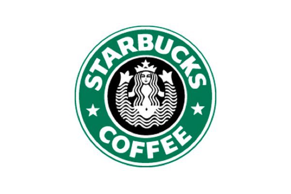
Schultz hired Terry Heckler, an artist, and designer to help with the new logo. Drawing inspiration from the port of Seattle and wanting to incorporate the idea of a fresh start and new opportunities to grow and succeed, Heckler made some big changes to the logo.
The mermaid received a makeover. Her breasts were covered by her hair, she kept her crown, and she became more streamlined.
The logo’s color transformed from brown to Kelly green to represent the company’s new purpose. The words “tea” and “spices” were dropped as well. Instead, they created a new wordmark – Starbucks Coffee, with two stars connecting the words.
The stars’ use and placement helped the logo stand out and push its brand identity to be memorable and easy to recognize.
In 1992, Starbucks went through its third logo design change. The logo zoomed in on the mermaid, creating a more intimate, close-up view. Her naval was no longer visible, and only some of her tail could be seen.
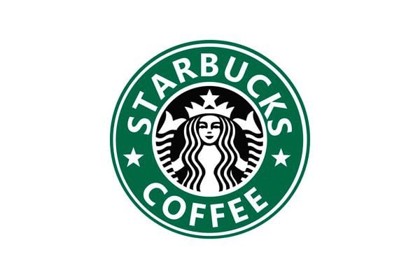
The font was also sharpened with a more professional and modern appearance. The result is a logo with a cleaner look and feel, with the siren having a bigger impact and focus.
Celebrating its 40th anniversary, the company decided to attempt a considerable rebranding effort.
With a blast to the past, they reimagined the original 1971 logo with a few modern twists and changed the logo’s color from green to black.
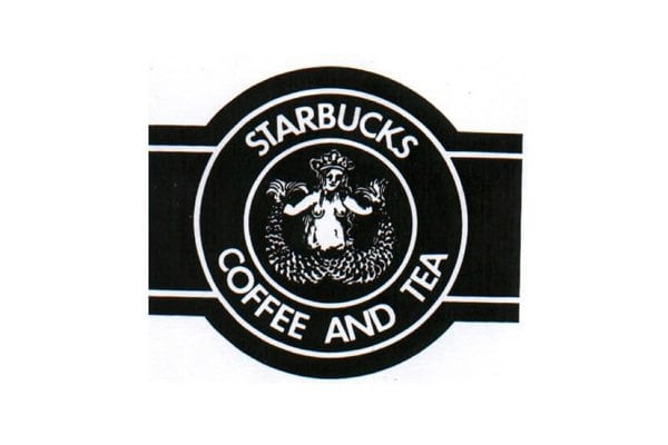
The result was a failure, and they received huge backlash from their customers. Their green branding and simple logo design had become so popular and familiar to the public, that their audience refused to accept anything other than the beloved green logo.
Just goes to show you how powerful the bond is between branding and your logo.
Realizing just how strong and successful their brand had become, Starbucks dropped many of the familiar design elements from its logo—giving it a very modern look and feel, with minimalism leading the charge.
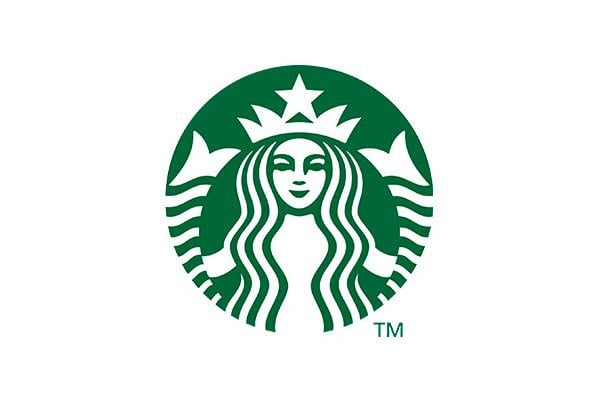
They said goodbye to the wordmark, stars, and outer ring. The logo now focused entirely on the siren, which they enlarged and gave a facelift. Her eyes, nose, and hair were redesigned to be more symmetrical, and they brought back the iconic green background color.
Starbucks explained that this latest approach allows the logo to appeal and connect with audiences worldwide.
There’s so much we can learn from the evolution of the Starbucks logo. Having a unique and recognizable mascot helped them create a strong brand presence, not just in America but also in countries all around the world.
From the very beginning, their logo was connected to their brand in the strongest possible way. There was no Starbucks coffee without the logo.
Circles are a top shape to use because they represent a never-ending journey around the world. Plus, it’s an easy shape to work with across different formats, whether you’re printing it on coffee cups (which have a curve and can cause challenges with your logo) or printed advertising like newspapers and billboards.
Not only that, but emblem logos give off a traditional, timeless feel, which is why it was Starbucks’ go-to for so long.
Along with their now-famous siren, choosing a bright, healthy green as their primary brand color also promotes a sense of compassion, nurturing, and kindness.
The Starbucks logo is a perfect example of how effective logo design goes hand-in-hand with its identity and branding efforts.
By refreshing their logo, Starbucks has kept its branding up to date and lets customers know they’re changing with the times.
Are you feeling inspired to brew your own business logo design? Head to our free logo maker to get started!
The information provided on this page is for information, educational, and/or editorial purposes only. It is not intended to indicate any affiliation between Tailor Brands and any other brand or logo identified on this page.
Products
Resources
@2024 Copyright Tailor Brands