If your logo design doesn’t appeal to your target audience, you’ve got a problem.
It could fail to engage their interest, or worse! Send a negative message, turning people away from your brand, not towards it!
But that doesn’t have to happen.
Remember when you fell for a brand logo at first sight, when it just clicked with you?
And as if by magic, with zero hesitation, you wanted to know more!
It wasn’t magic, but there were some pretty cool logo design tricks at play.
One that tapped into your emotions, made it feel familiar, giving you peace of mind.
You can create a logo with that kind of pulling power; all you need is a logo design that appeals to your target audience.
I’ll tell you how and provide actionable steps so you can do it right now.
And it begins with designing for your audience.
Your target audience are the folks who want or need your product or service and have a track record of paying for it. They’re a specific demographic of society, determined by age, gender, location, education, profession, income, family status, and other social factors.
If you’re now thinking, how do you identify your target audience? You’re one step closer to creating a logo design that appeals to your audience.
ACTION STEP #1 – IDENTIFY YOUR TARGET AUDIENCE:
Let’s begin with three tactics you can use right now to identify and better understand your target audience.
1. Analyze your customers. If you have past or previous customers (if not, skip to step two), find out their demographics. An excellent way of obtaining this info is by engaging with them through social media and conducting surveys, and an even easier way is to look at your reviews.
2. Analyze your competitors. You can learn a lot from your competitors, like who they’re selling to and which marketing channels they use to reach them. Go online and check out their websites, look at their testimonials, follow their social media links and see who’s posting replies; How old are they? What do they look like? Where they’re from.
3. Use Google Analytics. If you have a website, Google Analytics provides data about your visitors. Such as the channels they use to find you and which content engages their interest. Identifying their likes, dislikes, and preferred search platforms will give you a demographic outline you can work with.
Once you’ve identified your target audience, you have to devise a design strategy that appeals to their emotions.
I’ll explain next.
ACTION STEP # 2 – TARGETING YOUR AUDIENCE USING DESIGN:

A lot of business owners adopt a one design suits all approach when creating their logo design. But this is where they run into trouble because if you try to design for everyone, you’ll connect with no one.
Your target audience is the deciding influence when choosing which logotype, colors, fonts, and shapes you’ll use. After all, the buying decision is in their hands; your only objective, or that of your designer, is to create a logo design that engages, connects, and converts them.
When you know which design elements resonate with your audience, you can use them to express your brand values and tap into their emotions.
Remember, your logo is your most powerful marketing tool, but only if it appeals to those you made it for.
Here’s how you make that happen:
ACTIONSTEP # 3 – APPEALING TO YOUR TARGET AUDIENCE:
You do it by becoming your audience!
When you have a deeper understanding of your audience’s pain points, you can authentically empathize with them. When you do that, they’ll believe in you. Making them feel like you did when you found a brand that you fell in love with.
But first, you’ve got to walk in their shoes.
ACTION STEP # 4 – CREATE A BUYER PERSONA:
Okay, you know your logo design has to resonate with your target audience, but there’s just one problem: what makes a logo appealing?
There are color combinations, fonts, shapes, and images proven to work for every marketplace because they send the right messages to consumers. However, it’s not the companies that determine these elements; it’s the audience.
After all, it’s the brands that use design elements that resonate, connect, and convert their target audience that become memorable. A proven strategy for finding those elements is to create a buyer persona of your ideal client.
A buyer persona works by giving your ideal client a personality, enabling you to learn how they communicate, where they hang out online, their main pain points, attitude, style, interests, goals, challenges, and behaviors.
Keep your buyer persona singular because by making it a distinct individual, you’ll understand what makes them tick, how they feel, and what they think.
To help you get going, start by sitting down to answer some questions about your customers using our very own template.
ACTION STEP # 5 – USE THESE LOGOS EXAMPLES TO APPEAL TO YOUR TARGET AUDIENCE:

Target audience – postpartum training:
This fitness logo uses contrasting fonts and colors to reinforce its message that moms are strong, individual, and beautiful, especially after giving birth. The font used for the word strong reflects their strength, while the signature font used for mom shows their feminism and paternal side. Pink for mom reinforces that the training is for women, and the black gradient reinforces the message that you have the strength to do anything.

Target audience – fitness/bodybuilding:
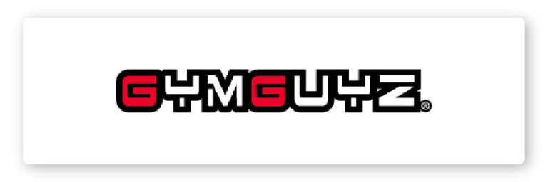
GymGuyz is a global home fitness service that prides itself on providing customized training to suit its client’s individual needs. Their font reflects this personalized approach, the brand’s drive and strength, and what their clients can achieve. And the use of a singular color, red, in the two G’s, conveys energy and vitality. While reinforcing their brand message that they provide one-on-one personal service.

Target audience – kids fashion:
Kids love color and animation, and the e-commerce clothing brand Beebay (brilliant wordplay) uses every designer trick to engage their target audience.
Their brand message is “We provide comfortable, chic, and vibrant clothing your kids can have fun in.” The choice of primary and secondary colors, along with their tagline, reinforces their message. While the bee provides a strong brand visual that shouts hardworking, productive, sweet clothing your kids will love to wear.

Target audience – high end:
The Chanel logo`s one of the most globally recognizable fashion logos, and it’s universally considered a contributing factor to Chanel’s success.
So, how did they do it?
A chic, classic, minimalist couture font, with black on white or white on black coloring, along with the clean interlocking Coco Chanel icon, all convey class, prestige, and wealth. Precisely like the target audience, the brand was designed to engage the rich and famous.
Their slogans also tap into their target audience’s desire, “Share the fantasy – It’s beautiful up here“ and “In order to be irreplaceable, one must be different.”

Target audience – cooking enthusiasts:
With 4 million YouTube subscribers, food wishes have found a recipe for success! A YouTube logo aims to catch the viewer’s attention and instill a vision of what viewers will discover when they click on the channel. Meaning it has to be attractive, symbolic, and informative.
Food wishes used a combination logo to achieve this. Their name connects with their audience’s desire for creating dreamy food; their tagline ensures it’s for everyone. The clever use of a spoon for an I, whisking the O, conveys a relaxed and obtainable approach.

Target audience – gamers (Ali-A):
The video game industries tend to use bright, primary colors in their predominantly wordmark logos to grab the viewer’s attention and get their minds spinning. And gamers, like Ali-A (17.5 MILLION SUBSCRIBERS), are using a similar approach.
In February 2020 – Ali-A rebranded his logo design. He opted for blue (signifying trust, loyalty, wisdom, confidence, and stability) to stamp Ali -A`s authority on the niche. A futuristic silver surround, similar to a spaceship porthole, with his initial emerging from within, signifying the new brand approach to his followers.

We’ve covered a lot, so to summarize
1. Identify your target audience: As the saying goes: if you’re marketing to everyone, you might as well be marketing to no one. Keeping in mind who you want to target will help you fine tune your brand to meet their needs.
2. Create buyer personas: This exercise is a useful tool in the brand building process. After all, you want the right person consuming your content, subscribing to your email list, and remaining loyal to your company.
3. Check out the competition and learn from the big brands: Research who shares the same space as you, what they do well, where they fail, and what they do to get their customers.
4. Leverage symbolism in your design: Never underestimate the power of symbolism to communicate the essence of your brand in just a glance.
5. Keep it simple, unique, and make it memorable: Strong logos feature a unique quality while still remaining simple in design.
With thousands of new businesses coming online every day, you needed an advantage.
You now have one.
You know how to make your logo design appeal to your target audience.
Giving them peace of mind and the confidence to find out more.
Converting them from viewers into users.
Remember, if you identify, target, and appeal to your audience, your logo could be the one they remember for life!
Products
Resources
@2024 Copyright Tailor Brands