
Are you trying to create logos with personality but are feeling a little stuck?
Don’t hate – just animate!
When we talk about what makes a good logo, we often discuss the psychology behind different colors, fonts, and layouts. Not enough air time goes to animated logos – so we’re here to change that.
Human beings love to look at things that move; it’s why we tend to choose movies over novels (even though the book is usually better), and why we’re captivated by all things social media. Motion holds our attention in a way that static images sometimes fail to.
And, it’s no wonder that brands around the world are catching on, gravitating towards dynamic logos – logos that change depending on context – and experimenting with everything from small color changes to full-blown animations.
The joy of animated logos is that any business in any industry can use them! However, there are a few things to consider before you leap into the world of motion design:
First off, animated logos are geared toward digital branding efforts; as in, if you’re creating a logo that will primarily be featured on a storefront or business cards, an animated design isn’t going to have much relevance for you.
(However, as having an online presence is a key part of establishing a memorable brand, you may want to think about getting a website up and running real quick.)
Another thing to note is that animation should serve your logo message, not detract from it. A photography logo featuring a wand setting a tripod on fire may look cool, but it’s also going to cause your audience to run in the opposite direction.
With that in mind, if you already have a static logo for your brand, you may want to put yourself out there and make an animated version. This will give your brand variety; you can use your static logo on printed materials and official communications, with your animation featured on your website and social media pages.
Ready for a few ideas on how to bring your animated logo to life? Here are some of the coolest logos in motion design to get you started.

To animate is to be bold, and this creative brand played on their namesake with motion galore. An animation studio itself, Bold’s logo touches on every kind of movement – from a rolling ball through bouncing geometric shapes – until it settles on a simple yet striking typeface that delivers its message loud and clear.

As gaming logos go, this one is pretty spot-on. Games are often about figuring out both literal and figurative twists, and navigating the “big reveal” when it hits. This logo embodies that reveal, as it starts from a single point and curves its way into the entire Game Geek design.
Is this a logo or an art exhibit? That’s the question the design begs you to answer. Its moving letters play on the idea that perspective changes art – a spot-on message for an art gallery to give its audience. And, the frame around the shifting letters adds a nice, exhibit-like touch.
This animated logo uses a pulsing speaker to represent ever-changing sound levels – the message being that with Shazam, the music never stops.
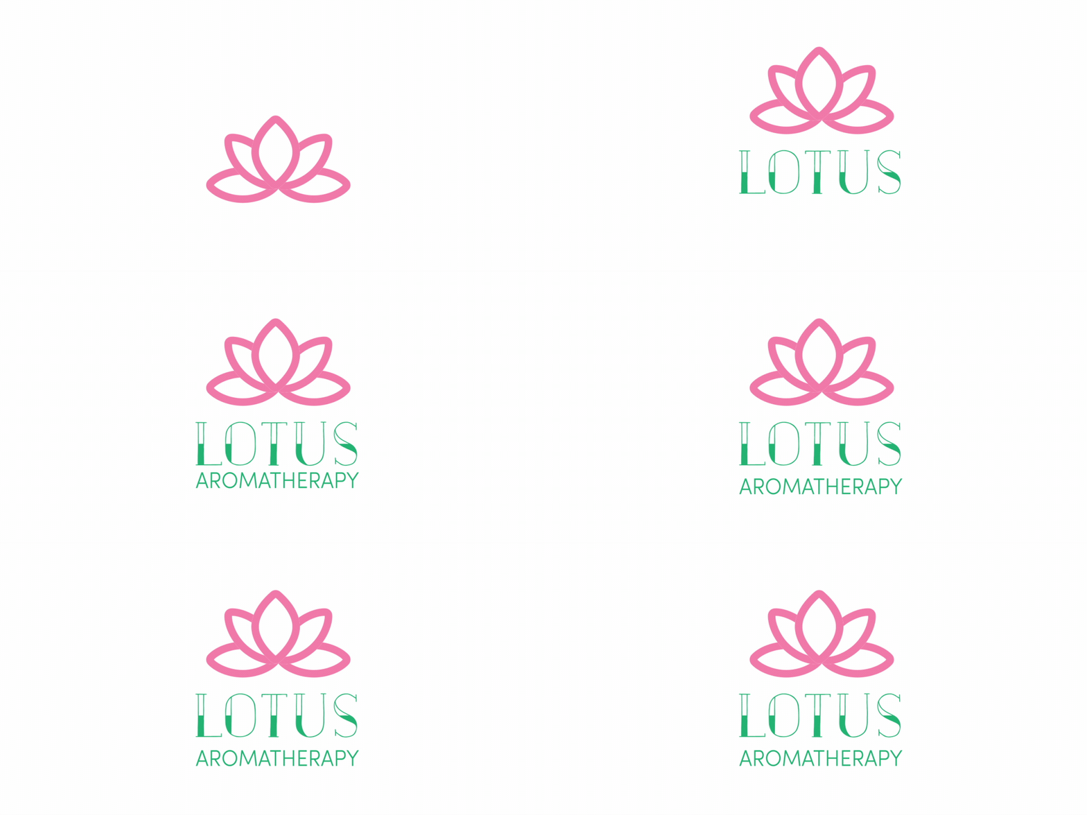
Nothing speaks to personal growth like a flower in bloom – ideal for an aromatherapy center. The animation is simple but resonant, as a single petal “grows” the logo name and turns into an entire lotus plant.
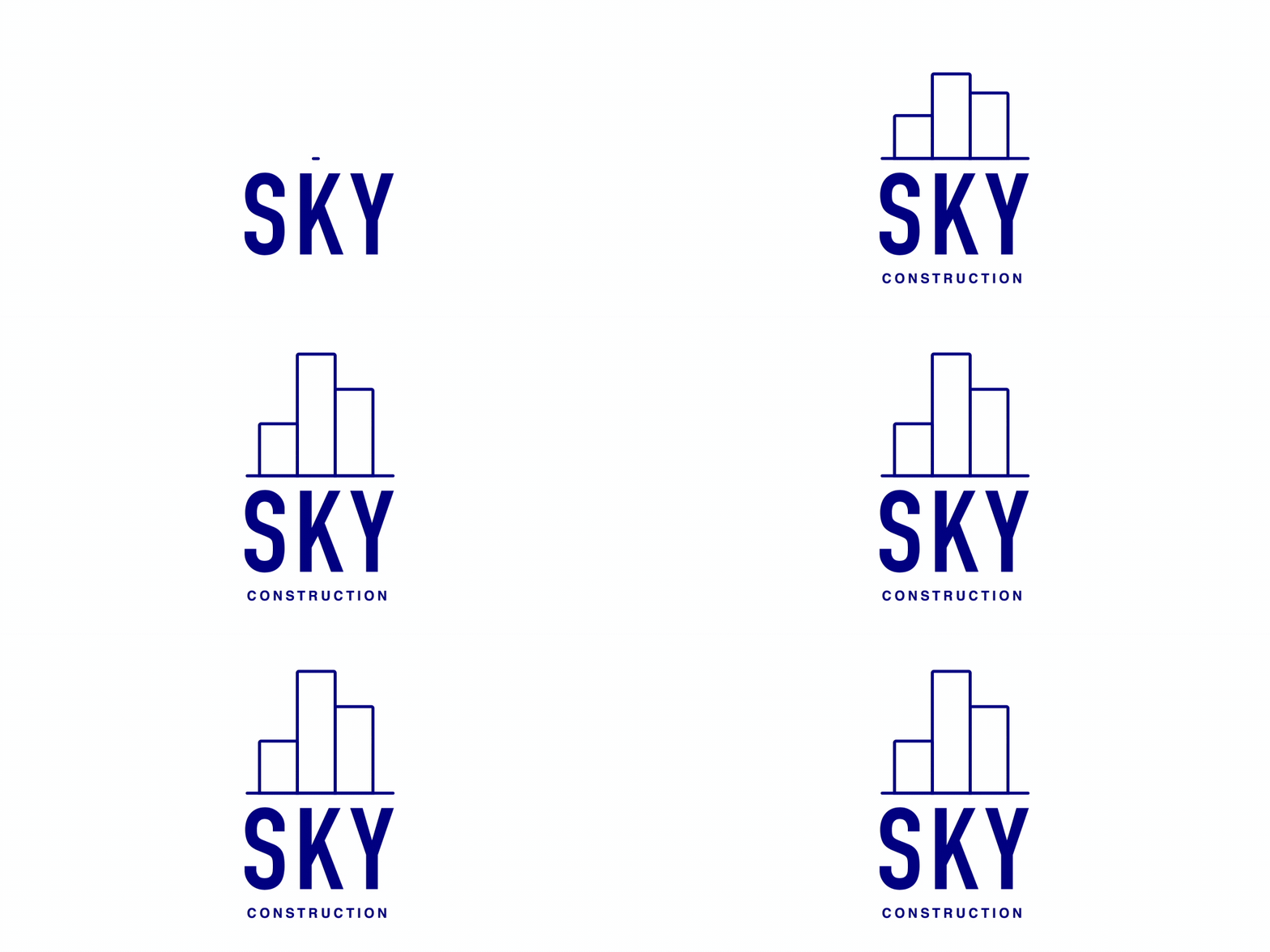
On the topic of growth, what better way to showcase a construction brand than through instantly-grown buildings? This construction logo uses simple geometric shapes to form a skyline, which is indicative of both the brand name and message.
This studio is all about bringing different elements together to create art, and they use an animated logo to emphasize that to their audience. In addition to looking super cool, the movement in the logo helps to illustrate the brand message of “connecting pieces”.

Have you seen the animated version of FedEx’s logo? It plays on the white space arrow hidden between the “EX” of their static logo, throwing arrows every which way to indicate direction. FedEx ships all over the world, and the logo plays on that idea through the sharp movement of each arrow.
Not sure what type of logo you want to create? Don’t commit! Designer Gun Karlsson did just that with Brikk, using animation to turn the word into an image of its namesake.

We’d be remiss if we didn’t add our own cool animation to the mix. At Tailor, we’re all about helping small businesses design a logo and build their brand, and what better way to show that than through a logo that builds itself with movement?

This animated design brings a whole new meaning to the “handwritten” logo, a well-known characteristic of vintage logos and breweries alike. Using a strong, decorative font, the pacing of the animation makes it look like someone is physically drawing out the name of the brewery – giving the overall logo a personal and retro touch.
This investment company wants its customers to know that it will make them money, and it’s speaking to a niche clientele – specifically, one that invests in science and technology ventures. To illustrate that point, the Lux logo twists and turns to play on math signs – both to allude to these disciplines and to acknowledge the intersection of the two (science+technology).
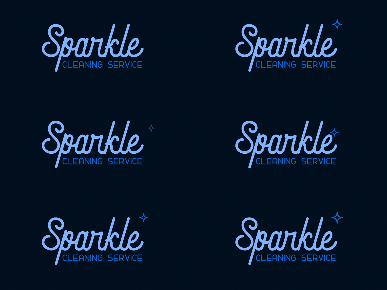
Rather than going with flash and flair, this logo uses light animation to really…sparkle. Just like its namesake, it’s clean and ready to get to work.
Are those film reels rotating, or a pair of blinking eyes? Thanks to animation, they can be both! It’s a playful yet intricate logo, no doubt intended to distinguish the studio from others in the heavily-saturated market.

For motorcycle company Vrooom, emphasizing movement is exactly the type of brand advantage that brings their customers to the door. The speed of the logo rushing in and out of the frame signifies the agility of their products, while the moving rectangles above the business name are reminiscent of handlebars.
Another hand-drawn logo, Tangles uses a script typeface as the basis for “tangling” the letters of the logo, as a testament to the name.
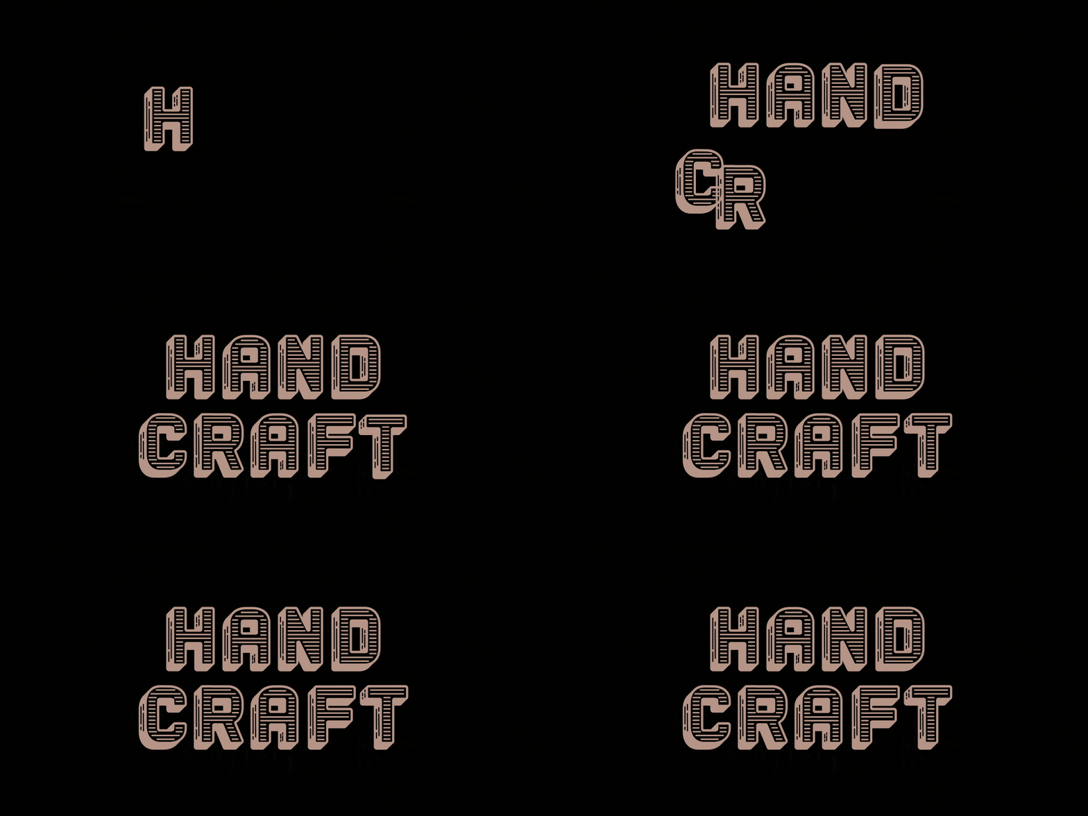
Adding movement to your logo doesn’t have to be complex to be cool. Taking a vintage logo that stands on its own and having it slide its way into the frame is enough to give it the edge it needs to set itself apart.
Moving from t-shirts only to an entire lifestyle brand, Ugmonk rebranded and took on an animated logo in the process. It’s minimalist, quirky, and light – just like their clothing – and sneaks in a t-shirt-like icon in the middle of all the motion.
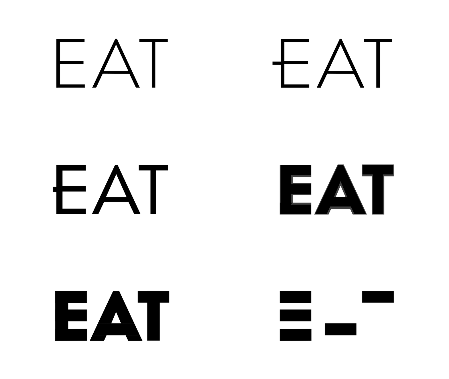
A font all on its own, Eat is a living embodiment of its own meaning – the logo gets “fed”, making the font heavier and heavier (i.e. with thicker weights). Notice that the logo interrupts its feeding to briefly become the word “fat”; you can do with that what you will.
A brand that caters to millennial entrepreneurs, Echo needed a logo that could speak to their target audience – and what better way to do that than embrace their digital sensibilities? It’s sleek, it’s sharp, yet it stays professional – and with its forward motion, you can practically hear the echo.
This restaurant is all about free-spiritedness and uniting its customers, through its open kitchen and communal dining space. They used an animated logo to make that individual-yet-communal feeling come through; although the logos ‘o’s’ have a habit of wandering the frame, they always manage to find their way back to where they belong – a proverbial sitting down at the collective table.
Have you had enough logo design inspiration to get your brand moving? Whether you’re a motion designer yourself or a small business owner trying to make your mark, an animated logo may be just the thing you need to put yourself out there. Use these 21 logos as a starting point, and begin to brainstorm ways to translate movement into meaning!
The information provided on this page is for information, educational, and/or editorial purposes only. It is not intended to indicate any affiliation between Tailor Brands and any other brand or logo identified on this page.
Products
Resources
@2024 Copyright Tailor Brands