Let it be known that not all runners enjoy getting up at the crack of dawn to get those miles in (ahem, me). Staying in bed and catching another hour of sleep is an appealing temptation.
But as soon as I spot my Nike sneakers sitting by the door, it’s a silent push to get moving. And I think to myself, “Just do it.” It becomes a mantra. Every morning I see the Nike brandmark—that swoosh sign that resembles a check on my daily to-do list—and I’m motivated to, well, do it.
That’s what a killer logo tagline can do.
Let’s cover what a logo tagline is (and how it’s different from a slogan), some examples of taglines, and how to include one in your logo design. Let’s do it!
A tagline is a phrase that highlights what a business does, emphasizes a value or specific message, and/or clarifies a brand’s mission. You can think of taglines as a brand’s mission statement condensed into a few words.
It can be an important part of your brand’s identity. McDonald’s “I’m lovin’ it” or Coca-Cola’s “Taste the feeling” comes to mind. These phrases are almost (if not equally) as iconic as the famous golden arches and the red and white script logo.
Just like McDonald’s and Coca-Cola, you can use a tagline to enrich your brand’s image. A tagline performs a variety of functions that are essential to propel your brand forward. In just a few words, you can elevate your brand above the competition and grab your audience’s attention by telling the world who you are and what you care about.
Ultimately, taglines are a powerful way for your customers to connect with your brand and foster brand loyalty.
The following are business taglines that span a wide range of industries to demonstrate that a good tagline is catchy, concise, and timeless.
Have you ever heard your parents say you better eat your Wheaties before an important event? There’s a reason for that! Wheaties worked hard to maintain brand recognition through their strong association with sports.
The famous tagline was first used in the 1930s and has been known to feature prominent athletes on its packages. From football stars and coaches to aviators and parachutists, nearly every sport imaginable gave testimonials singing Wheaties praises.
To this day, Wheaties is still considered to be the breakfast of champions.


We often take it for granted that we have access to refreshing, naturally hydrating water. Evian sources its water from the French Alps, so you can enjoy natural spring water anytime, anywhere. When you have a product that’s a necessary, life-sustaining need such as water, you don’t need a logo tagline to say any more than that. By keeping it simple, your logo tagline will speak volumes for your brand.
As I mentioned earlier, Nike’s message is one that easily resonates with everyone. The brand became more than just athletic apparel—it became a way of life. It encourages you to overcome any obstacle you face in life. It’s telling you to not let anything stand in your way.
Apple’s tagline “Think different” was first used in the commercial called “Here’s to the Crazy Ones.” The commercial and tagline are a homage to the visionaries and pioneers who challenged the status quo and changed the world. If that isn’t inspiring, I don’t know what is.
Shortly thereafter, Apple rose to unprecedented fame. Most importantly, the tagline is a call to action and immediately instills in the customer a sense of belonging among icons such as Albert Einstein, Martin Luther King Jr., and Mahatma Gandhi.
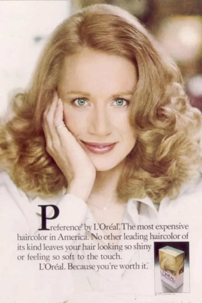
It’s been 51 years since L’Oreal’s tagline was first announced and the message of empowerment is just as relevant as ever. At 23 years old, Ilon Specht was working at the L’Oréal Paris New York agency in 1971 when she first came up with the phrase after becoming discouraged by constantly writing commercials through the male gaze.
Specht’s words and concept sparked a change in beauty advertising, which until then relied exclusively on male voices. Over half a century later and the message still holds a place in society and acts as an important reminder for all.
“This slogan reflects the unique character of the Marine Corps and underscores the high caliber of those who join and serve their country as Marines,” said Maj. Gen. Richard T. Tryon, commanding general, Marine Corps Recruiting Command. Indeed, it does.
Advertising Week, the largest and most prestigious annual gathering of advertising and media executives in North America, named the Marine Corps to its Walk of Fame for their tagline in 2007.
The tagline is so effective since it instills a sense of pride, belonging, and privilege for those who serve in the Marines.
The terms “logo” and “tagline” are often used interchangeably, but they serve different purposes.
Unlike taglines, slogans are usually used for only one product or campaign. When businesses want to focus on a new theme or idea, they change their slogans.
Taglines, however, are timeless and are rarely changed since they represent a brand. Essentially, a tagline is a catchy phrase that invokes an image of your brand in the minds of your customers. It helps people make associations with your business like me with the Nike swoosh mark.
A tagline has immense power to boost your marketing strategy if implemented correctly. Here are some tips to guide you as you think of your logo tagline:
Think about why you’re creating a tagline in the first place. Is it to show people why your company is different? To inform people about what your company does? As you write your tagline, don’t stray from your intended purpose; focus on the message you want to deliver.
If you think it’s most important to share information about your products or services, for example, then that information should be in your tagline. On the other hand, if you strongly believe in a set of values, and you feel that your audience will connect with those values, then your tagline should focus on your business’s purpose, principles, and ideals.
Then there’s the differentiation tagline, which is intended to make your business stand out from the competition. You can think of a differentiation tagline as a phrase that answers the question, “What makes my company different from the others?”
There’s also an information tagline that explains exactly what your business does. If you have a small, relatively unknown business or a generic business name that doesn’t reveal much about your business, an informational tagline can be a good idea.
For many businesses, a logo tagline functions as a way to describe your product or service. This is particularly true of small businesses that don’t yet have brand recognition.
A family-owned restaurant, for example, might benefit from a simple descriptive logo tagline, like “Home-cooked Mediterranean Food.” The purpose of such a tagline is to entice the public by explaining what the restaurant offers. In this case, a straightforward description of the food might be more attractive to a hungry audience than a vague, albeit more emotive, catchphrase.
A brand is all about the emotions and perceptions that you intentionally develop around your business. A tagline helps your target audience connect with the essence of your brand. And when you tap into your audience’s emotions—magic happens.
Subway’s “Eat Fresh” is simultaneously descriptive and emotive. Not only does it describe what the sandwich chain offers, but it also appeals to its audience by invoking fresh food and healthy living.
Other taglines are purely emotive. Bank of America’s slogan, “Life’s better when we’re connected,” connotes several attributes of the bank: Digital connectivity, strong customer relationships, and a feeling of community and togetherness. Combined, these attributes turn what might otherwise seem a distant corporate entity into a friendly and accessible business.
L’Oréal Paris’s classic logo “Because you’re worth it” also evokes a powerful emotional response in its audience. Buying L’Oréal, the message implies, is empowering, and women are worthy of treating themselves to beauty products.
The best logo taglines are easy to remember. They have a particular ring and flow, and they’re typically no longer than 4 or 5 words. Short and sweet taglines like General Electric’s “Imagination at work” are memorable and concise.
Other logos are snappy because they use rhyme, repetition, or wordplay: “Maybe she’s born with it. Maybe it’s Maybelline” highlights the play on words “maybe” and “Maybelline” to emphasize the company’s brand name.
Bounty’s slogan, “The Quicker Picker Upper” employs rhyme and playful language to make their paper towel brand stand out. Dollar Shave Club’s “Shave time. Shave money” uses both puns and repetition to describe their business while explaining its money-saving benefits.
You might want to avoid using words or references that will make your tagline obsolete in 5 years from now. Things like “woke,” and “YOLO,” definitely don’t belong in your logo tagline. Words like “help,” “achieve,” and “trust“, however, have a chance of making a long-lasting impact.
Aim to create a tagline that stays relevant for years to come, with it being catchy and simple enough to become a timeless classic.
Now that you know the building blocks for creating a great logo slogan, you should also know what to avoid:
Excessive wordiness is a logo tagline biggest no-no.
First, a long-winded, overly descriptive tagline won’t be a tagline at all—it’ll be a description. Second, it isn’t going to fit anywhere. It’s not going to look good on your website or marketing materials, and it certainly isn’t going to look good on your brand logo.
To keep your tagline concise, pare down your desired tagline to only the most important keywords. Check for places where you use redundant words or where you can replace passive with active voice.
Let’s say you want your tagline to be “Delicious coffee you’ll want to wake up on time for.” That’s a lot, right? But you could break it down so it’s “Coffee to wake up for.”
While slogans are useful, you should avoid creating a slogan just for the sake of having one.
A tagline needs to have a purpose. If your tagline is meaningless, irrelevant, or simply doesn’t make sense, it’ll only be a blight on your brand.
Time Warner Cable’s slogan “Enjoy better” consists of weak, nondescript words that communicate nothing about the company’s brand. Not only that, but the phrase “enjoy better” doesn’t make much sense. What are we supposed to enjoy? And in what way is it supposed to be better?
A logo tagline can elevate your brand if implemented correctly. Here are some tips to guide you when including a tagline in your logo design.
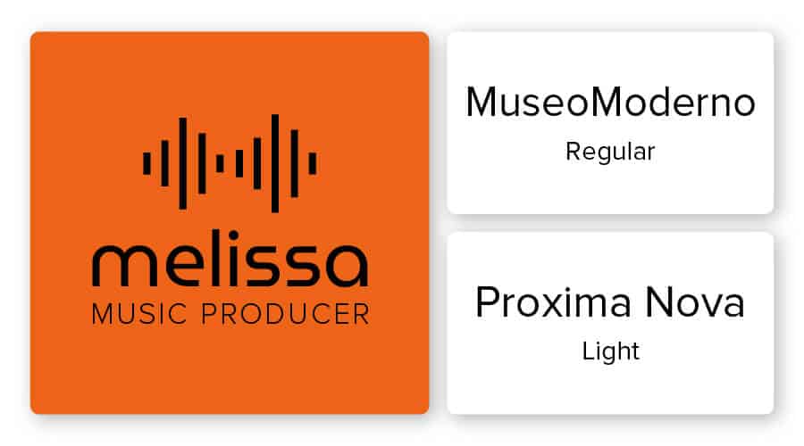
You’ll want your company name and your logo slogan in different fonts to differentiate them from one another. However, you need to be careful about which fonts you pair together. If you choose fonts that are too busy or that clash, your logo will appear convoluted and difficult to read.
When pairing fonts, the golden rule is to put contrasting fonts together. You can use contrast in your logo design to establish a hierarchy, which can help viewers focus on your most important elements. In addition to highlighting your design’s focal point, contrast adds interest to the logo.
Some examples of contrasting fonts are serif with a sans serif. Or pair a script font for your company name and stick to a clear, minimalist font for your logo tagline. Also, mix up weights and sizes to provide contrast between your company name and logo tagline. If you look at the logo above, the word “Melissa” is thicker than the tagline underneath it.
The last bit of advice is to use legible fonts, especially if your tagline will be written in smaller letters.
Your brand’s personality is rooted in its colors—are you more of a classic black and white, or maybe a soft pink and blue? The trick is to understand color combinations, you can create a logo design that tells your audience exactly who you are and reinforce your logo tagline.
Before you even pick a color, think about the emotions you’re trying to elicit and ask yourself how you want your consumers to respond to your brand.
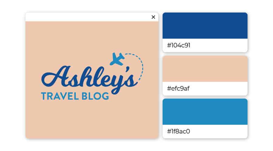
The first rule of thumb to mastering color combinations is to keep it simple. It’s best to stick to 2 colors, 3 max. If you’re going to pick 3 colors, it’s best to choose 2 different shades of the same color and then add another color to add contrast. This is exactly what Ashley’s Travel Blog logo did by pairing a pink-tan background with a dark and light blue to make it pop.
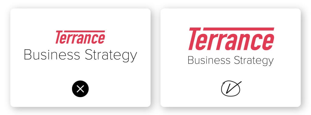
This is a rule that we strongly advise you to follow: Your logo tagline should be smaller than your business name. The reason boils down to a design principle known as visual hierarchy, which refers to the arrangement of certain elements in order of importance.
Look at the 2 logos above. The logo on the left looks wrong, right? That’s because the tagline is larger than the business name Terrance. The visual hierarchy is totally off balance. But the logo on the right is balanced properly because the name Terrance is larger than the tagline. It’s all about balance.
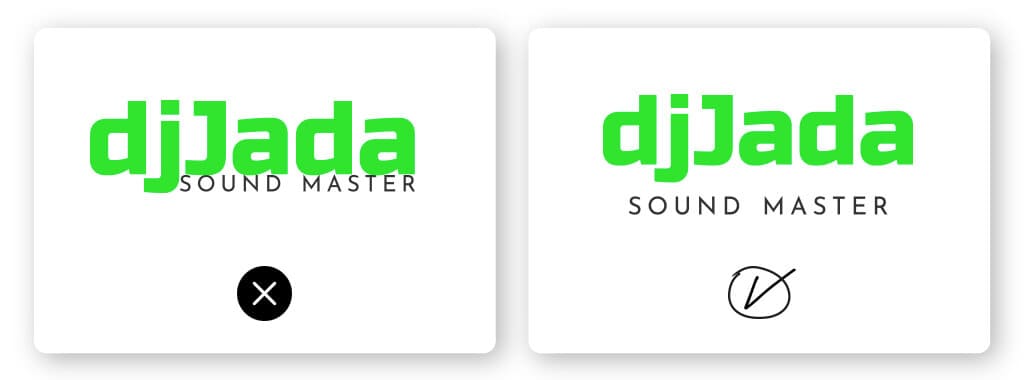
This bit of advice is pretty intuitive. Take a look at the DJ Jada logo above—the design on the left is smushed together making it hard to read. The design on the right, however, has enough space between the business name and the logo tagline.
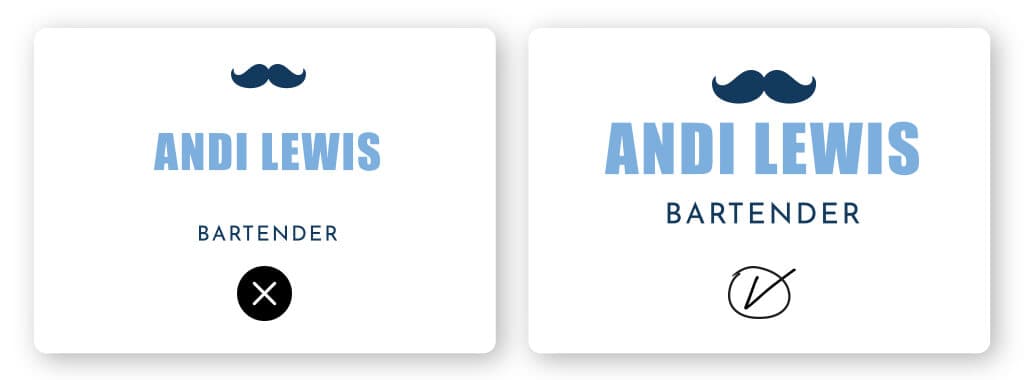
The same could be said of the opposite; you don’t want your logo tagline to be spaced too far away from your business name. Take a look at Andy Lewis’s logo where it’s obvious the space between the words is too big. The logo on the right, however, is just right. It’s all about that Goldilocks ratio.
Your tagline, brand name, and logo form an inseparable trio that’s a core part of your brand’s identity and messaging.
As you’re brainstorming tagline ideas, try to come up with a phrase that will capture who you are as a business and that you’d be proud to associate with your brand far into the future.
Once you choose the right tagline, decide how you’re going to incorporate it into your brand. Use your logo tagline on website pages and marketing materials, and ensure when you create your logo that it’s aligned with what your brand identity is trying to express.
“The information provided on this page is for information, educational, and/or editorial purposes only. It is not intended to indicate any affiliation between Tailor Brands and any other brand or logo identified on this page”
Products
Resources
@2024 Copyright Tailor Brands