
Most of us know that creating a website is a fundamental part of any small business strategy. A website establishes your company’s online presence and is an important resource for attracting leads and guiding customers through the sales funnel.
While a website is meant to transmit practical value about your business and your brand, it’s also the place to build emotional connections with your target audience. Your website’s look, feel, and personality are just as powerful as the information on your site when it comes to drawing in prospective customers.
The secret to crafting an online presence that intuitively resonates with your audience is to create a branded website. You can think of a branded website as your business’s personal profile, with a combination of visuals, colors, and strong written copy that together create a cohesive picture of your brand’s personality.

A website consistent with your brand image and personality is vastly more effective than a website that simply looks good. A website that either ignores or is inconsistent with your brand image is a missed opportunity to shape public perception of your brand.
Take a step back from your company for a second, and think about yourself. You probably have a personal Facebook or Instagram account, right? Both social media platforms have space for you to add a short bio, and Facebook even encourages you to select featured images.
As you contemplate what to put in your bio, you’re probably thinking, What captures the essence of me? Are you funny and lighthearted or serious and professional? Do you have a hobby or interest that best embodies your personality—like “basketball fan” or “proud father”—or do you prefer to focus on something more abstract, like “daydreamer” or “creative thinker.”
And, which images should you put on your profile? Pictures of yourself with your family? Pictures of you at work conferences? Photos of partying with friends?
The point is that the photos, information, and tone of voice you choose to include (or exclude) on your profile shape people’s perception of your personality. Company branding works the same way. The content and design of your small business’s website and social media pages determine how your audience perceives your brand.
The benefit of a branded website is that it strengthens customer connections and builds trust. If your brand has a personality that resonates with your target audience and speaks to their values and needs, your brand can become your customer’s best friend.
US grocery store chain Trader Joe’s has a powerful branded website that establishes its personality as a friendly (and funny) neighborhood store. Avoiding seriousness and formality, the website’s list of suggested recipes is simply labeled “TJ’s Test Kitchen.” The blog post “A Tale of Two Cheddars” not only informs customers about new products, but also builds brand loyalty with a humorous, engaging narrative about sourcing their new cheddar cheese.

Driving emotional connections like Trader Joe’s is not only an important part of attracting new customers; it’s also crucial for retaining a loyal customer base who will buy time and time again.
On top of that, a powerfully branded website builds brand recognition. Trader Joe’s branded website makes it stand out as being more than just another supermarket.
Now that you know why a branded website is so important, here are some actionable tips for effectively branding your small business site.

The first step in creating a branded website is defining your brand. After doing market research, think about your target audience and the kind of brand personality that would resonate with them most.
Your brand personality is the human element of your brand. It’s made up of a consistent set of traits and behaviors that you apply across your brand’s image and voice.
There are five main types of brand personalities. While there’s definitely room for variation and overlap, these traits can help get you started:
As you build your website, your choice of visuals and text should be consistently rooted in your brand’s personality.
Let’s dive into the specifics of how to create branded visuals and written content for your site.

Website visuals are a way to build recognition of your brand image. Every visual element on your site should touch back to the way you want your audience to perceive your brand.
Unless you’re coding your website from scratch, you’ll probably need to choose a website template (or theme, if you’re using a content management system like WordPress).
It’s important to conceptualize what type of site you’ll need before deciding on a template, so that you end up with one whose design supports the point of your site. For example, an eCommerce site will need much more capabilities, pages and functions than a simple “Coming Soon!” landing page.
Note that you can find website templates and WordPress themes on digital design marketplaces like MasterBundles, which offer all sorts of website graphics, designs, and HTML-based templates that are affordable and easy to edit. You can also use these sites to access design “bundles” that include fonts, icons, and illustrations for special occasions, to help you keep your site on-brand during holidays or seasonal changes.
Your logo is the face of your brand. Because of this, it plays a prominent role in determining your website’s aesthetic style overall.
You’ll want a logo that represents your company’s product, mission, or values. Choose icons and typography that symbolize your company. A pool company, for example, might choose a wave, sun, or fish icon, while a sportswear company might choose a basketball.
You should also choose colors that represent your brand personality. Color psychology is a well-researched field that can have an impact on customer perceptions of your brand. Green, for example, tends to be associated with nature or the environment, while red and yellow are youthful, energetic, and bold. A black and white color palette, on the other hand, comes across as sophisticated and timeless.
Designing a logo involves choosing a combination of icons, typography, and colors that best represent your company’s products, values, and personality. Once you have a logo, be sure to place it on your website’s homepage. We also recommend you place it in the top lefthand corner of each web page.
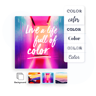
Your color scheme should be based on the brand colors of your logo.
As you choose colors for your website, consider which colors to use for your site’s background, navigation bars, and prominent text such as CTAs and headlines. While you shouldn’t overuse color–black and white is always a safe choice for a clean and professional site–you should use pops of color that match or complement your logo’s existing color scheme.
Your brand imagery—images and illustrations— should also complement your brand’s color palette. Take your own photographs or create your own images (stock photos are a big no), and be sure your use of color doesn’t clash with your site’s logo or background.
You should also consider your images’ content and style when branding your website. If you work with a designer, try creating illustrations and infographics in a distinct, uniform style that your brand can embrace as its own.
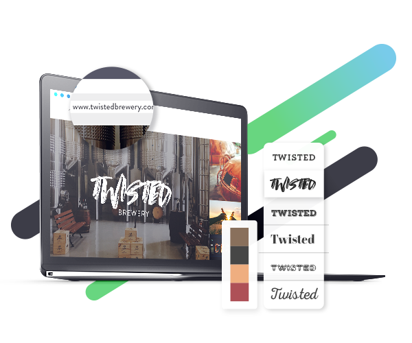
Your website layout is a more subtle way to teach your audience about your brand. If your brand shines most in visuals—perhaps you run a photography business or a travel blog—choose a website layout that accommodates large photos and prioritizes visual elements.
Regardless of your brand, your website should be clear, with plenty of white space, and should have a straightforward navigation bar that facilitates user flow.
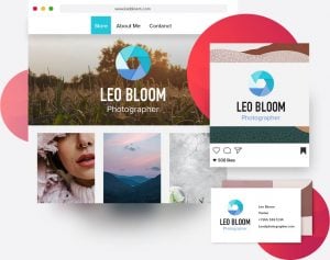
Once you have your basic visuals down, you may want to consider various website add-ons or plugins depending on what you’re using your site for. For example, if you want your site to double as a lead magnet for email marketing, you’ll need a form builder to easily collect email addresses from your site visitors.
Or, if you want to optimize your site for search engines, you’ll need access to SEO features that will help improve your site’s rankings in Google.
Luckily, there’s a DIY answer for most web-service needs. Sites like Website Planet can help you find and compare the best web services offered in each category, whether you need form builders, email marketing resources, social media management tools, etc. Try to think about all of the ways your website can serve your brand, and then compare between relevant services until you find the right ones for you.
Lastly, it’s super important to have a domain name that matches your brand. Customers who are familiar with your brand will search for you online using your brand name, and your website is more likely to show up if your domain name matches the search.
And, any time you share a page from your website, you’ll want to make sure that your brand name shows up in the URL, in order to promote brand awareness among your current audience and new customers.
If you already have a domain name that doesn’t match your brand, or if you’re planning to have a lot of internal webpages with long URLs, don’t fret! You can use a branded URL shortener to help you enhance your brand visibility every time you share a link.
Now that you’ve learned about the visual elements of branding your website, it’s time to focus on your brand language. The way your brand speaks—your words, sentence structure, voice, and tone—establishes its personality. All across your website, it’s critical you use your brand voice in every piece of text, whether in headings and CTAs or long-form blog posts.
While not every business has a tagline, taglines are a useful way to highlight your company’s product or your brand’s personality or values. Think about Nike’s “Just do it”—the catchy tagline makes the brand memorable, and it’s encouraging and motivational, conveying the company’s values and connecting customers to the brand.
Some brands place taglines in their logos, while others simply place them on their business cards and website. On your website, a great place to put the tagline is on your home page so that users see it as soon as they enter your site. You can also elaborate on your tagline in your site’s About section (more on that later).
Blog posts are another opportunity to reveal your brand’s personality through written voice. Because blog posts directly address searchable questions and are indexed on Google, a blog post might be a reader’s first encounter with your brand.
With that in mind, it’s important that your blog post not only conveys information, but that it does so in a voice consistent with your brand’s personality and tone.
If your business doesn’t already have a blog, it’s high time you create one. Long-form content is one of the most important and effective organic marketing tools, since it allows you to reach new users through SEO.
It also gives voice to your brand, strengthening your brand’s authority in the industry. Be sure to link to your blog on your website so that users can find and access it with ease.
Your brand story is a simple, concise narrative about your brand that explains your brand’s reason for existing (its origins, ideation, and the problems it sets out to solve) as well as its vision for the future.
Your brand story is the place to explain your brand’s mission, purpose, and values—all while doing so in a voice consistent with your brand’s personality.
Warby Parker is an example of a brand with a powerful brand story that focuses on its customers. The eyewear company explains that they got started when one of their founders noticed that a single eyewear company dominated the market—and that glasses were prohibitively expensive as a result.
Looking to help customers who wanted fashionable eyewear but couldn’t always afford the high price, Warby Parker was founded with everyday people and social consciousness in mind.
Just like Warby Parker, you can place your brand story on the About page of your website. Feel free to also occasionally touch on your story wherever relevant in your blog posts, social media pages, and marketing materials.
All other website copy should also be written in your brand voice. This includes your website’s headers, such as navigation bar headings, general website copy, calls-to-action, landing pages, and FAQs.
Even microcopy—those tiny, hardly noticeable elements of web copy—make a huge difference in changing the voice of a brand and its relationship to customers.
Think about the difference between Get It Free and Sign Up (It’s Free). While the former makes a more aggressive sale, the second is softer and more conversational. Which one would you prefer to represent your brand?
Remember, every single interaction you have with your customers—from long, involved blog posts to teeny tiny website copy—shapes their perception of your brand. The more consistent you are in sticking to your brand’s voice and tone across all your written content, the more powerful your brand will be.
Branding your business website goes hand-in-hand with content and SEO as one of the best ways to attract and convert leads. Website branding involves making every aspect of your site consistent with your brand’s personality, from your images and layout to your web copy and blog posts.
Ready to create a branded site? Head to the Tailor Brands studio and start creating!
The information provided on this page is for information, educational, and/or editorial purposes only. It is not intended to indicate any affiliation between Tailor Brands and any other brand or logo identified on this page.
Products
Resources
@2024 Copyright Tailor Brands