Your logo needs to captivate your audience. It should be chic, modern, and elevate your brand above your competition.
However, it’s easy to overcomplicate your logo by adding too many colors and images.
Instead, why not focus on the bare essentials? Maybe you should consider creating a minimalist logo—one that’s simple but makes a bigger impact than everyone else’s.
Let’s take a deep dive into what minimalism is and how to apply it to your brand, and then check out some top minimalist logos for inspiration.
Minimal design refers to a clean aesthetic that takes the “less is more” approach. It is essentially a creative recipe that removes fancy embellishments. Gone are complicated layouts; instead, minimalist designs favor clean, bold, and simple compositions with only one or two colors.
And, our brains LOVE them because they’re so easy to process and remember. Instead of expending mental energy trying to decipher convoluted images, minimalist designs make it incredibly easy to understand what your logo is trying to tell us.

Logos used to be complex; some were incredibly complicated and nuanced, and their creators were proud of the many hidden meanings contained in them.
However, the trend is no longer about complexity; instead, consumers and smartphone users want simplicity.
Part of the reason is that we’re now in an age of information bombardment.
Nonstop emails, notifications, popups, and an always-online mentality mean that your audience only has so much energy and time to read and retain new information before the next urgent thing takes away their concentration.
In other words, our attention spans are getting shorter and shorter.
Enter: Minimalist logo design.
Rather than cramming a bunch of elements together—like multiple fonts, colors and shapes—minimal logos avoid frills and extras. Instead, they embody a single, fundamental design concept that can be used across backgrounds and mediums.
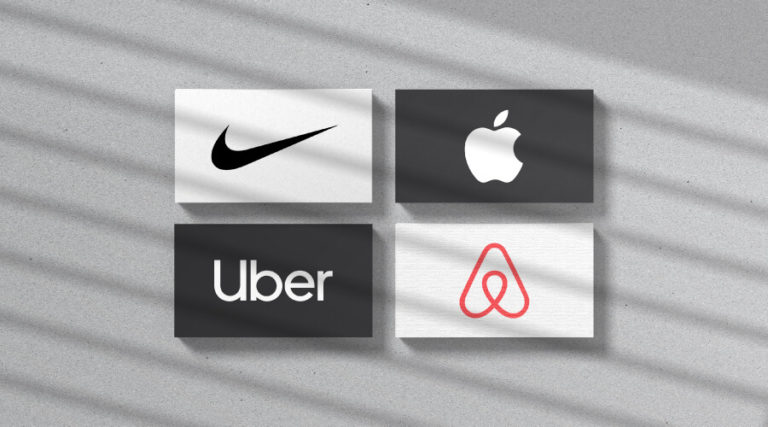
Flat logo design is a great example of a minimalist logo concept. In fact, most of the famous brands you can think of (Uber, Airbnb, Apple, Nike, etc.) use minimalism to make their point. Notice how these brands have no trouble being memorable; their simplicity is what makes them so resonant in the minds of their customers.
This post will help you understand when a minimalist logo design is the right choice and how to combine it with other design elements, and demonstrate examples of logos created by our logo maker for various business sectors.
For the reasons mentioned above, the current logo design trends right now are all about minimalism. Many brands are using the mantra of less is more and have overhauled their logos to be in line with minimalist designs.
Why have they made such a move?
Because they know that minimalist logos are eye-catching, memorable, and make such a significant impact on their audience.
Plus, they’re easy to use with smaller screens, such as on mobile phone devices.
Chances are, your audience consumes a lot of your messaging and advertising on smartphones, tablets, and even smartwatches, which is part of the reason why minimalist logos are currently trending.
If you need your logo to stick out and resonate in your audience’s brains, then a minimalist logo design could be what you need.
If you need some logo design inspiration or just want to see minimalist logos in action, here are some of the most popular industries currently using minimalist designs. Let’s take a look at a few striking minimalist logo examples – all of which were created with Tailor Brands’ design tool.
Photography is all about imagery and strong visuals that capture moments in time. If your clients need a photographer, you can showcase your professionalism from the very beginning with a minimalist photography icon.
A picture is worth a thousand words, and so is a smart, simple logo. You can even include your specialization, such as photographing animals, people, or events.
One of the biggest industries that uses minimalist design is the tech industry. Minimalist logos in the tech industry are used to emphasize clean code, ease of use, and trustworthy software. Before choosing colors for your logo, try looking at your competitors to see which palettes they use; then, go with an opposite palette on the color wheel so that your minimalist brand will stand out.
There are thousands of real estate companies, each competing to grab customers’ attention and, hopefully, sales commissions. A minimalist design is bound to make a good impression and be unique, letting your business stand out from the crowd. Clever use of lines and negative space can easily create an attractive logo for a real estate business.
If you offer clean, quality, finished work, a minimalist construction brand mark is a great way to show that to your audience. You can use a simple icon to demonstrate what you specialize in, like Sky Construction does with its abstract, geometric symbol; or, emphasize the feeling you want your audience to have after coming in contact with your brand, like Mountain Construction does with their icon.
You can create a mouthwatering logo for a restaurant without relying on fancy images and complicated designs. Because with minimalism, you’ll have a secret ingredient that will turn heads. Your customers will instantly recognize your restaurant’s chic personality and tasty menu.
Here are some excellent minimalist logos you can take inspiration from. Spas create an incredibly relaxing atmosphere, whether you’re giving facials, massages, or yoga classes. Having a mindful spa symbol with plenty of white space and a beautiful layout lets your customers instantly recognize the Zen-like qualities of your spa.
Brand yourself as a personal trainer with a minimalist fitness logo, so that your audience can imagine themselves being on the receiving end. Even with a clean and straightforward design, you can showcase your brand’s personality and fun fitness vibes.
Just like your jewelry, your logo needs to charm your audience to buy your glittery goods from you. Make your jewelry logo stand out with a classic and sophisticated minimalist design, using flat icons and negative space.
Minimalism is a huge advantage in fashion logos, because it allows your audience to imagine themselves wearing what you offer (rather than boxing them into one type of design or another). As you see from the logo examples above, you can choose a typeface that hints to the style of fashion you offer, while using abstract icons to reinforce that mood.
Depending on your specialization, there can be lots of other businesses trying to snap up your future customers. If you want to grow your lawn care business, create a distinct, minimalist lawn care logo.
One of your biggest sales opportunities is your logo. Use it to successfully let your customers know that your business means, well, business, with a clean design that uses simple lines, giving your brand a fresh name.
These are the most important factors to consider when using minimalism design with your logo. You don’t have to abide by every single one of them, but if you want to create a stunning minimalist logo design, try and implement them all.
Keep it flat. Throw away any 3D shapes or effects, and remove color gradients.
Stick to one color. You can make the most impact by using only one color. Experiment with different colors and shades to see which one makes the biggest impression.
Remove redundant features from your logo. Consider chopping off any extras that aren’t needed. This could anything from a second icon (big no-no) to extra lines, in order to help create a shape of some kind. This is easier to do when starting from scratch. But, if you’re redesigning a logo, it can be tough deciding what to lose.
Choose a font with personality. Because minimal designs are so…minimal, every element has to make an impact. This means you can’t neglect the typography you use. Make sure that your chosen font says something about your brand that matters, and that it still abides by the factors here. Keep space between the letters and ensure that it’s easily readable.
Use all available space. Don’t crowd any elements in your logo together.
Try using negative space. Want your minimalist logo to REALLY stand out? Use negative space. This is where you create an image in the white space between two different objects.
Look at the Martini House logo below. They created a house using negative space between two martini glasses and a saltshaker.

When giving your logo a minimalist overhaul, remember that you want to convey a certain message to your audience. Keep your brand personality in mind, and make sure that the logo you’re creating will resonate across the board.
You now have all the tools to experiment and create your own minimalistic logo – one that packs a punch. Remember that less is more with your design, and that every element counts. If you don’t need it, then throw it away.
So, it’s time head to our tool and create your eye-popping logo today!
Products
Resources
©2025 Copyright Tailor Brands