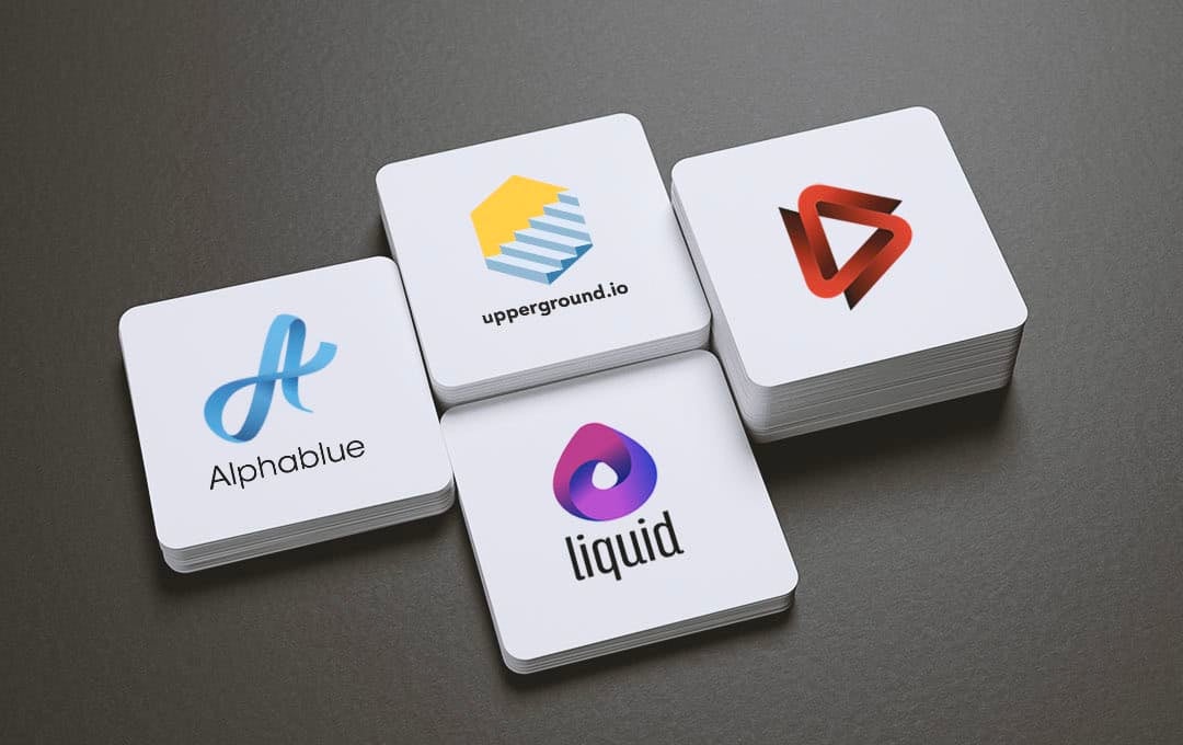
Having an eye-catching logo is a vital part of your business. It needs to turn heads by being visually appealing, while also highlighting your brand’s personality. It should also be memorable, so people don’t forget it in a hurry!
There’s a large variety of different design elements you can use to stand out from the crowd and catch your audience’s attention. In this post, we’re going to take a look at 3D logos made with our logo maker, and explain how you can use one to pack a serious punch.
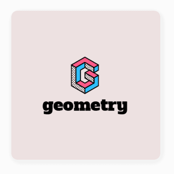
Unlike regular logos, which are two-dimensional (2D), a 3D logo has an extra visual dimension that causes the design to pop off the page. Ever seen a 3D movie? We’re going to apply the same principle, but your audience won’t need to wear red and blue glasses to see the effect.
You may be asking yourself, “If 3D logos are so captivating, why isn’t everyone using them?” Well, despite the advantage we just spoke about, there are some disadvantages as well.
Unlike flat logos, 3D ones often have lots of elaborate detail—which is necessary to create the 3D effect—and it can be tricky scaling down your logo on, say, business cards.
But, you can easily avoid these issues by noting how and where you plan to use your logo—and following the 3D logo design tips we outline below.
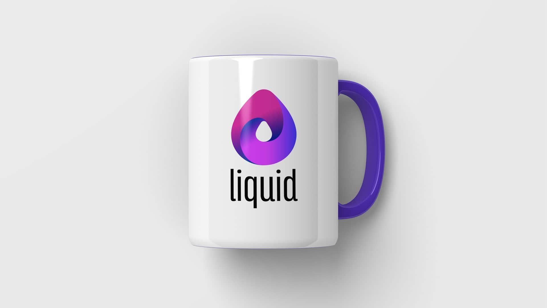
Now it’s time to get down to business. In the rest of this post, we’re going to show you the design elements that help to make a great 3D logo, with some examples to inspire you to create your own.
A neat trick you can use to create a 3D effect is including realistic elements in your logo. The idea here is to trick your viewers’ minds into believing the images aren’t flat. In the real world, our brain uses visual cues to tell the difference between flat images and multi-dimensional images.
You can do this by using different gradients and various shades to make your brain think your logo has more than one dimension to it. Popular examples include items like ribbons, recreating the effect of a page turning, or peeling off a sticker to create depth with otherwise flat images.

Another tool in your 3D arsenal is using shadows and highlights to create artificial depth in your logo. You can use them separately or together to turn an otherwise flat image into a 3D one.
Sometimes, simply adding a shadow underneath your logo’s main element creates the illusion that it’s hovering, helping to separate it from the background and give it depth. Adding highlights helps to trick your brain into thinking the image isn’t flat by mimicking how sunlight bounces off it.
Remember that highlights (tints) are where light is hitting your logo, and shadow (shades) are where your logo is blocking light.
Look at the logos above and take note of the effect each shadow and highlight have on the logo. Try covering up the shadow with your finger, and you’ll notice how the logo becomes instantly flat! That’s the power of shadows and highlights. You don’t need to be a design whiz to use these tools for yourself.
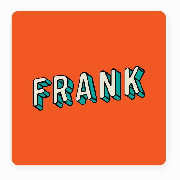
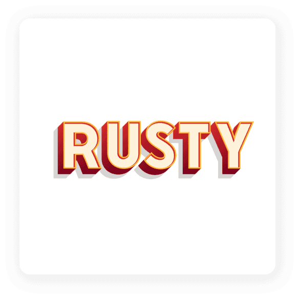
Many logo designers use tools like Adobe Photoshop or Illustrator to create cool 3D logos. These programs allow them to manipulate their logo and use effects like highlights, color gradients and adding shadows—bringing flat objects to life.
But there are also plenty of designers who have mastered the art of hand-drawn 3D logo design, which brings a personal feeling to the logo.
Businesses in the artisan industry often use hand-drawn logo designs as a signal to customers that their brand isn’t a big corporation. The hand-drawn element helps to portray the boutique feel of a small business compared to that of a large chain.
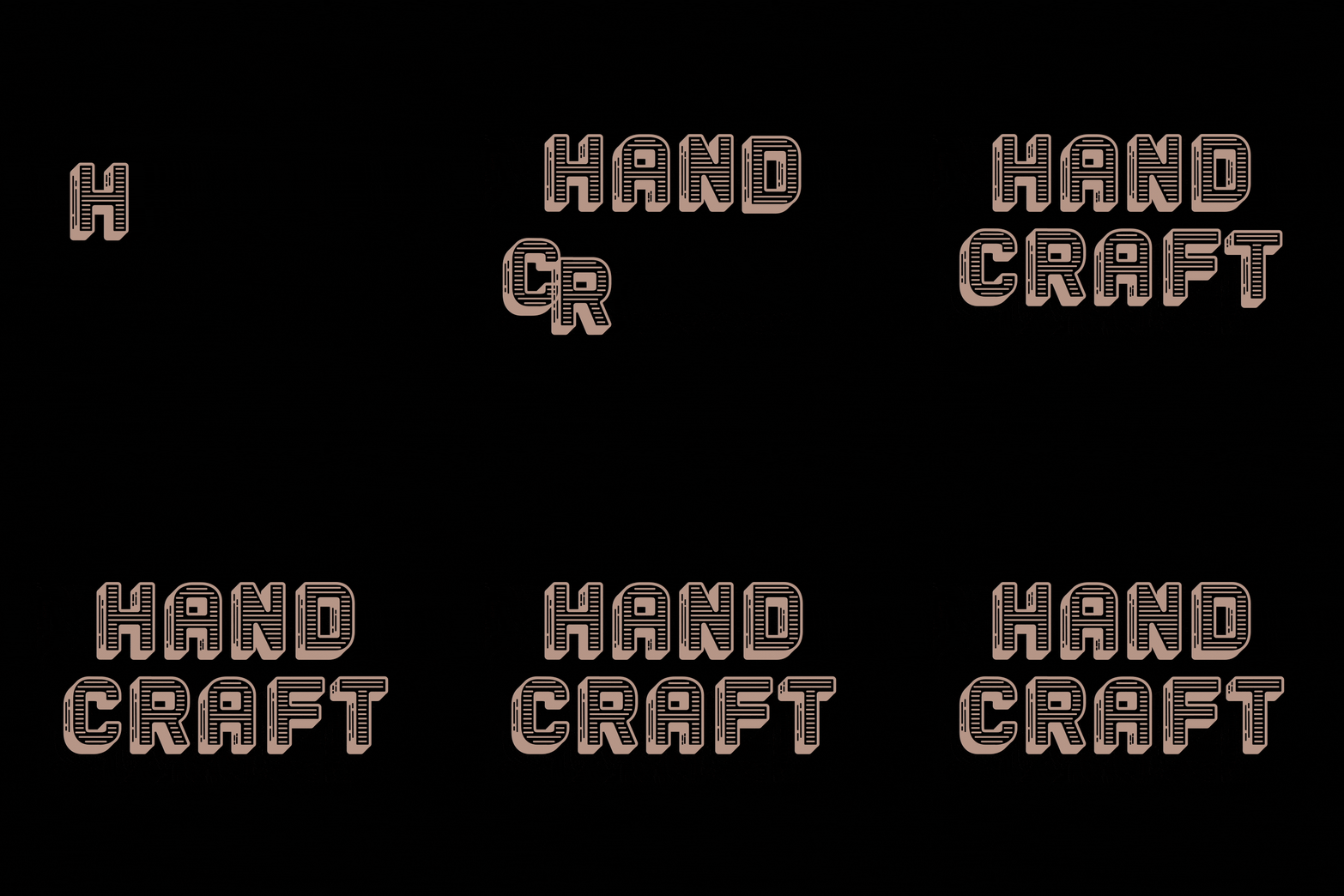
The trick to creating a hand-drawn 3D logo is to properly use perspective, and place elements on top of each other to create depth. By overlapping each part, your audience’s brains will automatically see the logo in 3D.


Another way to add an extra dimension to your logo is by using textures. For example, furniture store owners can add a wood-grain texture along with shadows and highlights to create a 3D wooden logo, while metal workers can use metal textures to represent their trade.
There’s an unlimited number of surfaces you can add to your logo to not only make it pop, but also let your audience know more about your business’s industry, products and services.
If you’re unsure how to go about this, try using word association to generate a list of surface and texture ideas you can use in your design.
If you really want to step it up and take your 3D logo to another level, include animation to make your logo physically move! Animated logos are often overlooked as a design option, but that’s a mistake. The human eye loves movement, and it tends to hold our attention better than static images.
Using software like Adobe Animate, you can give your logo life and make it dance to your tune.
You can make small, subtle adjustments, such as a line slightly moving backwards and forwards, or an element sliding into place. Or, you can make your entire logo come alive as each item moves across the screen.
Animated logos are great if you have video content or you’re active on social media, as the movement helps to grab your audience’s attention in an otherwise crowded digital space.
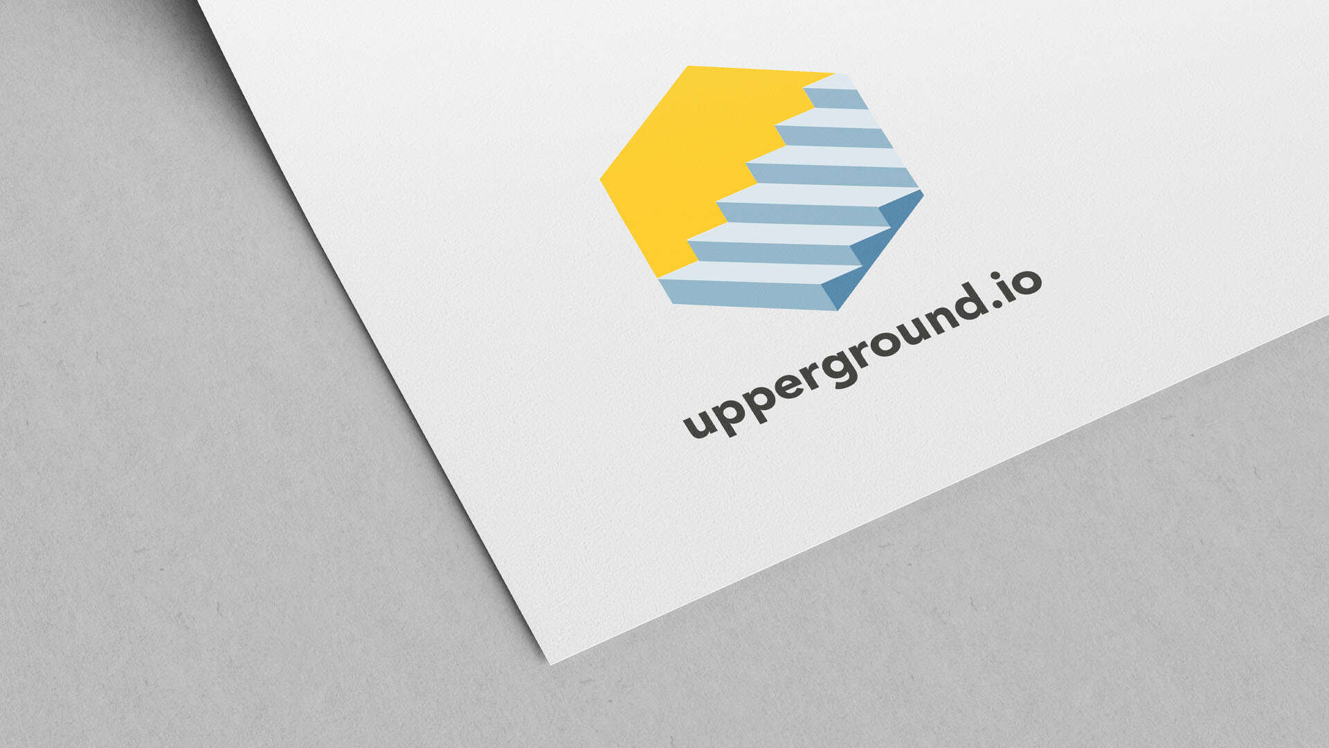
When it comes to creating a 3D logo, more isn’t always better. Sometimes adding a small detail, such as a shadow underneath your main image or a small highlight effect, can instantly turn your flat logo into a page-leaping, 3-dimensional eye-grabber.
You can also experiment with different textures and animations to convey your brand’s product and service immediately.
Need help designing your 3D logo? We got your back! Head to our free logo maker and tell us a little about your business; our AI will do the rest.
This portion of our website is for informational or educational purposes only. Tailor Brands is not a law firm, and the information on this website does not constitute legal advice. All statements, opinions, recommendations, and conclusions are solely the expression of the author and provided on an as-is basis. Accordingly, Tailor Brands is not responsible for the information and/or its accuracy or completeness. It also does not indicate any affiliation between Tailor Brands and any other brands, services or logos on this page.
Products
Resources
©2025 Copyright Tailor Brands