When it comes to web design, there are so many different directions you can take your website—the options are literally endless. And while you may think the theme and color palette for your website is crucial (which it is), that’s not the only thing that keeps visitors on your website.
Your website shouldn’t just be a pretty face. Below, we gathered the top 7 website formatting tips that you can incorporate into your website to make it a more comfortable experience for visitors and keep people coming back for more. So, let’s get started.
Your website isn’t for you, it’s for your customers. While, of course, you’ll have bragging rights, the main purpose of your website is to engage with your customers and persuade them to make a purchase.
But for that to happen, it all comes down to your website’s design. A good website is centered around user experience, the overall experience a visitor has when they visit your website. Without a proper layout, visitors don’t know what to click, where to go, and what to buy.
Your website’s format guides them through the buyer’s journey. And if your website’s format is, let’s say, too cluttered, the visitor will feel overwhelmed and leave before making a purchase. So, you could say that website formatting can make or break a potential customer relationship—and that’s what’s important.
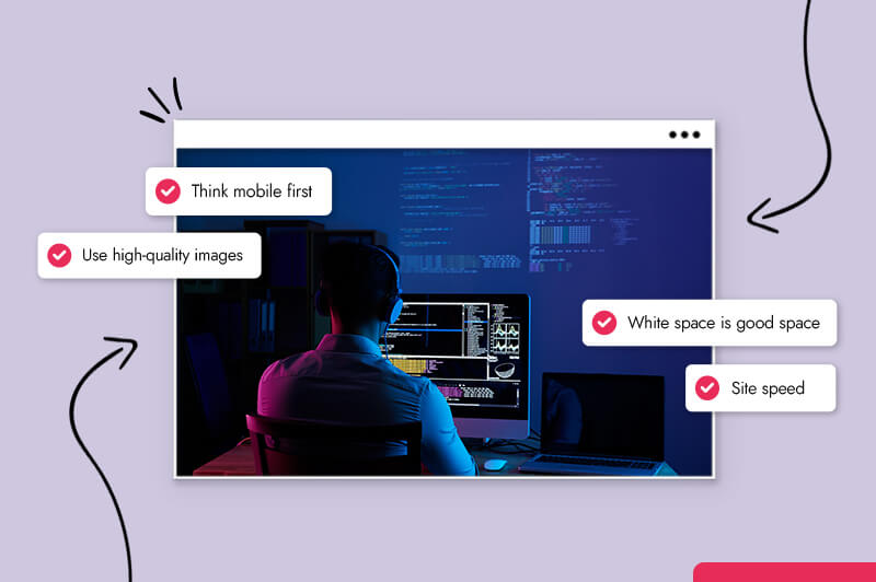
You want your business to boom and keep those sales coming in. For that, your website needs to function optimally. Here are the 7 website formatting tips that will improve your business.
You may be looking at your website from a desktop computer, but your customers are on their phones. In the US, over 230 million consumers own smartphones, with 79% of them making a purchase online using their mobile devices.
In other words, your website must be mobile-friendly. If not, you’re losing out on potential customers. And the proof is in the numbers. According to Hubspot, 98% of people have left a website because it didn’t display properly on their mobile devices.
Your mobile website should be clean and less busy than your desktop website. A good web designer can help simplify your website for mobile use, by reducing page elements and simplifying certain features, like the menu bar. While you can hire a web designer to do it for you, using a mobile responsive website theme or template will do the work for you and ensure your website is mobile-friendly.
If you’re using WordPress, here are some mobile-friendly templates. If you’re using a website builder their templates are mobile-friendly.
To check if your website is mobile-friendly, check here.
People feel they need to fill in the white space on their website, but I’m telling you to embrace it. No one likes to look at a cluttered website. Remember websites from the 90s? Exactly. Use the white space to your advantage.
Giving room between paragraphs and images makes elements on your website easier to digest for the visitor. It’s a great way to avoid not overwhelming your visitors which can help increase traffic to your website.

I’m using our website as an example because it shows the power of white space. This is our landing page. It’s simple, nothing fancy. And yet, gets your eyes looking exactly where we want you to look without overwhelming you with pop-ups and flashy effects. That’s the power of white space.
People aren’t coming to your website to analyze how it looks. Of course, your overall design can grab the attention of your visitors, but what’s really important is how easy they can move around your website. Research shows that site speed can influence how long a visitor stays on your website. If your site is slow, people aren’t going to stick around.
When it comes to improving site speed, there are a lot of factors that come into play. It could be your server, if you have large images or videos on your website, and more. A website designer can help you figure out where the problem lies.
However, here are a couple tips to improve your site’s speed:
When looking at your website’s format, you want to make sure it follows the visual hierarchy. What does this mean? The visual hierarchy is a principle that arranges your website’s elements in a specific way to lead the visitor’s attention to the important elements first.
Many businesses will highlight important elements like their business name or logo by enlarging them to catch the visitor’s eye. People tend to look at bold and large titles first, and then read smaller paragraphs. Another tactic is by placing important elements, like a CTA, in specific places, like right in the middle of the screen.
By creating a visual hierarchy for your website’s information, you can guide the visitor, showing them what they need to see first.
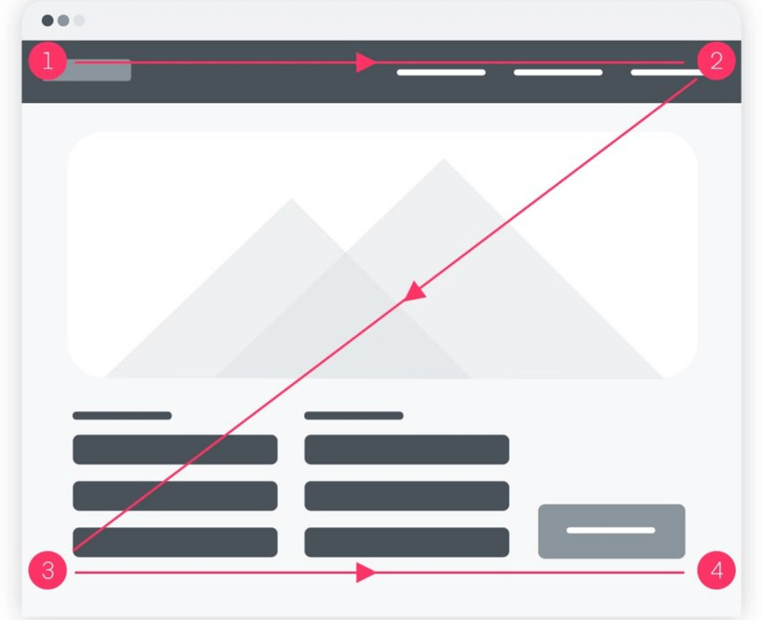
The image above shows a standard website design and where the eyes go first. As you can see, the eyes start at the top left-hand corner where the logo is, then travels through the navigation bar, and then through the rest of the page.
How intense does ‘The Fold’ sound, right?
The Fold is important to remember when improving your website’s format. It’s the first section of your website the user sees before they scroll. It’s the most important part of your website and must include a call-to-action (CTA), a button that encourages the visitor to take a specific action.
For example, “click here” or “buy now” are both CTAs. In The Fold, you need to hook your audience so they’ll continue through the website. Your CTA should be very visible and clear—this is your first chance to get them through the buyer’s journey.
Your website isn’t a one-time job. Oh no, it’s an on-going process. You’ll always have to make changes to your website. Why? Because it’s important to make adjustments that will improve the user experience.
And the best way to do this is by using data analytics. Data analytics will provide you with valuable information about your visitors and how they engage with your website.
With this information, you can make adjustments to your website that speak to your visitors, increasing the user experience. Free platforms like Google Analytics will help you learn more about your audience.
Here are some metrics you should look at to help you understand your visitor’s behavior:
These metrics will give you an idea of how your visitors interact with your website. For example, if your visitor doesn’t move past your homepage, this could be a sign that you need to work on the visual hierarchy or improve the content.
Your website’s homepage doesn’t need to look like a circus to get your point across. It should convey your message in a simple and easily digestible way. Let’s be honest, even when you’re looking at other websites, you don’t read every paragraph. And neither do your visitors.
So, you want to make sure your website format is minimalistic and simple. The less the visitor has to do, the better. And by now, you know our attention spans are the size of peanuts. Your homepage should include the following:
Anything else other than that is simply making your homepage cluttered. Here are a couple of examples of homepages that did it right.
You can tell right away what this website is about. Aside from the content, the imagery and color palette gives you a calming atmosphere.
But let’s look at their formatting for a second.

Take a peek at their visual hierarchy. Where do your eyes go? The first thing you look at is the main image, then the logo, then the navigation bar, and after, you read the main content.
The website is designed to lead your eyes to what they want you to see. Their CTA is at the bottom left-hand corner which you’ll see after reading the main content.
TrueVentures is an American investment firm that focuses on early-stage startups. But I didn’t have to tell you that. Their mission statement is one of the first things your eyes see.
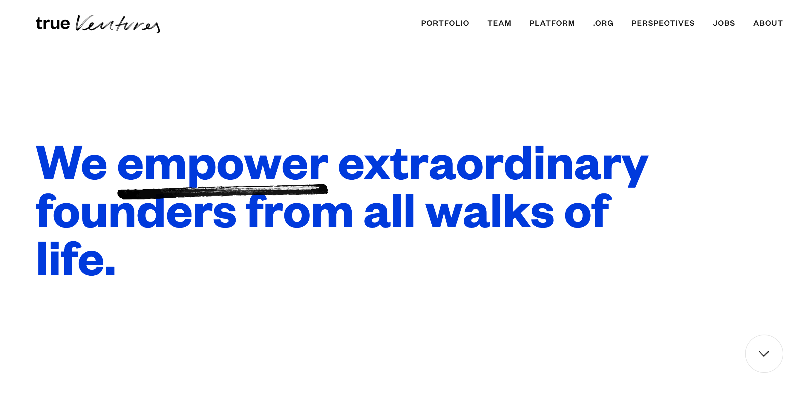
TrueVentures took advantage of the white space to make the content pop. They didn’t overdo it with text and imagery; instead, they decided to keep things simple – and it worked.
Their website formatting matches their brand personality and that’s what makes their homepage look effortless.
Now that you know why website formatting is important and the simple ways you can improve your website’s user experience, it’s time to make those changes on your website.
If you’re experienced in web design, you can do it yourself. But if not, consider outsourcing this task to someone who has web design experience. For outsourcing websites, read this post.
This portion of our website is for informational or educational purposes only. Tailor Brands is not a law firm, and the information on this website does not constitute legal advice. All statements, opinions, recommendations, and conclusions are solely the expression of the author and provided on an as-is basis. Accordingly, Tailor Brands is not responsible for the information and/or its accuracy or completeness. It also does not indicate any affiliation between Tailor Brands and any other brands, services or logos on this page.
Products
Resources
©2025 Copyright Tailor Brands