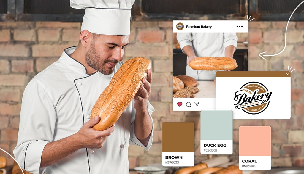
You want to eat the best bread in town (who doesn’t?), but we all know what draws you into a bakery – it’s the logo. You’ll notice the bread in the window, but usually, the first thing we see is the logo.
But is a logo that important? Everyone knows what a bakery has to offer, right? But who says your bakery is like all the others? That’s where a logo comes into play.
A strong logo not only sets your bakery apart from the rest, but it has the power to give us that little nudge to check out what’s inside. Your logo tells people what you have to offer inside. And that’s why having a unique logo is important for your bakery business.
Whether you’re just opening your own bakery or want to give your bakery a little face lift, check out the logo designs below to help get inspiration for your own bakery logo.
To help you with your bakery logo, here are examples of bakery, pastry, and cake logos’ choice of fonts, icons, and character features.
Need a little inspiration for your bakery logo? Here are some examples to gain creativity from.
Maman started as an independent Soho cafe but has flourished into a lifestyle brand with locally sourced cafes across Montreal, Toronto, and New York City. Offering a range of baked goods, coffee, and brunch, they host to those seeking a rustic, home-like atmosphere. Celebrities run to their cafes, and they now host events for high-end designers and brands. Their fluid logo reflects their laid back yet contemporary business.
Masseria Caffe & Bakery is a small coffee shop in New York City that prides itself on its delicious pastries, sandwiches, and beverages. While their food speaks for itself, their cafe is simple, dependable, and traditional. So, they chose a logo that represents those business values. Their logo font is the highlight and draws in the eyes, telling you that they’re a reliable and traditional cafe/bakery.
Corner Bakery is an American chain of cafes specializing in bread, sandwiches, pastries, and lunch. Starting as a small cafe, they’ve expanded and have over 129 locations across the United States. Fresh ingredients and open flame stoves inspire them to make high-quality food for their customers. Their logo clearly represents their business values. Their logo is fresh, clean, and reliable. It invites you to enter their cafe, and just by looking at the logo, you know they’re going to give you a meal worth its value.
Butler is a New York City favorite with 4 locations throughout the city. They serve meals and baked goods, along with freshly sourced Intelligentsia espresso. The logo gives you the sense that they offer more artisan pastries and meals. And it’s true. Butler offers more of a fine dining breakfast pastry experience, and the logo expresses that. The cursive font indicates elegance and sophistication, which you can use in your bakery logo if that’s the message you want to show.
You can also use a cursive font in your logo to show your business’s charming and traditional elements. Fortunato Brothers bakery did just that. Three Italian brothers decided to open a bakery shop selling authentic Italian pastries. Forty-five years later, Fortunato Brothers is a landmark in New York as they stuck to providing the same quality, style, and service from the beginning. Their logo’s cursive fonts symbolize reliability and tradition.
Cake shop logos are all about showing the sweet side of life. Let’s look at some examples for inspiration.
From baking pies out of her kitchen, Lisa slowly grew her business and raised $25,000 on Indiegogo to open her cake shop, Sister Pie. The phrase ‘sister pie’ was a term of endearment between Lisa and her sister. The phrase turned into a concept of women of all generations gathering together to make pies. It’s a warm and loving story of how Sister Pie became a reality, reflected in the logo. The cursive font gives an elegant and feminine touch, while the hearts give warmth to the logo. You feel the love in this logo.
“You make the memories, we make them sweet,” that’s what Piece of Cake Bakery is all about. Their logo uses an icon to symbolize what their business offers, and their business name is very straightforward. In other words, you know exactly what they do just by looking at the logo. While some businesses will use abstract icons, literal icons get the message across very clearly and effectively.
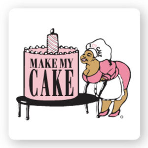
While many businesses opt for a contemporary and modern logo, you don’t necessarily have to do that. It really depends on the theme of your business. Make My Cake offers cakes that are made with the southern baking traditions of Mississippi and Alabama. The logo is of the family matriarch Josephine Smith, and symbolizes tradition, quality, and authenticity.
Movie producer turned baker, founder Lisa J. Olin decided to follow her passion for cakes and pastries by starting her business, Cake Monkey Bakery. Now, Cake Monkey is a storefront and a wholesale bakery with over 80 shops offering Cake Monkey products. Cakes Monkey’s logo uses a retro font to symbolize a traditional element and brings a nostalgic emotion.
Retro logos can symbolize a classic and timeless element in your business. Ms. Cupcake is the UK’s first gluten-free bakery. Their logo plays off of the logo used in Bewitched, a 60s American sitcom. So, they incorporate the retro font to show they’re using traditional cupcakes, only with a gluten-free twist. So, from this logo, people will expect to see their favorite flavor, only gluten-free.
Pastry shop logos can come in many forms. Let’s take a look at some examples for your inspiration.
Milk Jar Cookies put a spin on the idea of milk and cookies. Their homemade cookies and locally sourced milk are all the rave, and their logo shows that. You can mix traditional fonts with bright colors to play around with the message behind your logo. In this case, they used a soft baby blue background color to add lightness and fun to their logo.
Ovenly is an award-winning retail and wholesale bakery in New York City. With their logo design, they show sophistication, simplicity, and modernity. They focus on finding the balance between savory and sweet in their baked goods. Their logo consists of a simple font and uses a cleverly placed rolling pin icon to signify what they do as a business.
Pattycake Bakery makes classic treats with a twist and handcrafted organic and vegan sweets from scratch. Their logo has a warm and inviting vibe, with a smiling cupcake in the middle and cozy cursive font. The bright colors mixed with the font and icon blend beautifully to create a welcoming and family-friendly logo.
Moose is an Asian French fusion bakery out of Michigan. The head chef originated from Taiwan and wanted to connect with his roots by opening the Moose bakery. The logo is clear and uses an icon and fonts to symbolize what the business offers. A bold logo immediately grabs the eye and signifies stability and safety.
Built from scratch, Fantasy cupcakes make delicious and artistic cupcakes for all to enjoy. And their logo does a great job of showing that. They use a strong icon of a cupcake in a cold color to show what their business offers. Aside from their business name, they also include the phrase “baked fresh daily” on top for additional information. This isn’t necessarily needed, but in this case, it helps them stand out among their competitors.
The Cravory was founded by two entrepreneurs who wanted to bring something new to the dessert world. Built on the traditional cookie, they created new combinations of flavors that would wow their customers. Their logo font is traditional, but their colors and layout give a contemporary feel. Their business story reflects in their logo.
Most of the logos we’ve shown you use a strong icon or font. However, LBP bakery chose to go with an abstract logo with a monogram font. A monogram font expresses professionalism and luxury. The abstract logo adds uniqueness to their business and can be more engaging for customers.
Many bakery and cake shops want a classic feel to their business. So, they stick to traditional fonts and icons. The Buttercup Bake Shop is a great example of this. They chose a traditional and sophisticated font and used a small cupcake icon to show what their business does. They used soft and understated colors, adding an old-school feel to their logo.
F+F (fat and flour) is a small pie shop in Los Angeles, California. Owner Nicole Rucker is an award-winning pie champion and cookbook author. When creating her business, she wanted a fun and light business name – we love it! She abbreviated her business name in her logo and created her logo with a 70s retro vibe. The bright colors and overall design catch the eye and make you curious about what the business offers.
If you have a traditional bakery, you want a logo that matches. Let’s take a look at some inspirations for your logo.
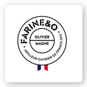
In the middle of Paris, France is Farine&O. A traditional French bakery; they wanted to make sure their logo represented those traditional values. They play around with different fonts in their logo, with one font standing out among the rest. This helps bring the eyes to the business’s name before reading the rest. It’s a masculine and traditional logo, telling everything you need to know about the business.
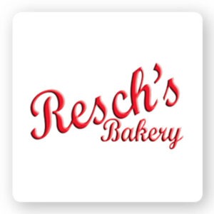
Resch’s bakery has been around for a while, since 1920, to be exact. And their logo shows it. The name of the bakery shows that it’s family-run, but aside from that, the font they use indicates tradition. They added bright red to add a modern twist, which also makes the logo pop.
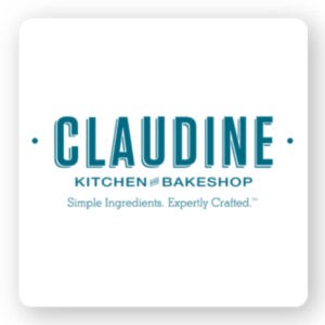
The Claudine Kitchen & Bakeshop is a brunch cafe that makes all its dishes and baked goods from scratch. They focus on creating a modern twist on casual comfort food. And their logo tells you everything you need to know. They use three different fonts, with the business name being the boldest. They also include their mission statement, “Simple ingredients. Expertly crafted.” So, you know what you’re going to get and the quality of their products.
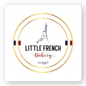
The Little French Bakery is just that, a little French bakery in Redondo Beach, California. And their logo says it all. They use a mix of fonts that give a French vibe to the logo and of course, an iconic symbol of Paris, the Eiffel Tower. You can choose to use an icon in your logo without making it take over your logo, and this is a perfect example of that.
Flor bakery focuses on creating simple and flavorful desserts and bread. They chose to go with a very simple logo with only their business name. Though it’s a simple logo, it’s strong. The font is clear and clean, with a bold color. While you don’t know what the business offers right away, the logo does make you curious to find out.
Pi Bakerie uses Mediterranean baking traditions from Greece and Italy, incorporating them into their own signature baked goods. The logo plays on their business name, “Pi” which is the circumference of a circle.
Have a bread shop and want a logo that pops? Here are some examples of bread shop logos that did it right.
Orwashers was founded in 1916 in New York City by a Hungarian immigrant family. Since then, it’s continued to blossom and serve the local community. This bread shop has a strong logo with a clever icon. While the logo font is bold, signifying tradition and reliability. However, they made the “O” a loaf of bread to show what their business does. They did a great job of keeping the logo simple yet purposeful.
The Bourke Street Bakery started in a little corner in Sydney, Australia. Since then, they’ve opened up other locations worldwide. So, what makes their logo special? Well, in comparison to the other logos on this list, it’s different. And we like different. They used a cursive font in gold and a rustic stretch of a loaf of bread. There’s something hip and trendy about the logo, while at the same time, reliable.
The Breads Bakery is a New York bakery known for its artisanal bread and pastries. And their logo doesn’t play around. It’s a logo that has a presence and will not be mistaken. They use a strong background color, a clear business name that explains exactly what they offer, and a subtle flour icon. You don’t necessarily need an abstract logo; sometimes, it’s best to stick with a simple and literal design.
Pitchoun! is a fine French bakery in Los Angeles that offers artisan bread, pastries, cakes, and cooked dishes. Their logo is clean, simple, and easily conveys the message. The bright orange is different from most bakery logos and helps it stand out. The French boy holding a baguette tells you exactly what they offer, and the font is bold.
La Bicyclette Bakery was opened by founder Flo, a man passionate about French baking. And his logo represents his story. The logo of a French man holding a baguette next says it all. The cursive font adds sophistication and elegance to the business. In addition, the logo includes the bakery’s location, which is in Brooklyn, New York.
Do you have an artisan bakery? Well, let’s take a look at these artisan bakery logos for inspiration.
White Wolf, a Japanese patisserie, focuses on breaking barriers and bringing people together through food. We love it! Their logo comes with multiple meanings. In Japan, the white wolf is a protector and guardian, which is the main icon. For this patisserie, this may have a special meaning. So, you can create a logo with multiple meanings for your business.
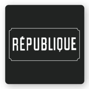
Republique, located in Los Angeles, offers a gastronomic environment in a historical space. They have a bakery, cafe, and dining area with a French-inspired menu. But we didn’t have to tell you that. Based on the logo’s font, you can probably tell it’s a French bakery. See what font can do? This logo is bold and simplistic; however, it shares a story. When making your logo, choose a font that matches your business.
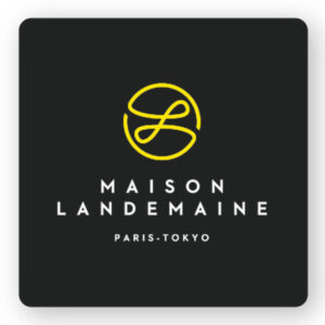
Maison Landemaine is an artisanal bakery that uses organic and environmentally-conscious ingredients for its baked goods. Now, they decided to opt for an abstract logo for their business. The logo is bright, fluid, and smooth, giving off a sophisticated, elegant, and respected atmosphere. Their logo created curiosity about what they offer.
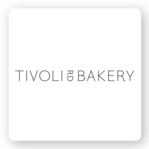
Specializing in sourdough bread, Tivoli Bakery prides itself on using natural ingredients and traditional cooking methods for its bread. And while their logo is simple, it reflects the bakery’s style. The logo’s thin font signifies softness, femininity, and care. In contrast, the narrowness of the letters shows modernity. Using the right fonts can convey the message you want to tell.
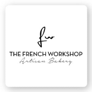
The French Workshop is an artisanal bakery in New York City. As you can see, most artisanal bakeries primarily use fonts as their logo and minimize the use of icons; however, that’s just a trend – it’s not a rule. The French Workshop uses an icon and various fonts to tell its story. In addition, because their business name can be misinterpreted, they include “artisan bakery” in their logo. You can include more detail if you feel your logo isn’t clear.
With all these bakery logos, we hope you’re inspired to create your own bakery logo. To create your bakery logo, write down the logos that catch your eye and why you like them. Then, use our logo creator to design a logo of your own. You have all the inspiration you need, now it’s time to bring your logo to life!
This portion of our website is for informational or educational purposes only. Tailor Brands is not a law firm, and the information on this website does not constitute legal advice. All statements, opinions, recommendations, and conclusions are solely the expression of the author and provided on an as-is basis. Accordingly, Tailor Brands is not responsible for the information and/or its accuracy or completeness. It also does not indicate any affiliation between Tailor Brands and any other brands, services or logos on this page.
Products
Resources
©2025 Copyright Tailor Brands