I’m here to help you decide if the meaning of blue is the right fit for your business, and whether it includes the messages that you want your business to send. I’ll dive deeper into the psychology of blue, how you can combine it with different design elements in order to send a more specific message, the industries that use blue the most, and more.
Let’s get to it!
The Meaning Behind Blue Logos
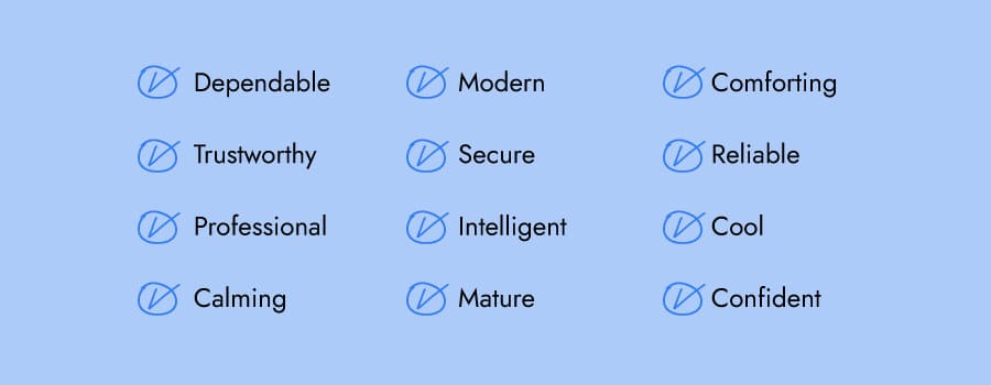
Colors have a significant influence on our behavior, mood, and even physiological reaction. That being said, color associations are strongly dependent on culture, personal experiences, and upbringing—color meaning is not one-size-fits-the-crayon-box.
If you want your logo to express trust, maturity, reliability, intelligence, and a sense of calm, blue is the color for you.
Many businesses require earning customers’ trust, none so more than banks. PayPal and Bank of America both require customers to share important and valuable information, and so a high level of trust and commitment needs to be established. It isn’t a coincidence that both their logos use blue as their primary color.
Modern and innovative technology companies like Intel, for example, use blue in their logo to project intelligence and steadfastness.
How to Combine Blue With Other Logo Design Elements

When it comes to blue logos, there are certain design elements that combine well and those that don’t.
Typography
Choosing the right typography in your logo could bolster your overall brand. Review the 5 main font families to determine which one suits your brand best.
Serif –Great choice for brands that want to be seen as trustworthy, established, and reliable. Whole Foods’ font, for example, features rounded edges to evoke things made from the earth or by hand. Gap’s font, for example, is well known for its iconic white, capital letters that convey these traits.
Sans-serif –Modern, easy to read and straightforward, sans-serif is a popular choice among start-ups, tech businesses, and even aerospace companies such as Boeing.
Slab serif –Bold and impactful, slab serif fonts are frequently used by car and technology companies.
Script –Well-suited for businesses that want to express elegance and add a personal touch, such as photographers, coaches, or any family-owned brand.
Decorative – Loud, fun, and entertaining, these fonts are flexible enough to let companies decide which emotion to focus on.
Of course, these are just general rules, but by no means are they set in stone. Feel free to play around with different font combinations.
Shapes and icons
In your logo design, different shapes can help forge an emotional and psychological connection between your brand and consumers. It’s important to understand what each shape says about your brand and how you can effectively incorporate them into your design.
Circular logos paired with blue are designed to be calming, symbolizing reliability and friendliness. Walmart’s logo signifies these traits through their blue logo, crisp bold white font, and circular lightbulb-shaped icon.
Businesses choose an emblem logo to create a vintage vibe while appearing well-established and prestigious. This type of logo is an excellent choice for modern businesses that want to convey confidence, trustworthiness, heritage, and tradition. The Royal Bank of Canada (RBC), for example, uses an emblem logo to pay homage to tradition.
Is a Blue Logo for You?
Like I mentioned before, colors are subjective and there’s no right or wrong way to use blue in a logo.
That being said, you can use blue if it aligns with one of the messages/values of your brand. Or, you can use blue to differentiate yourself from competitors’ logos.
If your brand falls under one of these industries, here are a few ideas for how to use blue:
Blue logos for finance brands
Everything you want in a financial services firm—stability, integrity, trust, reliability—is associated with blue. Banking, investment firms, credit unions, and others in the finance industry have selected a blue logo to build on these core attributes as well.
When people see the color blue symbolizing a financial company, they get a sense of credibility and certainty. Visa, PayPal, Bank of America, and American Express are some of the biggest names in the banking industry. It isn’t a coincidence that all of their logos use blue as their primary color!
Blue logos for health brands
The color blue is associated with intelligence, professionalism, cleanliness, calm, and modernity. Those are the exact things you want in a healthcare setting, right? Blue gives off a serene, relaxing vibe that tells you you’re in good hands, everything is going to be alright. That’s what’s helped make blue the predominant color in the healthcare industry.
Blue logos for tech brands
Technology companies lean towards blue’s steadfastness and security. It’s a great color for tech because it implies intelligence and modernity. Blue will make sure your tech business is taken seriously.
The most famous tech companies like Facebook, Twitter, and Skype all use blue in their logo and they’re all instantly recognizable and trusted by millions of people worldwide.
Blue logos for aviation services
When you’re getting into a machine that’s taking you 36,000 feet into the air, you’re going to want to trust the airline. That’s why United Airlines, JetBlue, Spirit Airlines, British Airways, and more chose the color blue. It’s a color that conveys confidence and trust, which is critically important for those in the aviation business.
Blue logos for automotive brands
BMW, Subaru, Ford, and General Motors—these are just some companies in the auto industry that have a blue logo. These companies sell cars, which, aside from being an expensive investment, also needs to be reliable, safe, and trustworthy. It’s no wonder some of the top auto companies in the industry have a blue logo!
Blue logos for hospitality brands
What are some things you look for in a hotel? A clean, safe room to sleep in, professional and reliable staff, a sense of calm and comfort. Companies in the hospitality industry know that these things are key traits customers are looking for.
Whether you’re a hotel guest seeking a serene and calming environment in a big city or looking for a small cabin in the woods type of bread and breakfast, a blue logo will express those characteristics to make you feel right at home.
Color Combinations That Work With Blue
Blue can be pretty versatile depending on the colors you combine it with. Let’s take a look at some examples of blue logo color combinations:
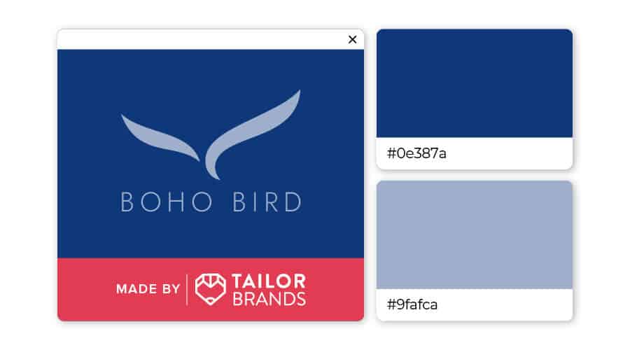
A combination of dark blue and gray-blue emit feelings of reassurance and calm. The contrast between the dark and the light blue brings a sense of balance that would suit healthcare professionals, spas, and those in hospitality.
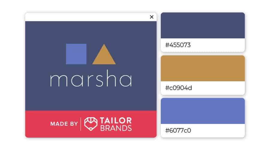
Blue might be used a lot for logos, but that doesn’t mean it has to be boring! Try combining 2 shades of blue with brown-yellow to create a professional looking, humble color scheme that is unique and memorable. This color scheme would work well for consultants, tea or coffee brands, and even clothing.
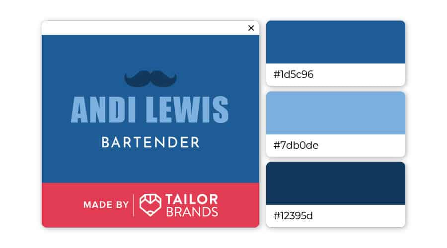
Don’t be afraid to layer blue on top of blue on top of blue! Here, the 3 shades of blue balance each other, while adding a unique touch that’ll separate your brands from the crowd. This color combination would work well for auto or tech companies, as well as accountants and other business professionals.
Over to You
We’ve seen that blue conveys dependability, confidence, intelligence, and more, but combining it with other design elements can lead to a unique and impactful logo.
If you are considering blue as a primary color for your brand’s logo, try out Tailor Brands’ logo maker to create a blue logo!
