A brand mark is the visual elements (symbol, art design, or image) of a company’s brand that make it immediately recognizable.
According to the Social Science Research Network, 65% of people are visual learners. This means that people process visuals more efficiently than text, which is one reason why a brand mark is one of the most common types of logos used by businesses.
In this post, we’ll cover the difference between a brand mark and a logo (yes, there’s a difference), how to create a brand mark, and go over some examples for inspiration.
You’re not alone if you thought a brand mark and logo are the same things. The 2 are confused all the time.
A logo is a symbol made up of text and images that identifies a business. A brand mark is a type of logo design. Your logo conveys the purpose and values of your business to your audience by using colors to evoke specific emotions and shapes to incite certain feelings.
Most logos use a combination of typography, images, shapes, and other elements to describe a brand, but a brand mark doesn’t. A brand mark uses imagery only. For instance, we can see the brand mark of Mitsubishi on the right and the standard logo on the left.
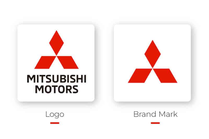
Mitsubishi uses their brand mark as their logo since the visual alone is enough to spark recognition. A brand mark works best for businesses that have already established themselves in their chosen industry.
Brand marks can be tricky to nail because they need to stand alone without your business name for extra context. That means the image you choose has to be insightful, timeless, unique, as well as easy to understand and remember.
That sounds like a lot, right? It doesn’t have to be! You can get a brand mark for your business with our logo maker in just a few minutes. As you create your brand mark, keep the following tips in mind:
You should select an image that represents your brand’s purpose and mission as opposed to a picture of your product. For example, a candle company that uses a candle as their brand mark may have a hard time selling other products in the future. But if that company were to use an image that showcases their commitment to their community, they can use their brand mark well into the future.
Your brand mark can be inspired by many things. Some companies take ideas from their name, like the skincare line Drunk Elephant with their elephant icon. When you decide on a brand mark, make sure to use it consistently. When it comes to creating a memorable brand mark, familiarity is key, so design something you can use across all platforms from business cards to app icons.
Think about creating a brand mark that will never go out of style. You can do so by avoiding today’s design trends and instead create a brand mark that’ll be fresh for years to come.
Among the many examples of great brand marks, I’ve selected some you may recognize.
Twitter created their bird icon to represent tweets, which is an accurate representation of what the brand does. You might’ve noticed that the design doesn’t include the company name, the reason being that the bird itself is enough to instantly identify the brand.
The beloved retail store took inspiration from their own name to create a brand mark that is now able to stand on its own. A simple circle is encased in an outer ring, creating an icon that is the same no matter how you turn it.
Apple’s logo is effective because it represents the company’s name, which helps boost brand recognition. Over time, the pairing of the brand mark and brand name made it easier for the public to recognize the image and immediately connect it to the company. Now the apple image is iconic.

The World Wildlife Fund brand is famous for their panda brand mark. They made the design unique by its creative use of negative space. The brand mark is representative of WWF’s commitment to protecting wildlife.

Ever since it appeared on the Sticky Fingers album in 1971, The Rolling Stones’ wide-open mouth and tongue brand mark has embodied the iconic rock ‘n’ roll band. Whether you like rock and roll or not, the big red mouth brand mark is one of the most widely recognized symbols ever. The tongue and lips brand mark represents rock and roll’s power and energy.
The oil and gas company removed the word “Shell” altogether from the design to direct consumers’ attention to the brand mark instead. The brand mark is a red and yellow Pecten shell that has become a ubiquitous sight on the road.
Nike’s infamous swoosh icon became so famous on its own that the sportswear company was able to drop their name from the logo entirely. Interestingly enough, they didn’t need to include any graphics of sports equipment to get their message across. And now their brand mark is instantly recognizable.
The WhatsApp brand mark is a phone inside a text bubble—simple yet effective. The brand mark symbolizes the function of the app, which is to send text messages and phone calls. Though generic, the brand mark has become well known and is instantly recognizable.

When it comes to conveying meaning and emotion, visuals can deliver results in a way that words can’t. It’s no wonder the top brands use a brand mark!
As I mentioned before, usually brand marks only work for businesses that are relatively well known in their industry. If done well, your brand mark could put your business on the map.
You’re now ready to make your mark!
This portion of our website is for informational or educational purposes only. Tailor Brands is not a law firm, and the information on this website does not constitute legal advice. All statements, opinions, recommendations, and conclusions are solely the expression of the author and provided on an as-is basis. Accordingly, Tailor Brands is not responsible for the information and/or its accuracy or completeness. It also does not indicate any affiliation between Tailor Brands and any other brands, services or logos on this page.
Products
Resources
©2025 Copyright Tailor Brands