The Meaning Behind Brown Logos
Colors have a significant influence on our behavior, mood, and even physiological reaction. That being said, color associations are strongly dependent on culture, personal experiences, and upbringing—color meaning is not one-size-fits-the-crayon-box.
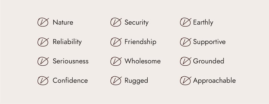
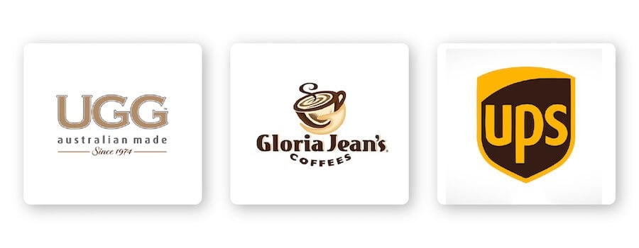
If you want your logo to express attributes like reliability, confidence, friendship, approachability, and more, brown is the color for you. For example, consider how both UGG Australia and Gloria Jean’s Coffees deliver high-quality products while expressing an earthy, grounded vibe.
Brown can also convey a sense of security, which makes it the perfect color for UPS’s logo. The brown icon has become a globally recognized symbol of reliability and security.
As you can see, there are different ways you can use brown to help send your specific message to your audience.
How to Combine Brown With Other Logo Design Elements
When it comes to brown logos, there are certain design elements that combine well and those that don’t.
Typography
Choosing the right typography for your logo could bolster your overall brand. Review the 5 main font families to determine which one suits your brand best.
Serif –Great choice for brands that want to be seen as trustworthy, established, and reliable. Both The Coffee Bean and Tea Leaf and M&M’s logo are great examples of pairing a serif font with brown. The brown evokes friendliness and approachability, making the traditional font look inviting and memorable.
Sans-serif –Casual, easy to read, and modern, sans-serif is a popular choice among start-ups, tech businesses, and restaurants. Brands that want to appear approachable would benefit from pairing sans-serif fonts with the color brown.
Slab serif –Bold and impactful, slab serif fonts are frequently used by car and technology companies. Mostly, slab serifs are fun and make an audience feel happy, and could really make an impact when used with brown.
Script –Well-suited for businesses that want to express elegance and add a personal touch, such as photographers, coaches, or any family-owned brand. Although it isn’t really popular to use script font with brown, it’d be a nice pairing if you want to express warmth and friendliness.
Decorative – This is a font that’s loud, fun, and entertaining! These fonts are flexible enough to let companies decide which emotion to focus on.
Of course, these are just general rules, but by no means are they set in stone. Feel free to play around with different font combinations.
Shapes and icons
In your logo design, different shapes can help forge an emotional and psychological connection between your brand and consumers. It’s important to understand what each shape says about your brand and how you can effectively incorporate them into your design.
Square and rectangles are powerful shapes that represent positive ideas and feelings, such as reliability, stability, and a sense of order. When combined with brown, squares and rectangles deliver a bold yet balanced logo design. If you take a look at Nespresso’s logo, you’ll notice how the logotype is framed within a brown square, telling shoppers that they can expect quality and dependability.
In logo design, an icon is a symbol that conveys values and ideas that are immediately recognizable. To take your icon a step further, try incorporating negative space into your design. If you look closely at Cotton Incorporated’s logo, the 2 “t’s” are separated by white space that creates the shape of a cotton flower.
Is a Brown Logo for You?
As I mentioned before, colors are subjective and there’s no right or wrong way to use brown in a logo.
That being said, you should use brown if it aligns with one of the messages/values of your brand. Or, you can use brown to differentiate yourself from competitors’ logos.
If your brand falls under one of these industries, here are a few ideas for how to use brown:



Brown logos for coffee brands
Whether you own a small coffee shop or sell your own beans, you’ll want a double-shot espresso strong logo! Brown is an earthy color associated with stability and groundedness—just what people want from their cup of coffee. That’s what makes it such a popular color for coffee brands (and it doesn’t hurt that it’s also the color of coffee). Just take a look at Gloria Jean’s Coffees’ logo for inspiration!
Brown logos for chocolate brands
If you’ve ever taken a walk down the candy aisle, you’ve probably noticed that many chocolate brands use brown as their logo color. Brown practically oozes decadence and indulgence, which makes it a great color for chocolate brands like Hershey’s and M&M’s.
Brown logos for vintage brands
Vintage logos have a weathered, hipster appearance. Also known as retro logos, vintage logos take inspiration from a time period and emulate that nostalgia through a specific design. Minimalistic colors work well for vintage brands, especially brown.
Brown logos for logistics brands
Logistics brands need to tell customers that they’re fast-paced, hard-working, and friendly all through their logo. If you take UPS as an example you’ll see that they’re able to express those core traits through their brown logo.
Brown logos for beer brands
Brown can connote feelings of comfort and contentment, which are also the same feelings you get when you crack open a cold beer. So when it comes to beer brands, it’s always wise to stick to classic beer colors like brown.
It’s important to note that no one color fits in a box. Take a look at what competitors in your industry are doing and if the color brown is too commonly used. If it’s overdone, you might think of using an alternative color to stand out. But if it isn’t used enough, ask yourself if the psychology of the color will work for your brand before choosing it.
Color Combinations That Work With Brown
Brown can be pretty versatile depending on the colors you combine it with. Let’s take a look at some examples of brown logo color combinations:
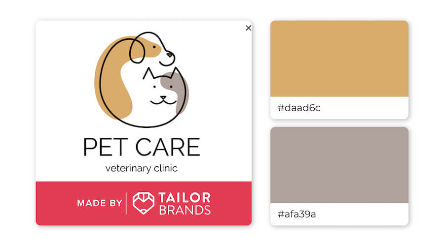
Brown is thought of as a warm color, while gray is cooler, which is why they pair together so well! Brown and gray communicate a warm welcome and suit brands that want to instill a sense of calm and stability.
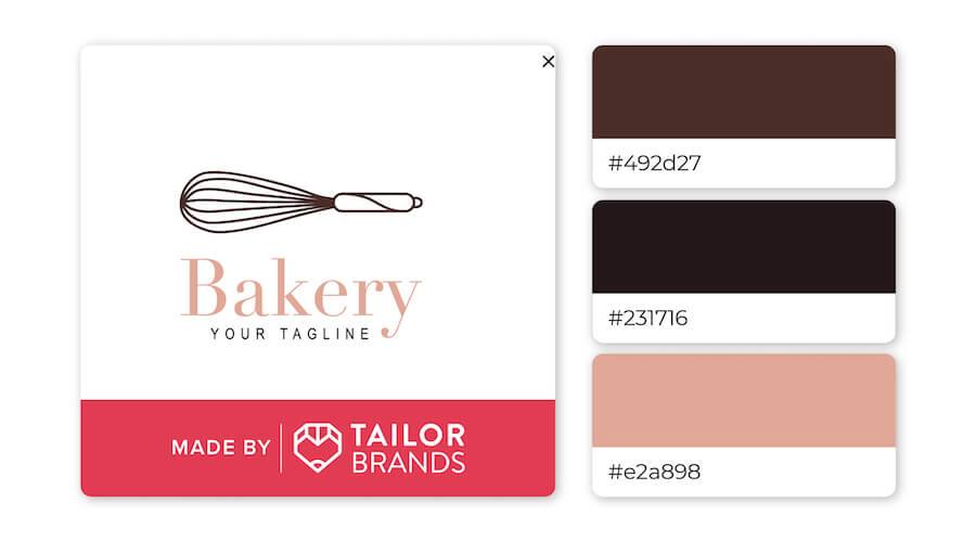
Combining blush pink with black and brown might seem odd, but this trio proves that it’s a winning match! The color combination is different enough to make the logo stand out while still expressing a sense of softness.
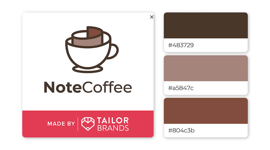
This design is giving off a cozy, curl-up-with-a-steaming-cup-of-coffee vibe. Though these colors on their own might be plain and boring, together they create an inviting, warm feeling.
Over to You
We’ve seen that brown conveys confidence, security, and friendship, but combining it with other design elements can lead to an impactful and unique logo.
If you are considering brown as a primary color for your brand’s logo, try out our logo maker to create yours!
