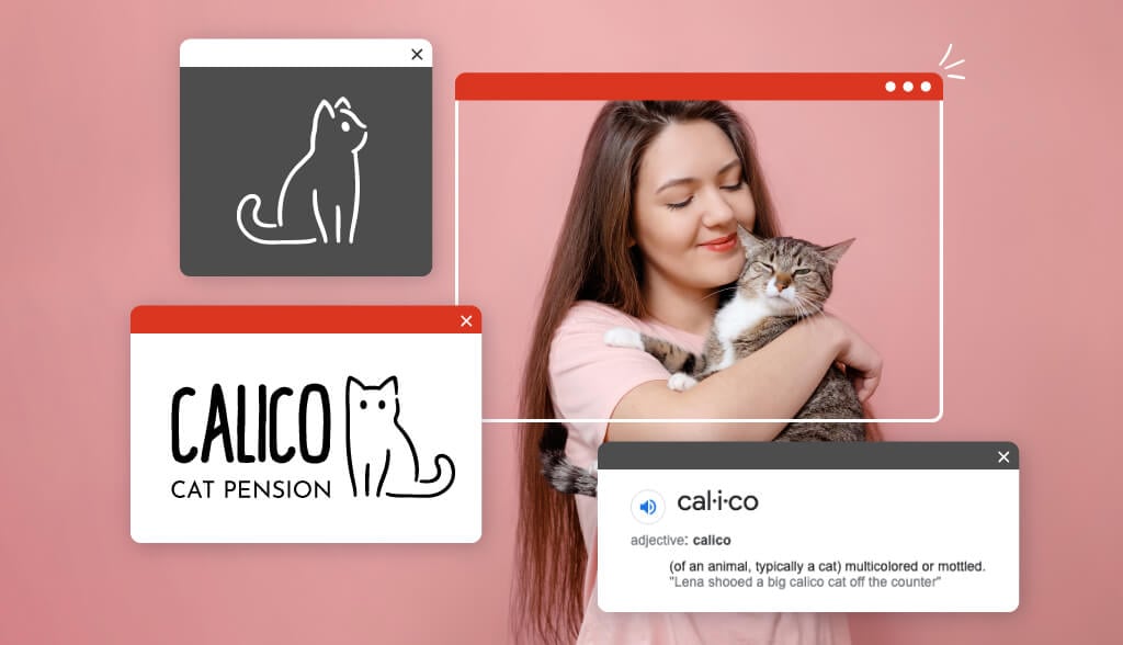
What is a Combination Mark?
There are 2 main logo categories: Image or icon-based logos and name-based logos.
Combination marks have 2 different elements:
- Text (Logotype): The brand name or initials spelled out in a specified font
- Icon (Illustrative elements): Shapes and objects that help represent the company
While some businesses use one of these 2 elements in their logo, other brands combine the 2 to create a combination mark. This kind of logo can be powerful because it combines the impact of 2 strong design elements together.
How to Combine Text and Icon in a Combination Mark
There are multiple ways to combine your icon with text. Here are some of the most common ways to create a combination mark, plus popular combination logo examples to give you visual inspiration for your own design.
Horizontal combination logo layouts
A side-by-side layout may be the most popular way to combine 2 distinct logo elements, because it doesn’t require any special arranging or stacking. To achieve a horizontal combination mark, most designers will create text that relates in size to the icon. The font should not feel too heavy or too light for the icon in this design layout, or you will end up with a visually lopsided design.
Freelancer

This platform connectsfreelancers with businesses. So, for their logo, the brand combined an origami hummingbird with a bold sans-serif logotype. The hummingbird represents the strength, positivity, and resiliency of freelancers, while the blue color instills confidence that pairs nicely with the confident font face in black.
Microsoft
The Microsoft logo has undergone some profound design changes over the years. The current version moved from solely a logotype to incorporate the 4 colorful squares (window panes) next to the font.
Timberland
This classic clothing and shoe brand uses a leafless tree to illustrate timber. On the website, the iconic emblem is positioned right next to the bold Timberland name. However, Timberland is quick to change it up when they want to stack their elements or just use one (like only the emblem on their shoes).
Ralph Lauren
Positioned in the middle of “Ralph” and “Lauren” is a polo player in full motion. The body of the horse and rider make up the bulk of the illustration and align with the font to keep the weight balanced.
Bumble
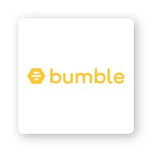
Bumble is another brand that frequently stacks the logo or only uses their icon. However, this logo was designed to sit right next to the honeycomb illustration with a very similar height. The golden colors also add to the overall feel of sweetness and happiness.
City Pantry
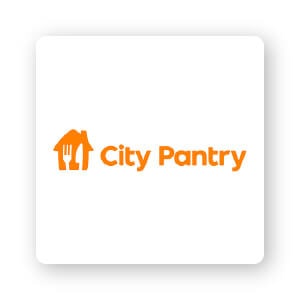
This company uses a cute illustration of a home with a fork and knife incorporated, placing the typed words next door. The warm goldenrod color pairs well with the soft sans-serif font and rounded corners of the illustration for a friendly appeal.
Stacked combination logo layouts
Stacking your icon above the logotype can create a more condensed logo that fits better in square or circle formats (like a social media profile picture). Businesses with shorter names may find it easier to stack their combination logos.
Typically, the stacked logo also allows the icon part of the design to be much larger than in the horizontal layout. Though it isn’t a hard-and-fast rule, the icon piece should roughly match the width of the name or fit within the letters somehow to create a succinct design.
Huawei
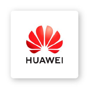
This big brand for information and communications technology (ICT) uses a sun-like symbol in bright red. The petals illustrate the Chinese word “hua,” which means petals or lavish, while the second half of the name is the Chinese word for achievement or accomplishment.
Lacoste
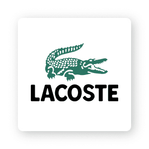
This logo design hasn’t changed much at all since the ‘80s. Using a defensive crocodile to represent the founder’s nickname (René “the Crocodile” Lacoste), the brand took the simple route of stacking the animal icon right above the very simple logotype.
Converse
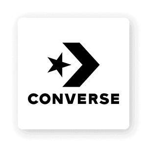
When you first think about Converse, you may recall the old star emblem patch that shows up on the side of classic Chuck’s. However, the newer logo shows a star and chevron mark positioned almost like a bow and drawn back arrow. The icon shows the brand is moving forward and is positioned above the classic converse typeface—simple sans serif, all-caps letters.
Drunk Elephant
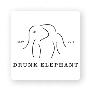
The biocompatible skincare and cosmetic brand uses a very whimsical and abstract elephant icon planted above a very sensible, serif font.
John Deer
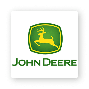
Iconic tractor and machinery company John Deer uses a bounding deer for its recognizable icon, which is placed directly over the standard sans-serif typeface. The green and yellow colors represent plant life, harvest, and energy.
Satorisan
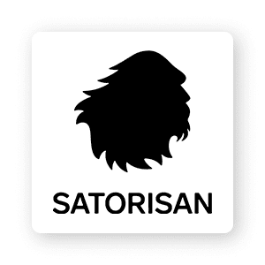
For a shoe brand, the Bigfoot silhouette is funny and on-point. The all-black monochromatic logo is eye-catching in its use of details and negative space.
Integrated combination logo layouts
For an even more cohesive look, create a combination logo where the font resides within the icon. When designing your logo, make sure the logotype doesn’t get lost in an overly busy icon. Here are a few examples so you can see what I mean:
Tivo
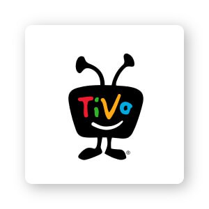
Creative and fun, the streaming TV brand Tivo uses their logotype for the face of the alien-like, walking retro television set.
Bolden
This black-owned skincare line for darker skin tones uses a combination logo to express their commitment to natural beauty. The “O” in Bolden is creatively combined with a leaf icon for a creative design detail in the logotype.
Dear Me Podcast
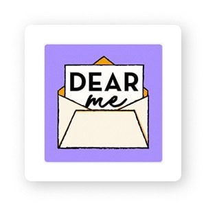
This reminiscent “note-to-past-self” podcast uses an envelope and note to encase the handwritten logotype.
Lay’s
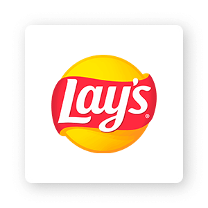
Nothing screams “potato chips” more than the Lay’s logo. The red banner on the yellow sun (or a potato or chip) grabs attention. The bright colors of this combination logo convey feelings of convenience and excitement.
Burger King
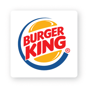
To make up an illustrative burger, Burger King used the logotype positioned between 2 buns. Recently, the King decided to ditch the blue circle and use a flat throwback logo similar to the versions introduced in the ‘60s and ‘90’s.
Alvarez and Marsal
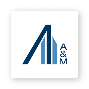
This combination mark uses a building-like illustration next to the ‘A & M’ initials. Working with global businesses, the company chose colors and structural shapes that convey confidence and stability.
Over to You
The fun part of designing a logo is that there aren’t any strict rules you must follow. It comes down to what works for your business.
Now that you know what a combination logo can offer, it’s time to start dreaming up your own! Use our logo maker tool right now to get started and create a logo for your brand.
