The first thing I did when I moved into my new apartment was scout out a coffee shop. Luckily, there were 2 cafes in my neighborhood ready to fuel my caffeine addiction.
Both offered my go-to cappuccino with oat milk at the same price, and both locations were relatively the same distance from my apartment. So what made me choose one cafe over the other?
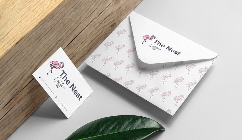
It came down to the nice barista who’s always up for a conversation, the chill music, the coffee cup design, their elegant black and gold color scheme—all of those things kept me coming back. Suddenly, I was a loyal customer recommending them to all my friends.
Those different elements culminate in what’s known as brand identity.
The way I feel about my local coffee shop is the way that your target audience will feel about your business—if you work on building a memorable brand identity.
Let’s be honest: All these terms – “brand,” “branding,” “brand identity” – sound exactly the same, amirite? There’s a lot of confusion around these terms, and much of the mix-up comes from their widespread incorrect usage.
But just before we get to the specific definitions, I want to help clear up some confusion by using a lesser-known Coca-Cola story.
In 1985, the Coca-Cola Company discontinued their 99-year-old classic recipe and announced a new formula.
And loyal fans of the drink were distraught. Consumers staged protests, poured New Coke down sewer drains, and a psychiatrist Coke hired to listen in on calls told executives people sounded as if they were discussing the death of a family member.
That is the power of a strong brand identity.
Consumers wanted the brand they’ve remained loyal to for years to deliver on the classic product they’ve come to love. Ultimately, Coca-Cola underestimated their loyal drinkers’ emotional attachment to their brand.
So what can we learn from Coke? To build a brand, you’ll need to begin the process of branding. The act of branding helps customers identify your products or services, distinguish you from competitors, and create a persona that your target audience can connect with. (If you want to learn more, I recommend you read more about branding here).
Your brand is the culmination of your branding efforts. It’s the set of emotions and perceptions that you intentionally cultivate around your business, which you constantly communicate to your customers through visual and verbal cues.
And brand identity is the consistent message of your business that is communicated over and over again, which ultimately becomes the face of your brand shown to the world. A brand identity consists of 7 components: Your business name, logo, tagline, color palette, typography, imagery, and voice. Those specific elements shape a brand that is instantly recognized and liked.
Think about McDonald’s for a second. The fast-food restaurant chain dominates the world of fast food. It is worth $106.4 billion and is the world’s 9th most valuable global brand as of 2020.
But, as good as that burger might be, it’s still just a hamburger. So how did McDonald’s reach the top of the fast food chain?
No, it’s not their Big Mac Special Sauce! It’s their branding.
To distinguish their burger from all others, McDonald’s focuses on creating memories for the customers. From Happy Meals, the iconic figure of Ronald McDonald, to their memorable tagline “I’m lovin’ it,” McDonald’s executes their brand identity flawlessly and consistently.

Brand identity is important because it:
As a rule, brand identity must be consistent and clear, no matter where it is displayed. Delivering the same message (through verbal and visual cues, which I’ll cover in a bit) lets consumers know that you’re a reliable authority, instilling trust, loyalty, and sales.
That means everything from your logo, typography, colors, packaging, and messaging all reinforce the reputation (and identity) of your brand.
If you understand how all of these elements deliver a unified experience, you can build an extraordinary brand identity, just like the insurance company Lemonade did.
Most insurance companies aren’t necessarily what anyone would call fun or pleasant to do business with. Lemonade Inc. is changing that through stepping up their branding game.
From their signature hot pink color scheme and minimalist website design to their slightly quirky Instagram page, Lemonade has strategically cultivated a brand identity that speaks to millennials, their target audience. Having done so has set them apart from all other insurance companies.

When it comes to building a brand identity, there are a few crucial things to keep in mind before jumping into it.
A brand strategy is a long-term plan that outlines how you’ll achieve goals that ultimately result in your brand’s identity.
A well-defined brand strategy is directly linked to your target audience’s needs and emotions. It will help you shape how you want people to interact with your business, how you want them to feel, and the messaging you want to communicate to them.
There are several components that go into a brand strategy:
Nailing down your brand strategy can save you a lot of time and stress down the line.
That being said, if you’re still unsure about your logo, struggling with color combinations, or don’t know yet which marketing channel you’ll use, don’t panic! Like I said before, all of this is a process that takes time.

Pinpointing your target audience is the first step on the road to building an exceptional brand identity.
Understanding your audience in and out is so important because they will affect everything about your brand, from what your tone of voice will be right down to typography and color choice.
Your target audience is the group of people that your product or service is most likely to appeal to. By understanding who they are and what they want and need will help you engage and build connections with them.
As a result, you’ll be able to figure out your unique selling point—AKA, the thing that gives you an edge over competitors.
Lemonade understood that insurance is unappealing to most people, let alone a younger generation. So they created a brand identity that identifies with millennials in a way other insurance companies don’t. For instance, Lemonade’s messaging is to make buying insurance as easy as ordering pizza. That’s a message any millennial (myself included) can get behind!
Then there’s Drunk Elephant, the skin care line with a cult following. The entire brand is directed and designed with Millennial and Gen Z-er’s in mind. From the abstract line art drawing of an elephant as its icon to their color palette, the whole package reflects the clean and minimalistic vibe their target audience connects well to.
You can figure out who your target audience is by creating a list of demographic and geographic information. Get a pen and paper and write down the following:
Or, feel free to use our handy buyer persona template to get started!
Understanding your brand personality is a key part of your overall brand identity. It’s one of the many ways to shape your target audience’s perception of your business.
As you might have guessed, brand personality is the human component; the emotional hook that connects with an audience. It lets the people you want to reach see who you are as a business.
So why is brand personality important? Let me explain using an example. Airbnb is a hugely popular vacation rental marketplace. Chances are you’ve stayed in an Airbnb yourself! But there are a lot of different businesses that provide the same service, right? So what makes people choose to stay at an Airbnb over a standard hotel?
They’ve created an exciting brand personality that encourages people to feel like they belong no matter where in the world they are. The untraditional, authentic way to experience new places gives people the adventure they’re after while still providing the security and safety a home provides.
The whole process of building a brand identity is not easy, nor is it straightforward or quick. It takes a lot of passion and perseverance, but it’s 100% worth it to set your business up for success.
Even McDonald’s, Apple, or any other well known brand didn’t build their empire in a day. But they followed the same guidelines listed out here—the same ones you’re starting out on your journey. Start with a business name, a logo, and slowly but surely, more details and visuals will follow. You’ve got this!
Building a brand identity is a multi-step process, and every component needs to support your overall business goals.
No matter where you are in the business development process, it’s important to go over these critical steps to ensure you’re well on your way to building a strong brand identity.
Here’s an overview of the 10 key branding identity elements you need to create a brand identity that is strong, consistent, and attractive.
Your business name embodies the product or service offered and differentiates it from similar brands in the market. It’s often the first impression you leave on potential customers. They either remember it or they don’t. (Talk about pressure!)
Consider a name that best describes who you are as a business and what you provide. It needs to be unique, easy to remember, aligned with your brand personality (I’ll get into that later), and have an available trademark.
Choosing a business name is a common obstacle for new business owners, but don’t let that keep you from moving forward!
To get your creative wheels rolling, let’s check out a few different kinds of business names to choose from:
Traditional business names clearly describe the product or service offered. It’s functional and leaves very little room for confusion. A traditional name fits a business that wants to convey a sense of trustworthiness and seriousness, like Bloom’s Law Firm.
The upside of choosing a traditional business name is that it communicates your business’s core purpose; the downside is that it could potentially be unmemorable.
If you can’t think of the perfect word that best describes your business, you can always make one up! Invented names offer you a lot of room for creativity, but it’s not the easiest to come up with.
You can play around with misspelling a word like Tumblr, or just take inspiration from the service you provide like Airbnb.
You can fuse 2 different words together to create a name that uniquely defines your business. Compound names allow room for creativity, while also providing some context.
Take LinkedIn as an example. The name precisely describes the service it provides, which is to link users with their professional network.
2-word business names are a combination of strong keywords or the name of the founder.
A lot of well known brands have adopted a multi-word business name. Abercrombie & Fitch, for instance, were the 2 founders of the now famous clothing brand.
Your logo is the main visual focal point of your entire brand identity. Consider the message you want to resonate with your audience, while also communicating your business message.
Whether you use a designer or design your logo yourself, it should capture the essence of your brand. Keep in mind that it should be simple, timeless, scalable, and memorable.
Done right, a logo can grab and hold your target audience’s attention, make a lasting impression, separate you from competitors, and foster brand loyalty.
One last bit of advice: Don’t stress about being unique!
A lot of business owners spend a lot of time trying to come up with the best, most original design ever to make their brand stand out. Instead, focus on establishing patterns (through colors, fonts, icons) that evoke a certain feeling from your audience.
If you want to learn more, check out this video:
After your business name and logo, your tagline is a strong marketing tool. A good tagline should evoke a response from your target audience.
A tagline captures the unique value your brand offers, and helps your audience associate your business with an overarching idea.
Maybe your tagline clarifies what you do or expresses an important brand attribute, like Nike’s “Just do it.” Coined in 1988, it’s timeless and conveys motivation and strength in just 3 words.
However, a tagline is not a must for all businesses. Could it be useful? Yeah. Is it super critical to the success of your business? No. In fact, you might just decide to skip it altogether and that’s totally fine! A tagline is also something you can add later on as your business progresses.


Typography is the large umbrella term all fonts fall under. Basically, it’s just the specific way letters are arranged.
Choosing the right typography in your logo could bolster your overall brand. Whether you’re designing a logo for a photography business or a Zumba side-hustle, the font you use can be key to effective brand recognition.
There are 5 main font families, each with their own personality. Once you understand each font’s distinct characteristics, you can choose which best represents your business.
Of course, these are just general rules, but by no means are they set in stone. Feel free to play around with different font combinations. (Pro-tip: It’s best to stick with one or 2 types of font.)

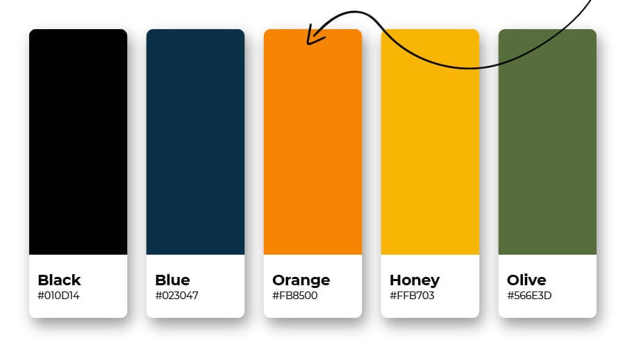
Color is the most emotionally engaging element in your brand identity. Deciding on a color palette is a key way to enhance your identity and add versatility to your designs.
According to color psychology, colors elicit an emotional response, like blue expresses calm and red conveys passion. Even adjusting the shade can alter the emotion elicited. Think about how baby blue evokes calmness, whereas a darker shade of blue instills trust. Knowing about the emotions certain colors express can help you select the right ones for your brand.
Okay, let’s do a quick exercise. I want you to picture the Dunkin’ Donuts’ logo, you know the one with the stacked words, the bubbly letters, and the coffee cup, all in their signature orange and pink color palette.
Now, imagine the same logo in all black. It’s just wrong, right? That’s because Dunkin’s use of their signature colors are as famous as their jelly-filled donuts. Black is way less sweet and approachable and doesn’t match Dunkin’s personality at all.

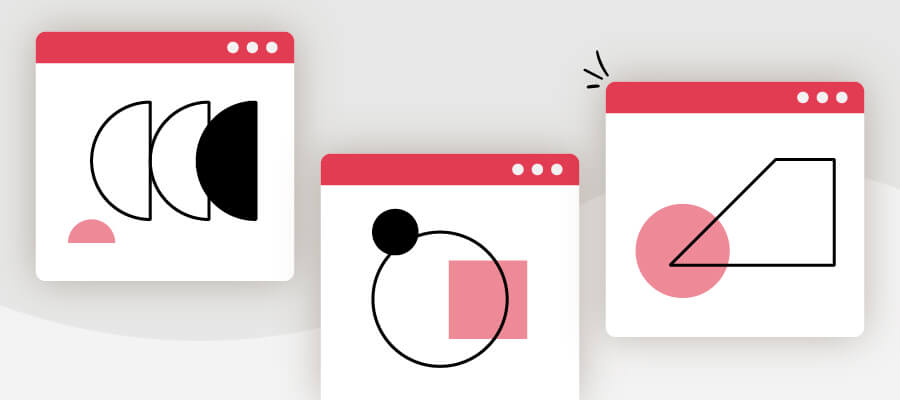
Brands utilize a visual language with graphics and shapes to convey a distinctive look across a range of materials (brochures, business cards, etc) and media (websites, social media, etc).
Shapes can help form a clearer picture of your brand (pun intended). This effective element can be useful to reinforce the desired reaction from your target audience. So let’s say you’re a wellness coach. You’d want a circular logo with soft edges as opposed to a square with hard edges. See what I mean?
If you understand what different shapes are associated with, you’ll be better able to effectively incorporate them into your design.
The images you use can do one of 2 things: Turn heads or make no impression at all. Make sure you fall into the latter group, which you can do by remaining true to your brand!
From your website header to social media pages, every place you include an image should be uniquely you.
Think of it this way: Coordinate your images like you would an outfit—the whole look should be aligned with the overall image you want to project to the world. If you sell customized cakes, you’ll want your social media page to be filled with pictures of rainbow sprinkles and glitter frosting!
Remember, your brand identity is what sets you apart from competitors, so why choose images that look generic or like everyone else? It’s best not to use stock images, but rather genuine images of the product or service you offer.
If you’re saying to yourself, “Yeah, that’s great and all, but photography is not my thing—even my friends know to never let me take pictures at brunch.” (Come on, I can’t be the only one!)
Don’t worry, you have some options:

Think of your website as your business’s home.
You invite people in and ask them to stay a while. Your guests (AKA, your target audience) are there to learn more about you, what you do, how you do it. Some guests will stay, others will leave, and (hopefully) come again (next time with friends!). Most importantly, your website’s goal is to make a good impression and form a lasting relationship with your guests.
It’s important to note that a website is not a must for brick and mortar stores, but crucial if you’re a digital service or e-commerce. It’s also possible to sell online without a website.
Social media is a fundamental tool for marketing your business organically. Organic marketing is drawing customers to your brand using unpaid strategies like creating content on social media. The idea is that the more value you offer prospective customers, the more they’ll be drawn to you.
A branded social media presence on channels like Facebook, Instagram, Pinterest, YouTube, and Twitter can help you reach new prospective customers and build connections with your audience. Doing so makes your brand appear authentic and relatable.
By no means is building a social media presence something that happens overnight. Good branding on social media is an ongoing process in which you’re constantly communicating with your audience—responding to their comments and messages, finding new ways to engage with them, etc.
But not all social media channels are equal, and you should consider carefully which is the best for your business. Instagram is an excellent way for you to show rather than tell audiences about your products and services, values, and unique voice. Facebook gives small businesses the opportunity to showcase their products and services to a massive audience. With Twitter, it’s easy to engage with customers and stay relevant.
I recommend focusing your efforts on one to 2 channels. Each has its own algorithm and is a hard nut to crack. Once you’ve mastered one social media platform and have the room to grow, then move on to the next (if you want to, that is).
People are attracted to brands that they can rely on time and time again. You want to hold onto the people who support your business by continuing to meet their expectations. (Remember the New Coke debacle?) Maintaining brand consistency ensures your customers are satisfied after every interaction with your business.
Moreover, everything you do needs to align with your brand. Adhering to the same elements (logo, color palette, font—AKA, everything mentioned above) over time makes it easy for your target audience to stick with your business. Consistency lets your customers know that you’re reliable, instilling trust, loyalty, and sales.
Your logo is the gateway – your audience will interact with your brand on social media, your website, and keeping all of these pages consistent with your design is the best way to create an authentic experience for them. Inconsistency will lead to confusion and ultimately lead them not to trust you.
So how do you do this in practice, even if you’re just getting started?
You spent time crafting the perfect logo—pop it into your emails, social media profile picture, business cards, etc. You debated for hours on the best color scheme, so use it everywhere!
Building a memorable brand identity won’t happen overnight. It’s a process that starts with choosing a business name, then designing your logo, typography, and so on. All these different elements will come together in time to form your brand’s unique identity.
You might have some setbacks and that’s okay! Even the biggest brands we all know and love have made mistakes along the way, the New Coke debacle being an example. But if you stick to your brand strategy and follow this guide, you’ll be on track to building a strong brand identity
You have everything you need to get started, and we’re here to help if there’s anything you want to know about starting your own brand. If you feel like you need a more in-depth coverage of branding, check out our e-course to get started.
Happy branding!
The information provided on this page is for information, educational, and/or editorial purposes only. It is not intended to indicate any affiliation between Tailor Brands and any other brand or logo identified on this page.
Products
Resources
@2024 Copyright Tailor Brands