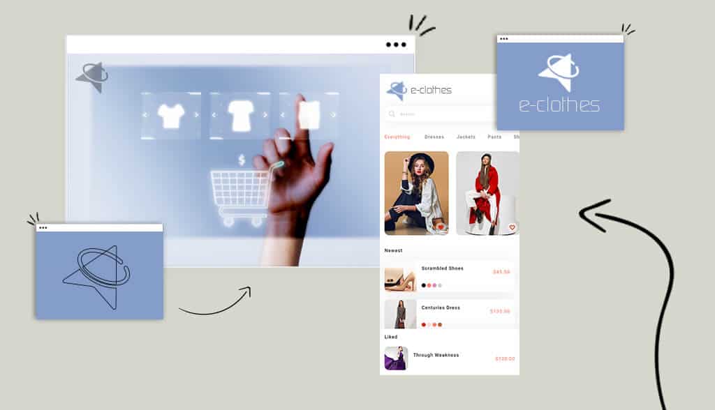
Think back on the past week and I can guarantee you bought something from an ecommerce store (I’m right there with you). Ecommerce (any business that buys and sells goods or services online) has become a major part of our lives.
According to eMarketer, global retail ecommerce sales will surpass $5 trillion for the first time, accounting for more than a 5th of overall retail sales. Total spending will exceed $7 trillion by 2025 even despite slowing growth.
That’s good news for those of you in the ecommerce business! There’s tons of opportunity and it’s very exciting. But before you set up shop, you need to design a logo. This post is going to walk you through everything you need to know about designing a logo for your ecommerce store.
There are a lot of reasons why you need a logo for your ecommerce store.
First, there’s no face-to-face interaction, which means there’s a certain amount of trust that’s inherently lacking in the ecommerce business model. That’s where a logo steps in. Your logo acts as the face of your online store. It can connect with your customers emotionally, instilling trust. And trust is very important for brand loyalty and a successful ecommerce store.
On another note, your logo won’t just appear on your website, but also on your products, email, business card, etc. Every time you use your logo, it solidifies your online presence and, thus, brand recognition. Brand recognition is the extent to which a consumer can identify a brand.
2 Southern California friends traveled to Costa Rica and fell in love with the laid-back lifestyle. The friends teamed up with a local artisan who designed bracelets that captured and celebrated the simple things in life, and thus, Pura Vida (or “pure life” in Spanish) was born. The brand’s logo conveys their personality and values perfectly, in the tagline (“live free”), icon (pineapple), typography, and layout. Customers can learn a lot about the brand just from the logo; they can also connect with Pura Vida’s values on an emotional level.
Consider the other businesses in your industry (Pura Vida certainly isn’t alone in the jewelry marketplace). It’s crucial to separate yourself from the market and a logo is one of the top ways to do just that. Your logo shapes your brand’s personality, and that’s what makes customers go to you.
For a logo to be effective, it must be well designed and executed. Follow these design principles to create a winning logo.
Straight to the point, uncluttered, and clean—those are the things your logo should be. A simple logo gives your target audience an immediate sense of who you are as a brand and—though it seems counterintuitive—is quite memorable. eBay’s logo drives this point home:
Your logo will be used on a variety of platforms in varying sizes and formats. If your logo has too many design elements going on, the details will be lost or completely illegible when scaled up or down.
The file type of your logo is an important consideration, although an often overlooked one. Your logo can be a 10, but if it’s in the wrong file type, it won’t be legible. The most important file format for your logo is a vector. Without getting into the technicality of vector graphics, it’s important because they can easily be resized without compromising the quality of the image.
That means vector files can be sized up or down without any pixelation or distortion. So, when you scale your logo down to place on a sticker or scale it up to use on a banner, create it as a vector file.
Strive to create a logo that is 100% unique. Good advice, hard to follow, right? Start by searching for logos in your industry. What patterns keep popping up? For example, financial services and banks (Visa, PayPal, and American Express) often use blue as their main color scheme. To stand out, Mastercard and Ally Bank chose red/orange and purple respectively.
Don’t be afraid to veer from the norm in your industry, otherwise, you might wind up not getting noticed.
Let’s talk about a few tips to keep in mind when designing your ecommerce logo.
Your logo should reflect your brand and appeal to your target audience. A target audience is the intended demographic your ecommerce business is intended to serve. If your audience is plant parents who don’t necessarily have a green thumb, your logo should be designed to appeal to them. Take Lazy Gardens’ logo as a perfect example:

Take the time to understand your audiences’ interests, income level, location, age, gender, values, occupation, etc to help you design your logo.
Ecommerce is a hyper-competitive space, which means you need to check out what your competitors are doing. After all, you don’t want to create a logo that’s a near copy of all the others.
Identify what works and what doesn’t for your competitors. How can you improve the various design elements to create a stand-out ecommerce logo? Maybe it’s diverging from an overused color scheme or using a different font than your competitors.
When it comes to designing an ecommerce logo, it must be unique. A great way to do that is to incorporate your business’s name into the design. It’s a subtle yet effective way to reinforce your brand and increase brand recognition.
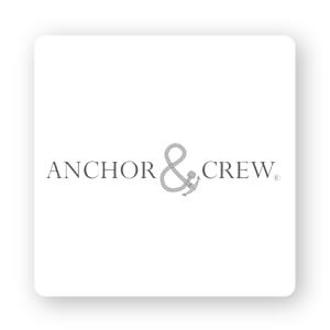
Jeweler Anchor & Crew is known for their signature anchor bracelet, which inspired the brand to use an anchor icon to symbolize “&” in their logo.
The colors you choose for your ecommerce logo depend on what you want to communicate to your target audience and how you want to be perceived. Certain colors send subliminal messages: Blue is relaxing, red is passionate, green is earthy, and so on.
Common colors found in ecommerce depend on what market you’re in. So, again, check out what colors your competitors use and see how to make your logo stand out.
While there are no set rules for choosing a font for your ecommerce logo, there are some guidelines to keep in mind. First, if you’re using an icon, use a simple font that is easy to read and won’t compete for attention. Artisaire’s crisp, clean sans-serif font is a perfect balance to the abstract logo next to it. A text-based logo, on the other hand, can take advantage of more elaborate fonts.

Next, you should understand your market niche, your target audience, and the overall feeling you’re trying to convey. Take Bebemoss, a women-owned business that crochets toys entirely by hand using organic cotton yarn and stuffing from recycled bottles. The font looks like Comic Sans MS, a sans-serif non-connecting script typeface intended for cartoon speech bubbles and children’s materials. This particular font choice was a well-thought-out decision on Bebemoss’s part because it relates to their target audience and conveys a casual, warm feeling.
Layout might not be the first thing (or second) you think about when designing your logo, but it’s important. Your logo doesn’t have to be perfectly symmetrical, but it should be aligned with its surroundings. You’ll encounter situations when your logo sits against vertical or horizontal borders, so you need to consider the layout for both layouts.
Your logo might appear on everything from t-shirts and fanny packs to investor decks and business cards. That means the way your logo looks on a smartphone isn’t the same way it’ll appear on a laptop. To design a solid ecommerce store logo, create a logo that works in all situations.
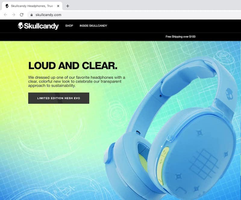
Additionally, consider what your favicon will look like. A favicon is a small icon that’s found on browser tabs, bookmarks, and search bars. Skullcandy, a headphone company, uses a skull icon as their favicon so viewers can clearly recognize the brand.
Now that we’ve covered nearly everything there is concerned when designing an ecommerce store logo, let’s touch on some other design considerations.
You need to have a consistent color palette…and everything else. People want brands that they can rely on. You need to meet their expectations by maintaining brand consistency to ensure your customers are happy.
Consistency lets your customers know that you’re reliable, instilling trust, loyalty, and sales. The more consistent your brand image, the more customers will resonate with your business. It’s really that simple.
Using a consistent color palette in your logo is a must. Think about it this way: What if you were to use a yellow and orange logo on your website but then change it to red and pink on your social media? The inconsistency would lead to confusion and mistrust.
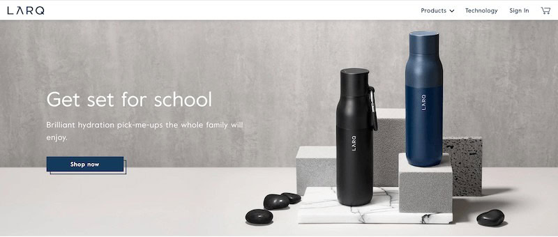
Plus, keeping your color palette consistent is so aesthetically pleasing. Just look at Larq’s gray, black, and blue color scheme—calming, modern, and sleek.
When it comes to fonts, it’s best to use no more than 3 different types. Otherwise, your ecommerce store will look unprofessional and confusing. There are 5 font families; limit the number of font families you use to 2 at most.
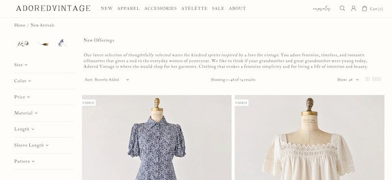
If you use more than one font family, make sure they complement each other based on their character width. Combining a serif font with script would create harmony (e.g., Adored Vintage), whereas a bold font paired with script would look wrong.
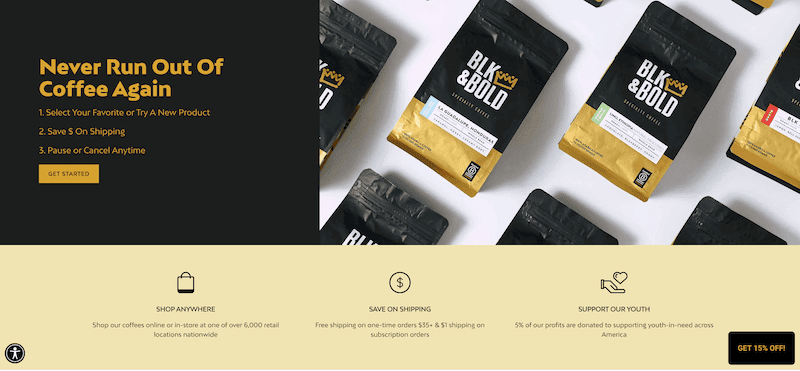
From your website banner to social media, every image should be related to and support your brand. BLK & Bold Specialty Beverages does a great job coordinating their images on both their website and social media profiles to align with their overall image. What’s especially genuine about BLK & Bold is they never use stock photos. Each image of their product is an authentic photo that invites the viewer to feel welcome the same way you feel when stepping into a coffee shop.
Ecommerce has a permanent stronghold in our life, so you’re in good company. Like Paul Rand (renowned graphic designer for IBM, UPS, and ABC) said, “If, in the business of communications, ‘image is king,’ the essence of this image, the logo, is the jewel in its crown.”
That’s a lot of responsibility riding on a single graphic design, amiright? Making an ecommerce store logo is a massive undertaking, but this article covered all the important principles that can help guide the process.
This portion of our website is for informational or educational purposes only. Tailor Brands is not a law firm, and the information on this website does not constitute legal advice. All statements, opinions, recommendations, and conclusions are solely the expression of the author and provided on an as-is basis. Accordingly, Tailor Brands is not responsible for the information and/or its accuracy or completeness. It also does not indicate any affiliation between Tailor Brands and any other brands, services or logos on this page.
Products
Resources
©2025 Copyright Tailor Brands