Pepsi is an iconic American soda brand, and their logo is just as recognizable as the sweet bubbles of their celebrated drink.
Interestingly, the Pepsi logo has gone through a number of redesigns, with a complete shift in concept and feeling as the brand grew over time. Yet even non-soda drinkers (and Coke-lovers!) can instantly identify Pepsi’s logo and know what it represents.
Let’s take a look at how the Pepsi logo has evolved from its first iteration in 1898 to the current mark the world has come to know and love.
A Brief History of Pepsi
The original Pepsi product was born in 1893, created by Caleb Bradham for his drug store in North Carolina. It was made with water, sugar, caramel, nutmeg, lemon oil and cola nuts, and the concoction was dubbed “Brad’s Drink.” By 1898, Bradham had renamed the drink “Pepsi” after the pepsin enzyme, which helps with digestion, in order to help market it as a “healthy” cola.
The original drink was designed to offer a similar benefit as Coca-Cola, which first came out in 1886. However, it wasn’t until nearly 100 years later that the brands would truly come to a head-to-head battle.
Pepsi is now valued at over $11 billion, and PepsiCo generated more than $70 billion in net revenue in 2020. Their current product portfolio includes 23 brands that are bringing in more than $1 billion in annual sales, and its snacks, beverages, waters and other products are sold in over 200 countries.
The Evolution of the Pepsi Logo
The Pepsi logo has had a pretty drastic change over the years, in an effort to set itself apart from the competitor it had initially emulated. Its style also shifted in order to keep up with the times and take on a more trendy, though classic, look.
That said, the brand has chosen to remain true to its original colors and overall logo feel, though the fonts and imagery slowly morphed into what we know and love today.
1898-1940
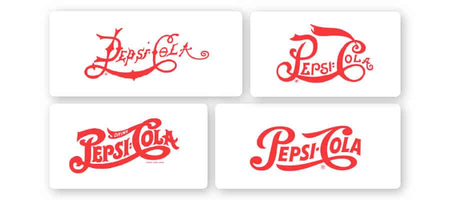
The initial Pepsi-Cola logo came with a very strange font that was more common way back when. The thin letters with uneven kerning (spacing between letters) was the first attempt to create the overall feel of the brand. The drink was being marketed as a health aid for digestion, and the tagline was “Exhilarating, Invigorating, Aids Digestion” accordingly.
Over time, the logo words started to become softer and less wild, in that the letters started to show a much more even spacing.
By 1940, the logo was paired down to a succinct banner with smooth words. It had a very Art-Deco-era feel. The letters were clean cut and more thinned out from the version in 1906, where the font gave off a little bit of a carnival vibe. And, the lines from the ‘C’ took on flourishes that highlight the rest of the word, without the awkward connection it had previously tried to share with the ‘P.’
Notice that with all of these logotypes, the Pepsi-Cola name is already written on a wave—an element that continues throughout the lifetime of the Pepsi brand. The words on the slight upward swoop gave the feeling of motion and energy.
1950

With the red logo and similar font to Coca-Cola, Pepsi-Cola always struggled a bit to get out from under the shadow of the competing brand. This is one case where the brand confusion led to some defining moves on Pepsi’s part. In 1950, the brand introduced the iconic blue color to its bottle caps, and logo, for the first time.
While the banner wordmark stayed the same, its wavy lines were emphasized in the background color swaths. “More bounce to the ounce” became the drink’s tagline, in an attempt to promise more fun than the competition’s product.
1962
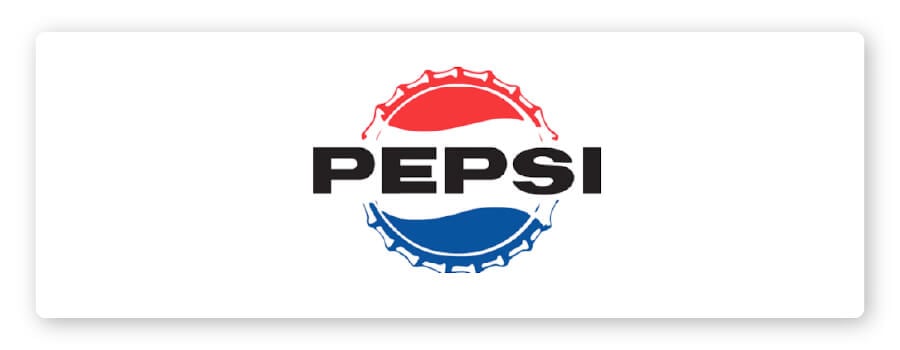
In 1962, the “Cola” part of the name was dropped from the brand, along with the script font elements. In an attempt to really establish brand differentiation, Pepsi developed a completely different look, though it still maintained that overall feeling of movement and energy with the wavy lines.
Pepsi had become a drink for the youth of the ‘60s, and so it ditched the old drug-store-label look for something that seemed like a bold stamp of approval.
Then in 1965, Pepsi-Cola combined with Frito Lay Inc. to form the company PepsiCo Inc., which is how it remains today.
1973 – 1990
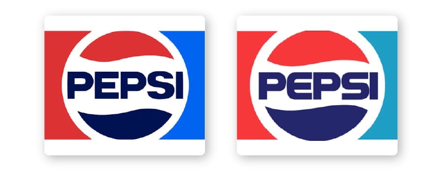
The flat design of the ‘60’s was here to stay. Keeping the font fairly simple, the brand did start to shift its style. It went from a straightforward sans serif to a more futuristic font with rounded edges. The logotype changed colors from the harsh black to match the blue energy of the lower wave.
And, rather than stay confined to a bottle cap, the logo took on the circle emblem that we’re still familiar with to this day.
In 1975, Pepsi started the Pepsi Challenge, to really push its growth by taking a share of Coca-Cola’s audience. Small booths were set up throughout malls all over America, where young hires wearing a bright Pepsi Challenge t-shirt would ask anyone passing by to do a blind taste test. According to Pepsi, most people preferred Pepsi over Coca-Cola. The popular stunt certainly gave Pepsi what it wanted with a bigger share of the market.
In response, Coca-Cola tied to change their recipe, and introduced a new version to keep up with the times. People hated it. This initially created a setback for Coca-Cola, but it didn’t allow Pepsi to fully take the #1 spot in the market. Instead, it reaffirmed people’s desire for Coca-Cola and gave Coca-Cola the spotlight on the national stage.
Coca-Cola quietly brought back their original recipe. This moment helped define the 2 brands and where they stood in the markets. Coca-Cola is an old-school classic, and the brand of Santa and Norman Rockwell. Pepsi, on the other hand, took its place as the drink of the upcoming generation and promoted itself as the brand of modern stars of the day like Michael Jackson, Britney Spears and Shakira.
1991
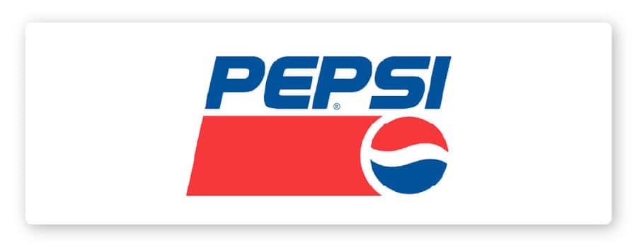
The big Pepsi logo shift in 1991 was really just to pull the brand name out of the wavy globe.
The font and design elements largely stayed the same, though the logo took on a red banner element with more prominence than the version from the ‘70s. And, the white line of the wavy globe took on a much more narrow shape than the previous logo versions had.
1998 – 2005
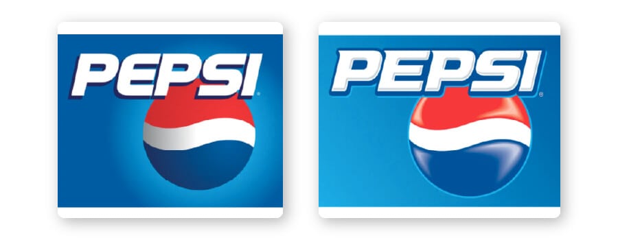
Suddenly, in 1998, Pepsi ditched the banner and took on a 3D logo. The blue color became dominant for the first time, replacing the red banner with a solid cobalt backdrop. Additionally, this new 1998 logo had a glow and kept the sci-fi-looking, rounded slab serif font.
In 2005, the logo showed even more depth by shifting the background to a horizontal gradient and adding shine to the Pepsi emblem. The font changed to a serif for the first time in nearly a century, and a blue line was added to help it pop from the background. And, the light gray shading within the letters helped them stand out as 3D elements as well.
2006

The slight logo change in 2006 included adding the mouth-watering droplets covering the wavy globe that illustrated the drink. Though the Pepsi logo was becoming complex, it was a pretty cool trend in the early 2000s.
2008
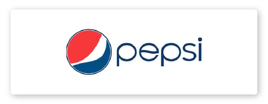
This drastic logo change in 2008 was designed by Arnell Group for more than $1 million. Pepsi was ready for a facelift, and they had the foresight to shift to something more simple in the rising wave of virtual storefronts and digital brand presence.
Everything was flattened and simplified. The font “Pepsi Light” was created by Gerard Huerta with the “e” reflecting the iconic Pepsi wave, while the globe lost its symmetrical waves in favor of something edgier. Not everyone loved the changes, with some calling it cheap, simple, lazy and soulless. But, Pepsi stuck with their rebranding choice.
They felt the logo still embodied the fun, energetic brand of youth.
2014
A tiny tweak in 2014 shifted the logo to one with no outline around the globe. The waves are implied minimalist design elements that hold the structure of the circle.
The overall branding is ideal for modern platforms and packaging. It’s easy to read and represents Pepsi’s brand elements in the clearest way.
Though the skinny, lowercase sans-serif font is a bit disconcerting to those familiar with the brand’s historical look, it takes on a fresher and more relevant vibe for the younger generations. And, sticking with the youth has been Pepsi’s way since nearly the start of the brand.
2023
In 2023, Pepsi unveiled its first major logo redesign in 14 years, marking a bold return to its roots while embracing a sharper, more digital-ready future. The new logo reintroduces the classic globe and wordmark combination, placing the Pepsi name back inside the circle for the first time since the early 1990s. But this isn’t a simple throwback. The updated mark features a thicker, more confident sans-serif wordmark in all caps, set in black, which creates a strong contrast against the vibrant red, white and blue globe. The wave inside the globe is now more dynamic and expressive, with a subtle pulse that nods to the brand’s association with music, energy and pop culture.
Historically, the 2023 redesign feels like a full-circle moment. After decades of experimenting with script fonts, 3D effects, gradients and minimalist flattening, Pepsi has returned to a look that balances nostalgia with modern simplicity. The flat design remains, reflecting the needs of digital platforms and scalable branding, but the attitude is more assertive than the softer 2008 and 2014 versions. By bringing back the centered wordmark and deepening the color palette (including an electric blue that glows in digital applications), Pepsi reconnects with its late-20th-century identity while signaling renewed confidence in a competitive market.
Stylistically, the new logo stands apart for its clarity and boldness. The heavy typography anchors the symbol, giving it a timeless, almost retro-industrial feel, while the refined globe keeps it contemporary. It’s a strategic blend of heritage and momentum, honoring the brand’s long-standing visual language without feeling stuck in the past. In many ways, the 2023 logo captures what Pepsi has always tried to represent: youthful energy, cultural relevance and the willingness to evolve with the times, only now with a stronger sense of who it is.
Over to You
A logo is a big deal for most brands, and creating the element that defines and illustrates your brand can be a daunting process. If you’re trying to design a logo for your own business, you can look at iconic brands like Pepsi to see which design choices they’ve made throughout the years.
Our logo maker helps make the process as easy as possible, by generating a number of personalized, unique logo concepts based on your branding ideas and style preferences. You can try the logo maker for free to create the perfect logo for your brand!
