The Meaning Behind Green Logos
Every color has a significant influence on our behavior, mood, and even physiological reaction. That being said, color associations are strongly dependent on culture, personal experiences, and upbringing—color meaning is not one-size-fits-the-crayon-box.
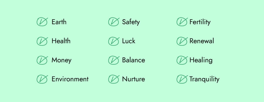
If you’re looking for a logo that’ll express safety, luck, balance, nature, balance, money and success, green is the color for you.

WhatsApp, the mobile messaging app, promises simple and secure messaging and calling. To convey those attributes to their audience, WhatsApp purposefully chose green, a color often used in the digital world.
Grab, the transport app, is another company that utilizes green’s attributes to send a message of safety to their audience.
Or take a look at Subway’s logo. The green logo is used to reflect fresh vegetables, encouraging their audience to view the fast-food chain as a place to grab a healthy, natural meal.
How to Combine Green With Other Logo Design Elements
When it comes to green logos, there are certain design elements that combine well and those that don’t.
Typography
Choosing the right typography in your logo could bolster your overall brand. The font you use in combination with green can be key to effective brand recognition.
There are 5 main font families, each with their own personality:
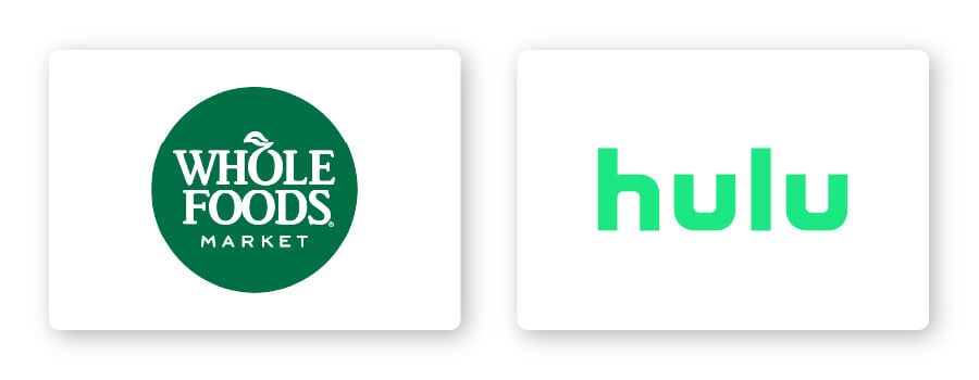
Serif –Great choice for brands that want to be seen as trustworthy, established, and reliable. Whole Foods’ font, for example, features rounded edges to evoke things made from the earth or by hand.
Sans-serif –Modern, easy to read and straightforward, sans-serif is a popular choice among start-up and tech companies such as Hulu.
Slab serif –Bold and impactful, slab serif fonts are frequently used by car and technology companies.
Script –Well-suited for businesses that want to express elegance and add a personal touch, such as photographers, coaches, or any family-owned brand.
Decorative – Loud, fun, and entertaining, these fonts are flexible enough to let companies decide which emotion to focus on.
Of course, these are just general rules, but by no means are they set in stone. Feel free to play around with different font combinations.
Shapes and icons
Different logo shapes can help forge a clearer emotional and psychological connection between your brand and consumers. It’s important to understand what each shape says about your brand and how you can effectively incorporate them into your design.
Circular logos paired with green are designed to be welcoming, symbolizing stability and balance (think Starbucks, Spotify, and Fiverr).
Abstract shapes also work well with green in logo designs (think Starbucks logo). Unlike other shapes, abstract logos incorporate recognizable shapes to form a logo with layers of meaning.
For example, Evernote, a note-taking app, uses a combination abstract logo design depicting an elephant. But there’s a clever hidden meaning: The corner of the elephant’s ear is folded over, in the same way people often fold the corner of a page to make note of what point they’ve read up to. The use of a green elephant as the main image calls back to the brand’s identity as an app that provides mindfulness, balance, and creativity.
In logo design, an icon is a symbol that conveys values and ideas that are immediately recognizable. Many brands choose to use animal logo icons because animal imagery can cement their values and characteristics in their audience’s eyes, such as the John Deere’s leaping deer.
The deer icon and color green paired together communicate the company’s drive for progress and prosperity, while also communicating their mission to build agricultural machinery that helps us take care of the earth.
Is a Green Logo for You?
Like I mentioned before, colors are subjective and there’s no right or wrong way to use green in a logo.
That being said, you should use green if it aligns with one of the messages/values of your brand. Or, you can use green to differentiate yourself from competitors’ logos.
If your brand falls under one of these industries, here are a few ideas for how to use green:





Green logos for tech brands
Technology has found a permanent place in our lives, and many of us have spent hundreds of dollars on everything from software to video games. If you’re in the tech world, consider using a green logo to help your target audience have peace of mind when using your product or service.
Green logos for environmental brands
Green is the color of life. It’s associated with nature and the earth, so it makes perfect sense for an environmental brand to choose a green logo.
If you take a look at many eco-friendly products on store shelves, you’ll see that almost all of them use green in their logo or packaging.
Green logos for food brands
As a food brand, one of the best ways to tell customers that yours is healthy, fresh, and nutritious is by using a green logo.
Take Tailor Brand’s user Pawcuterie Box as an example of a business that did just that. The goal behind @pawcuteriebox is to encourage pet owners to treat their furry friend in a fun and healthy way. By using green in their logo, customer’s will automatically understand that this is a brand that provides the “greenest” treats for pets.
Green logos for cleaning brands
Green is often used by cleaning brands since it’s associated with health and safety. From Scotch-Brite and Swiffer to Seventh Generation, many cleaning brands utilize the color green to signal to their customers that their products are healthy and safe to use.
Green logos for health and wellness brands
We automatically associate green with nature, which is why many health and wellness brands incorporate green in their logo design.
The owners behind Kief and Coffee faced a problem many of us encounter: Their love for coffee was being spoiled by caffeine-driven jitters. So, they decided to create a CBD-infused coffee to address the problem. Talk about having your cake (well, coffee) and eating it, too!
They knew they wanted a fun logo with a signature green frog. To create the perfect logo, @kiefandcoffee turned to Tailor Brands to create a fun design that fit their brand perfectly.
Green logos for finance brands
Because green is often associated with money, prosperity, and security, many financial companies take advantage of that in their logos. Some of the most well-known brands from the financial sector use green logos, such as Fidelity, TD Bank, and NerdWallet.
It’s important to note that no one color fits in a box. Take a look at what competitors in your industry are doing and if the color green is too commonly used. If it’s overdone, you might think of using an alternative color to stand out. But if it isn’t used enough, ask yourself if the psychology of the color will work for your brand before choosing it.
Color Combinations That Work With Green
Green can be pretty versatile depending on the colors you combine it with. Let’s take a look at some examples of green logo color combinations:
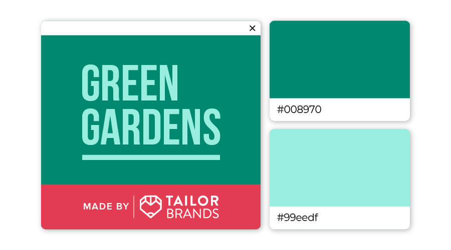
Deep jungle green is a color pervasive in the natural world that says renew, refresh, and regenerate. Associated with clarity of mind and creativity, turquoise is a color that encourages reflection and openness. This color combination will bring a sense of renewal and clarity to your brand.
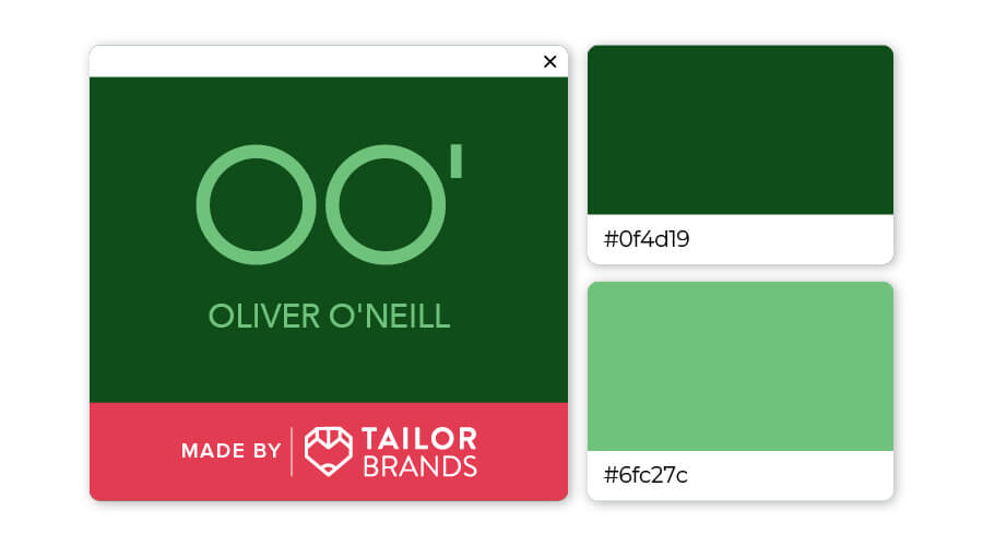
Just by its name alone, you know that the color forest green is reminiscent of nature. This versatile hue is associated with growth, and paired with a lighter seafoam green keeps it cool and fresh. The color contrast creates a logo that pops, attracting the viewer’s eye.
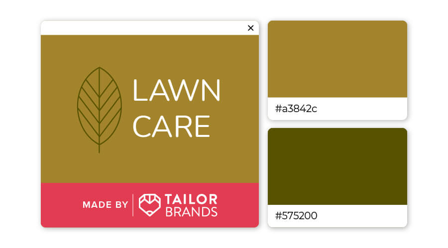
The earth tones brown and green always pair well together. Here the almost yellow-brown harmonizes naturally with a deep olive green. Together, the color combination tells customers this brand is one that promises balance, healing, and tranquility.
You can check out this video to learn more about how color psychology affects people and what it means for you when you’re ready to design your own logo (skip ahead to 2:12 to learn about green).
Over to You
We’ve seen that green conveys health, nature, safety, and balance, but combining it with other design elements can lead to an impactful and unique logo.
If you are considering green as a primary color for your brand’s logo, try out our design tool and start creating yours!
