Twitch is one of the largest and most popular live-streaming platforms for gamers. Each day around 15 million people log in to follow their favorite streamers as they shoot, slash, and punch their way to victory.
If you’re a Twitch streamer, you know how hard it can be to gain new subscribers. It’s a challenging and competitive environment. Everyone is vying for the attention of users, and there’s not much room to promote yourself.
When it comes to catching your audience’s attention and getting them to join your stream, your biggest asset is your logo.
Yes, your logo is small – but when designed correctly, it can pack a massive punch!
Go to any Twitch page, and you’ll see an endless list of streamers. The only thing that sets them apart is their logo.
To join the ranks of Twitch’s most successful streamers like Ninja, Tfue, shroud, Rubius, and xQcOW, you need a top-notch logo ASAP.
If you want to see more Twitch logos, check out our Twitch logo ideas page. Otherwise, keep reading to learn about what makes a good Twitch logo before we show you how to make one yourself!
A good Twitch logo needs to tick all of the below boxes. Otherwise, it’s like trying to bake a cake with one arm tied behind your back.
Easy to notice – Your Twitch logo is relatively tiny compared to other graphic elements like the snapshot of your live stream or game banners. This is why your logo needs to stand out from all the other visual elements around it. Having at least one bright color can help draw people’s eyes while they’re scrolling the page.
Entices users to click on your channel – Creating an eye-catching logo is one thing; getting users to click on your channel is another. You need to give your users a reason to watch you instead of someone else. You can do this by showing them what type of streamer you are or what kind of games you like to play. Often, a cool-looking logo that they identify with can be enough to pique their interest. As the wise Morpheus once said, “I can only show you the door. You have to walk through it”. Make that door look super enticing!
Adaptable – Your logo will show up in all sorts of places and on different screen sizes and devices too. It should be simple enough that it’s easily viewable when shown on small screens like smartphones, and agile enough so you can scale it to any size.
Unforgettable – The average Twitch user watches streamers 2 hours per day. To keep them coming back to you, create a logo that’s easy to remember!
Distinctive – Not only does your logo need to leap off the site and grab attention, but it also needs to stand out from similar streamers. Sometimes ignoring popular trends will help you make a more significant visual impact. If blue is the hottest trend, blaze your own path and use luminous green instead to be as unique as possible.
Relevant – You may have a fantastic logo designed by the hottest artists in the industry. Still, it’s meaningless if it doesn’t resonate with your audience. Ensure your logo does its job by using design elements that appeal to them. It’s tricky to balance simultaneously, but you need to be distinct to get the most out of your logo while also making it relevant.
Simple is good – Imagine your target audience is scrolling through the list of available live streams. The best logos are the ones that you can understand at just a glance. Twitch is like a packed shelf in the supermarket. Will shoppers walking down the aisle notice your logo?
Agelessness – We’re not saying your logo has to stay relevant for hundreds of years, but avoid following trends or jumping on the latest bandwagon just because it’s popular ‘right now.’ Trends come and go, but a fantastic logo is timeless.
Every Twitch streamer needs a great logo. Let’s talk about how to create one!
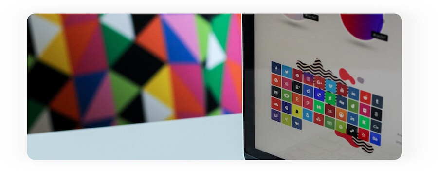
Here’s our cheat sheet to creating the perfect logo for your Twitch channel.
How do you know which design choices to make? Choosing random colors and icons is a sure way to fail.
It would be best if you based your choices on your future subscribers in mind. What kind of content are they looking for? What genre of games do they enjoy? And what type of streaming personality are they looking for? Work those into your logo design while retaining your own uniqueness.
The only way to know this information is by understanding who your audience is, what they like, and what they’re expecting to see.
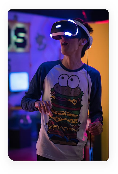
Icons are one of the best tools you can use to create a unique logo that send a message. Take a look at Twitch’s own icon. On the surface, it’s simple. But it tells people that you can chat and watch live streams simultaneously without using any text.
Now check out these other icons. Can you tell what they do just by looking at them? That’s the power icons have – but only when used correctly. An effective icon tells your audience something about your channel.
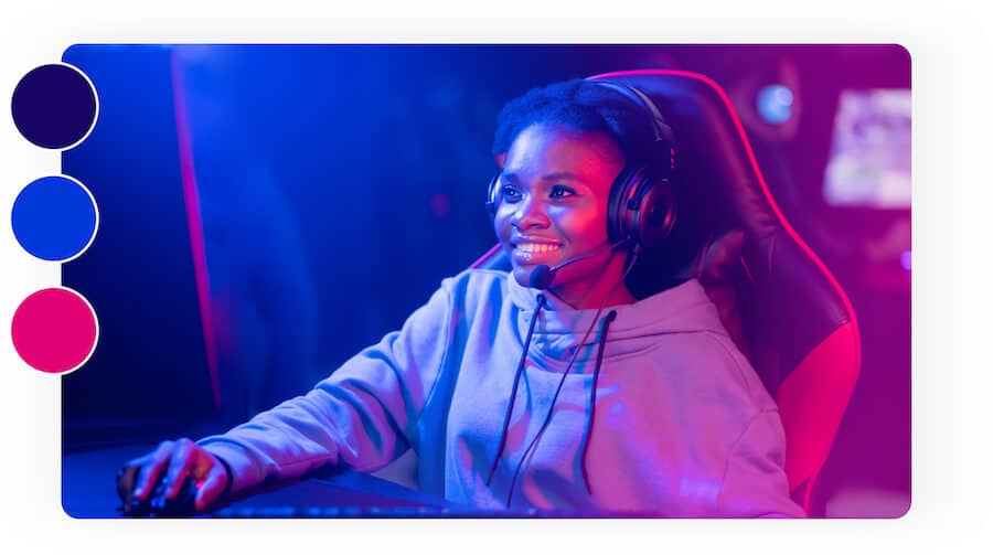
Logo colors play an important psychological role, and it’s one of the most critical choices you’ll need to make. Your color palette needs to be noticeable, resonate with your audience, and look visually appealing. Mixing a light color with a dark shade allows you to create contrast and gain attention. Stick to 1-3 colors at most, as using too many reduces your logo’s effectiveness.
Using fancy fonts may look good, but they can be hard to read on logos, especially when your logo is small. If you opt to use text on your logo, give it enough space to breathe and use a clean font that’s easy to read.
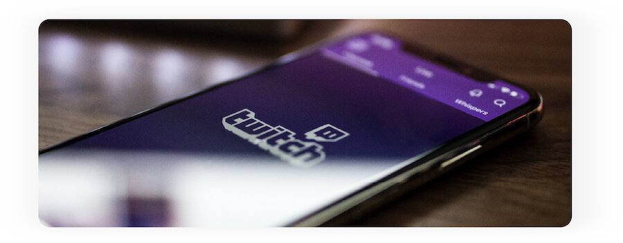
Along with a logo, Twitch allows streamers to create banners. These vast images are your most prominent graphical asset and shown on your profile.
The recommended size for your profile banner is 1200 x 480 px. That’s a lot of space, but don’t fall into the trap of cluttering it up with too many images, icons, text, and colors.
Your banner should complement your logo. Stick to the same color themes as your logo to keep your branding consistent.
Your banner and logo must work together to set your channel’s character in stone. Branding on Twitch is essential if you want your channel to succeed.
Usually, when popular brands or streamers have a distinct look, people will disregard similar-themed logos as copycats.
Ninja, the American video game streamer, is famous for his blue hair and blue-themed Ninja logo. Using Ninja as an example, it’s a bad idea to use the same shade of blue and feature Ninjas in your logo.
Instead, focus on what makes you unique, and stick to branding that helps you stand out from the crowd. Zero in on your individuality. Whether it’s your personality, looks, or favorite games, use it to your advantage.
Suppose everyone is using dark colors in their logos. In that case, you can infuse your logo with a bright color to instantly stand out. Many streamers are creating cartoon versions of themselves and using them as their logo. Don’t follow the herd – be unique!
Here are 6 amazing Twitch logos to help you brainstorm your own logo design.
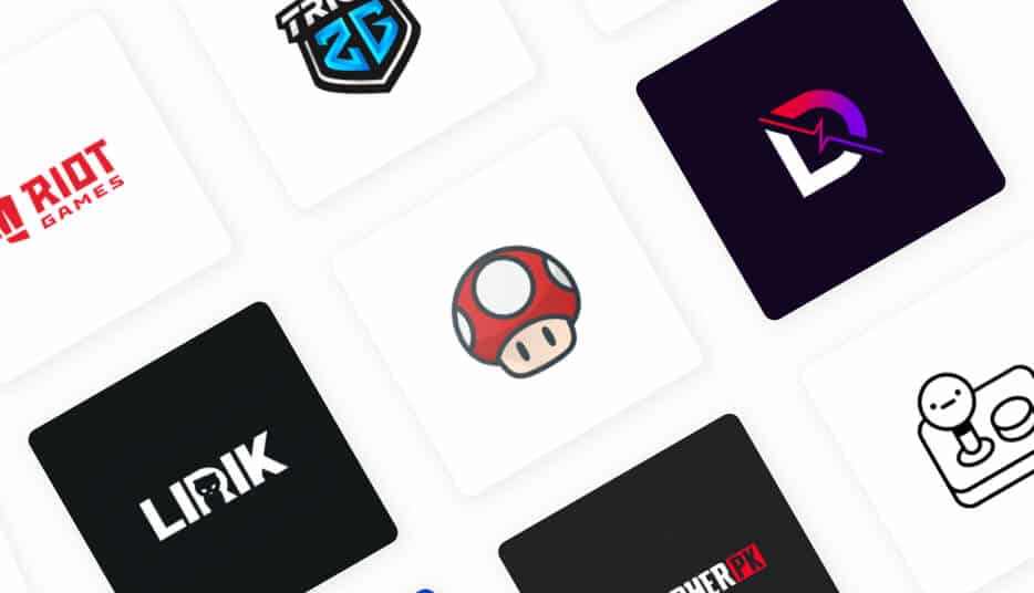
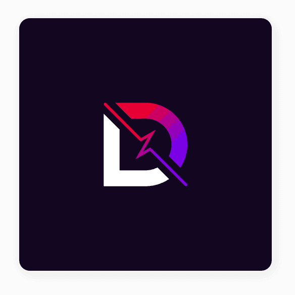
DrLupo makes clever use of a dark background to make his logo pop. The contrast between the white and red-purple gradient is very eye-catching. The heartbeat within the D shows his channel is alive and filled with action. His design allows users to spot his logo instantly.
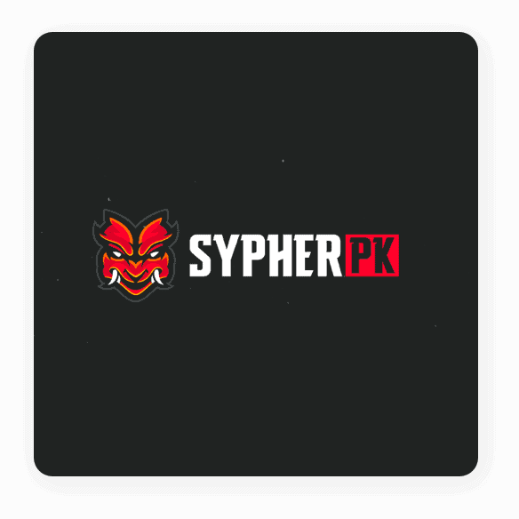
SypherPK’s iconic Shogun icon lets watchers know he’s an action-orientated streamer who doesn’t stray away from violence in player vs. player matches. Similar to DrLupo, the dark background allows his other elements to pop right out of the screen.
Instead of opting for a wide range of colors, Lirik has gone the minimalist route, showing that sometimes less is more. Lirik uses a silhouette to create his feline logo. It’s a unique idea and has served him well to help him gain millions of subscribers. In general, people love animals, like cats and dogs, and are drawn to them.


Another minimalist logo, Riot Game’s logo certainly ‘packs a punch’ and ticks all the right boxes. Its white-on-red color scheme stands out. It’s simple, it’s unique, it’s memorable, and it lets people know there’s plenty of action to be had!
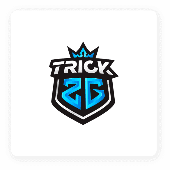
Trick2g’s emblem tells audiences that he’s focused on the sports part of e-gaming, which makes sense as Trick2g mostly plays League of Legends. It’s a competitive player vs. player game and not for the faint of heart. Using an emblem design lets Trick2g pack a lot of design elements into a small space. He’s crowned himself as the king and made space for his name, so everyone knows who he is. The light blue and white color scheme perfectly complements each other and helps him stand out from other streamers.

Ninja is by far one of the most popular streamers on Twitch. His blue Ninja logo has become iconic in the gaming world, and Fortnite has added a blue ninja as a playable character. The dark shading on the Ninja adds depth to give it a 3D effect, and the yellow headband is small but eye-catching.
Twitch has grown to become the go-to place for gamers to live stream, and boy, is it a competitive landscape. You need all the help you can get if you want to grow your channel.
Whether you do it for fun or to make money, a great logo could mean the difference between someone checking out your stream or ignoring you for someone else.
With the tips and advice on this page, you have the knowledge to level up your Twitch logo, so it benefits you instead of slowing you down.
This portion of our website is for informational or educational purposes only. Tailor Brands is not a law firm, and the information on this website does not constitute legal advice. All statements, opinions, recommendations, and conclusions are solely the expression of the author and provided on an as-is basis. Accordingly, Tailor Brands is not responsible for the information and/or its accuracy or completeness. It also does not indicate any affiliation between Tailor Brands and any other brands, services or logos on this page.
Products
Resources
©2025 Copyright Tailor Brands