To start a successful business, you need a strong focus and vision. Kodak founder George Eastman had such a vision for his company: To make photography “as convenient as the pencil.”
It’s safe to say Eastman’s hard work and determination paid off. Kodak heralded the modern era of consumer photography and film.
Kodak’s success lies in their picture-perfect branding, specifically, their logo. In this post, we’ll look at how Kodak’s logo transformed over the years into an instantly recognizable, iconic symbol.
A Brief History of Kodak
Kodak began selling cameras in 1888 for $25. It was advertised with the slogan, “You press the button, we do the rest.” For the first time ever, the public had access to easy-to-use and low-cost photography.
Interestingly enough, Kodak has no special meaning. Eastman said, “The letter ‘K’ had been a favorite with me—it seemed a strong, incisive sort of letter.” Fair enough! In 1888, he trademarked the name “Kodak,” a meaningless word that went on to develop its own definition.
In 1969, Kodak produced the camera astronauts on Apollo 11 used on the moon. And, the first ever photo of Earth taken from space was captured with Kodak hardware.
Despite all their inventions and successes, Kodak didn’t focus enough on digital photography and was overtaken by other brands like Nikon and Canon. Regardless, we have Kodak to thank for paving the way for the photography and film industry.
Evolution of the Kodak Logo
The Kodak logo we all know today didn’t always look like we now know. In fact, you’d probably not even be able to tell it’s from the same company! Let’s check out the evolution of Kodak’s logo from 1907 to the present day.
1907
Created in 1907, the first Kodak logo was a lettermark with the initials EKC (Eastman Kodak Company). The letters were enclosed in a circle, symbolizing authority and timelessness. At that time, government stamps were circular. Kodak wanted to express a similar feeling of dominance in the market by using a circular design.
That being said, it wasn’t a great logo. The main reason being that the design was assembled without much thought or with any kind of branding concepts in mind.
1935
In 1935, the Kodak logo underwent major design changes. Their now iconic color palette (yellow and red) was first introduced at this time. As you might know, colors have meaning and can stir up emotions.
Red is a color that evokes feelings of energy, passion, excitement, and comfort. Another warm color, yellow expresses friendliness, cheer, positivity, and happiness.
This color scheme was not an accident but rather an intentional move to connect the company with their audience. People usually take photos to capture a happy moment, like a family reunion or graduation, Kodak decided to use red and yellow to express those emotions.
The second thing that changed was the shape of the logo. Kodak said goodbye to the classic circular design and opted for a landscape shape, which was trendy at the time.
1960
In 1960, Kodak decided to toss out the conventional rectangular shape and replaced it with a triangle. The new shape was meant to give a new and unique look to the logo, which it definitely did! This major change in the design gave the whole logo a fresh look.
Every logo needs a unique feature to take a design from good to outstanding. That feature was a curled corner for Kodak. The curl added a touch of depth that was otherwise missing from the logo.
1971
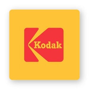
The Kodak team decided to go with yet another logo shape during their ‘70s redesign. They completely removed the triangular shape and replaced it with a square box, which continues to be part of the business’s symbol to this day.
Different shapes can create emotional and psychological connections between a brand and their target audience. By choosing a square shape for their logo, Kodak conveyed feelings of professionalism, strength, and stability. Kodak was a well-established company in the photography industry during the ‘70s, so their logo only helped drive that message home.
If you look at the red box, you’ll notice that there’s a carved out yellow arrow that makes the image look like the letter ‘K’ for Kodak.
1987
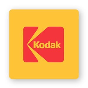
When the company changed its logo, this time they decided to make some much-needed update to its font. You might’ve noticed the earlier versions used a serif font, which made the logo feel as if it was stuck in the past.
Fonts have meaning; serif fonts are popular with companies that want to display traits such as tradition, respectability, and reliability.
Kodak decided to step away from the conservative vibes of serifs and went with a sans-serif font. The entire look got an upgrade with just that change. The new Kodak logo had a modern look and feel that spoke to the changing times.
2006
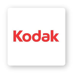
When the 2000s rolled around, Kodak went with a totally different look. No more rectangles or squares, the new logo featured just the company name in a sans-serif font framed with 2 thin yellow lines.
The only thing that remained the same was the company’s red and yellow color palette. This logo leaned into minimalistic design principles by trying to say a lot with the least amount of design details.
2016
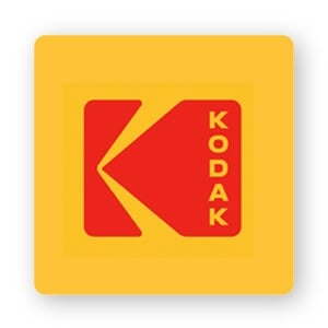
In 2016, Kodak needed to renew its brand to increase its relevance and value. The company was beginning to launch products aimed at reintroducing the brand to a new generation of creators. The brand needed to find a way to find a way to remain relevant in the minds of consumers.
Kodak Chief Marketing Officer, Steven Overman, said, “I don’t think of what we’re doing as ‘bringing back’ the iconic identity of Kodak, because in people’s hearts and minds, I don’t think it really went away….The latest iteration needed to feel fresh, yet classic, yet sit harmoniously alongside a range of logos that you still see on signage and packaging around the world. Our goal is to amplify what is already memorable and resonant around the world.”
Kodak didn’t want to replace its iconic brand with something completely foreign and instead chose to incorporate its long history into its new design. Ultimately, the design they went with wasn’t all that different from the 1987 redesign – except this version of the logo is written vertically in all capital letters.
Over to You
Though Kodak isn’t the household name it once was, there’s still a lot for us to learn from its logo evolution.
When you’re thinking about designing your own logo, remember that there’s a specific audience who you’re trying to reach with it. Down the line, you may need a change if your target customers aren’t responding well to your business.
At the same time, if it isn’t “broken” – don’t fix it! Check that your colors, font, and shape support the message that you want to send, and make sure to use your logo consistently wherever your business shows up.
