When people think of denim jeans, they automatically associate them with Levi’s, and vice versa. Levi’s has cornered the denim market since what feels like forever, and their iconic logo is recognized worldwide–for their 2-horse icon, red tag, batwing logo, and Arcuate Design stitching.
But Levi’s logo didn’t always look like the one we know and love today. In fact, Levi’s logo has gone through 8 redesigns over the years!
Read on to discover the full history of Levi’s logo.
Denim pants had been around as workwear for many years, but when did they become a staple in the American fashion lexicon?
It all started in 1853 when Levi Strauss, a Bavarian merchant, moved to San Francisco to begin a West Coast branch of his brother’s dry goods wholesale business. As his business grew, Strauss made a name for himself as a well-respected businessman. One of his customers was a tailor named Jacob Davis.
A woman asked Jacob to make a pair of pants her husband could labor in and wouldn’t fall apart. Jacob came up with the idea to put metal rivets at points of strain, like pocket corners. These riveted pants took off and Jacob asked Levi Strauss to patent the product together. They received the patent on May 20, 1873, and just like that, jeans were born.
Levi’s logo has undergone 8 redesigns over nearly 150 years. Some updates were minimal, while others took a daring approach. Let’s take a closer look at Levi’s logo journey.
Before Levi’s was called Levi’s, it was called the 2 Horse Brand. (In fact, Levi’s wasn’t the company’s official name until 1928.) Levi Strauss & Co.’s patent would expire in 1890, so they needed a way to build a reputation that their jeans were good quality, strong, and dependable. More importantly, they needed to express that to consumers in a quick and easy-to-understand way.
They landed on a logo image of 2 horses pulling in the opposite direction on the same pair of jeans attempting to rip them in half.
The image was meant to serve 2 purposes. First, it demonstrated the quality and strength of their jeans and became a recognizable branding element. Second, many consumers didn’t speak English as their first language and not everyone in the West was literate.
Strauss & Co. knew they needed a memorable image so that consumers could go into a store and ask for the pants with the 2 horses, and they’d get a pair of Levi’s jeans.
You’ll notice that this new logo shares virtually nothing in common with the previous one except the name. This logo is a stripped-down, minimal fuss design, which might’ve been the point. Levi jeans were in high demand in the 1920s, and so the 2-horse image was no longer necessary.
They ditched the monochrome color scheme and went with a soft tan background that allowed the bright red to pop. The redesign threw away everything but the name Levi Strauss, leaving out the “& Co.” Even the typography was changed, opting for a bubble-like text with rounded edges and nearly no kerning (the space between the letters).
By the 1930s, though popular, jeans were confined to the working class (cowboys, lumberjacks, and railroad workers) of the West. Levi’s jeans were first introduced during the dude ranch craze of the 1930s when vacationing Easterners brought home Levi’s pants. World War II also promoted blue jeans, which were declared an essential commodity and only sold to people working in defense.
This logo redesign is historic in that the brand dropped Strauss and began using the abbreviated name of the company. As competitors began copying Levi’s jeans and their iconic Arcuate stitching, the brand decided to sew a little red tab (legally known as Tab Device) into the back pocket seam to distinguish them from imitations.
This might have inspired the new logo redesign color scheme. The navy almost black blue text and bright red background command attention. The block text conveys an immovable structure that incites confidence and strength–a fitting redesign for the time!
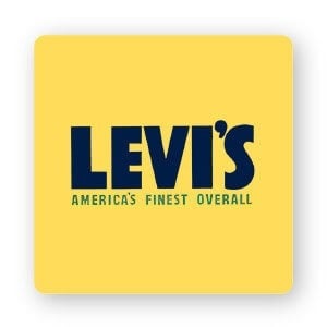
In this logo redesign, Levi’s stuck with the bold, confident typography, but this time with an all-caps sans-serif font. There’s also more kerning–giving the logo more breathing room and a comfortable, laid-back feel. Interestingly, the company swapped red for yellow and green, emphasizing the relaxed vibe. The only thing they kept was the tagline “America’s Finest Overall.”
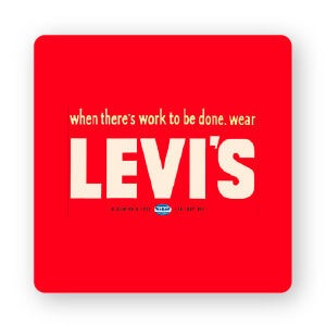
In 1949, after World War II, Levi’s redesigned their logo yet again. This time they brought back the red color scheme and kept the all-caps sans-serif font.
If you look carefully, the only thing that changed in the font is the apostrophe; it took on a geometric shape as opposed to a circular, soft shape previously used. You might also notice the ‘S’ is less fluid in this design. Additionally, the company changed their tagline from “America’s Finest Overall” to “When there’s work to be done, wear Levi’s.”
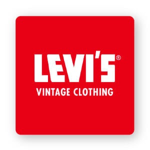
Between the 1950s and onwards, Levi’s jeans became popular among subcultures, including rockers, hippies, and greasers. That could be a potential reason why this font worked for the time. The letters were sharpened and smoothed; the red and white color scheme was made even brighter.
The brand yet again adopted a new tagline: “Vintage Clothing,” written in a simple all-caps, sans-serif font.
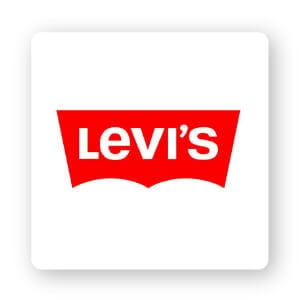
Around 1967, Levi’s was refreshing its image. Famed brand designer Walter Landor (best known for Coca-Cola’s script) worked on Levi’s redesign. This logo’s batwing shape mirrored the Arcuate stitching on the jeans’ back pockets.
In 1971, Walter Landor & Associates suggested the brand change its all-caps logo by having the ‘E’ lowercase. The refreshed image made for a youthful, timeless feel.
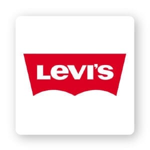
For about 34 years, Levi’s logo was unchanged, until 2003 when it underwent minor tweaks. They decided on a dark red background and reduced the height of the text. All the identifying features of the brand’s long history remain.
What’s remarkable about Levi’s logo is their ability to capture their long history and modern style. The iconic brand is around 169 years old; it thrived as a company due to their continued innovation and high-quality product, and the red and white batwing logo has come to symbolize strength, durability, and timelessness.
What’s the takeaway for you? Levi’s logo is unique, clean, modest, and noticeable, and it works because it’s readable, versatile, memorable, and timeless. So, when you’re thinking about creating your own logo, try to instill those qualities into your own design!
This portion of our website is for informational or educational purposes only. Tailor Brands is not a law firm, and the information on this website does not constitute legal advice. All statements, opinions, recommendations, and conclusions are solely the expression of the author and provided on an as-is basis. Accordingly, Tailor Brands is not responsible for the information and/or its accuracy or completeness. It also does not indicate any affiliation between Tailor Brands and any other brands, services or logos on this page.
Products
Resources
©2025 Copyright Tailor Brands