When we think about logos, we often imagine huge corporations and big-name brands. But logos are just as important for freelancers like you as well.
A logo is a visual reference that invites prospective clients to explore your offerings, a critical step for the growth of your business.
Whether you’re in tech, graphic design, consulting, or bookkeeping, you’ll need a logo that speaks to your target audience. As the face of your business, your logo is the reference point for everything your freelancing business stands for and offers.
Designing a logo for your freelance business can make a big impact on your growth and success. In this post, we’ll cover freelance logo design tips and inspiration so you can get started making your own!
While there isn’t a set list of rules when it comes to designing a freelance logo, there are best practices you can follow to ensure you nail the perfect design.
Here are 5 freelance logo design tips to keep in mind:
As a freelancer, you must distinguish your products or services from competitors in the market. To do that, you need to sprinkle some personality into your logo.
By adding a dash of your personal touch to the design, your logo will showcase your unique characteristics and create an instant connection with your target audience.
People automatically respond to authenticity, which in turn creates strong consumer loyalty and a community where you can promote your freelancing services.
Incorporating your name in your logo is a great and simple way to add a personal touch. You can include your name with a signature-style logo (think Walt Disney), wordmark (FedEx), or initials (BMW).
You can also experiment with signature style fonts to take your logo design up a notch. You may want to consider hand-drawn lettering to be sure your logo looks different than anyone else’s.
An icon-based logo is a symbol that reflects your business uniquely and recognizably.
There are a few different types of icons, including abstract, geometric, pictorial, crests and emblems, interactive, and custom. Each type has its own meaning and purpose.
Try to find an icon that represents your freelance business, but be careful not to use overly-used symbols. For example, if you’re a writer, you might consider a writing instrument like a pencil. But that’s rather obvious and a bit generic, right? Instead, what do you offer that is unique? Maybe your specialty is editing, in which case you could choose an eraser or delete button icon.
The options are limitless! However, make sure your creativity didn’t take the icon in an unrecognizable direction.
Also, if you’re a skilled artist, you might consider creating a logo sketch yourself!
Colors influence our perception and evoke certain emotions, even if we don’t always realize it on a conscious level. Your logo’s color scheme depends on the message you want to convey to your target audience as well as industry best practices.
A doula, for example, would pick a color scheme like yellow (to convey happiness and positivity) and blue (to inspire a sense of calm and wisdom). Meanwhile, a financial advisor might go with a more conservation color scheme like black and white.
Again, always think about ways you can add your own personal touch.
Great logos should be seen from a distance and stand out from a crowd without being over-the-top extra.
Trust me when I say the best logos are simple. Clients want to work with an established professional who takes their work seriously.
As the face of your freelancing business, your logo design immediately tells prospective clients what kind of professional you are. If your logo is tacky, excessive, or just lacking, it will be a negative reflection and tarnish your reputation.
The key is to carefully design a freelance logo that matches your skills and profession in a simple, easily recognizable way.
Are you ready to begin designing your own freelance logo but need some inspiration? Say no more!
Below, I’ve curated logo designs from some of the most popular industries, all made with our logo design tool.
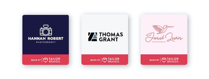
Whether you do nature or wedding photography, your logo is important for attracting and retaining clients. Most people in the market for a freelance photographer are just looking for the best deal. But having a strong logo will set you apart from the others and leave a lasting impression in client’s minds.
Nature photographers might choose a straightforward font and imagery like a mountain range or birds. Or if you’re an outdoor adventurer, you would pick something more bold and cool like a pair of hiking boots or a trekking pole icon.
On the other hand, wedding photographers often use script fonts and floral icons to convey the softness and emotions associated with weddings.
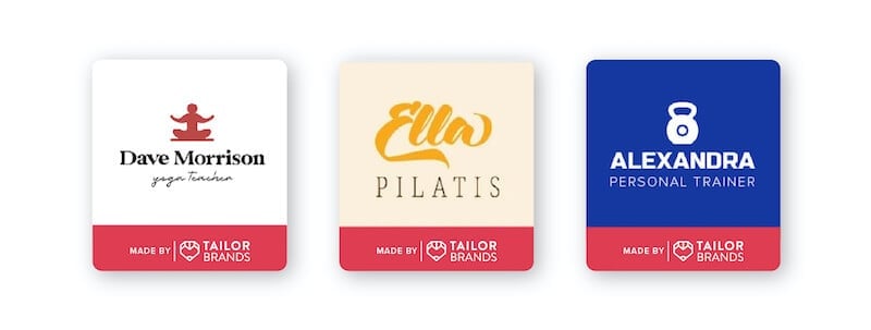
While most fitness regimens are taught in similar ways (hey, you can’t reinvent squats and lunges), every instructor has their own style. Bring that uniqueness into your freelance personal training logo design!
Pilates instructors may choose a calming color scheme like Ella Pilatis’ light yellow and orange. Weight trainers, on the other hand, want to convey a no-nonsense, let’s do this vibe through their logo, which Alexandra’s strong blue color palette does perfectly.
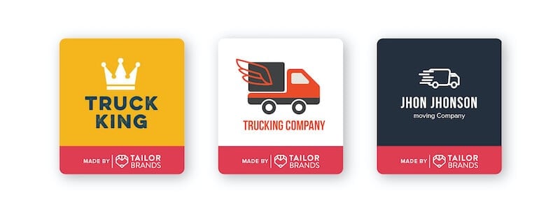
Your moving business needs a solid logo that lets customers know you’re trustworthy and reliable.
You’ll often see mover’s logos with an icon representing their service. If your moving service promises speedy, reliable delivery, you’d want to show some movement to your design. You can do that by adding cleverly placed lines that show your icon in motion.
When it comes to typography, you want your font to be as strong and dependable as your moving services are. Many movers prefer large block letters to be seen from near or far. You can go with a bold sans-serif font or try out a heavy-weight serif font.
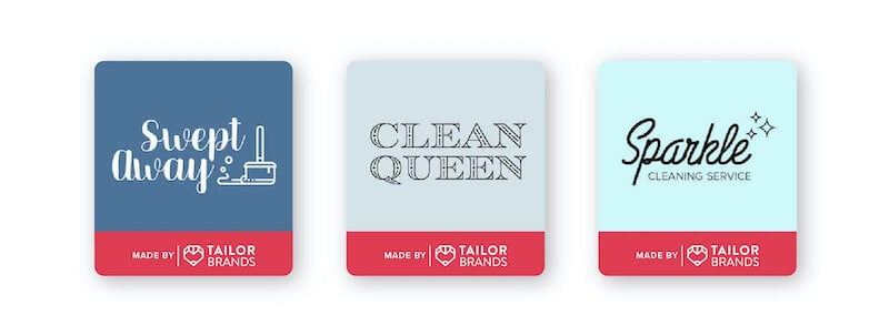
The best way to make a name for your cleaning service is through a spotless logo. A simple, clean-cut logo will tell customers you’re the one for the job.
Icon-based logos can be useful to visually explain what type of cleaning you do. If you offer car washing services, then you could use an icon related to the auto industry.
An icon can also reflect values your business offers. Take a look at Sparkle’s cleaning service logo above. The diamond icons indicate the business’s promise to leave everything in sparkling condition.
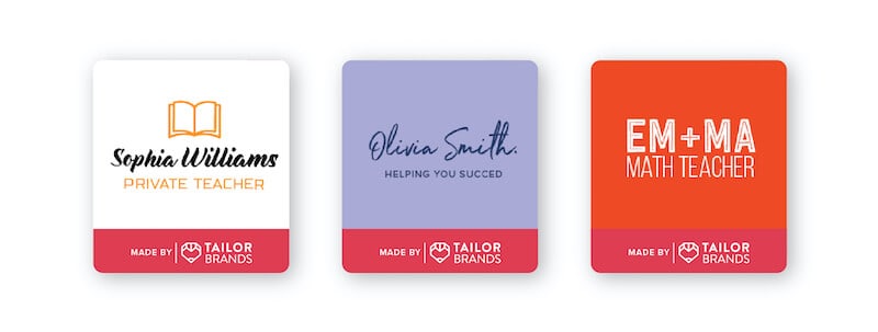
How does a tutor tell clients they’re a good teacher, smart, capable, and patient without saying a word? By designing an A+ logo!
The color scheme you choose is widely dependent on the subject matter and age group you tutor. If you tutor middle schoolers in math, you probably don’t want a dull black and white color scheme that’ll put them to sleep before you even get to multiplication! Just take a look at EM + MA Math Teacher’s bright and fun color scheme.
Now, if you tutor adults in French, then you might want to go with a more sophisticated color scheme such as light pink and black.
The same rules apply to the kind of font you choose. Going back to the French tutor example, a script font would fit perfectly.
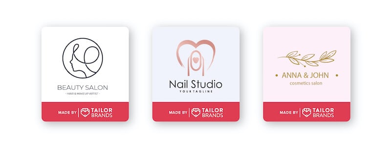
Whether you offer nail, hair, makeup, or cosmetic freelance services, a beautiful logo will attract customers to you. With the right design, you’ll be able to communicate what you offer and how it makes people feel.
An icon will help people know what your business offers. If you’re a nail artist, an icon of a polished hand or nail polish bottle would do the trick. If you make all-natural body lotion and oil, you can use a female silhouette, flowers, or circular, delicate shapes. When paired with the right color palette, it’ll be clear what kind of service you offer.
Many beauty brands choose a great font to be the primary focus for their logo, Fenty Beauty, Bobbi Brown, and Revlon being a few. If you go this route, make sure you tweak it a bit to make it stand out. You might adjust the kerning (the space between letters) to spread the word out or crunch it all together. Or you could flip letters just like Fenty Beauty did.
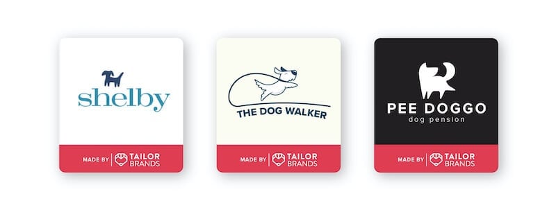
If you’re a dog walker, you know that dog owners have a hard time leaving their furry friend in the hands of a stranger. Dog owners want to know they’re leaving their pet with someone trustworthy, dependable, positive, and friendly!
You can express those traits through your logo by choosing the right icon, font, and color. Shelby’s dog walking service logo gives off professional vibes. And you can’t go wrong with a simple silhouette of a dog! Both the navy blue and teal express trustworthiness and confidence. Overall, Shelby’s dog walking logo instills a sense of calm and comfort for prospective clients.
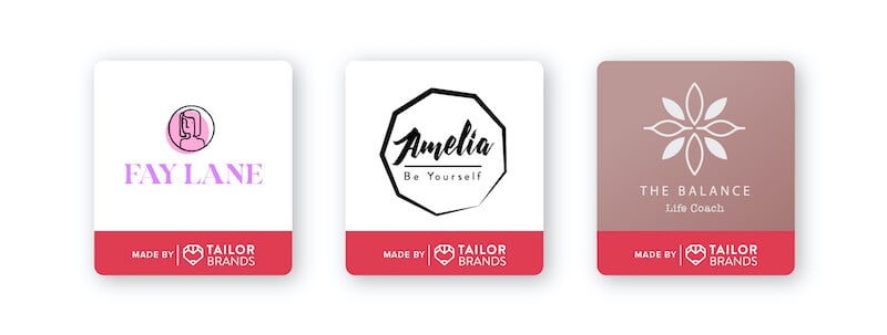
As a life coach, you help people improve their relationships, careers, health, wellness, and day-to-day lives. You’re a support system and a motivator using your skills to help clients achieve long-lasting change.
But potential clients don’t know if you’re the right life coach to help them achieve those things. They infer it from your logo and decide on the spot if you’re the one to help them. Design a logo that catches their eye and encourages them to trust you to be that person for them.
There are certain characteristics you must possess as a life coach: Patience, positivity, non-judgemental, observant, and inspiring. Express those qualities through the elements in your logo. You can choose uplifting colors like pink (check out Fay Lane’s bold pink color scheme) or grounding shades of brown and green (see Amelia’s logo).
In this field, you can use icons such as Fay Lane’s outline of a woman; also feel free to play around with circular shapes.
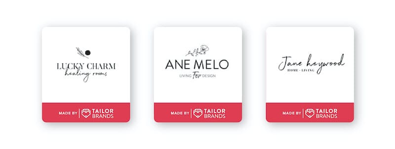
Home organizers help declutter and arrange spaces to create a sense of calm and structure. As such, your logo should be simple and clean to convey a sense of calmness and order.
As a professional organizer, you know not to clutter your space—the same goes for your logo design. Opt for a minimalist approach using a simple icon or font. The outline of a house, coat hanger, grid-like shapes—any icon that reflects structure and neatness is a good option.
To enhance the organization, go with a simple color scheme. Natural colors like brown, green, and blue are refreshing and create a sense of peace. If a more striking design suits your personality more, use a bright background color to draw attention to your logo.
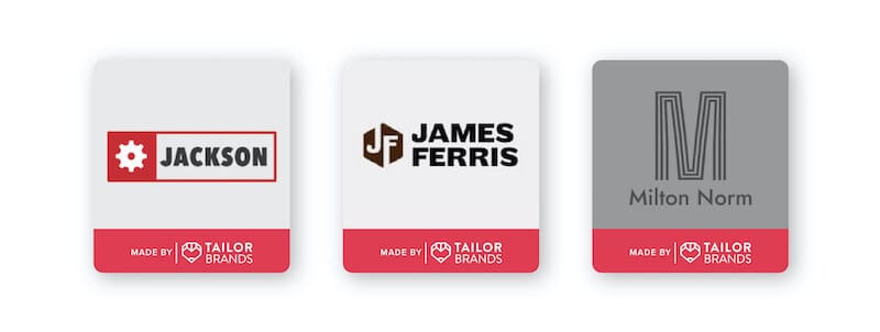
As a freelance handyman, you require a strong logo that will lay the foundation of your business. Your logo design must communicate that you’re the right one for the job.
When potential clients see your logo, it should tell them that you know what you’re doing. But, most importantly, your logo should instill a sense of trust. Considering that most times you’ll be working in a client’s home, you want them to feel at ease. The best way to do that is from the first impression they get when they see your logo.
As a handyman, there’s something to be said for a good, old-fashioned quality logo. Choose a traditional emblem to show clients that your business holds old-fashioned values like integrity and hard work.
You can be an exceptional freelancer with excellent samples and reviews, but if your logo is poorly designed, people might not bother checking out your services. On the other hand, a well-designed, unique logo can inspire your target audience to explore your work.
An eye-catching, aesthetically pleasing freelance logo immediately boosts trust and credibility and marks you as a professional in your field.
This portion of our website is for informational or educational purposes only. Tailor Brands is not a law firm, and the information on this website does not constitute legal advice. All statements, opinions, recommendations, and conclusions are solely the expression of the author and provided on an as-is basis. Accordingly, Tailor Brands is not responsible for the information and/or its accuracy or completeness. It also does not indicate any affiliation between Tailor Brands and any other brands, services or logos on this page.
Products
Resources
©2025 Copyright Tailor Brands