When you make a logo with Tailor Brands Logo Maker you get access to the editor studio in which you can tweak and customize your logo.
And, when looking at the studio, we’ve noticed that a lot of our users tend to have similar habits when tweaking their logos – some of which go against design best practices.
Because these logo design mistakes are pretty common, we spoke to our Chief Designer, Tom, and asked him how to get the most out of the Tailor Brands Logo Editor in order to make the best logo to represent your brand. Although we’ll be referring to the Tailor Brands logo editor throughout this post, these rules can apply to anyone who is trying to make their own logo.
Read on for Tom’s advice on 8 ways not to use the Tailor Brands logo editor, and what to do instead to create a logo that stands out.
1. Too much opacity
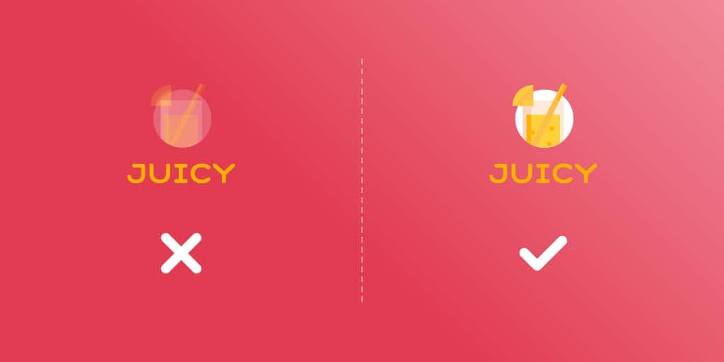
An invisible logo does not a strong logo make. Yet, we often see barely-there logos that can hardly make their mark, because they’re almost impossible to see!
Logos are meant to make a snappy first impression for your company, one that your audience will easily be able to see with just a quick glance. And, the last thing you want to do is create a logo that frustrates your audience, or asks of them to do any extra work.
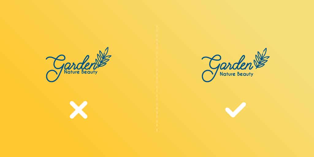
However, a logo that’s too opaque (see-through) can’t be registered in a blink of an eye – it forces your audience to do a double take, and not in a good way.
When playing with your logo opacity, it’s okay to tweak it slightly one way or another; that said, make sure your logo is sturdy, clearly visible, and can be easily seen on any background.
2. Too many fonts
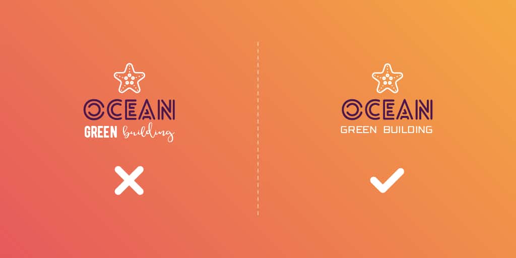
We’ve spoken about the right ways to pair fonts before, but it’s worth repeating here for anyone trying to design their logo.
Fonts should never come in fours or fives, and your logo definitely is no exception to that rule. In fact, your logo should have a maximum of two fonts – one for your business name, and the other for your tagline.
No exceptions.
This is because every font has a certain mood that they bring to the design table, and using too many fonts automatically confuses this mood.
Notice how the first logo here looks like it has three distinct features – Ocean, Green, and Building. Can you take away a message from this design? I know I can’t. In contrast, the logo to the right tells me that “Green building” as a whole is helping to describe the company Ocean, because of the way the fonts complement one another.
When pairing fonts, always try to stick with two that contrast enough from one another that your audience can easily tell the difference between them, but that still give off the same feeling and vibe.
3. A tagline that’s bigger than the name of your business
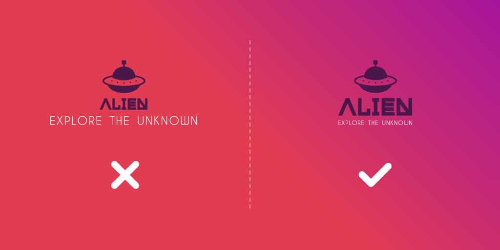
A tagline is meant to enhance your logo, in that it tells your audience a little something extra about your business.
Whether you choose to have a tagline in order to showcase the value of your business or explain more about what your company does, it’s not the main event.
I repeat: The tagline is not the main event of your logo.
Yet, we often see designs that all but swallow the logo itself, because the tagline takes up so much space on its own.
According to principles of design hierarchy, we tend to perceive objects that are bigger as more important; for example, we always read the title of a text first, and only then continue on to the body. And, the last thing you want is for your audience to think your tagline is actually your logo name – like “Explore the Unknown” looks in the top-left logo.
Remember that it’s perfectly fine to have a tagline that’s smaller than your logo – in fact, it’s usually preferable. But, once a tagline gets bigger than your business name, it’s probably time to rethink your design from scratch.
4. Disproportionately large icons
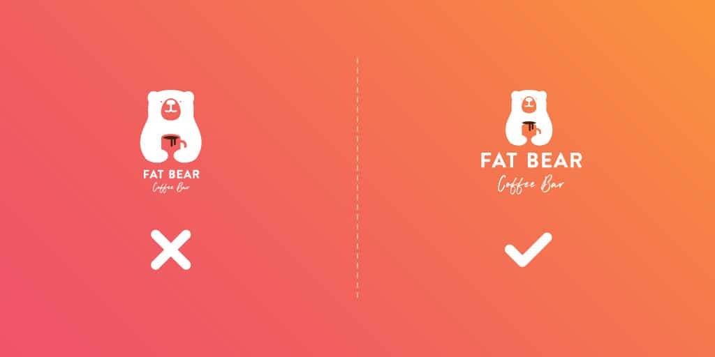
Again, you want to achieve harmony between the different elements of your logo – including your icon.
However, if you’re using a name-based logo, then your logo name will carry a lot of weight. It’s the thing your audience will most remember about your brand, while your icon tells your audience something more about the logo (just like your tagline).
Ideally, your audience will eventually come to associate your icon with your business name, but that’s only going to happen if each element works together.
In this vein, your icon should support your logo without overwhelming its design. And, icons that are larger than the business name take up too much space, and they’ll make it really difficult to resize your logo on smaller surfaces (such as on business cards or social media posts).
However, if you’re hell-bent on playing with your icon, a cool thing you can try is to take an icon, enlarge it, and then put your logo name inside.
And, voila! You have a proportional logo with a cool, icon-like border.
5. Elements that are too close together
For the eye to properly scan your logo, it needs a little room to breathe so it can process what it’s seeing.
But, when an icon is stacked on top of a business name, and they’re both being carried by a tagline, there’s no chance that any breathing is taking place! As you can see with the top left logo, the tagline is being swallowed by the logo name-icon combination – making it difficult to get a clear picture of what the logo is trying to say.
When designing your own logo, make sure to space out the elements enough that each stands on its own.
If you have trouble picturing the proper spacing, try to close your eyes for a few seconds to give yourself “distance” from the logo. Then, as you open them, look at your logo like a new visitor would; if you can’t immediately distinguish between each part of your logo, you’ll know the elements are too close together.
6. Elements that are too far apart
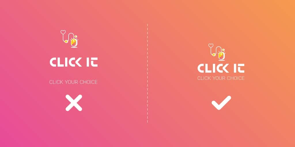
This seems unfair; didn’t I just say that your logo elements shouldn’t be on top of one another?
Yes, and I stand by that claim.
However, we often see logos that have elements dragged all over the page – the icon on the top left corner, a tagline hiding at the bottom, the business name somewhere in the middle – and these logos almost never send a message.
Instead, they’re confusing to look at, and they take the eye way too much time to scan (like using too much opacity).
While spreading the design out like that may seem to give all of your logo elements a lot of weight, what it actually does is ruin the cohesiveness of the design. Just look at the Click It logos above; which one helps paint a united picture? My money is on the second one.
Try to have a little white space between each design element in your logo, so that all of the parts are equally distant from one another – but don’t go overboard! Make sure that it looks like one, unified design, rather than a bunch of random elements scattered on the screen.
7. Kerning that doesn’t work
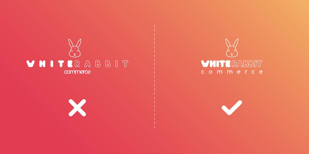
For those who don’t know, kerning refers to the spacing between letters. Higher kerning refers to letters that are further apart from one another, while lower kerning is when letters are closer together.
In both cases, extreme kerning is a no-no! When your logo letters are too close together, it’s going to be difficult for your audience to read the logo name at all.
That said, too much spacing, like in this commerce store’s logo on the left, is aesthetically jarring and throws off the whole design. It also demands that your audience works to read your logo from start to finish, and you never want to design a logo that could potentially turn your audience off.
So, how do you find the right balance?
When you’re in your logo editor, you can tweak your logo’s kerning by clicking “Type.”
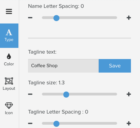
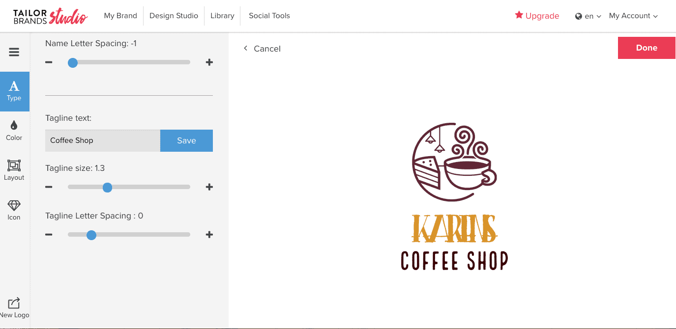
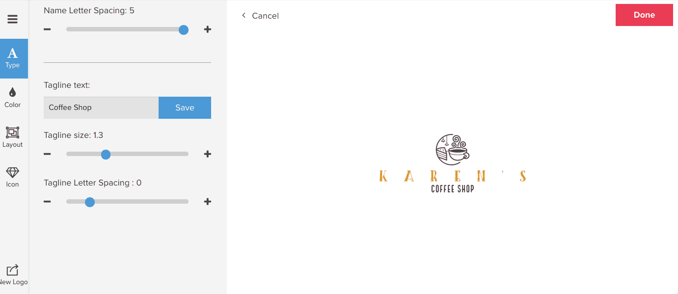
Then, adjust the Name Letter Spacing as you need by clicking the blue circle and dragging it to the right or left.
The best way to have a balanced logo is to keep that blue dot somewhere in the center-left, between 0 and 2. You’ll also want to adjust the Tagline Letter Spacing, so that your tagline’s spacing mirrors the kerning of your logo name.
8. Wrong shapes at the wrong time
As you may know, using simple geometric shapes with a vivid color palette has become a popular logo design trend – one that’s probably here to stay.
And, we’re excited that our logo editor now has the option to add shapes to your logo!
However, we often see logos that are overwhelmed by their shape, so much so that the original message of the logo gets lost.
So, when should you add shapes to your logo?
There are two rules of thumb: Shapes look best if your logo’s name isn’t too long, and when they enhance your logo’s message.
Remember, you’re trying to paint a cohesive picture of your brand and company vibe. That can work well when a shape brings this picture together, but not if the shape takes over the design – or if the shape has the wrong personality for your brand.
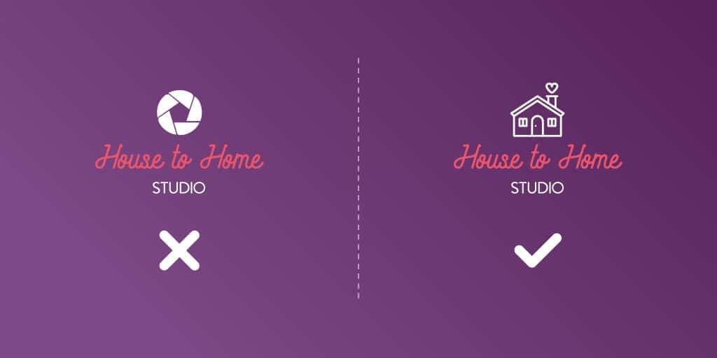
Neutral shapes like circles are generally more versatile, while shapes with jagged edges or complex patterns have a stronger vibe.
That said, as you can see in the real estate logo above, the more neutral shape on the left side doesn’t serve the logo it’s representing; this type of logo needed something more specific, like the icon on the right.
Over to You
When designing your logo, remember that the most important thing is your audience. How will they react to your logo? What will they understand from its design? Are each of the elements working together in a way that speaks to them?
As you play with your logo’s layout, tweak fonts and adjust its size, try to keep your message at the forefront of the design.
