Once you have a logo, you’re going to want to use it on all your branded material. There are 3 options as to where you can place your logo: Top left, top center, or top right.
According to UX best practices, your logo belongs in the top left corner of a page. However, many brands have gone against the grain and placed their logo in top right corner. Wild, right? It all depends on where it’s being used, but don’t worry, we’ll cover that soon.
So, if you’re wondering where exactly you should position your logo, read on!
Where you place your logo has more implications than you might think. The Nielsen Norman Group performed a study to find the ideal logo location. They found that left-aligned logos are the best choice since that is where the eye is naturally drawn.
And check out these stats: Users are 89% more likely to remember logos on the top left corner than logos placed on the right. That’s critical!
If you’re dead set on a top center or right placement, there are some benefits such as appearing unconventional, distinguishing yourself from competitors, and standing out from the crowd.
The decision of where to place your logo ultimately comes down to where it’s being used. Let’s explore that next.
Where you place your logo often depends on where it’s being used. Let’s check out how to properly place your logo on different mediums, including websites, emails, letters, stickers, and more.
You should avoid placing your logo on the right side of your website. According to the Nielsen Norman Group’s study, left is the way to go because most people look immediately to the left-hand corner of a website for the logo. If you place it in the right-hand corner of your website, it might impact your visitor’s ability to remember your brand. Also, people are used to seeking navigation on the top corner of a site, so putting it anywhere else might confuse them while getting around.

It’s all about making your user’s experience as easy and intuitive as possible, which is why top-left is best. However, that isn’t a hard and fast rule. A centered logo could work for your website, especially if you want to appear sleek and fun. Check out Mailchimp’s webpage for a great example of a centered logo.
The last thing to keep in mind is scale. Users will visit your site on their smartphone, laptop, and tablet. Make sure your logo is scalable so that it maintains its quality no matter where you place it.
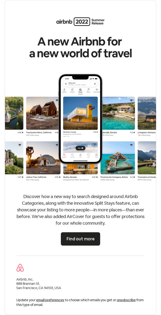
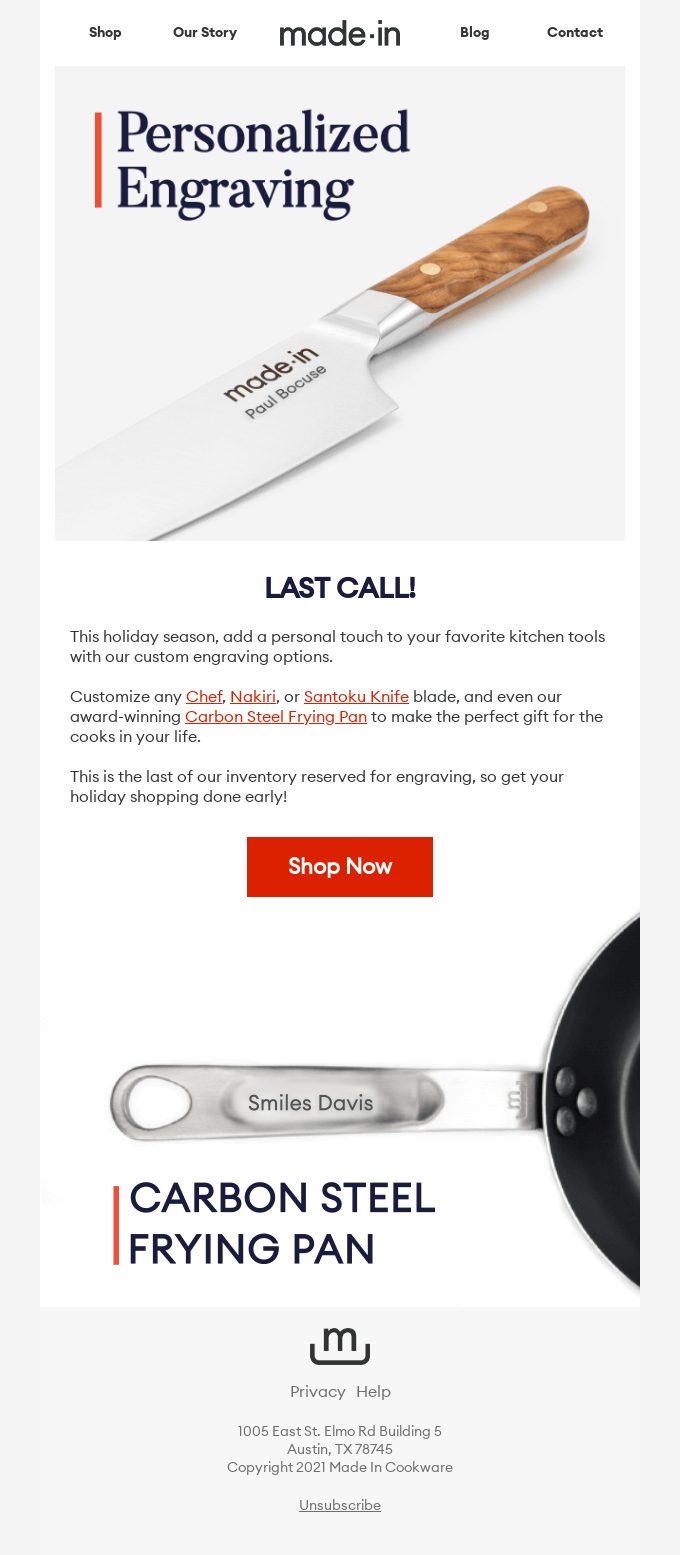
Similarly, you’ll want to place your logo on the top left or center of an email. You can place the logo twice—top and bottom—if the email is long enough. This is a good opportunity to use different variations of your logo; so maybe use the image and text at the beginning of the email and then just the image at the end.
Take a look at how both Airbnb and Made In Cookware use just text on top and then just the image on the bottom.


If yours is a long email with a lot of information squeezed in, consider using dividers of white space. It’ll separate your logo from the rest of the content. This will help organize your email layout in a cleaner, easy-to-read way.
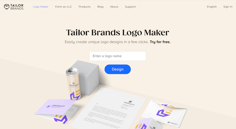
A business logo on a document and letter adds a professional touch. Positioning your logo on a document and letter is no different than a website. It’s best to place your logo on the top left-hand corner or center of the page.
Be aware of how the logo will look on your letter. You don’t want it to be too large and overpowering or too small that it’s hard to read. Size it to fit the area on the page and how it’ll look best.
Another thing to consider is spacing around the logo. If you look at both the examples above, you’ll notice that there is ample space around the logo and the rest of the letter. It’s important to keep a good amount of space so that the reader can quickly understand who the letter is from.
The most important consideration when deciding where your logo should go on a billboard is readability. On a billboard, there’s usually a lot of visuals going on that could easily swallow your logo up. That’s why you should work it into the larger picture rather than placing your logo anywhere as an afterthought.
A popular logo placement is the bottom half of a billboard. Spotify almost always places their logo on the bottom left-hand corner of their billboard. Being consistent allows the viewer to know where to look and become familiar with the brand’s overall layout.
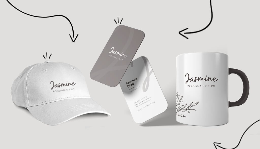
This is where you can have a bit of fun and creativity to play around with your logo placement. When you print your logo on a t-shirt, for example, you have the freedom to have the logo be front and center or just a small section on the back. The choice is totally up to you and what you want to accomplish with the apparel.
Also, you can consider using different variations of your logo on apparel. You can choose to print just the icon or the business name on a t-shirt or hat, or you can put any variation you have. As long as you remain consistent, you’re good to go.
When it comes to putting your logo on things like stickers, labels, and office supplies, you have a lot of freedom. Again, you can use different variations of your logo depending on where you use it. Place just the icon on stickers and business initials on office supplies. Do whatever makes sense for you and your brand.
You put a lot of thought, time, and effort into your logo design. Now you’ll use it on your website, emails, letters, billboards, shirts, stickers, and more. In a lot of cases, there’s a lot of imagery and text going on, so you need to integrate your logo placement thoughtfully.
Hopefully, this article has helped you figure out where and how to place your logo.
This portion of our website is for informational or educational purposes only. Tailor Brands is not a law firm, and the information on this website does not constitute legal advice. All statements, opinions, recommendations, and conclusions are solely the expression of the author and provided on an as-is basis. Accordingly, Tailor Brands is not responsible for the information and/or its accuracy or completeness. It also does not indicate any affiliation between Tailor Brands and any other brands, services or logos on this page.
Products
Resources
©2025 Copyright Tailor Brands