Having the perfect logo can make a significant impact on your business. But getting it right the first time is tricky, especially for new companies.
And, as time goes on, there are changes in design trends, technology, and consumer behavior, which put your logo’s ability to convey trust and credibility at risk.
This is true for businesses that were created a while ago—especially if you made a logo based on design trends that were popular at the time. If this relates to you, then you may need to do some catching up to make sure your brand is seen as modern and up to date.
The best way to bridge that gap? Redesign your logo and breathe fresh life into it!
Knowing when to redesign your logo isn’t an exact science. It may seem scary, counterintuitive even, to take something that’s so well-known like a logo and tweak it. But if you do it right, the results can be amazing!
That said, a logo redesign isn’t something to take lightly. If you’ve built up a loyal customer base or following that’s already used to your logo, you’ll want to tread cautiously; changing your logo may lose you the brand recognition you’ve grown among your audience over time and negatively impact your sales going forward.
So, if you’re on the fence about redesigning your logo, here are 6 questions you can work through to understand if you should stay with what you currently have, or if it’s time to take the plunge and start from scratch.
If you find yourself targeting a new audience, such as younger consumers, then it may be time to re-think your current logo design—especially if you’re having trouble connecting with them.
A new company logo can help give your brand a fresh, modern look, that’ll help your audience identify with you.
It’s common for top businesses across all industries to face stiff competition from newcomers who claim they’re more agile, modern, and have better technology. Releasing a redesigned logo shows your patrons that you’re not just sitting back and watching it happen.
It’s common for businesses to expand or shift their focus, such as adding a new lineup of products or even merging with another company. If your business has changed in some significant way, consider changing your logo too to reflect those changes.
This is a tough question to ask yourself, but it’s an essential one. Chances are that fashion and design trends have changed significantly since your logo was first designed, and you run the risk of people thinking your business is a dinosaur (old, and died a long time ago).
Marketing channels have drastically changed over the years. Odds are, you’re not developing TV commercials or paying for billboard ads, but instead, using internet marketing mediums such as Facebook, Instagram, and PPC campaigns. This means that logos today have to be designed with small screens in mind. If your logo is hard to view on a smaller screen, you’re going to need to redesign it.
Your logo represents your company and should convey an important message. If it’s ‘just a nice look,’ then you should create a new logo that emphasize your business’s core values and strengths.
There’s more to redesigning your logo than just throwing it in the trash and starting from scratch. In fact, your logo may just need a refresh instead of a full redesign.
Refreshing your logo is not necessarily easier, but it’s less dramatic, as the changes can be minimal. When refreshing your logo, you want to keep your current design elements in place, update your color palette (if needed) and simplify the look of your logo to modernize it.
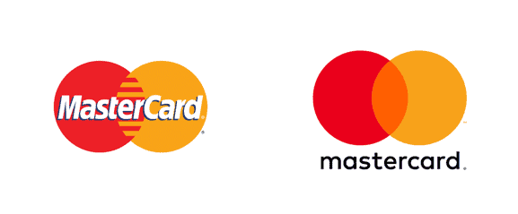
Mastercard refreshed their logo in 2016, and it’s an excellent example of how updating the design elements on your logo can have a significant impact.
They kept their color palette, toned down how the circles interact with each other by gently overlapping them instead of using hard, cut lines to connect them, and removed their name from the center of the design.
But, sometimes even a refresh just isn’t enough. In more severe cases, a full redesign is needed. Before you start drastically taking a knife to your logo, ask yourself these 3 crucial questions:
You need to be clear why your logo needs a redesign. If your answer is “because it does,” that’s not good enough. Unless you’ve identified the specific problem with your logo, you won’t be able to remedy it.
(Re-read the section “When to consider a redesign” if you don’t have an answer.)
A good logo is made up of many elements combined together—colors, typeface, shapes/icons. Before overhauling your logo or deconstructing it, inspect each of your logo’s elements and identify:
1. What they are (such as the specific color scheme, font-style, shapes and icons).
2. What the meaning behind them is. This will help you remove any elements which you don’t need to keep; if there’s no meaning, or the meaning is working against you, it’s time to say sayonara.
One of the biggest challenges you’ll face when redesigning your logo is ensuring that you keep hold of the visual element(s) that your customers use to identify you.
Mastercard knew that their most prominent identifying element was the color and layout of their two circles, which is why those elements remained unchanged.
What they did change was how the two elements connect with each other. But anyone familiar with MasterCard can still instantly recognize them.
Don’t risk confusing your customers by changing your most iconic element, unless you absolutely have to.
Updating your logo doesn’t necessarily mean ripping it apart and starting over from scratch. You may want to consider a logo refresh, which is like a logo “upgrade” to help reflect current trends and make it appeal more to your target audience.
A logo refresh typically includes things like adjusting your color palette, tweaking your fonts, changing or creating your tagline, and/or reorganizing your logo’s shape. It can be a good way to signal to your audience that your brand is up-to-date and listening to their current needs and wants.
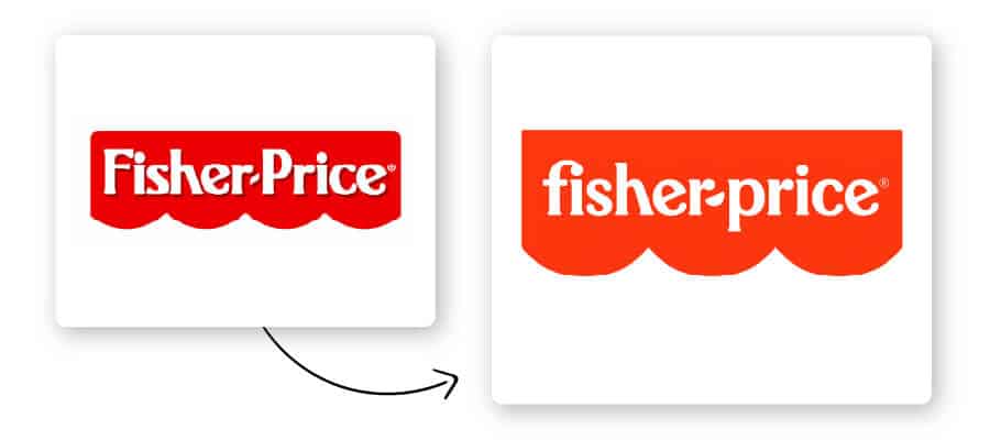
The Fisher-Price logo change is a good example of a logo refresh; they preserved their well-known red-and-white color palette and the logo’s overall shape and mood, while switching out their font for one that better emphasizes a playful sense of fun (and getting rid of one of the circle-like shapes on the bottom).
These small tweaks coincided nicely with the brand’s new tagline – “Let’s be kids” – and helped the brand to refine their current message of play and delight for children.
On the other hand, a logo redesign is usually a much more dramatic change to your current logo. It can include a new color palette, typography, shapes, icons, and even changes to the way your brand’s name is displayed – but it also involves rethinking the entire brand message that’s behind your logo in the first place.
Logo redesigns are a good way to reflect a fundamental change in your business, introduce a new name, or even reconnect with your target audience if you see that your current brand isn’t effectively doing so.
Mature companies typically redesign their logo when their market strategy completely changes, or if they see seriously declining sales and revenue; smaller businesses can consider a redesign if their initial brand message isn’t getting across to their customers with their current design.
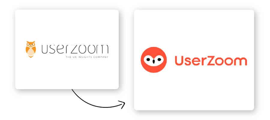
For example, UserZoom started as an online research tool for advanced UX researchers. As the company grew, they added services and features that ultimately changed their values, culture, and the target audience they served.
So, they preserved the one element of the “old” UserZoom that they felt was still relevant to their message – the owl – but gave it a modern, flat upgrade, while overhauling their color palette, changing the font, and removing their tagline from their logo. As you can see, the 2 logos have a completely different look and feel; you can barely tell that they represent the same company!
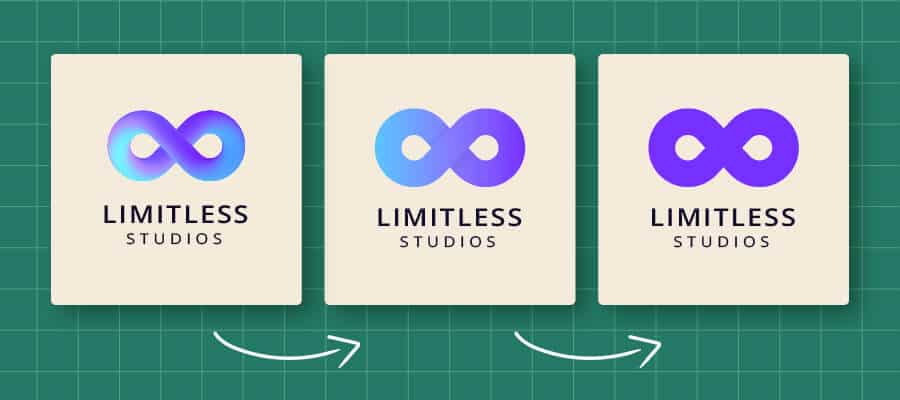
If you’ve gone through all of the above, then you’re ready to proceed with redesigning your logo. This part is very similar to designing a logo from scratch, except you have more information and research to work with.
The most important factors to consider when redesigning your logo are the elements that go into the design.
Before any new house or building can be constructed, you have to dig deep into the ground to lay the foundations. Otherwise, it’ll fall over in a strong wind. Your logo is the same; if the foundations are poorly done, it won’t stand up well.
So, first, you need to understand the purpose of your logo. Your logo needs to attract your target audience (the correct customers) and give them an incredible first impression of your brand.
And, note that your logo design will need to communicate your brand identity. It’s hard for new businesses to showcase their brand’s identity and personality because it takes time to develop one.
Now that you have an idea of what goes into redesigning a logo, let’s take a look at some of the best and worst logo changes in the last few years.
Here are a few of the world’s best logo redesigns and how they improved the brands they represented:
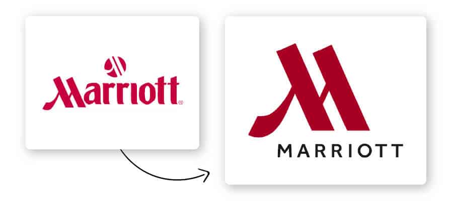
Marriott took the most memorable part of their original logo and used it to become the main visual focus of their new design – the letter ‘M’. In this new version, the ‘M’ is set in burgundy and acts as a monogram, which is a great option for hotels that want to appear timeless and prestigious.
It’s also a smart way to catch the eye of potential customers who are driving on the highway, in addition to looking distinguished on items like towels, ice buckets, etc.
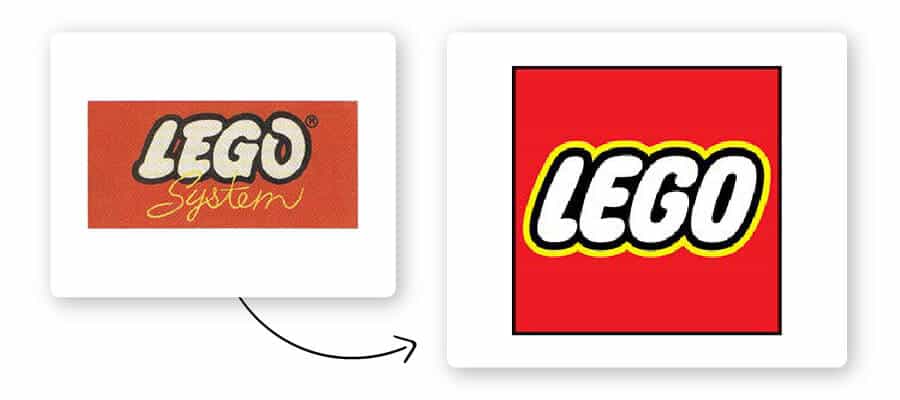
The Lego logo is iconic for many people, as it was a staple of our childhood. How many hours did you play with Lego growing up? Much like us, the Lego logo has also grown throughout the years.
Their biggest design change occurred in 1973, when Lego entered the US Market. The final design involved softening the font style and adding a yellow outline around the letters—quickly catching your eye, as well as channeling feelings of joy.
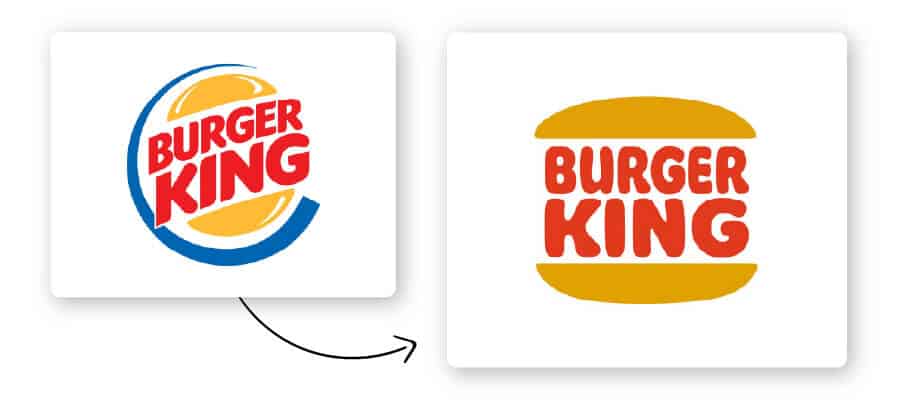
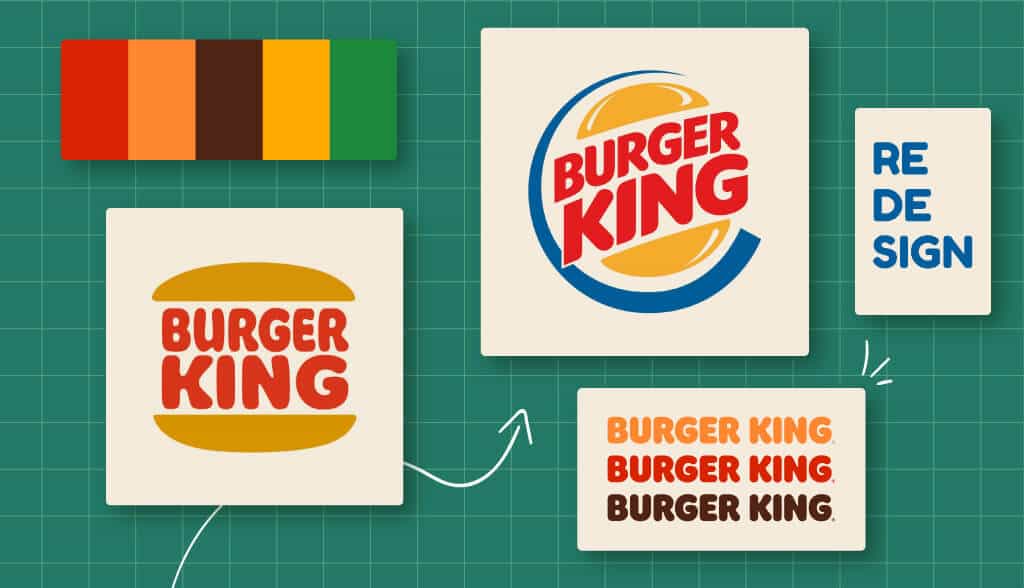
Popular fast-food chain Burger King recently redesigned their logo for the first time in 20 years, and it was a hit! Following in the footsteps of many big brands (think Airbnb, Target, etc.), they traded their curved mark for a simpler, flat design.
Not only does the new logo better emphasize their offering – sandwiching “Burger King” between 2 mouthwatering bun halves – but it also aligns with an older design of theirs from the ‘70’s. The redesign was a great way to modernize their logo while paying homage to the company’s history and where it originally came from.

Oxford – once known as distinguished and classy – took a modern swing and missed with this logo redesign. If that icon looks familiar, it’s because it’s uncannily similar to the Beats by Dre logo – and it doesn’t add anything to the current design.
Though this rebrand was an apparent nod to a younger crowd, it removed the “prestigious” aspect of Oxford’s original logo without replacing it with anything substantive.
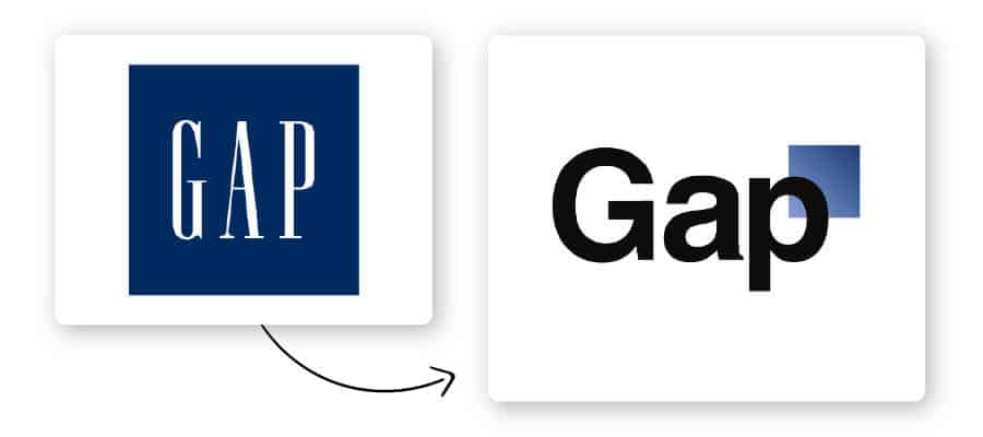
Who remembers when Gap rebranded? If you don’t, that’s okay; it took just one week before they reverted back to their original logo.
Part of determining if you need a logo redesign includes assessing whether you’ve changed something in your business or not.
Gap decided to rebrand after noticing their sales decline in 2010, but they didn’t make any changes to their actual clothing, storefronts, or business strategy. As a result, they received huge backlash from customers when they traded the famous square background with a smaller blue rectangle.
They hadn’t signaled to their audience that they were changing anything about the brand, so customers were confused when the logo they had come to know and love was suddenly replaced.
Moral of the story: If it ain’t broke, don’t fix it!
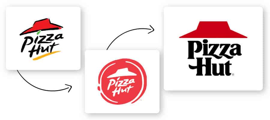
Pizza Hut didn’t exactly fail at their redesign, but they did ultimately circle back to their original logo concept.
When they first redesigned, they preserved elements of their original logo – like their signature slanted roof and playful font – and turned it into a pizza-like emblem. However, they ultimately reverted back to a modernized version of their original vintage design 5 years later. Notice that the current logo uses flat design (super trendy right now!) and bigger, bolder shapes than its predecessors.
Redesigning your logo isn’t a project to be taken lightly, nor should you choose to do it based on a whim. Instead, you need to understand why a redesign or refresh is required in the first place.
Identify which of your design elements are essential and which ones you can show the door. And, take note of the giant companies that have rebranded. They wanted a logo design fit for the digital age, and customers expect sleek and modern-looking designs.
Overhauling your logo also means you’ll need to replace all of your marketing assets—social media, email signatures, and any physical items and clothing your logo appears on.
So, only begin the redesign process when you’re 100% ready, as the consequences, both good and bad, can be huge. When you’re ready, our AI logo designer can help you start the process of redesigning your logo.
This portion of our website is for informational or educational purposes only. Tailor Brands is not a law firm, and the information on this website does not constitute legal advice. All statements, opinions, recommendations, and conclusions are solely the expression of the author and provided on an as-is basis. Accordingly, Tailor Brands is not responsible for the information and/or its accuracy or completeness. It also does not indicate any affiliation between Tailor Brands and any other brands, services or logos on this page.
Products
Resources
©2025 Copyright Tailor Brands