A logo is probably one of the first things you will make when starting your own business. And, because your logo is essentially the face of your business, it sets the tone and aesthetic of your entire brand.
Setting logo usage guidelines early on is a good idea; it will establish how and when your logo is used properly. Plus, it’s an integral part of building a brand.
Let’s go over logo usage guideline essentials to understand why you need them.
A logo usage guideline is a document you write up for future reference that includes different versions of your logo design and how they are to be used.
The logo you choose to tell your business’s story will also convey your brand message. Branding is a long game process, so it’s really important that you stay consistent with how and when you use your logo.
That’s why logo usage guidelines are so important; they will ensure your logo always looks great across all marketing materials, web pages, social media profiles, packaging, and more. More than that, guidelines also make sure your logo is presented in a way that is harmonious with your brand voice.
Every brand should create their own set of guidelines for logo usage. There are a few reasons why. Let’s get into it:
A logo is super important, and so is consistency. As your brand grows, your logo is going to reach a wide range of consumers, creating a perception of trustworthiness.
Think about it this way: You’re out shopping for a solid pair of leggings (because we all agree that yoga leggings are pants, amiright?) and spot a pair with the Lululemon circle emblem. You’re instantly ready to buy, and the reason why is because you know Lululemon is a top (and costly) athleisure brand. It’s a brand people can trust, and their logo lays the groundwork for brand loyalty. (Brand loyalty is when consumers form a connection with a brand and, as a result, continue buying from them rather than competing brands.
Basically, if your logo appears cohesively, your customers are more likely to seek you (and your logo) out first.
Once you’ve created the perfect logo, you don’t want anyone else altering it in any way. What if an employee wants to create a rainbow version of your logo or a completely black version? Or what if you want to acknowledge Breast Cancer Awareness Month by including a pink ribbon icon on your social media accounts? Logo usage guidelines clarify the do’s and don’ts of when and how your logo should be used.
The wrong changes such a change in color could lead to a different meaning for your logo. Colors, designs, and imagery all cause your audience to connect with your brand in a certain way. Guidelines provide rules that protect the core meaning behind your logo design.
It’s hard to remember a brand if its logo always looks a little different. Reduce logo variation by setting up guidelines that protect your core branding.
Now, I’ll explain all the elements you should include in your logo usage guidelines. I’ll demonstrate using a design created with our logo maker.
So, this is the original logo a photographer, Jason Dean, created for his business:
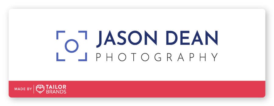
The original design consists of 3 colors (royal blue, navy, and black) set on a white background. The icon looks like an abstract camera, combining the focal brackets with a camera lens. And, the logotype font is simple and spaced out, with Jason Dean’s name bolder than the word ‘photography’.
Let’s explore all the ways Jason Dean might create logo usage guidelines to form his brand.
To start, create different versions of your logo that are considered acceptable. Notice in these examples the different space ratios:
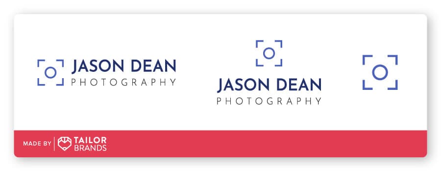
The logo appears horizontally, vertically (with icon stacked over text), and an icon-only variation. This means that these are the only 3 variations that can be used.
Your logo usage guide should also include when and where each variation will appear. Maybe Jason Dean will determine that the icon-only variation should be used exclusively on social media profile images. Perhaps the guidelines clarify that there are certain places where the logotype should always be included, like on a website.
This is one of those things that seems like it’s a no-brainer, but it’s important to remember that logos need room to breathe. Let’s say someone wants to put your logo into a cramped corner, ruining the clarity and visual impact. But, if they read your guidelines, they’d know they can’t do that.
Check out Jason’s design to see what I mean:

It wouldn’t look right if the camera lens icon was spaced far away to the right of the logotype. Logo usage guidelines makes it clear that the icon must appear a small space away from the text on a business card or website.
Spacing guidelines will help make sure the logotype isn’t too far away from or too close to the icon.
As a general rule of thumb, logos should have one or 2 fonts, including bolded variations. In most cases, using too many fonts will cause a cluttered and amateur-looking design. Once you’ve chosen the right fonts for your logo, use the guide to name those fonts and font styles.
In the example logo, Jason Dean uses Josefin Sans SemiBold and Light as the 2 fonts in his design:
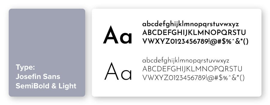
These are 2 very straightforward sans-serif fonts, and they work well together without question because they are the same typeface (just semi-bolded and light).
In the style guide, you may even clarify what fonts should be used for headers and body copy to best align with the logo and brand aesthetic.
Typography is a key design element, which dominates the logo and showcases the business name. Take a look at the right logo typography:
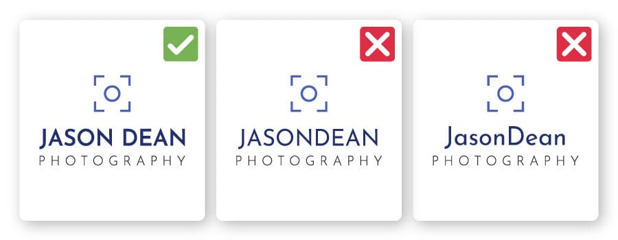
While the text is in all caps, the logo usage guidelines should clarify what the typography will look like when used in a brochure, articles, packaging, and so on.
For example, the guidelines might explain that any mention of the business must be written out in all caps- ‘JASON DEAN PHOTOGRAPHY’- to differentiate the brand versus the person.
Colors look different when printed versus displayed on a screen. However, you want your brand color palette to remain consistent throughout every aspect of business. Start by defining your brand color(s) and select the closest match for print, products, and screen.
Here are the 2 colors Jason Dean used in his logo:
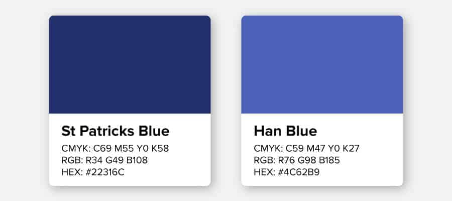
So, first let me clarify those technical terms. Each one refers to the same color, just how it would be used in different contexts:
You also might want to find the Pantone (PMS) swatch match because it can be helpful for things like matching shirt colors, promotional materials, signage, and more. Pantone is a standardized color matching system to help clarify colors to printers (including some colors that cannot be achieved with CYMK).
Color matching can be very difficult, especially when comparing your screen to printed materials. Not all screens show the same colors in the same way, and they can vary widely. If you allow someone to guess the closest blue, for example, you may have some materials with periwinkle logos and others close to royal.
Establishing the color codes in your usage guide takes the guesswork out of color selections.
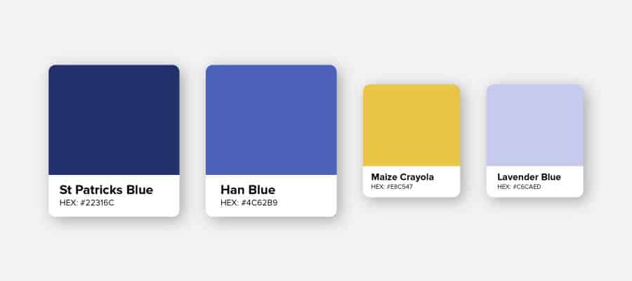
Within your guide, you will state all the acceptable color variations for your logo. This includes:
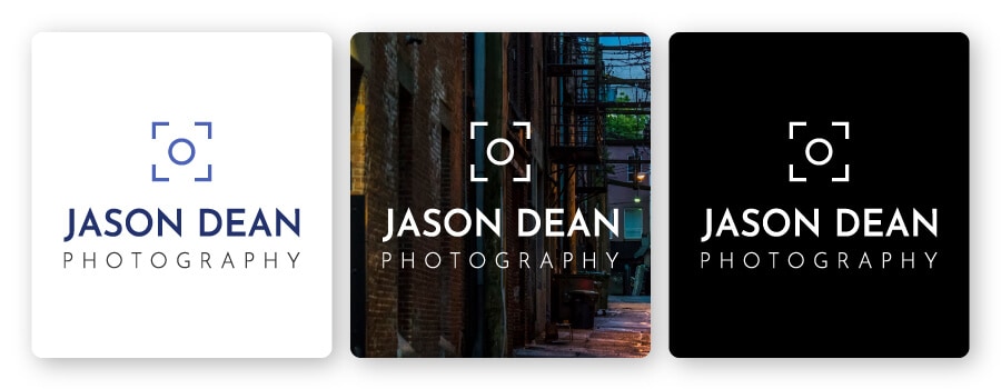
Your logo is going to be used in a variety of places. At some point, you will run into a situation where the background is not your standard white. In those cases, you have to determine how the logo should adjust to that change.
What should happen if you need a black and white version of your logo? Some marketing materials can only use black and white (or grayscale) logos, so you should have versions ready for those cases.
As you can see above, Jason Dean’s logo usage guidelines clarified acceptable uses of his logo on different backgrounds. Using the blue logo version on a dark or black background would be difficult to see, so an acceptable color choice is white. And, if Jason needed a monochromatic logo, he can use the black background with the white font.
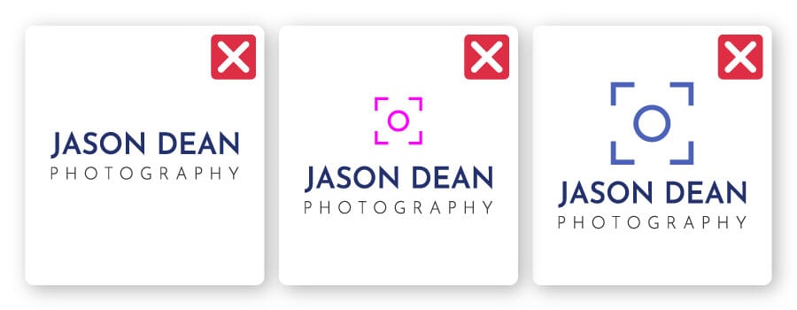
There will be some elements, like color combinations, dimensions, fonts, spacing, and capitalization, that you do not want used. The guide should outline common mistakes and clarify that they are not acceptable. Examples include:
Do you want to create your own logo usage guideline but don’t know where to start? Check out this logo usage guideline template (it’s free – score!).
It’s easy to use and will help you set up your own logo guidelines, including all the important factors we covered. Get started by clicking below!
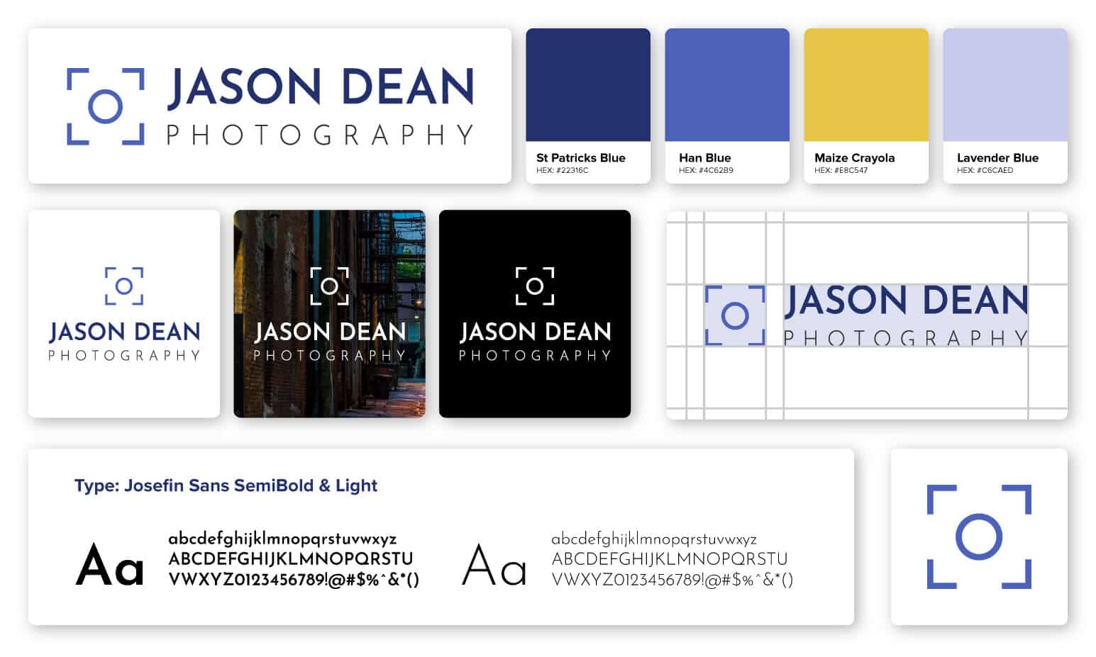
The main goal of a logo usage guideline is to make sure your logo looks good—always.
A guideline clarifies the right and wrong ways of using your logo in all the possible situations it will appear.
You’ve put in a lot of effort into creating a logo that looks good. Building guidelines will make sure your logo is used in a way that perfectly represents your brand everywhere your logo shows up.
If you want to get started, go ahead and download the free logo usage guideline template!
This portion of our website is for informational or educational purposes only. Tailor Brands is not a law firm, and the information on this website does not constitute legal advice. All statements, opinions, recommendations, and conclusions are solely the expression of the author and provided on an as-is basis. Accordingly, Tailor Brands is not responsible for the information and/or its accuracy or completeness. It also does not indicate any affiliation between Tailor Brands and any other brands, services or logos on this page.
Products
Resources
©2025 Copyright Tailor Brands