Popular designs and trends are changing all the time—and companies who want to make the biggest impact need a modern logo.
What do we mean by a “modern logo”?
A modern logo has clean lines, a minimalist design, and humble-but-eye-catching colors. In other words, it’s a simple but effective design!
People today are super busy, and businesses are spending lots of time and resources competing for their attention. (In the USA alone, adults are exposed up to 10,000 ads each day.)
This is why first impressions matter – a lot.
Whether you’re in construction, real estate, tech, or photography, having a modern logo will strengthen your business and announce to the world that you’re a modern brand.
In this post, we’re going to break down the characteristics of modern logos. Then, we’ll take a look at 15 awesome examples of modern logos across multiple industries to inspire your creativity.
Ready to take the plunge?
All businesses want their logo to help build trust and credibility, right? So let’s look at some of the main characteristics you need to create a modern logo that tells your customers and website visitors that your brand is right for them.
This may surprise you, but it’s often simple logos that have the most impact.
A simple logo cuts through all the noise and distractions surrounding it, making people sit up and take notice.
Imagine you’re walking down a busy street. There are lots of pedestrians walking around you, cars in the road beeping at each other, and hundreds of stores trying to grab your attention so you’ll walk in. But which logos actually catch your eye?
Chances are, it’s going to be the simple, uncluttered one, with a primary color that stands out, and a clean logo design that tells you exactly what’s in ‘store’ for you when you walk through those doors.
That’s the power of simplicity in modern logo design.
A simple logo can attract attention and instantly communicate your brand’s message, without the need for complex design elements.
Many of today’s modern logos don’t have icons and symbols – opting instead for just text. These are known as wordmark logos, and you don’t have to look very far to find them in the wild.
Facebook, Gucci, Google, and Uber are just a couple of famous companies using wordmarks.
Using unique color schemes and a modern font is a trending logo style that’s extremely popular. The trick is ensuring your font style represents your brand’s character and is simple enough to read at a glance.
Sans-serif fonts are popular among many businesses for their welcoming look. Their streamlined curves create a feeling of fluidity and agility, meaning the company is responsive and in action.
On the other hand, serif fonts – like Times New Roman – are much sharper, and more solid and professional-looking. Many newspapers use a serif font.
If you’re looking for a more creative or whimsical style, consider using a cursive font that mimics penmanship. The extravagant and flowing lines are much better suited to helping a business express its artistic side. Just be sure it’s not difficult to read.
So, think about the message you want to send your audience before you choose your logo’s typography. A law firm that wants to reflect a professional image of trust and authority should use a strong serif font to highlight those characteristics, while a more welcoming and creative business, such as a wedding cake decorator, should opt to use a cursive or sans-serif font to highlight their inventive side.
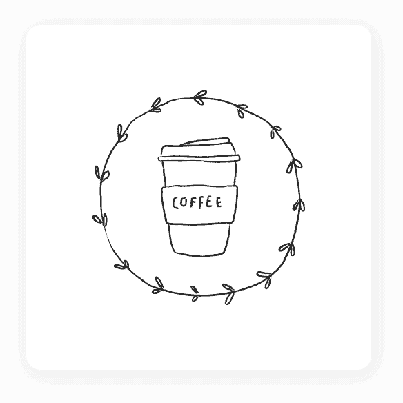
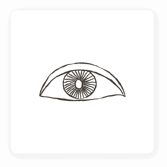
As technology advances leaps and bounds each year – especially when it comes to logo design – sometimes people forget that you can create your own modern logo with a pen and paper.
While it’s good fun to use the latest state-of-the-art software with all its clever bells and whistles, when you physically draw a logo, you’re putting your heart and soul into it. And, oftentimes your design will be the best one to represent who your brand is – hands-on, truthful, and caring.
You can sketch your own icon, or use your signature as your very own personalized font. If you’re feeling up to the challenge, you can even draw your own mascot, such as a bunny for a pet store or a computer with a face for a PC repair shop.
Incorporating a hand-drawn element adds an aspect of humanity that many logos today are missing.
Squares, circles, triangles, etc., may seem like simple concepts in the world of logo design, but successful companies know that each shape has a different psychological effect on their audience.
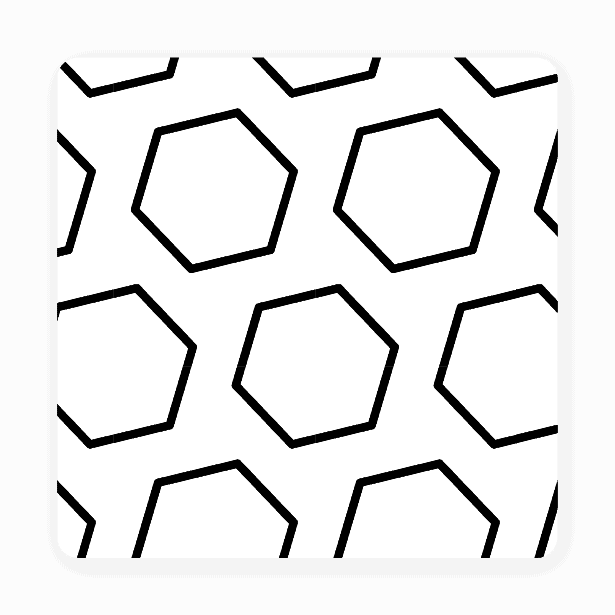
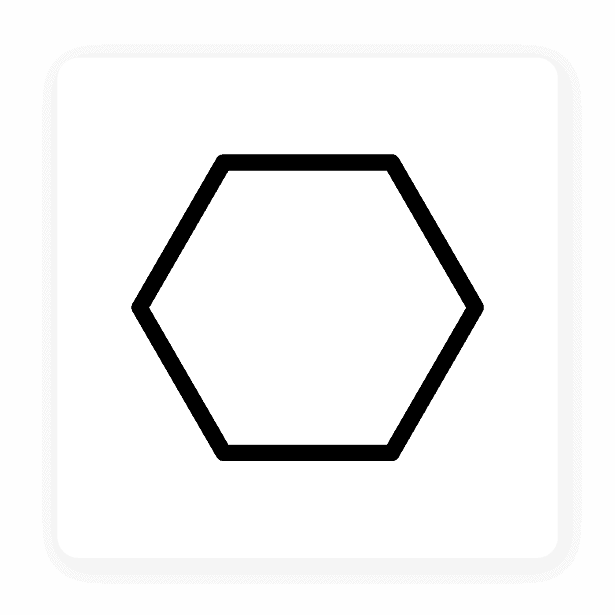
Some logos work best in specific industries. For example, a circle works well with any service-related industry, whether it’s childcare or a charity. The inclusiveness and warmth of a circle perfectly aligns with the service industry.
Suppose you need a logo for an industry that requires high levels of trust, like a financial planning company or insurance agency. In that case, a square is a solid, trusted shape that shows clients you’re reliable.
A modern logo design typically has 1-3 colors MAX. Too many colors in a logo can overwhelm your audience.
To create contrast and help people notice your logo even more, think about how your primary color will look next to your second and third colors. You can always use white or black as a background color to help boost your contrast.
Just as important to consider is the psychology of colors. Each color can evoke a different feeling or set of emotions from your audience.
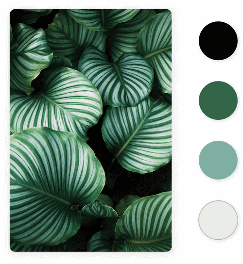
Red is used in warning signs because it’s an eye-catching color and easy to spot. People sit up and take notice when they see something red.
Blue is a more relaxed color used by brands who want to promote themselves as trustable and intelligent.
Black is a professional color that shows audiences you’re qualified at what you do and mean business.
Picking the right colors to represent your brand is just as important as everything else. With the right blend of colors, you can communicate the message and brand character you want to.
Now that you have an idea of what goes into a modern logo design, let’s take a look at 15 logo designs across several industries, all designed by our logo creator, to see how you can use them to your advantage.

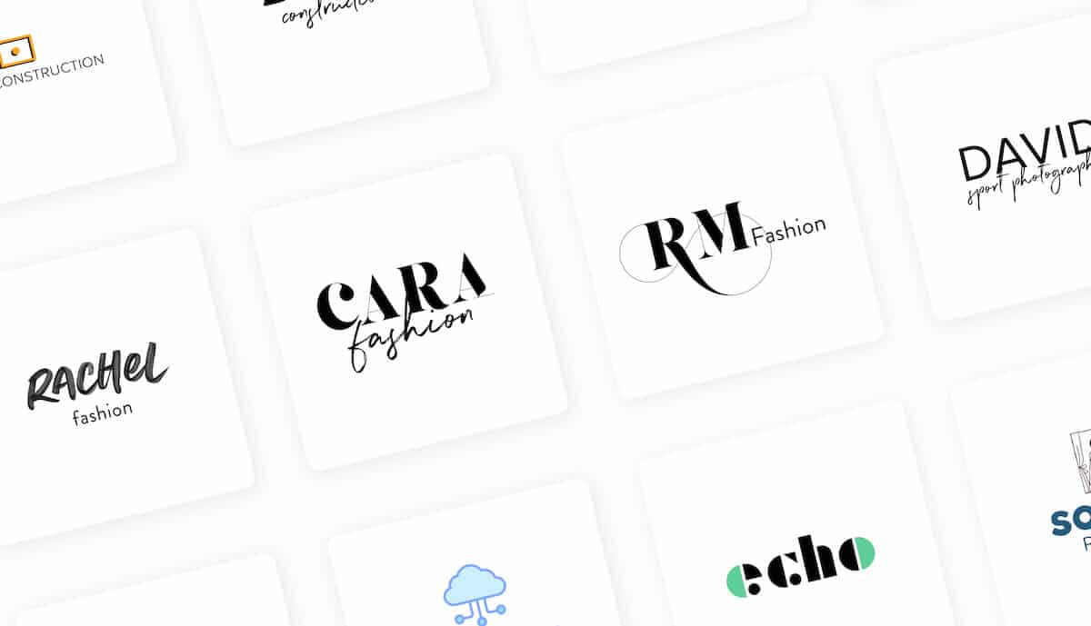
Modern logos are popular in the construction industry, mainly because they’re an easy way to communicate feelings of stability and trustworthiness. A lot of people think that construction logos have to be subdued or boring, as the industry is a more serious one; however, as you can clearly see from the logos above, there are ways to keep your construction logo simple while still making it eye-catching!
When considering your own design, what’s important is letting your audience know that you’re a safe, reliable company to work with and that they’re in good hands.
Let’s take a look at how Seaph Construction does just that. See how they use a bunch of geometric shapes stacked on top of one another to look like a brick wall? The way in which the shapes sit on top of each other also draws the eye upwards, conveying growth, sturdiness and security all at once.
And, you’ll notice that none of the above logos use more than one color (with the exception of Focus Construction, which has a small pop of orange to make their icon stand out), opting instead for a reliable black and carrying the bulk of the logo’s personality in their typeface. Try to think of ways to immediately signal to your audience what it is that you do, whether that’s through representative icons or through bold, heavyweight fonts.

Modern fashion logos tend to take a slightly different approach from construction logos. This is where a lot of hand-drawn elements come in—like the signature-looking font in Rachel’s Fashion or Cara Fashion—letting customers know that your style is all about adding the personal touch. However, if you’re going with the hand-drawn route, make sure that the elements you choose in your logo are easily readable on printed items, such as your labels, packaging, etc.
Also, though the logos pictured here are all in black (a popular color in the fashion world, if you’re going for a sophisticated or edgy vibe), you can consider pairing black with an accent color to make your logo pop—or even using a multicolored palette to get your message across. Pastel colors like muted blues, yellows and light pinks, are perfect for baby-focused brands, while deep purples would work well for luxury brands.
Again, note that the logos here are all simple wordmarks, while still containing completely different personalities and giving off individual looks and feels.

Like with fashion, real estate logos can have a wide variety of “acceptable” looks depending on what kind of real estate you deal with and who your ideal client is.
For example, the hand-drawn element in the Sophia Real Estate logo would work for a young dreamer who’s looking to buy their first modest home, but it probably wouldn’t land with the developer who’s in search of the perfect place to build their next mall.
Keys, frames, houses, and abstract shapes are all widely found in modern real estate logos, though that doesn’t mean you have to follow in their footsteps.
Before you design your logo, think about what your edge is—whether that’s in-depth knowledge of a specific neighborhood, top-notch negotiating skills for the lowest mortgage rates, or a knack for pairing first-time buyers with the ideal home on your first try. Then, think about the one, central design element that would bring that edge to the forefront of your brand and run with it!


If you’re in the tech industry, chances are you’re either focused on being the next “unicorn”, striving for innovation, or keen on letting your audience know that you’ll help them with some aspect of internet safety. No tech company is exactly the same, and neither are the tech logos that represent them.
However, regardless of your messaging, a modern logo design works across the board. Companies like Echo that want to emphasize the sophistication of their technology might want to use a font that’s made up of individual “bits” (if you know, you know!), while an accessibility brand like BrainTech is better suited towards a clean sans-serif.
You’ll often see a lot of green in tech logos, as it emphasizes productivity, growth, happiness, and money, though blue tends to pop up with anything having to do with security and payment processing.
Also, don’t forget that icons can do a lot of work for you, whether you’re using a literal cloud to underscore your cloud-computing abilities ,or a more abstract design that indicates the benefit your audience will get from your technology.

In an industry as creative and diverse as this one, you’ll want a logo that highlights the specific type of photography that you do—whether that’s natural light, family portraiture, or patterns and landscapes.
You can always take a leaf out of the Sophia Photography book and use a simple symbol that’s found in your niche, whether that’s a flower for nature photographers or a tennis racket for sports photographers. However, if you offer several types of photography, you may want to go with a more abstract icon (if any) in order not to box yourself in to one specific type of art.
In general, photography logos are another great place in which to use signature fonts, giving that intimate feeling that’s key to forming close connections with your clients (before you even meet them!). Like with fashion logos, you’ll want to make sure that the typeface you choose is easily readable and noticeable on a watermark, since that’s often where potential clients will first come in contact with your brand.
What you want your logo to tell your customers is up to you.
A modern logo lets your customers know that your brand is up-to-date with the latest trends and means business.
With the actionable tips on this page, you know how to tell the story you want and communicate the message that best represents your brand.
Whether you want to create a logo to help establish trust and credibility or excite your customers and get them pumped about your brand – you can!
Want to create a logo for your business? Whether it’s for a website, local store, or to print on merchandise, you can easily create a modern logo with the Tailor Brands logo maker.
This portion of our website is for informational or educational purposes only. Tailor Brands is not a law firm, and the information on this website does not constitute legal advice. All statements, opinions, recommendations, and conclusions are solely the expression of the author and provided on an as-is basis. Accordingly, Tailor Brands is not responsible for the information and/or its accuracy or completeness. It also does not indicate any affiliation between Tailor Brands and any other brands, services or logos on this page.
Products
Resources
©2025 Copyright Tailor Brands