You don’t have to be a sports fan to be able to recognize the Olympic Games logo. You know the one: The 5 colored interlocking rings, representing the participating continents and the flags of all nations.
It’s simple, easily grasped, yet symbolic and powerful enough to stand the test of time. The Olympic rings logo has become the basis upon which logos for all future Games are built.
While there’s always a big buzz when the time comes for the next Olympic Games, it’s usually the logo that people get talking about first. But some logos have been better received than others.
From the bizarre and laughable to the awe-inspiring, a look at the different Olympic logos over the years show the power of good and bad designs.
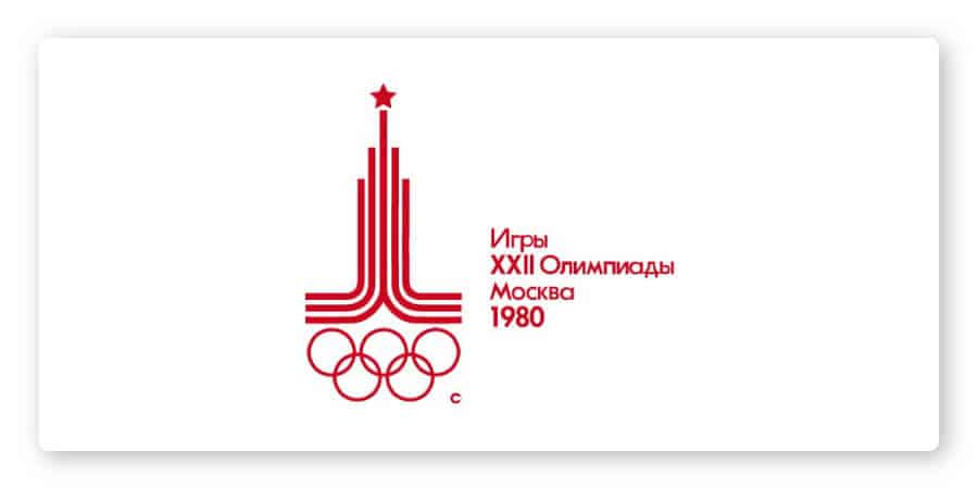
5 years prior to the Games, the Olympics Organising Committee commissioned a logo competition, open to professionals and amateurs alike. It was a hit; over 26,000 proposals were submitted from all over the world. Out of all the submissions, the young Soviet artist Vladimir Arsentyev’s design was chosen.
The central element of the logo consists of 3 parallel lines rising into an architectural silhouette typical of Moscow. A 5-pointed star stands above the icon, paying homage to the Kremlin flag.
The color palette used (red, black, and gold) was purposefully chosen to convey power and strength.
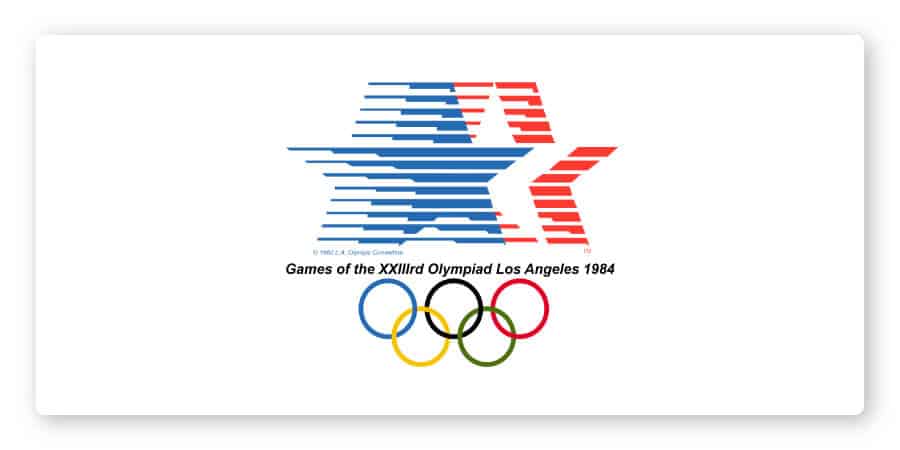
The Olympic Games is not just about sports– it is also about bringing people together. Designer Deborah Sussman and her husband Paul Prejza understood that the logo they were tasked to create also needed to encompass culture and art.
The resulting colorful and fun Los Angeles 1984 Summer Games logo made an impact with a fresh design that helped unify the diversity of Southern California. Visually defined by a patriotic color palette, it resulted in a bright and energetic logo that embraced the culture of LA.
The star icon symbolizes the highest aspirations that drive athletes and mankind alike; the horizontal bars portray the speed with which the Olympians race to achieve gold and glory.
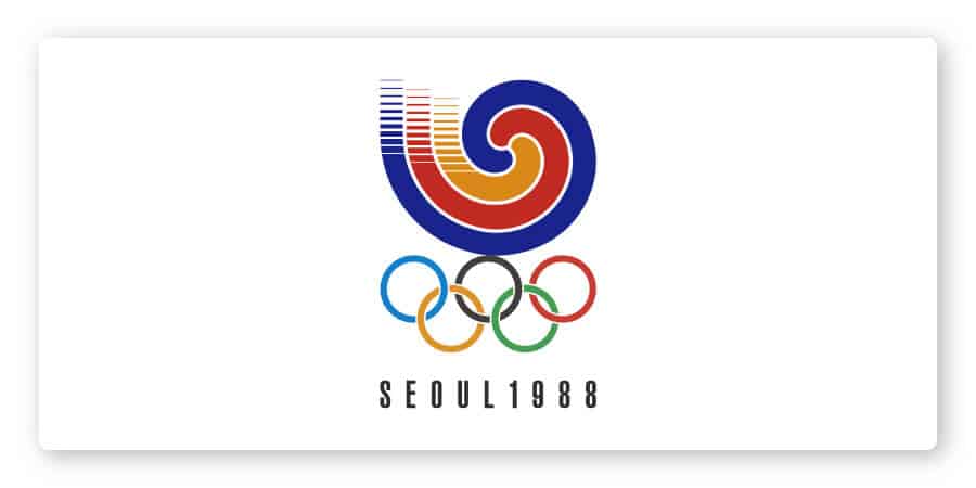
The 1988 Summer Games logo embodied its motto: “Harmony and Progress.” Compared to the previous designs, you can tell that the designers took this logo in a different direction. The abstract shapes and colors evoke the spirit of the Games, while still designing something completely new.
Just like the athletes coming together from all over the world, the 3 swirling lines meet in the center.
The emblem features a sam taeguk pattern, which is a traditional Korean symbol that is a variation of the taeguk symbol found on the country’s national flag. Sam taeguk patterns are widely used in Korea as decoration on fans, in folk art, and on the gates of houses.
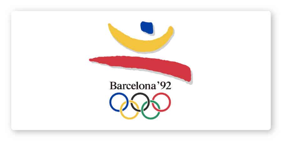
Now here’s a logo that leaps right off the page!
Designed by Josep Maria Trias, the leaping figure’s arms are wide open, symbolizing the warm, hospitable attitude found in Mediterranean culture. Its colors, yellow and red, represent the flags of Barcelona, Catalonia, and Spain, plus a dash of blue for the color of the sea.
And, the logo has a distinct ‘90s vibe to it, too, that is fun and paves the way for a new age of design.
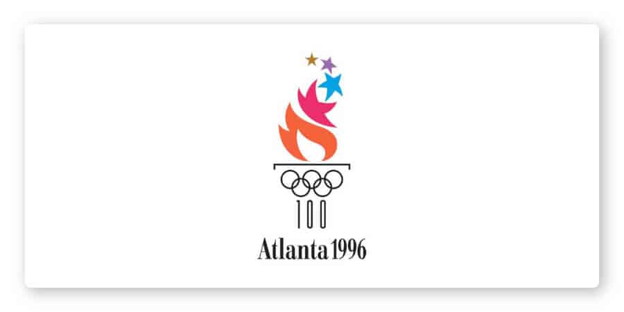
The 100th anniversary of the Olympic Games needed to have a logo that links the past with the present. This logo does that very well. (And it gets bonus points for style!)
Next to the 5 rings, the Olympic flame is the most iconic image. To pay homage to its origins, a fiery torch sits atop a Grecian column.
The flame in the emblem changes color as its shape turns into stars tapering upwards. Each individual star is a different shape and color reflecting the diversity of all peoples who are part of the Olympic Games.
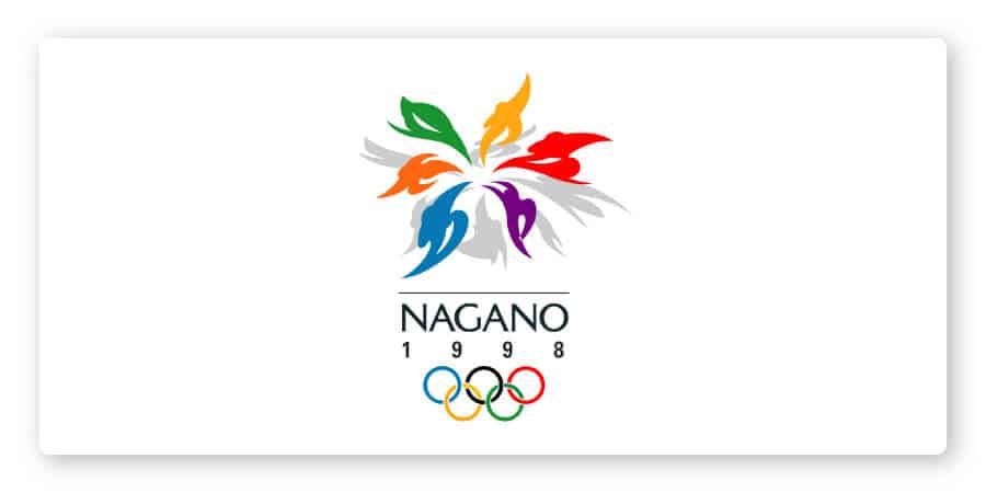
Nagano’s logo might be my favorite in Olympic history. This is one of those logos that beg the audience to take a longer look, which is a great example of an abstract logo with deeper meaning.
At first glance, the emblem appears to be a flower, but if you look closely you can see each petal represents an athlete practicing a winter sport. And if you look at it from another perspective, it can also be seen as a snowflake symbolizing the Olympic Winter Games.
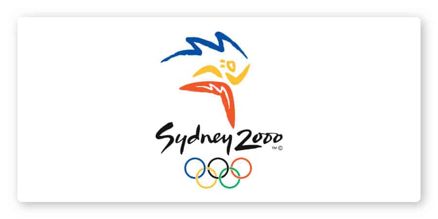
What can’t an abstract logo do?
Bold, energetic, exciting– that’s exactly what you feel when you look at the Sydney Olympic logo. Even the typography perfectly matches the entire logo, exuding liveliness and playfulness.
The blue lightning at the top is reminiscent of the Sydney Opera House; the lightning is supposed to represent Australian culture, as well as the fire of the Olympic torch. (Yeah, an icon can do all that!)
The “Millennium Man” figure is made of 3 boomerangs—another Australian symbol—while the colors symbolize the sea (blue), the sun (yellow), and its earth (red).
This logo gets a 10/10.
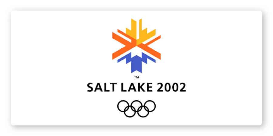
What I really like about this logo is that it takes elements from abstract geometric and symmetrical shapes.
The icon represents a snow crystal and a sun rising over a mountain, formed from the negative space around the blue. The yellow, orange, and blue colors represent the Utah landscape, from the desert to the mountains.
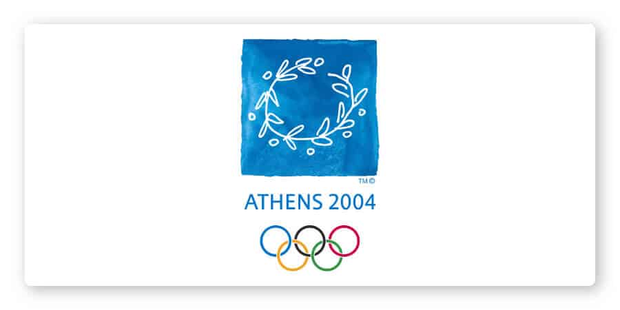
This logo took a turn from the abstract and turned to the symbolism of a wreath made from an olive tree branch, or kotinos. The emblem is a direct reference to the ancient Olympic Games where the champion was crowned with the kotinos.
And, the design of the wreath as an open circle acts as a warm welcome to all who participate in the Games, the largest peaceful competition in the world.
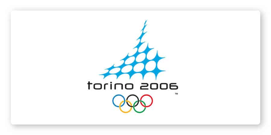
Designed by the Italian studio Benincasa-Husmann Brand Design, the logo for the 2006 Olympics was inspired by Turin’s Mole Antonelliana, a major landmark monument in Italy.
The emblem is supposed to portray the silhouette of the monument, which then transforms into a mountain where the white snow meets the blue sky. But, the jury is still out on the design.
Some people think it’s modern and cutting edge, whereas others say the awkward web shape of the icon makes it feel like this was designed for a technology convention rather than the Winter Olympics.
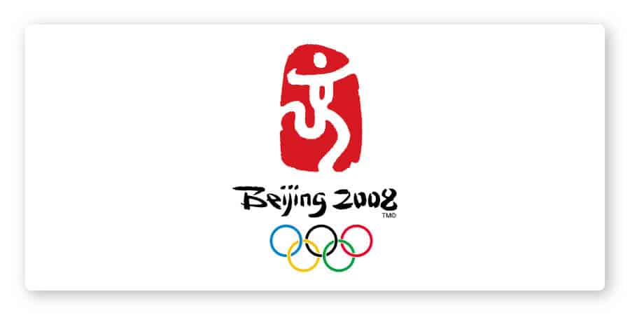
Within the bright red logo, the clever use of negative space creates a figure called “Dancing Beijing.” It’s a stylized version of the Chinese character that means “capital” (Beijing is the capital of China).
Although I love a good abstract logo with clever use of hidden meaning, this logo doesn’t completely meet the expectations of what an Olympic logo should be.
In other words, if you looked at just the icon alone, you’d never know it was for the Olympics.
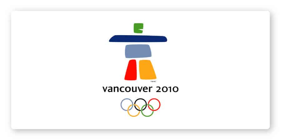
Vancouver’s 2010 Olympic logo has a lot going for it. Another abstract geometric logo, the composition is simple, striking, and inspired by a cultural landmark called inukshuk.
The risky font choice, vibrant colors, and playfulness of the rounded shapes bring this logo to life.
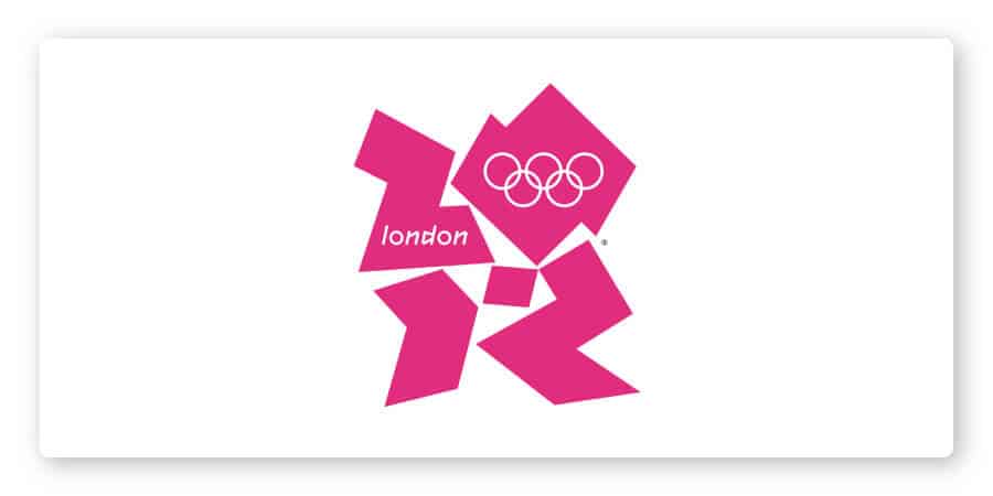
The London 2012 logo was one of the most controversial ever designed. You could say it was skating on thin ice.
After the design was revealed, a petition was drafted and signed by over 48,000 people to have the logo scrapped and redesigned.
Some people said the felt didn’t represent London at all; others thought it resembled the Simpsons siblings (Lisa on the right and Bart on the left).
Either way, it definitely didn’t take home the gold.
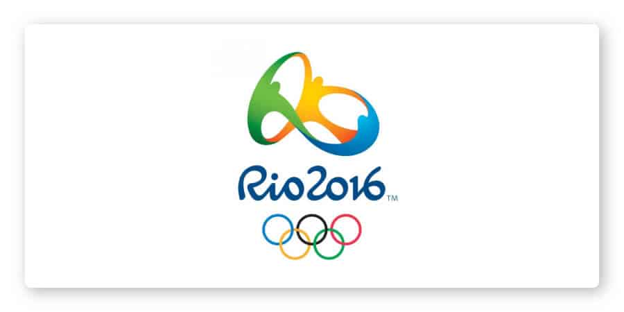
When it came to designing the Rio logo, they needed something special to commemorate the first South American city hosting the Summer Olympics. It was an opportunity for Rio to showcase their culture (and increasing tourism never hurts either!).
The color choices were inspired by the Brazilian environment and the psychology of colors. Blue represents water and dependability; green is for the forests and growth; and yellow symbolizes the sun and Brazilians’ warm, happy nature.
This one gets a round of applause for perfectly capturing both the spirit of Brazil and the spirit of the games.
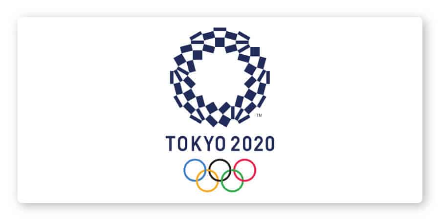
Entitled Harmonized Checkered Emblem, the simple circular logo is made up of 3 shapes of rectangles all in indigo blue. The design is meant to reference a pattern popularly used in kimonos.
According to designer Asao Tokoro, the logo was intended to represent the different countries, cultures, and ways of thinking, to communicate a message of unity in diversity.
It’s simple, effective, and original.
Designing a logo for the Olympics is much more than just a logo– it is a symbol associated with success and progress. For any country, when it comes to their logo, it needs to represent them and to tell their story, past, present and future.
The same principles that went into each Olympic logo design should be implemented in your own logo. I hope this article inspires you to reach for the gold medal of logo design.
This portion of our website is for informational or educational purposes only. Tailor Brands is not a law firm, and the information on this website does not constitute legal advice. All statements, opinions, recommendations, and conclusions are solely the expression of the author and provided on an as-is basis. Accordingly, Tailor Brands is not responsible for the information and/or its accuracy or completeness. It also does not indicate any affiliation between Tailor Brands and any other brands, services or logos on this page.
Products
Resources
©2025 Copyright Tailor Brands