Creating a photography logo for your business will help you focus your brand.
With so much opportunity to expose yourself and your business – on social platforms and the like – it’s important to give your customer base the best view of who you are and what you do.
Alright, I’m done with the puns!
Today, with the simple touch of a screen, a photo can be captured, so it’s important to show your worth with good branding.
To make yourself stand out, you’ll want to narrow down your photography niche and brand yourself in an approachable way. You want your brand to speak to your specific industry and show your professionalism.
Nothing is stopping you from setting up shop and creating a photography logo within a few clicks, so let’s dive into what you’ll need to come up with a good logo and, as a result, good branding materials.
What Makes a Good Photography Logo
You’ll need more than a nice image, font, and a standard color scheme to make your brand pop.
To start, your logo needs to grab attention. You want your brand to be noticed by the people YOU want it to. If you’re a wedding photographer, you’ll cater to a specific group of people, but if you’re a rave and club photographer, your customer base will be different.
In other words, your logo should resonate with who you want your customer to be. Using colors and imagery that will appeal to your target audience will help them take notice of your brand and feel like it’s relevant for them.
There’s no point in having a plain logo that’s easily forgotten; when someone sees your logo, you want to make sure they don’t glance right past it without a second thought.
Your logo should tell your audience what you do or what they can gain from you. Don’t make your audience try and guess what your brand does; try to play with different design elements like colors, images, symbols, and fonts to tell your brand’s story.
To get some ideas for logo designs, check out some of the top photography logo types below!
Types of Photography Logos
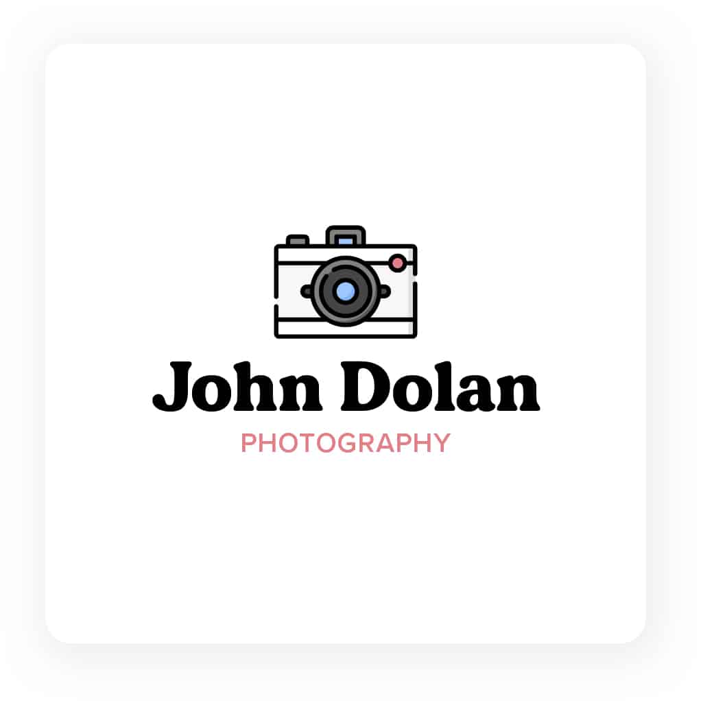
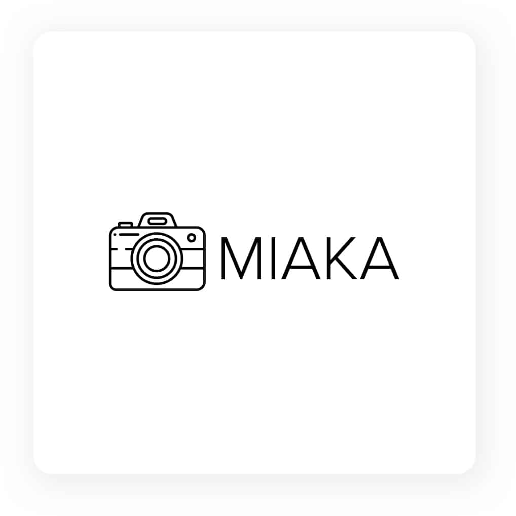
1. Camera themed photography logos
The best way to have your logo speak for itself is by including some sort of visual that clearly indicates to anyone looking at it that you are a photographer.
There are many different ways you can do this. If your business is called Shutter Studios, for example, you can include a lens shutter as part of your logo design. Or, if you go off of initials, try to find a way to design them so that they are clear, but also give off some sort of camera-y vibe.

Choosing a camera-themed icon will be your most straightforward option and is the most basic way to ensure your customer knows you’re a photographer regardless of the niche you work in.

2. Signature-like photography logos
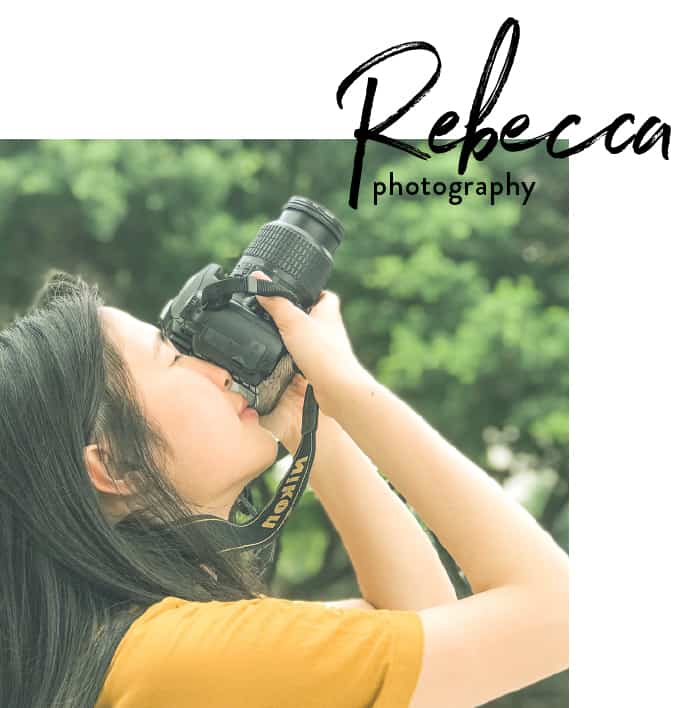
If you’re a photographer that works – or wants to work – in a more professional environment, consider sticking to a text-only logo that showcases your business name.
For example, if you specialize in photographing corporate events and keynote speakers, you’ll want a logo that gives off the same impression. To do that, stick to sturdy classic fonts like serifs and sans-serifs.
Serifs, like Times New Roman, give off a very classy feel, and sans-serifs, like Arial, give off that professional vibe while being a bit more modern.
Choose the font that will match your brand personality well so that customers can know what to expect from your work. With one glance, a potential customer looking at your website, business card, or Instagram page will understand how you work and photograph because your logo will give off the same feeling as being at an event of that nature.
3. Nature-inspired photography logos
This type of logo is perfect if your photography niche is nature or landscape photography.
It’s always a good idea to let your logo represent what you do. You can leave a bit of mystery but consider the colors and background of your logo and how you want it to appear on your branded platforms.
Nature photography takes a sharp eye, so follow through with that in your logo design as well. You can use a symbol that represents your style. If you work with florists often, consider including a flower or bouquet, or if you do wildlife photography, you can include a bobcat or wild bird as part of your logo.

4. Sturdy photography logos
If you’re an architectural photographer, consider translating the structure of buildings into your logo design. A good way to do this is by encasing your logo in a border of some sort. Straight lines won’t steer you wrong if you want to give off a sense of structural integrity.
5. Photography logos surrounding newborns
Pregnancy, newborns, and babies take a certain nuance to photograph. The photos you see in this category are often soft-toned and give off a sense of gentleness and calmness.
Let your logo speak for your brand in this same way. Play into the soft color palette in your logo design by choosing pastels and warmer tones.
You can also opt for a softer and looser typeface to aid in your brand message as it will give off a gentle feeling. If you don’t want to associate with baby pink or baby blue, consider gender-neutral colors that usually appear in baby photography such as baby yellow, baby green, or any other shade in that color family.
6. Wedding photography logos
Wedding photography is often elegant with a twist. There are many styles within wedding photography, but you can get the perfect logo by following these key points.
Let elegance play into your logo design. To do that, you can choose a font that will give off that regal feeling.
Thin lettering with cursive font often works well here, but play around with your specific wedding photography niche and find what works best with your brand and style.
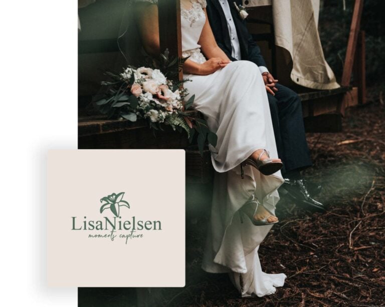
Consider also the style of wedding photography you do and what colors are present. If you do more hipster weddings that are at a woodsy location, play on the earthy browns and greens. But, if the weddings you photograph are more classic, stick to the clean and crisp white color scheme.
7. Nostalgic photography logos
If your photography style leans towards the vintage vibe, you’ll want your logo to reflect that.
Again, you’ll want to give your customers a sense of your style just by looking at your logo. Use a vintage font or a film-style grain in your logo design to give off the right amount of nostalgia.
Think emblems and stamp-looking logos that show your customers that you’re classy in a cool way. The stamped style gives off an older and worn-in look.

8. Clever and “punny”
photography logos
Going on a more abstract route may be a better fit for your photography business logo.
Can your business’ name be made into a photography pun or can you use some sort of metaphor? Go in this direction to really catch the attention of your customers.
Maybe you’re a drone photographer so you can consider somehow incorporating an abstract drone icon into your logo.
There are endless ways to make your logo lighthearted and professional, so stick with what you feel truly speaks to your brand and what makes you stand out from the crowd.

9. Modern photography logos
For a more modern photography style, opt for a modern logo design.
Think about symmetry and sturdy lines to help guide your logo. Take a look at your logos’ composition, spacing, lines, and aesthetics, just like you would in a photograph, and create the right feel for your brand.
You don’t have to have a stiff and uninteresting logo, but take into account the elements you usually work with and find a cool way to integrate them into your design.

10. The star of your photography should be in your logo
Making the subject of your photography part of your logo will ensure that your customers know exactly what you’re offering.
Whether you’re a high fashion/editorial, extreme sports, ballet, or dog photographer, including your subject matter in your design is sure to benefit you and your customers.
This is a sure-fire way to ensure your potential new clients know what they’re in for and it helps your personal branding efforts with minimal interaction from you. Just remember to pick a style that matches how you photograph.
If you photograph professional ballerinas, you won’t want the text on your logo to be bulky and aggressive, instead, you’ll opt for something softer like a cursive font.
11. Bright photography logos
A super saturated photography style may mean you should opt for a bright and colorful logo to match.
Let your logo represent what you do by showing how fun you are to work with and that your photos give off a feeling of happiness.
Your inner rainbow can shine here – just make sure that your color combinations make sense and set your limit to around 3 colors as to not make your logo too distracting. Choose complementary – opposites – or analogous – neighbors on the color wheel – colors for the best combinations.
12. Photography logos with a custom font
Sometimes, the typography of your logo needs to be the star. To help your brand stand out from others in your industry and niche, go for a custom font that gives your brand and logo personality. Bold fonts will give off strength and structure and softer fonts will show your elegant style.
You want your customers to be able to relate to you and the best way to do that is to show them who you are through your logo design. Being unique will help them recognize your brand regardless of where they see your logo.
You can find font makers online or outsource to a designer. Make sure that whatever you choose evokes the style and feel of your photography.


13. Fitness photography logos
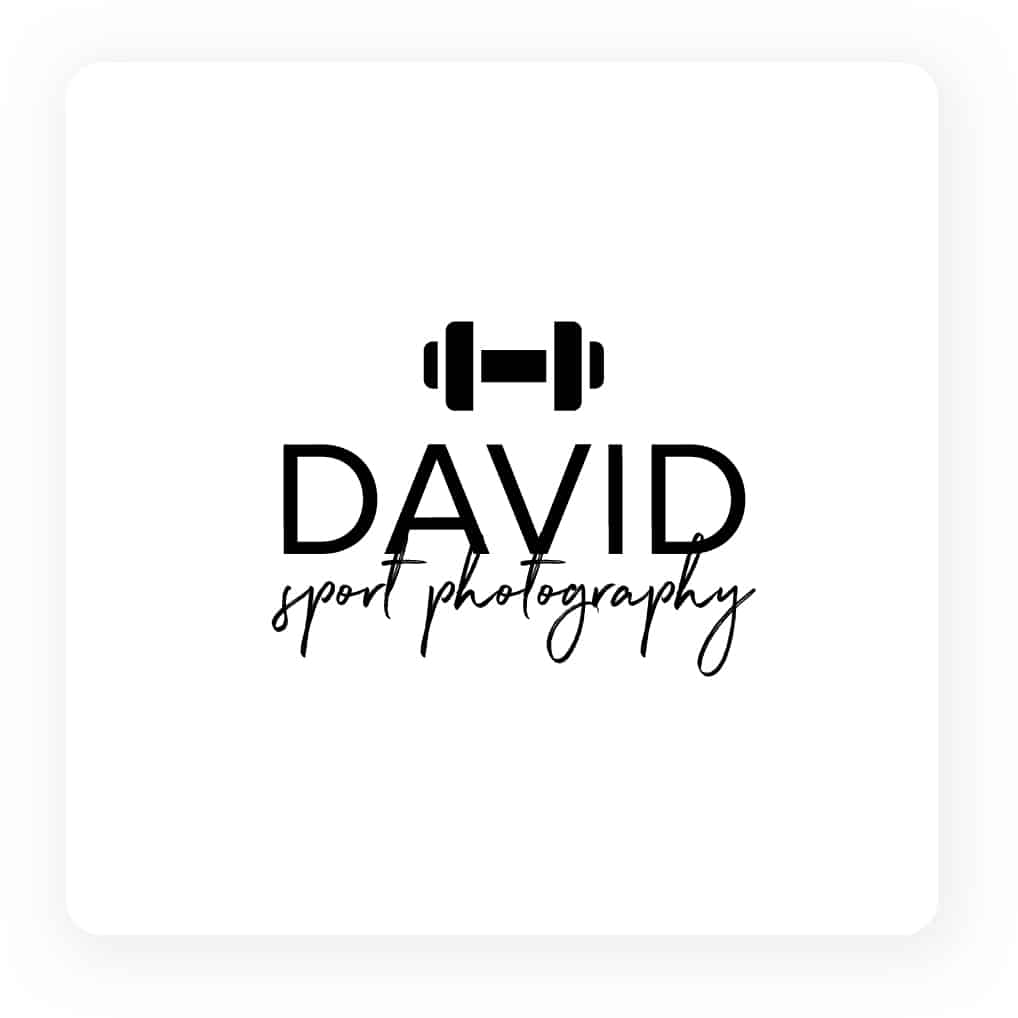
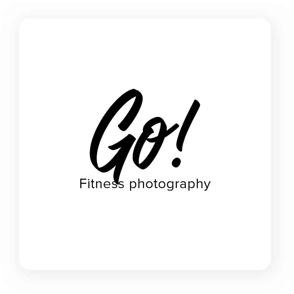
If you’re big in the fitness industry, you’ll want a logo that represents your client base well.
Using dumbbells, chains, or any other gym equipment as part of your logo design will place you as a serious photographer in your field to anyone who sees your logo.
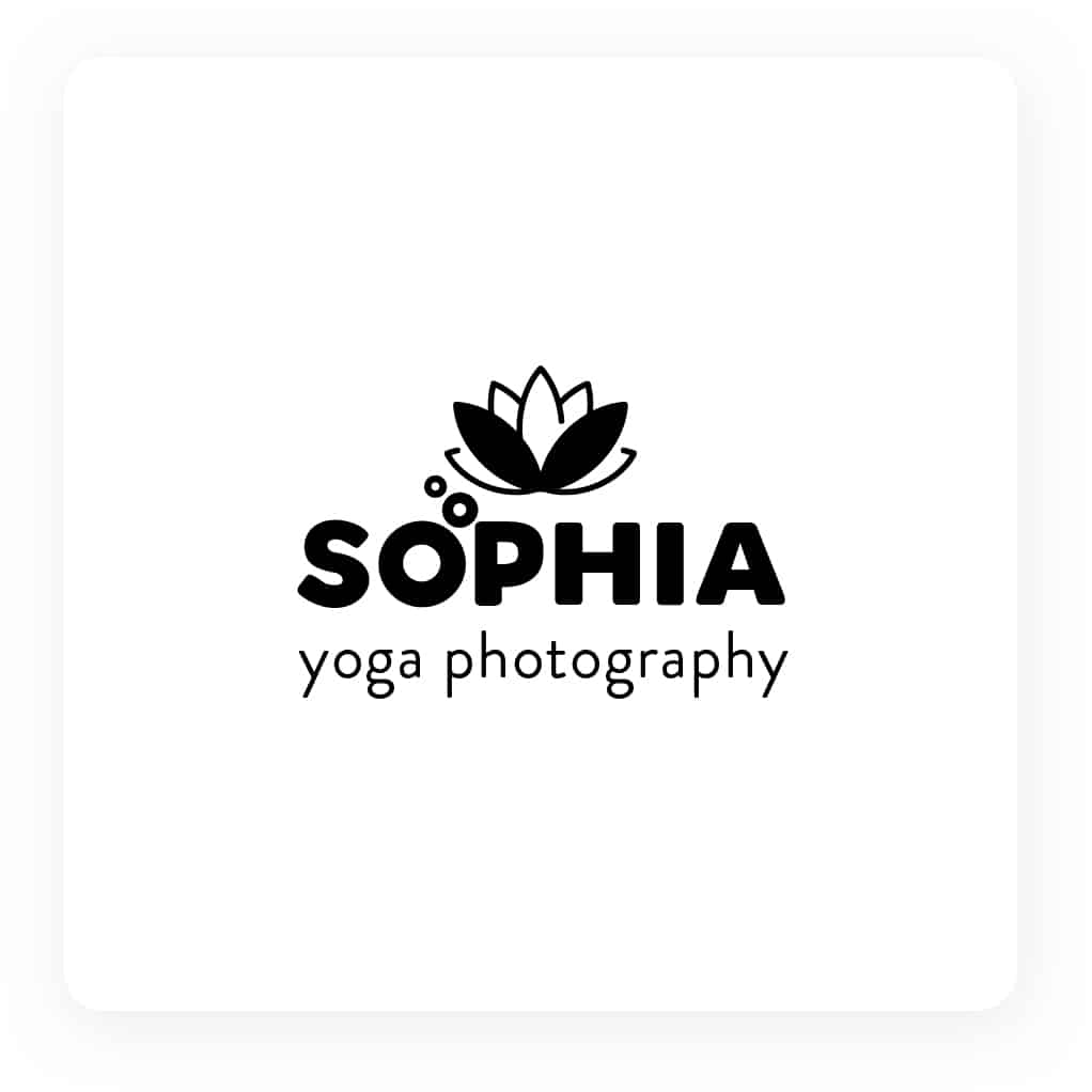
On the other hand, you may be photographing yoga so you’ll want to match your logo to the flexibility of the people you photograph. Consider curved lines and a flexible-looking typeface to ensure your customers know what they can get from your services.
14. Photojournalism photography logos
Photojournalism is another niche within the photography world. Although it can be whittled down into even more specific categories, there’s a certain type of regality and insight you feel when viewing these photos.
Think of Newsweek and how the photographs featured can capture an entire story frozen in time for generations to see.
You’ll want your logo to be of the same nature – sturdy, but not too stiff, so that whoever’s looking at the logo can experience the story of your brand but will also be able to trust its integrity.
Choose a font that gives that structure and consider a classic color scheme that avoids loud and unrelated colors.

15. Still life
Think stock photos or inanimate objects. If that’s where you shine, you’ll want to showcase that with a very professional logo.
This type of photography is usually what you’ll see in advertisements, so the composition, arrangement, lighting, and object are all important to get the perfect shot.
Play into these elements as you create your logo so that your customers can get a clear view of your quality of work and images. Here, balance is key.

Over to You
Remember to keep your photography logo unique, memorable, and true to your brand when designing it.
Why not try out the Tailor Brands logo designer?
Our AI-powered algorithm does all the hard work for you – all you need to do is answer a few questions and the logo maker takes care of the rest!
