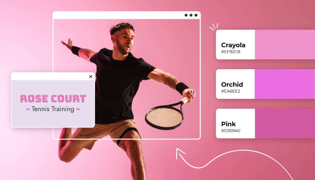
The color pink is usually perceived as a soft, feminine, often weak color. In fact, pink is among the least common colors used in logos.
But actually, pink is more versatile and powerful than that and can hold many different meanings that can help brands stand out.
Pink takes all the passion and energy of red and tones it down with the purity of white, leaving us with a color of tenderness and affection.
Discover the psychology of the color pink, how to use it with different design elements, the various industries that would benefit most from using a pink logo and if it could suit your business.
Every color has a significant influence on our behavior, mood, and even physiological reaction. That being said, color associations are strongly dependent on culture, personal experiences, and upbringing—color meaning is not one-size-fits-the-crayon-box.
For example, in Western cultures, pink is widely considered to be feminine, romantic, and soft. In South Korea, pink symbolizes trust. Whereas in Japan, pink denotes spring, youth, and good health.
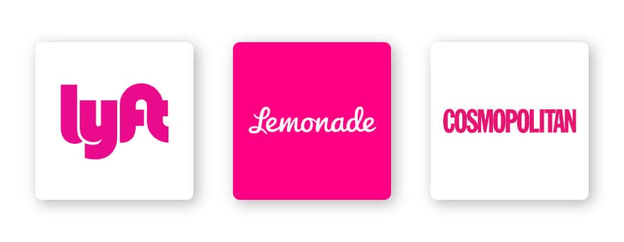
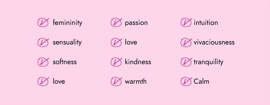
Still, pink is generally thought of as a color that symbolizes sweetness, warmth, love, softness, femininity, and playfulness. Brands take advantage of pink logos to exhibit these traits, such as Cosmopolitan and Lemonade. The insurance company chose a bright pink logo to take a boring subject and make it fun.
The color pink can also represent friendship, harmony, and approachability. Just take Lyft’s pink logo as an example. The rideshare company uses a bright pink logo purposefully to make women feel comfortable getting into their cars.
When it comes to pink logos, there are certain design elements that combine well and those that don’t.
Choosing the right typography in your logo could bolster your overall brand. The font you use in combination with pink can be key to effective brand recognition.
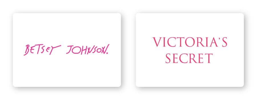
There are 5 main font families, each with their own personality:
Serif – Popular with companies that are seeking to portray an elegant, sophisticated brand, like Victoria’s Secret.
Sans-serif – Easy to read and straightforward; a popular choice among start-up and tech companies
Slab serif – Bold and impactful, slab serif fonts are frequently used by car and technology companies.
Script – Well-suited for businesses that want to express elegance and add a personal touch, such as photographers, coaches or any family-owned brand. Script pairs well with pink.
Decorative – Loud, fun, and entertaining, these fonts combine well with pink like Betsy Johnson’s logo.
Of course, these are just general rules, but by no means are they set in stone. Feel free to play around with different font combinations.
In your logo design, different shapes can help forge a clearer emotional and psychological connection between your brand and consumers. It’s important to understand what each shape says about your brand and how you can effectively incorporate them into your design.
Circles and round shapes are generally more feminine, symbolizing stability and collaboration. Logos that use rings are designed to be welcoming, positive, and focused on a message of unity.
Circle logos can also be a sign of continuity and perseverance, because the imagery is commonly associated with time, planets (or the sun), and more.
Think about using a circle in your pink logo design to send a message of togetherness, harmony, friendliness, and more.
Like I mentioned before, colors are subjective and there’s no right or wrong way to use pink in a logo.
That being said, you can use pink if it aligns with one of the messages/values of your brand. Or, you can use pink to differentiate yourself from competitors’ logos.
If your brand falls under one of these industries, here are a few ideas for how to use pink:
While pink is commonly made to look as bright and eye-catching as possible, let’s not overlook its soft and gentle side. By using light tones of pink, a personal brand can communicate new meanings beyond feminine.
From nail salons to makeup artists, pink is a natural choice for beauty brands. Pink has a strong connection with feminine brands, which is why any shade of pink can work well for a beauty brand.
Most real estate logos often feature white lettering on a solid color background, usually blue and gray.
However, in a competitive space like the real estate industry, you want your logo to stand out. Using pink in your real estate logo can convey feelings of trustworthiness, approachability, calm, and friendliness that can invite customers in and make them feel comfortable.
We’ve seen that pink is ideal for expressing elegance and femininity, which is especially true for wedding brands. Soft pink color palettes are usually your best bet for creating a wedding logo, as they’re approachable and work with most event themes.
For an inviting and versatile look, you can’t go wrong with muted tones (but don’t use more than 2 or 3 colors in your design—less is more).
When someone says they are “in the pink,” they mean that they’re in good health. So, naturally, pink would work great in a health and wellness logo.
Pink is known to have a calming effect. With its cheery and joyous presence, it’s hard not to smile in the face of pink.
The technology industry isn’t going anywhere, and tech companies need to separate themselves from the crowd more than ever. If you’re looking for a way to tell your audience why your software or service is the best there is, a pink logo might be the way to go.
Your logo’s color is where you can mainly differentiate yourself from competitors. Where your biggest rivals likely use masculine colors such as blue or black, you may want to consider more vivacious colors like pink that speak directly to your audience.
Pink can be pretty versatile depending on the colors you combine it with. Let’s take a look at some examples of a pink logo color combinations:
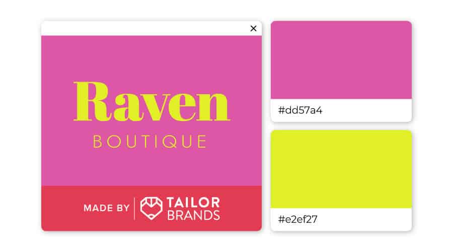
If you want a logo that customers associate with playfulness and optimism, then yellow and pink is the way to go.
The neon yellow has the advantage of being both young and bold at the same time, while the stable pink grounds the design.
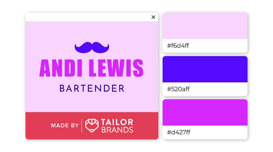
The 2 contrasting shades of pink complement each other well, while the electric blue makes the whole logo pop. Choosing this color combination is bold, yet classy, creative, and hip.
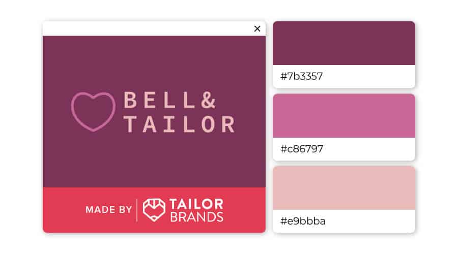
Ranging from purple to blush pink to nude, this trio is different enough to add a unique touch to the logo, while expressing a sense of softness.
You can check out this video to learn more about how color psychology affects people and what it means for you when you’re ready to design your own logo (skip ahead of 5:19 to learn about pink).
We’ve seen that pink conveys femininity, elegance, and playfulness, but combining it with other colors and custom typography can lead to impactful logos.
If you are considering pink as a primary color for your brand’s logo, try out Tailor Brands’ logo maker to create a pink logo!
This portion of our website is for informational or educational purposes only. Tailor Brands is not a law firm, and the information on this website does not constitute legal advice. All statements, opinions, recommendations, and conclusions are solely the expression of the author and provided on an as-is basis. Accordingly, Tailor Brands is not responsible for the information and/or its accuracy or completeness. It also does not indicate any affiliation between Tailor Brands and any other brands, services or logos on this page.
Products
Resources
©2025 Copyright Tailor Brands