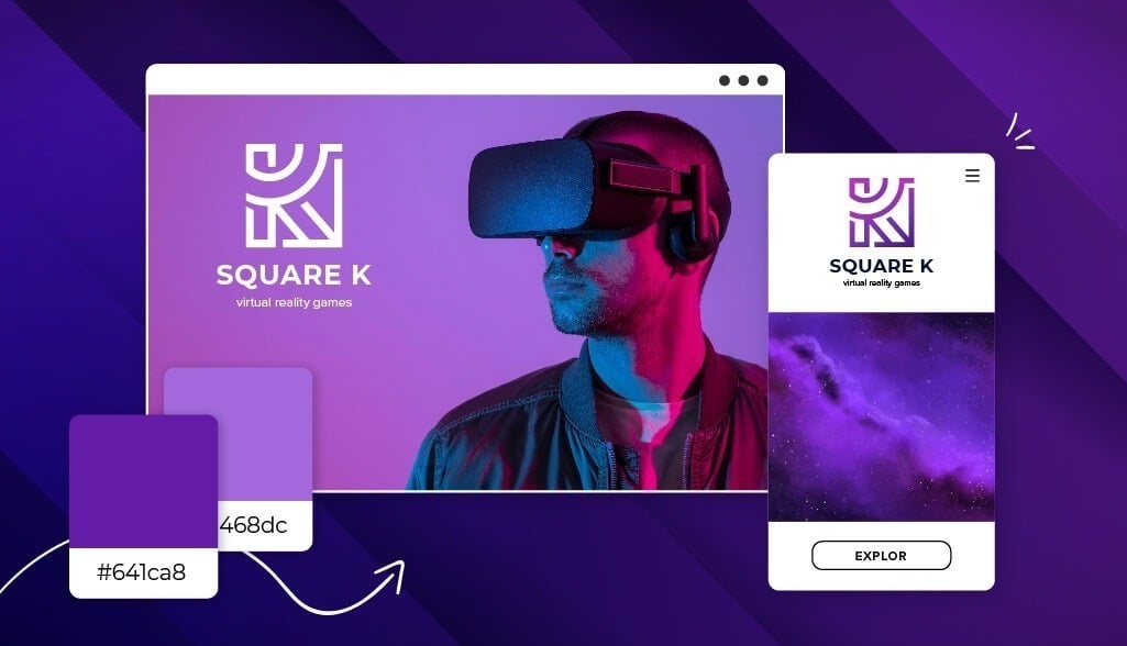
Thinking about setting your business’s logo in a pop of purple?
That might be an awesome choice – and I’m here to help you decide one way or another.
The meaning behind your business’s logo color can have a huge impact on whether or not your audience connects with your business at first sight. Now, I happen to love purple personally, and it can definitely make a strong impact on future customers – but only if used correctly!
I’ll talk more about what that means below, including the associations people have with purple, how it’s best integrated with other design elements, and what kinds of businesses use it most in their logo.
And, if you decide to design your own purple logo by the end of this post, you can head over to our logo maker to get started!
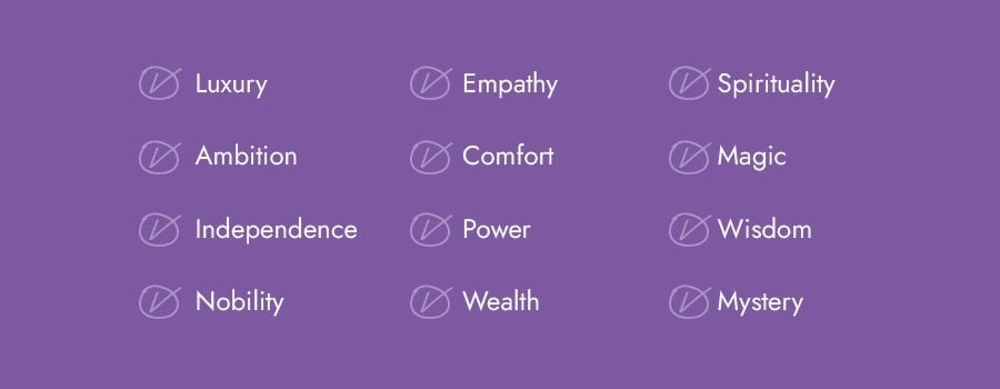
It has been proven that colors have a significant impact on our behavior, mood, and even physiological reaction.
However, the meaning of colors depends on a variety of factors, including culture, personal experience, and upbringing.
If you want your logo to express attributes like luxury, ambition, independence, empathy, wealth, and more, purple is the color for you. Let’s look at how some well-known brands use purple in their logo.
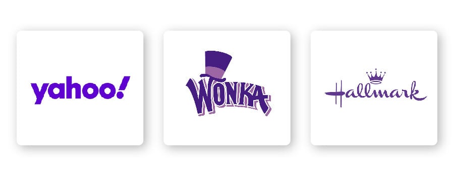
Look at how Hallmark, the oldest greeting card manufacturer in the U.S., uses purple to indicate luxury while also expressing comfort and empathy. Then consider how the Willy Wonka brand uses purple to convey magic and mystery, while Yahoo’s purple logo balances wisdom with creative fun.
As you can see, there are different ways you can use purple to help send your specific message to your audience.
When it comes to purple logos, there are certain design elements that combine well and those that don’t.
Choosing the right typography for your logo could bolster your overall brand. Review the 5 main font families to determine which one suits your brand best.
Serif – Ideal for businesses that want to appear established, respectable, and trustworthy.
Sans-serif – Casual, easy to read, and modern, sans-serif is a popular choice among start-ups, tech businesses, and even entertainment brands like StubHub.
Slab serif – Bold and impactful, slab serif fonts are frequently used by car and technology companies. Mostly, slab serifs are fun and make an audience feel happy.
Script – Well-suited for businesses that want to express elegance and luxury, such as Cadbury chocolate.
Decorative – This is a font that’s loud, fun, and entertaining, which is why it works for companies like Twitch.
Of course, these are just general rules, but by no means are they set in stone. Feel free to play around with different font combinations.
Shapes can help your brand build an emotional and psychological connection with your target audience. Each shape says something about your brand, so it’s important to understand the meanings of shapes to incorporate them appropriately into your logo design.
Square and rectangles are powerful shapes that represent positive ideas and feelings, such as reliability, stability, and a sense of order. When combined with purple, squares and rectangles deliver a bold logo design. If you take a look at Wizz Air’s logo, you’ll notice how the logotype is defined by its colorful lines and sharp angles.
In logo design, an icon is a symbol that conveys values and ideas that are immediately recognizable. Many brands choose animal logo icons because animal imagery can cement their values and characteristics in their audience’s eyes, such as Aussie’s kangaroo. The kangaroo icon and color purple paired together communicate the company’s commitment to providing luxurious products, while also remaining true to their Australian roots.
To take your icon a step further, try incorporating negative space into your design. If you look closely at the FedEx logo, there’s an arrow created by the white space between the letters “E” and “x”.
As I mentioned before, colors are subjective and there’s no right or wrong way to use purple in a logo.
That being said, you should use purple if it aligns with one of the messages/values of your brand. Or, you can use purple to differentiate yourself from competitors’ logos.
If your brand falls under one of these industries, here are a few ideas for how to use purple:
Purple is the color of nobility, luxury, and wealth, which is why chocolate brands like Cadbury and Milka use it as their logo color. Chocolate companies aren’t just selling candy—they’re tapping into an emotion that chocolate evokes. When associated with purple, those emotions are heightened.
Athletes and sports franchises wear purple as a bold, eye-catching visual exemplifying their athleticism on the field. Both the Los Angeles Lakers and the Baltimore Ravens use the color purple as their signature team color.
Purple is a color associated with traits such as independence, comfort, wealth, and magic—all of which perfectly match travel brands! If you’re a high-end travel agency, a purple logo could express traits such as luxury and wealth to your target audience. Wizz Air, for example, uses various shades of purple to channel the magic and mystery that comes with flying to new places.
Way back when, purple was a color worn by royalty and the upper class. Because of its connection to the wealthy, many universities like UCLU and Western University adopted purple for their own school colors to distinguish themselves as premier academic institutions.
Physiologically, purple heightens people’s sense of beauty and sparks creative ideas. This makes the color purple perfect for beauty brands. For example, Aussie is a hair care company that uses purple to express these attributes and remain rooted in nature.
If you need to curate a personal brand, you’ll need a color that immediately tells your audience who you are and what your expertise is. Showcase your talents using the color purple to express empathy, ambition, power, and wisdom.
It’s important to note that no one color fits in a box. Take a look at what competitors in your industry are doing and if the color purple is too commonly used. If it’s overdone, you might think of using an alternative color to stand out. But if it isn’t used enough, ask yourself if the psychology of the color will work for your brand before choosing it.
Purple can be pretty versatile depending on the colors you combine it with. Let’s take a look at some examples of purple logo color combinations:
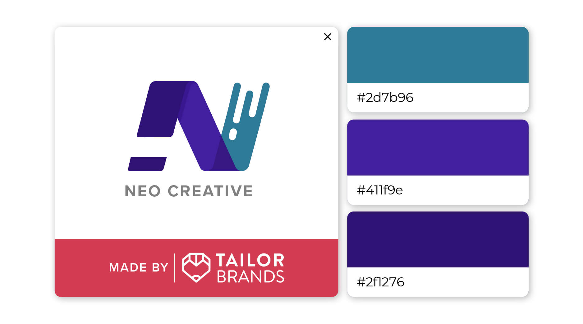
Pair green with 2 shades of purple to add harmony and balance to your design, while also creating movement and energy. This look would work well for athletic businesses, as well as anything related to the arts.
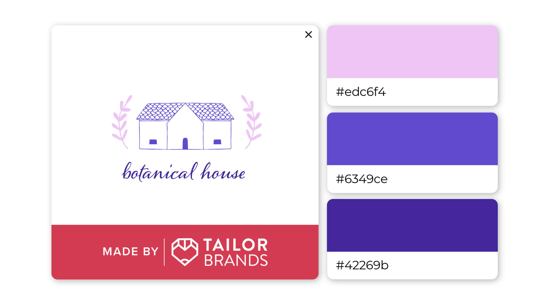
Intuitive and powerful, dark purple is a dramatic color that pairs well with a softer shade of purple. The combination of light and dark creates a sense of compassion and gentleness. This trio would work well for artistic endeavors.
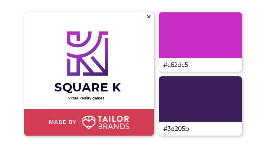
Let your logo pop with deep purple paired with hot pink. This bold, dramatic color palette demands attention, yet it does so with class and sophistication. This look would suit businesses in the world of technology or travel.
You can check out this video to learn more about how color psychology affects people and what it means for you when you’re ready to design your own logo (skip ahead to 3:52 to learn about purple).
We’ve seen that purple conveys luxury, ambition, independence, and empathy, but combining it with other design elements can lead to an impactful and unique logo.
If you are considering purple for your brand’s logo, you can head over to our logo maker where you can play around with different design elements, color combinations, and more until you get the design that’s right for you.
This portion of our website is for informational or educational purposes only. Tailor Brands is not a law firm, and the information on this website does not constitute legal advice. All statements, opinions, recommendations, and conclusions are solely the expression of the author and provided on an as-is basis. Accordingly, Tailor Brands is not responsible for the information and/or its accuracy or completeness. It also does not indicate any affiliation between Tailor Brands and any other brands, services or logos on this page.
Products
Resources
©2025 Copyright Tailor Brands