The Meaning Behind Red Logos
Colors are powerful because they make us feel things. And, while there may be certain associations we have with colors depending on our cultural upbringing and personal experiences, there are some emotional connotations that translate across the board.
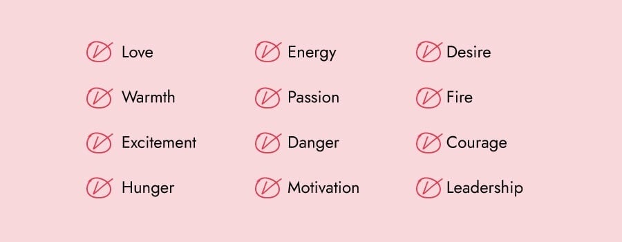
In red’s case, you’re getting a logo that will express love, warmth, excitement, energy, courage, leadership, and more. Check out the full list:
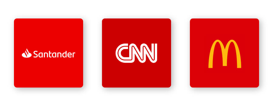
Red is the first color babies see other than black and white. You could say it’s one of the most eye-catching colors out there! The color red is exciting, energizing, and can even increase your heart rate, all of which is known to jumpstart your appetite. (That’s the main reason why McDonald’s logo is red and yellow.)
In the design world, red demands attention. The CNN logo uses the color red to signify their role as leaders in the news industry.
The intensity of the color red has inspired many brands from different industries to make it their logo color. A huge majority of financial brands use the color blue, and yet Santander went with red to not only stand out from competitors but to bring to mind energy, strength, courage, and command.
How to Combine Red With Other Logo Design Elements
When it comes to red logos, there are certain design elements that combine well and those that don’t.
Typography
Choosing the right typography for your logo could bolster your overall brand. The font you use in combination with red can be key to effective brand recognition.
There are 5 main font families, each with their own personality:
Serif –Serif refers to the small feet at the end of the stroke on a letter (think of the TIME magazine logotype). This font is seen as trustworthy, established, and reliable.
Sans-serif –Modern, easy to read and straightforward, sans-serif is a popular choice among start-up and tech companies such as Hulu.
Slab serif –Bold and impactful, slab serif fonts are frequently used by car and technology companies.
Script –Well-suited for businesses that want to express elegance and add a personal touch, such as photographers, coaches, or any family-owned brand. The Coca-Cola script logotype suggests historical roots and traditional values.
Decorative – Loud, fun, and entertaining, these fonts are flexible enough to let companies decide which emotion to focus on. H&M’s font appears as if it’s been brushed onto a white canvas, grabbing impulse shoppers’ attention and making them excited to buy new things.
Of course, these are just general rules, but by no means are they set in stone. Feel free to play around with different font combinations.
Shapes and icons
In your logo design, different shapes can help forge a clearer emotional and psychological connection between your brand and consumers. It’s important to understand what each shape says about your brand and how you can effectively incorporate them into your logo design.
You can use a circular logo with red to highlight a specific part of your design that you want to focus on. Showtime’s logo, for example, draws attention to the first half of the design by placing a circle over the first half of the lettering.
Square and rectangles are powerful shapes that represent positive ideas and feelings, such as reliability, stability, and a sense of order. When combined with red, squares and rectangles deliver a bold yet balanced logo design. If you take a look at Uniqlo’s logo, you’ll notice how the logotype is framed within a red square, telling shoppers that they can expect quality and dependability.
Abstract logos incorporate recognizable shapes to form a logo with layers of meaning. What’s interesting about The North Face’s logo is that it’s kind of a combination of both circular and abstract shapes. Their logo consists of a slightly skewed quarter circle with 2 lines running through it. The image was inspired by a rock formation in Yosemite National Park, which perfectly captures their strong connection with the outdoor community.
In logo design, an icon is a symbol that conveys values and ideas that are immediately recognizable. Many brands choose to use a mascot logo as their icon. A mascot is defined as an illustrated character that represents a business. Look at KFC’s Colonel Sanders—who doesn’t automatically associate the man in a dapper white suit and a red apron with the fast food joint?
Is a Red Logo for You?
Like I mentioned before, colors are subjective and there’s no right or wrong way to use red in a logo.
That being said, you should use red if it aligns with one of the messages/values of your brand. Or, you can use red to differentiate yourself from competitors’ logos.
If your brand falls under one of these industries, here are a few ideas for how to use red in your logo:



Red logos for food brands
Coca-Cola, KFC, McDonald’s Wendy’s, Checkers, Pizza Hut, Dairy Queen—you get the idea. Red has been known to increase appetite making it a great choice for businesses in the food industry.
Not only does red make you hungry, it can also quickly draw your attention. People make 62% to 90% of their snap decisions about products based on color alone. If you want to grab people’s attention so they grab a bite at your restaurant, cafe, or bakery, red might be the color for you!
Red logos for technology and media brands
YouTube, AMC, Adobe, and CNN are some of the technology and media brands that come to mind when you think about companies in these industries. Because red is a color that signals urgency and importance, it helps businesses have a strong influence on people.
Red logos for safety brands
Red is often associated with anger or danger, so you may not want to use it for a safety or security related brand. But, on the other hand, you can use red in your logo to stand out from competitors (win!).
To tone it down a notch, pair red with white or other muted colors to bring some balance to the design. You can also try pairing red with other primary colors (blue and yellow) to give it an energy packed logo that attracts a younger audience. For example, AAA Life Insurance Company has a red and blue logo to signal leadership and spark trust.
Red logos for professional services
Many professional services, such as architects, accountants, engineers, and lawyers utilize red in their logo design. If you take a look at some of the biggest architectural companies (BDP, HOK, and Gensler, for example) they have a red logo to prove not only are they industry leaders but they are motivated to be the best.
Red logos for airlines and travel agencies
Red is a color that expresses excitement, hunger, passion, and courage, which is why it’s the perfect color for airlines! Emirates, Delta, Air Canada, Hotwire, and CheapTickets all have a red logo to convey these traits. Having the color red in your logo will encourage people to finally take that trip they’ve been dreaming of!
Red logos for clothing and retail
Just about everyone can relate to the joy that buying a little something for yourself brings. In fact, research suggests that shopping gives you an emotional boost! The color red has a similar effect, so pairing the 2 together is explosive.
In fashion brand logos, red indicates youth, boldness, and playfulness. It’s the perfect color for grabbing a shopper’s attention! It’s also a color that’s easy to see from a distance, so your clothing or retail brand can stand out from the crowd and come off as a trusted brand.
Color Combinations That Work With Red
Red can be pretty versatile depending on the colors you combine it with. Let’s take a look at some examples of red logo color combinations:
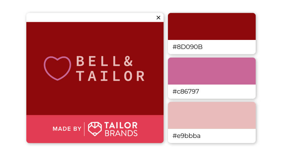
Like I said, red is versatile depending on how you use it. The different ranges of red—from hints of brown to blush pink—expresses softness and warmth. Consider using these color combinations for beauty, clothing, or retail brands.
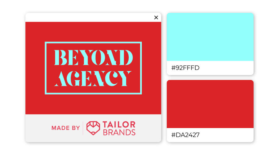
Combining crimson with electric blue is a sure-fire way to stand out! Red and blue are warm colors that encourage us to live loudly, boldly, and courageously. This color combination would suit airline or travel agencies, as well as technology and media businesses.
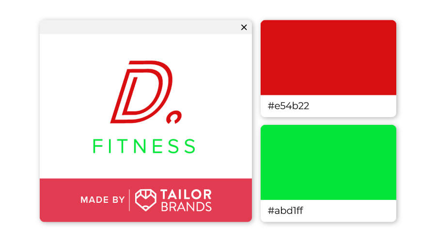
If you think red and green can only be used in the context of Christmas, think again! For a dramatic and striking look, pairing these 2 colors together result in a bright, vivid, trendy vibe that demands attention. It’s a great combination for brands in the fitness industry, entertainment and media field, as well as the gaming world.
You can check out this video to learn more about how color psychology affects people and what it means for you when you’re ready to design your own logo (skip ahead to 1:19 to learn about red).
Over to You
We’ve seen that red conveys excitement, motivation, and leadership, but combining it with other design elements can lead to an impactful and unique logo.
If you are considering red as a primary color for your brand’s logo, try out Tailor Brands’ logo maker to create yours!
