You want a logo that captures people’s attention and makes a lasting impression.
Repetition can help you do that.
It might seem incredibly basic, but using repetition can establish visual unity and an appealing aesthetic, and lead to brand recognition. (Who knew, right?)
Here’s how you can incorporate repetition into your design to make a logo with an impact.
It might seem self-explanatory, but understanding what repetition is as a design concept will allow you to use it more effectively.
Repetition is reusing the same or similar elements throughout your design. This is not to be mistaken as a pattern; pattern is repetition of more than one element working together seamlessly. (I’ll show you what I mean below with examples.)
The ultimate goal of repetition is to make a lasting impression on your target audience.
When it comes to creating your logo, using repetition can make a big impact when applied in the right way.
Repeating colors, fonts, words, or shapes can help tie your whole brand image together. (Basically, a brand image is the impression your target audience has about your business.) It can also help potential customers recognize your brand and keep coming back!
Repetition doesn’t mean your logo should have a lot of elements cluttered together. In fact, repeating an element gives your design depth and dimension, encouraging your eye to follow.
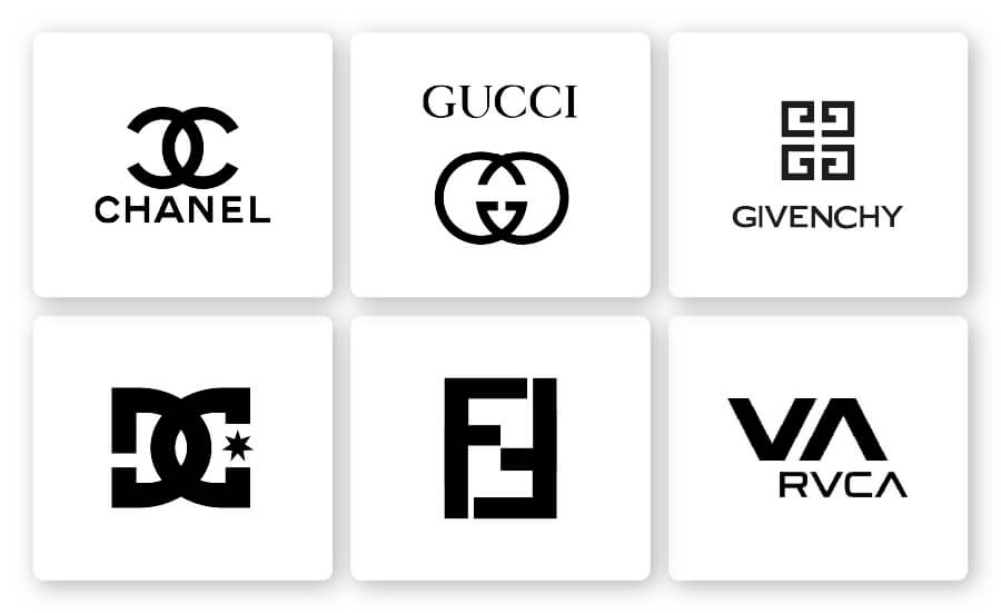
Some of the most iconic logos have a single repeated element, such as Chanel’s interlaced ‘C’. If you take a look at the RVCA logo pictured below, you’ll notice that the ‘A’ is the same shape as the ‘V’, just flipped upside down.
Simple, yet effective.
If you repeat multiple elements, that is considered a pattern, not repetition. A pattern is not as powerful in a logo as repetition because it has more shapes and colors combined to form a whole. So, a pattern is most commonly used in backgrounds on websites and app pages.
The Google logo is a clear illustration of this. Google could have used their multi-colored palette for every letter in their logo, but doing so would’ve looked busy. One color per letter also allowed Google to use those colors throughout their product lines to reinforce their brand identity. (We’ll get into more of that later on.)
You might think using the same element over and over again would make a logo boring or mundane, but it actually does the exact opposite!
Repetition creates:
Repetition is much more than consistent shapes and colors in a logo design. When it comes to designing your logo, you can play around with different elements to add depth and creativity to the design.
Here are 4 ways to use repetition to achieve a more attractive, balanced, and memorable logo:

When you use shapes in your logo, it’s easy to include repetitive elements.
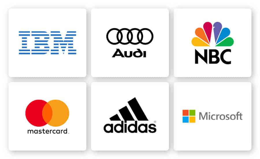
If you look at the logos for IBM, Audi, NBC, Microsoft, Adidas and Mastercard, you’ll notice that each uses geometric shapes repeatedly.
Mastercard’s logo consists of a circle used twice, and NBC uses a teardrop shape 6 times. This is to say that you can play around with how many times you want to use repetition in your logo.
Also, the repeating element doesn’t have to take up the entire logo; it could just be a part of it, just like the 24 stars that circle over the mountain in the Paramount logo.

Choosing the right colors for your logo plays a bigger role than just aesthetic appeal.
The right color combination can form a visual connection between your target audience and your business’s values.
Color can also add depth to your logo by using variation and gradation. Meaning, you can vary the shade or use colors that create a spectrum.
Most importantly, using color repetition can cause an increase in consumer recognition of your brand.
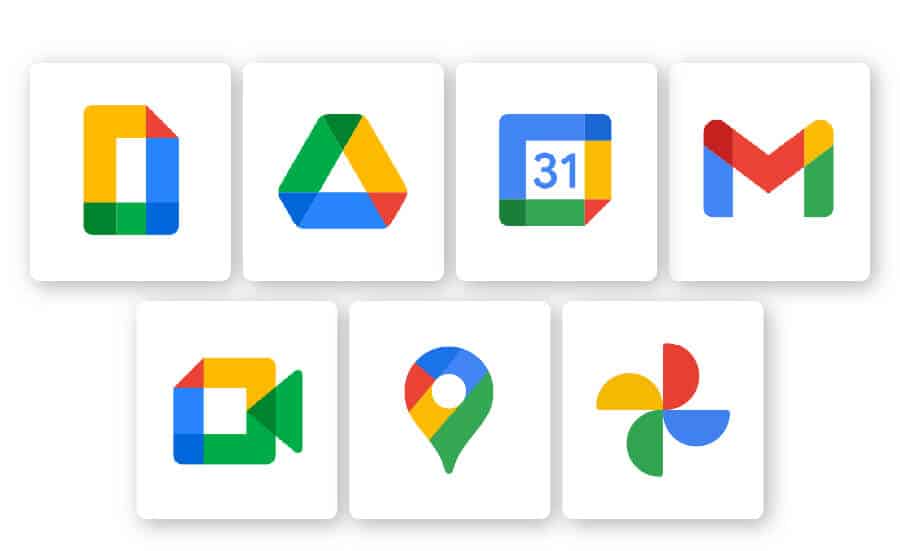
Google, for instance, has an established color palette that repeats throughout all other elements of their branding. If you look at any Google product’s icon (like Gmail or Google Maps), you will notice the same colors show up. So even if you don’t see the Google logo, chances are you would instantly recognize them by their consistent color repetition.

You can also flip, rotate, and overlap letters in your logo to create repetition. It’s common for fashion logos to use a logo centered around a company name (aka, logotype), so they often play around with repeating fonts.
Aside from being major fashion brands, what do Chanel, Gucci, Fendi, Givenchy, RVCA, and DC Shoes all have in common? Their logos have interlaced letters that mirror each other.
In some cases, like Gucci, the initials used in the wordmark are a totally different font than the logotype. But if you look at the ‘F’ in Fendi’s logo, the fonts are the same weight and size as the logotype.
How else can you use repetition with font in your logo? Well, you can use the same font in your tagline as your logo. Let’s say you want your tagline to be the secondary focus in your logo. You can use a lighter font weight to do that.
That said, it’s important to note that using too many fonts, colors or other design elements can result in a cluttered logo.

Using similar shapes that vary in size and spacing can create movement in your logo.
While the examples above of repeating geometric shapes convey consistency and stability, slight variations can express creativity and movement.
Looking at CISCO, Spotify, and SoundCloud, you can see very similar elements are repeating, but those elements aren’t identical. The size variation helps add dynamic movement these sound-based brands want to imply. Think about it: A static logo wouldn’t really fit the brand of any of these companies.
On the other hand, T-Mobile and BlackBerry successfully combine consistency with movement. Both companies want customers to know that they’re reliable, so the repeating design elements are precisely the same. However, they also want to show they’re moving forward with modern technology, which the spacing in between the repeating shapes conveys.
Now that you understand the concept of repetition, you’ll be able to apply it to your own logo.
However you add repetition to your logo, it’s a sure way to captivate your target audience’s attention and make a lasting impression.
Follow these principles of repetition and you’ll be on your way to a stellar logo.
This portion of our website is for informational or educational purposes only. Tailor Brands is not a law firm, and the information on this website does not constitute legal advice. All statements, opinions, recommendations, and conclusions are solely the expression of the author and provided on an as-is basis. Accordingly, Tailor Brands is not responsible for the information and/or its accuracy or completeness. It also does not indicate any affiliation between Tailor Brands and any other brands, services or logos on this page.
Products
Resources
©2025 Copyright Tailor Brands