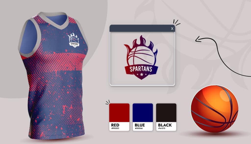
When watching any sporting event, the first thing you notice is the team logos worn by fans in the stands.
But is a team logo that important? The answer is yes. Your team logo represents the soul of your team while reflecting your team’s identity and purpose.
A strong logo not only sets your team apart from the rest but helps your fans feel a part of something special. Having a unique logo that your team and fans can wear proudly will make your team unforgettable.
Whether you’re a professional or recreational sports team, you have to set your team apart from the rest with a unique team logo.
Check out the logo designs below to get the inspiration you need to create your team’s very own logo.
What to Think About When Designing Your Team Logo (+Inspiration)
You want your team logo to stand out and positively impact your team and your fans. Using logo examples, I’m going to show you some of the best practices and how they’re used to successfully create an eye-catching logo.
Feature an animal

Every team has a mascot, so why not use it in your team logo? Many popular sports teams incorporate their mascot into their logo as they’re highly memorable and recognizable. Additionally, mascots can give your team logo a personality and humanize your organization. What these sports teams below succeeded in was choosing a mascot that represented their team values.
For example, Philadelphia Eagles use their mascot Swoop in their logo. The history behind Swoop reflects their team personality and values. Swoop was a bald eagle born with poor eyesight and strength, but had a ‘strong and true’ heart. The eagle grew in size after a Philadelphia Eagles fan gave him a jersey that helped him gain strength and vision to match the size of his heart.
Shape
Your logo’s shape can influence how a person interprets your team. Sharp-edged logos communicate power and stability; curvy logos represent movement and positivity (focusing on building a relationship with the audience); emblems signify tradition, strength, and security. Below, we show examples of sharp, curvy, and emblem-shaped logos.
Sharp edges

Curvy

Emblems

Energetic fonts

Every font has a personality of its own. The right font helps portray your team’s identity and values to the audience. Sports teams want to give off the message that they’re bold, motivated, and sharp. The Energetic fonts, like the ones below, symbolize power and movement. The Calgary Flames logo font portrays speed and aggressiveness, while the Los Angeles Rams logo font shows sharpness and determination. These team logo fonts work because the fonts chosen align with the message they want to convey as a team.
Sport specific

Some sports teams have their logos sport-specific. These logos focus on telling the audience what the team does, taking out any chance for misinterpretation. With an endless number of teams, using a sport-specific logo can help define the team’s purpose for the audience.
For example, the Pittsburgh Penguins have their mascot holding a hockey stick, while the New York Knicks logo is with a basketball. These logos below do well: add the sport-specific symbol to the logo without having it take over. The New York Jets feature a football in their logo; however, they keep it clean and professional.
Monograms

Monogram logos are typically a combination of one to three letters (usually three), creating a single symbol. Monograms are a great option if you have a wordy team name or don’t want to limit your business. Teams use monogram logos to highlight their team’s personality while keeping the logo simple and strong.
The New York Yankees logo works amazingly for a couple of reasons. Firstly, they used a distinct font that grabs viewers’ attention. They also incorporated the team color into the logo and used the blank space behind the logo to make it pop. The Detroit Tigers also did a great job of choosing a strong, unique font that pays tribute to their team’s history.
Cultural/location

Cultural logos are easily recognizable and can help unite a group of people. These logos take a specific part of local culture and incorporate it into the logo itself. For example, the Toronto Maple Leafs’ logo is a Canadian maple leaf, the national tree of Canada. The logo of Paris Saint Germain FC includes Paris’s most famous landmark, the Eiffel Tower. Both teams used their cultural/location symbol differently – and both ways work. The Toronto Maple Leafs took their symbol and made it the logo, while Paris Saint Germain FC incorporated the symbol into the logo.
Color choice

You want your logo to be seen, so it’s important to use colors that help it stand out. Many sports teams use bright colors like orange, yellow, and red to signify positivity, motivation, and power. These colors can be overpowering on their own, which is why most team logos use color combinations to create a balance. For example, Arsenal FC balances their bold red jersey with white. The San Diego Gulls make their black jersey pop by using orange as an accent color.
Over to You
A strong team logo will convey your brand message and values while uniting your biggest supporters. I hope you’ve been inspired to create your own team logo. Write down which designs caught your eye in this post – by knowing what you like, you’ll be able to get started and create your logo.
