
I don’t know about you, but when I think of time, the classics come to mind: It heals all wounds, it flies when you’re having fun, and the third one’s a charm.
And, while all of these cliches have gotten many a person out of an awkward moment, nowhere on that list is criteria for how to preserve it – or apply an abundance of it to your logo design.
Yet, according to the experts (us included), timelessness is a basic requirement of a company’s logo succeeding in the long run; if you’ve ever read up on logo design, you know that a timeless logo is a “good logo,” and a good logo is timeless.
While that sounds nice and all, what does it actually mean?
A question for the ages. (See what I did there?)
There are a few basic rules you’ll come up against when learning how to make a logo, and a case can be made for all of them contributing to the timeless effect. Let’s do a brief review:
– Logos should stick with two or three color combinations– any more and the design looks cluttered and unprofessional.
– Use a font that’s legible and full of personality; stick with just one, or two that contrast while complementing the other.
– When choosing an icon, don’t go with one that overwhelms the other parts of your logo, but do pick one that conveys something about what your business offers.
– Before you commit to a design, make sure the layout is as versatile as it could be; meaning, that your logo will look just as good on a banner as it will on a Facebook cover photo.
If you stick to these guidelines when creating your own logo, the odds are you’ll come up with a design that grows with your brand – that your audience can look at 20 years down the line and still think it’s just as tasteful and memorable.
Bearing that in mind, the fact of the matter is that a timeless logo can be the difference between a business that peaks and tanks within a matter of years, or a business that’s in it for the long haul.
With all that said and done, let’s look at a few logos and see why they’re here to stick around!
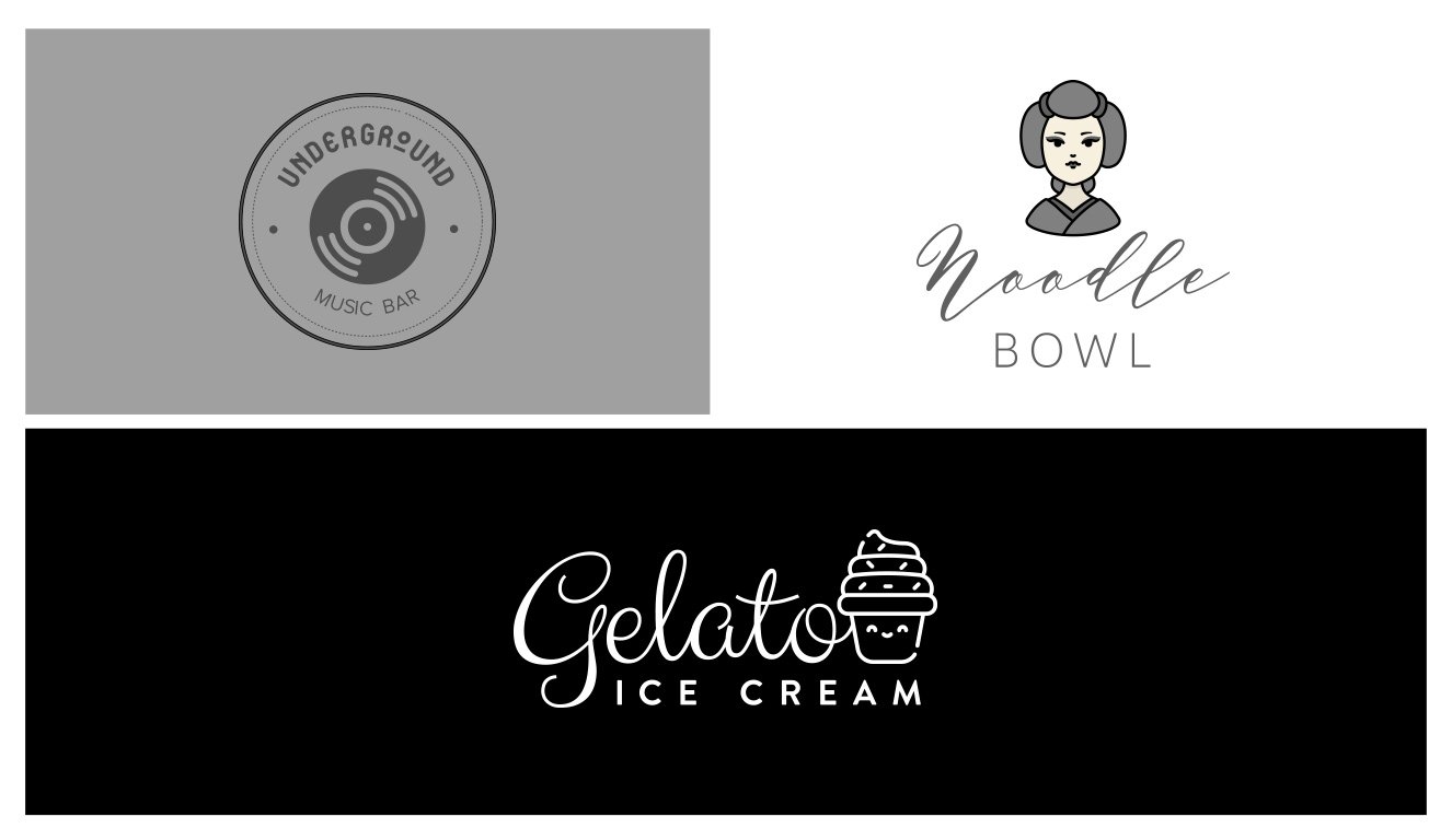
A fancy word to mean “black and white” or “without color,” monochrome logos are the definition of timeless. Black is always the new black, and the stark contrast it has when paired with white is forever going to be striking to the eye.
Black and white aside, there are colors that blow up some years and fade in others; if you’re up-to-date on recent color trends, you’ll know that the candy reds of today were not necessarily the favored shades of the design world in the ‘80’s. Monochrome, however, is never threatening and always welcome.
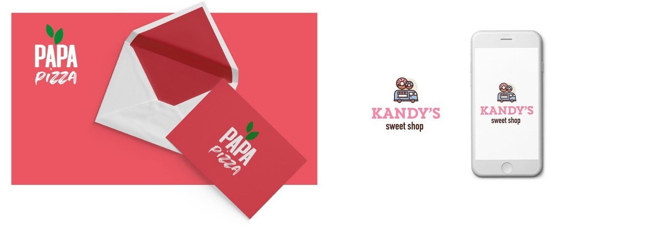
Not to be knocked, the simple logo is often the one that carries a brand to longevity. Simple logos tend to work better across mediums, contexts, and backgrounds, in that they’re versatile and easily adapt to their surroundings.
For a minimalist design, you can always look toward a classic typeface, like a serif or sans serif, to help you get the job done. And, as you’ll see with these simple logos, a clean layout with brief accents of color is all you need for a long-lasting design.
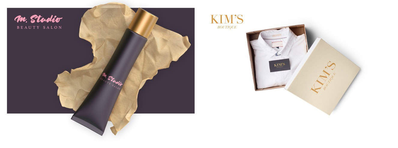
Logos that only use text, or wordmark logos, are never going to go out of style – simply because they’re so reliable. A logo that’s easy to read is always going to last longer than an illegible one, no matter how cool the latter design is.
Why? Easy! People – most of all consumers – don’t like doing mental gymnastics when shopping around, and if they see a logo that takes them even one second to process, they’re going to move on faster than you can flash whatever discount you’re offering. If you make your (clear) typeface the center of your design, it’s not likely to go out of style any time soon.
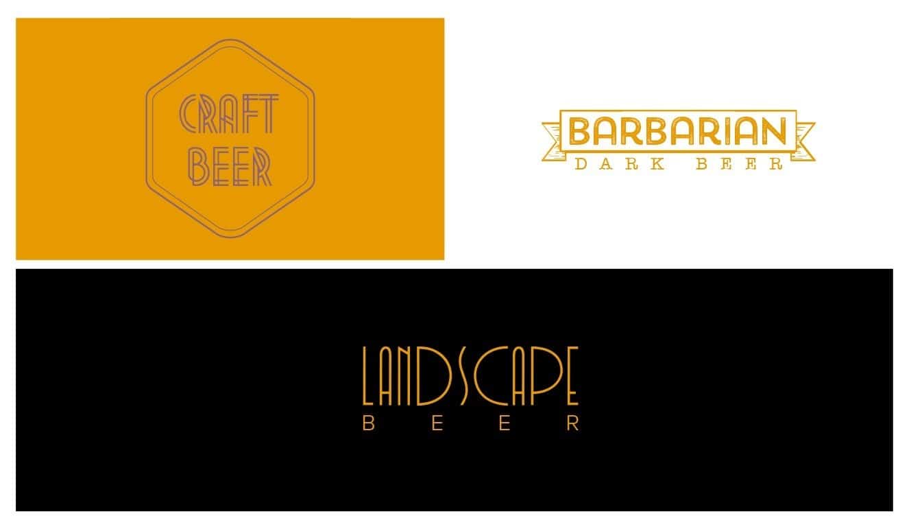
How can something that’s old by definition be forever? Good question – but if you’ve ever come across a brand that uses a vintage logo (or at least a logo in vintage style), you know that they’re just as relevant today as they were 50 years ago.
These logos exude nostalgia, but they do so in a way that makes us want to reconnect with the feelings we associate with the past. Though some have a hand-drawn feel while others rely on their frames, the power behind vintage logos as a whole lies in their ability to bring the past into the present – implying that our business has been around since the beginning of time.
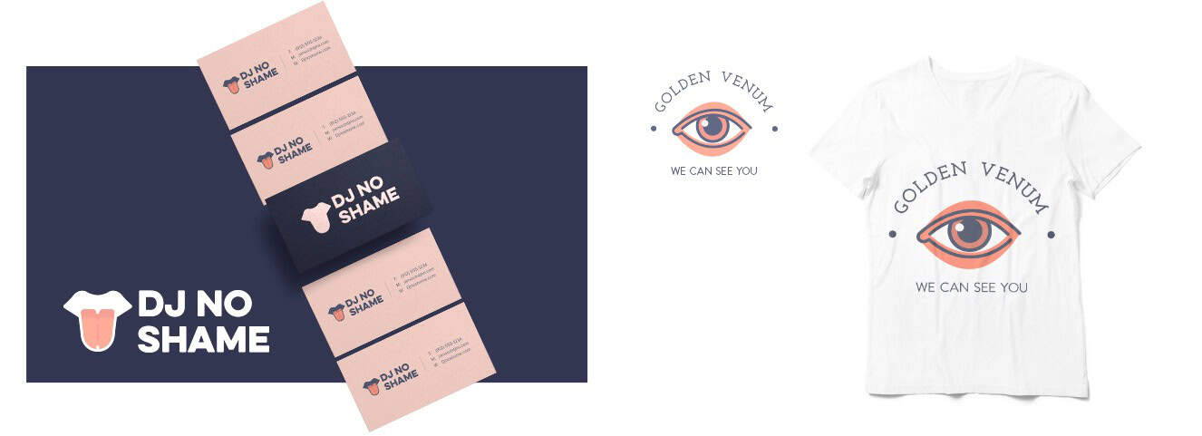
So maybe this is somewhat open to interpretation, but a cool logo remains a cool logo no matter the era. Call it intuition or aesthetic preference; either way, you tend to know something is cool regardless of when you’re looking at it.
Injecting personality into your logo is one of the best ways to get your audience to remember your brand after they first meet you. Here, it’s done through funky icons; other logos use quirky fonts to make their mark. Regardless of your method, if your logo is cool enough, it’s not going anywhere.
From freelancer to conglomerate, your business is in good hands with a timeless logo. Remember to keep it simple, show off your personality, and keep your future audience in mind as you design away.
Ready to make your logo? Check out these logo design mistakes to avoid before you start creating!
This portion of our website is for informational or educational purposes only. Tailor Brands is not a law firm, and the information on this website does not constitute legal advice. All statements, opinions, recommendations, and conclusions are solely the expression of the author and provided on an as-is basis. Accordingly, Tailor Brands is not responsible for the information and/or its accuracy or completeness. It also does not indicate any affiliation between Tailor Brands and any other brands, services or logos on this page.
Products
Resources
©2025 Copyright Tailor Brands