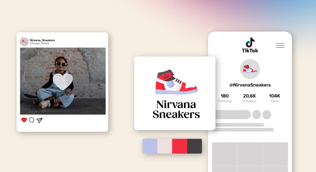
Every time someone visits your social media pages, it should be crystal clear who the owner is (you!). The best way you can make that happen without fail is to design a logo and add it to social media.
Your logo is your calling card, the face of your business, and the icon that people will associate with your brand. If designed well, it will help create trust, credibility, and authority. If it’s not quite up to scratch, then you’re going to seriously hurt your brand image.
Your logo also plays an extensive part in helping to establish brand awareness, or how familiar customers are with your product or services. If you want to strengthen your presence on social media—whether on Facebook, Instagram, or YouTube—including your logo allows your brand to spread further across the web.
Every time someone shares your content, your logo will reach the eyes of a new audience, which helps your branding efforts—not to mention increasing the engagement of your content, which can help you gain more followers and traffic.
Do you want to effectively build up your brand’s presence on social media through posts, videos, and other content? Then keep reading to learn how to add your logo to social media and how to get the most from your social media branding.

Before we get to the do’s and don’ts of putting your logo on social media, let’s talk about how you can add your logo to begin with.
First, when getting ready to upload and display your logo, pay close attention to where and how each different platform shows it. You may need to adjust your design to make sure it’s visible and fits within the respective platform’s boundaries.
There’s a large selection of social media channels available to use, including Twitter, Facebook, and Instagram. While they may look quite similar on the surface, there are plenty of unique differences between them, not least how they’ll display your logo.
But before you upload your logo, make sure your logo design is:
Instantly visible: This means it should contrast nicely against your main banner or cover image
Easy to see: Don’t make it too small
Suitable within the borders: Logo borders can be circular or square, so make sure none of your logos is clipped by the edges.
Mobile-friendly: Is it optimized for smaller screens
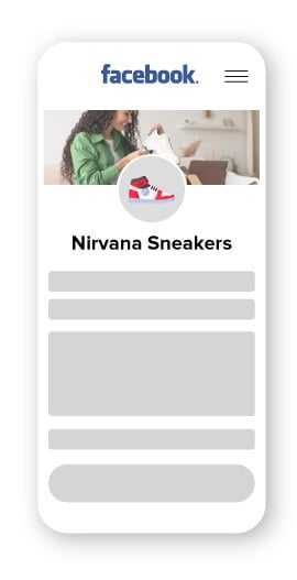
As you know, Facebook was one of the first social networking sites that went mainstream, allowing its members to connect with family and friends. Since 2004 it has evolved as a significant branding and selling platform and enables users to easily post and share content.
Logo requirements: Your logo should be 400px wide and 150px tall (at the very least).
File type: Facebook accepts PNG or JPG files. If your file is SVG, you’ll need to convert it.
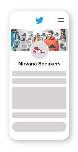
Twitter is a microblogging social network that allows users to post short ‘tweets’ that are limited to 280 characters. Tweets can include videos and links, and Twitter users can ‘retweet’ posts they like or want to bring attention to.
Logo requirements: Twitter recommends a logo size of 400px by 400px
File type: Like Facebook, Twitter only accepts PNG or JPG files
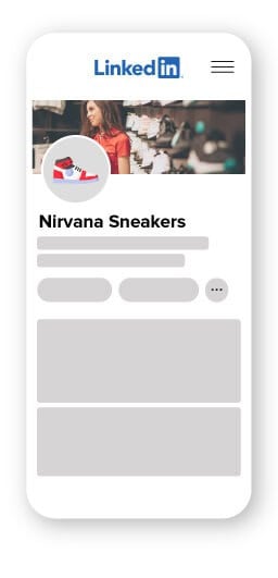
LinkedIn is geared toward business professionals. It helps its users look for new jobs and recruiters find the right people. Many companies that focus on working with other businesses (B2B) use LinkedIn to help brand themselves as a high-quality B2B firm by posting content and business updates.
Logo requirements: LinkedIn recommends a logo size of at least 300px by 300px
File type: LinkedIn accepts PNG and JPG files
Instagram is a photo and video sharing app that’s also accessible on computers and laptops. Users can engage with content they like by ‘following’ the account and seeing their future posts. You can also comment and like posts.
Logo requirements: Instagram recommends a minimum logo size of 110px by 110px and a maximum of 180x by 180x
File type: Note that Instagram does not accept PNG files
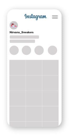
Step 1 – Sign in to your Instagram account and select the person icon to navigate to your profile.
Step 2 – Now click on “upload photo” after clicking on your profile photo and choose your logo file.
Step 3 – Next, head over to “edit profile” and select “change profile” picture. Here, you can click on “done” after picking your logo file.
TikTok has quickly scaled to the top along with the other established platforms like Facebook, Instagram, and Twitter. The platform takes a different approach featuring short videos as its form of content. You can also use a video marker to pre-edit your videos and add more elements. It’s a great way for businesses to connect with potential audiences around the world and get their brand out there.
Logo requirements: The correct size for a TikTok profile photo is 200 x 200 pixels.
File type: .jpg, .jpeg, .png
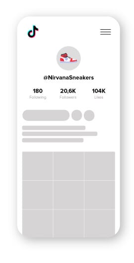
Step 1 – Tap “Me”. This is the starting point, as it will take you into the profile section of your account, where you’ll be able to make the necessary changes.
Step 2 – Tap “Edit Profile”. Next, hit the edit profile link and you’ll go into the area where all different edits can be performed, including those related to your profile picture.
Step 3 – Tap “Change Photo”. This one is self-explanatory: You’ll hit the change photo item in the menu and there will be just one step left to finish.
Step 4 – Tap “Take a Photo” or “Upload Photo”. Pick the right option based on whether you plan on snapping a photo for your profile picture or using one that is already in your gallery.
YouTube is all about uploading and sharing video content—music videos, how-to’s, comedy sketches, recipes, life-hacks, and much more. Amateurs upload a lot of the content, but YouTube is also an excellent place to promote your own video content.
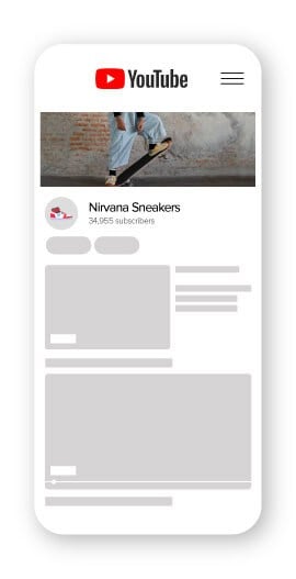
Logo requirements: YouTube recommends a minimum logo size of 800px by 800px
File type: YouTube accepts JPG, GIF, BMP, and PNG files
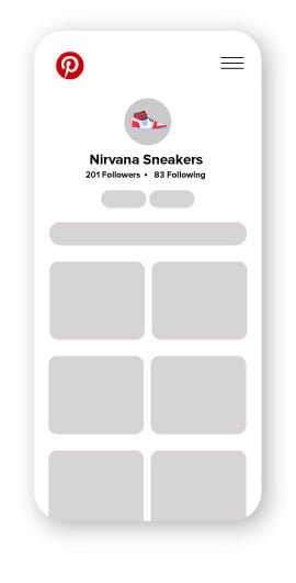
People looking to discover new ideas such as recipes, inspiration for home design, and more can use Pinterest’s visual discovery engine to find and pin ideas onto their very own board— allowing users to keep their ideas neatly organized. As a business owner, Pinterest is a great platform to leverage your SEO and increase your audience with inspirational and relevant content.
Logo requirements: Pinterest recommends that your profile log size is 165px by 165px.
File type: Pinterest accepts PNG and JPG files.
If you’re wondering if you should stamp your logo on all of your social media posts, the general answer is yes.
Now, there are some cases where you shouldn’t and we’ll let you know what those are just below this section. But including your logo will unquestionably help your branding efforts and help increase your overall brand awareness.
As promised, here are some tips for you to use when adding your logo to social media.
Imagine you have a beautiful white logo. Now place your white logo on a white background. Do you know what happens? It disappears. The same can happen with light colors and light shades. Light pink, blue, green, etc. can promptly become near-invisible if you’re not careful with the background you use. Without noticing, you may make your logo invisible by putting it on a similarly-colored background.
So, if your logo is dark, use a light background and vice versa. It’s always good to have a transparent logo on hand in order to do just this.
And, if the design of your post constricts you, you can cheat by adding a background to your logo to help keep it visible.
Consistency is one of the major pillars of branding. Wherever you decide to place your logo (as long as it’s visible) is where you should always put it from now on. Consistency is so important because it ensures your brand’s message, values, and image are reliable across your marketing channels. That’s what will get people to follow and support your brand.
So if it’s in the top-center of the image, always place it there. The only time you should move it is when you have no choice.
Much like placing your logo in the same location each time, you should try to keep your logo around the same size too—not only to help with your branding but also because funny things can happen when you start to play around with resizing logos. Especially when the file isn’t a high-resolution image.
Enlarging your logo can cause it to become pixelated. It makes your logo appear low-quality and amateurish—definitely not a good look.
And, when shrinking your logo, you run the real risk of making it cluttered and impossible to comprehend due to its small size, especially on mobile phones!
As I said, you’ll use your logo virtually everywhere you can. The thing is people will be browsing using different devices when they encounter your brand. Sometimes it’ll be on a smartphone, tablet, or laptop. You need to make sure that your logo can scale to fit each of those different devices.
A dynamic logo is useful in this case as it can adapt and shift according to the context it’s being used in. Unlike static logos, dynamic logos can respond to whatever device or place it’s being used. So let’s say your core logo is featured on your business card and website homepage, but it’ll have to look different when you use it as your favicon or Facebook profile picture.
Once you have your logo (yay!), you’ll have it saved in all different formats. The most common logo file formats are PNG, SVG, EPS, and PDF. Each file is used for a specific purpose, so let’s say business cards and a website header will need to be saved under different formats.
For example, Shopify supports the following image formats:
Or let’s say you want to download the National Geographic logo, you’d save it in a vector (SVG) or PNG file format.
Not only do you need a unique logo you love, but it also needs to be versatile enough to use on many different platforms. (Annoying, I know.)
Logo variation is how you rearrange your core logo so that it can work anywhere you use it. There are 5 variations you’ll need so that your brand looks consistent and professional. The 5 variations are:
Horizontal: Usually it’s the primary logo you use and from which all your variations stem. Best used for a desktop website header and large print materials.
Vertical or stacked: This is the scaled-down version of your core logo that’s used when there’s space restrictions. Stacked logos usually include just your icon and business name. It’s best used for mobile website headers, clothing tags, business cards, invoices, etc.
Icon: If you have an icon, you can use it by itself to promote your brand (like Nike’s swoosh symbol). It’s multi-functional and often used for favicons (website URL), website footer, apps, social media avatars, and profile pictures.


Cover photos are the images you’ll find at the top of your Facebook, Twitter, and LinkedIn, as well as marketing emails. If you decide to include your logo on the cover photo, you have to first consider the placement. Again, remember to be consistent and stick to the same color palette and font you use for other marketing materials.
Let’s check out some examples:
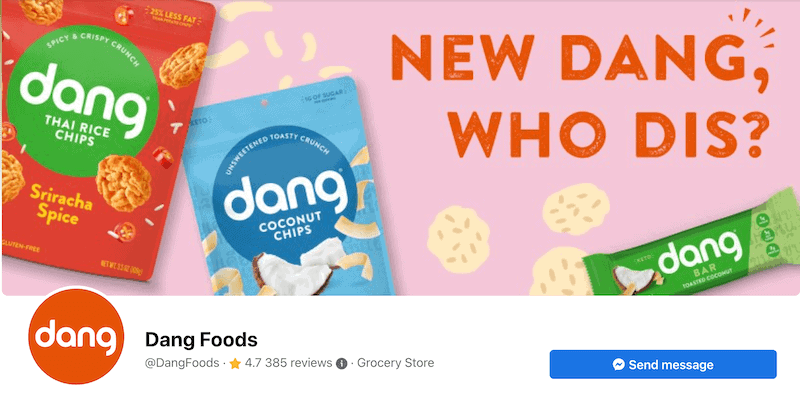
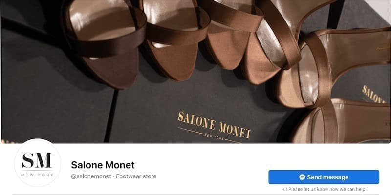
Footwear store Salone Monet (@salonemonet) chose to use a photograph of an array of high heels situated atop the box they come in. Food company Dang (@DangFoods) included their product packages on their cover photo. Do you notice any similarity between the 2 cover photos? Both feature their product directly so that customers can easily recognize and identify the brand.
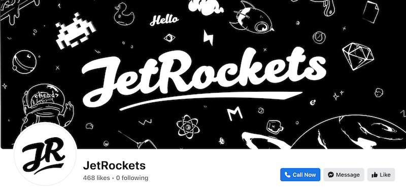
Software company JetRockets stuck with the outer space theme to stay on brand. It’s always important to remain consistent! The same thing with Purple’s YouTube cover photo—they went ahead and chose to use a plain purple background. Purple is a mattress company, so it’s cool that the cover photo is designed with the intricate details you find on a mattress. Guided meditation company Headspace features a cover photo that invites you in to relax.
The most important thing to remember is to be consistent with your use of design elements like color, typography, and imagery, and you’ll be set.
Before you go charging off and smacking your logo on all of your posts, images, and videos, here are three crucial scenarios where you shouldn’t include your logo.
1. The image or photo isn’t yours
Taking credit for someone else’s work can be tempting, but it’s not ok morally and can have severe legal repercussions. Copyright law can be challenging to understand, especially as it’s not so black and white sometimes, but that’s not an excuse to break it.
As a general rule of thumb, if you’re posting an image or photo that you received for free or that was created by someone else, don’t attach your logo to it without their permission.
The image doesn’t belong to you, and you’re essentially telling the world that it’s yours. It’s not unheard of for creators to sue for damages, and the law definitely won’t be on your side.
2. Your logo is too attention-grabbing
Yes, you heard me right. If your logo is just too awesome, or sports too many colors, you run the risk of lessening the impact of your post and stealing its thunder. This can happen when your logo is overly-large and takes up a lot of space.
If you find this happens to you, you should think about resizing your logo or redesigning it.
3. You are the brand
If you are the brand, then it’s ok not to use your logo on every post. Imagine if Instagram influencers included a logo with every image they uploaded; it would quickly become too much.
One of the reasons Instagram is so popular with influencers is because their face does most of the branding for them, which means they don’t need to add a logo to each post.
Before starting your social media branding journey, fully explore each of the available social media channels to identify which branding methods are most effective with your target audience.
If your target audience isn’t business professionals, you may get lackluster results from LinkedIn, but incredible engagement and feedback from using Instagram and Facebook.
Create your stunning logo today and get ready to make an impact across your favorite social media channels!
This portion of our website is for informational or educational purposes only. Tailor Brands is not a law firm, and the information on this website does not constitute legal advice. All statements, opinions, recommendations, and conclusions are solely the expression of the author and provided on an as-is basis. Accordingly, Tailor Brands is not responsible for the information and/or its accuracy or completeness. It also does not indicate any affiliation between Tailor Brands and any other brands, services or logos on this page.
Products
Resources
©2025 Copyright Tailor Brands