What is a Wordmark Logo?
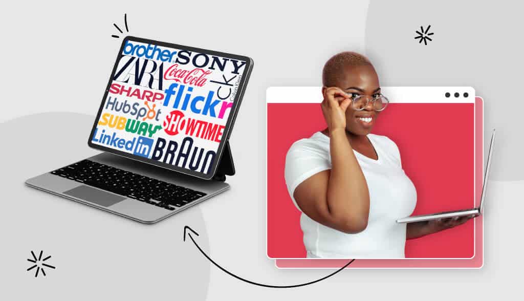
Also known as “logotypes”, wordmarks are purely letter-based and only feature the name of a business. We’re talking no images, icons, or even emblems; wordmark logos are stripped down, sometimes even reduced to initials with 1-3 letters.
However, stripped down doesn’t mean boring! Instead, these logos help to increase brand recognition, and they usually don’t go out of style because they’re timeless and versatile.
In fact, some of the world’s most famous brands use wordmarks. Think Google, Coca-Cola, FedEx.
What’s cool about wordmarks is that they don’t need a million design elements to make them stand out. They’re memorable for their simplicity, and, if designed right, they can be legible on any medium and in any size.
When to Use a Wordmark for Your Brand
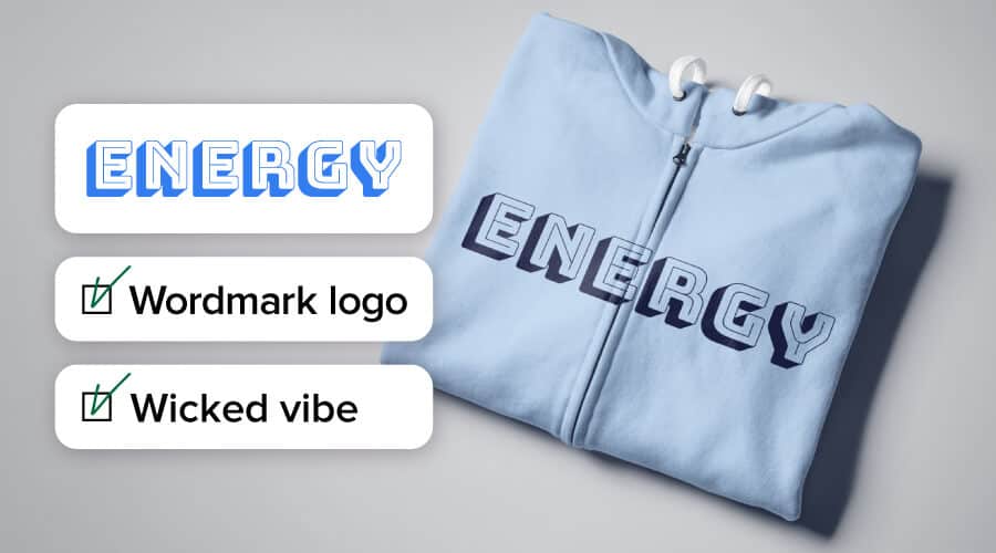
Because of the lack of icons or images, many people worry that wordmarks make for boring logos. We’ll show you why that’s not the case below, but in the meantime, here are a few scenarios in which you should think about using a wordmark to represent your business:
If your business is new. When just introducing yourself to the world, it’s not a bad idea to just tell it like it is with your logo. Starting with a wordmark allows you to build brand recognition, as your audience will come to associate your business with the fonts and colors of your logo. As you become more well-known, you can consider shortening the wordmark to a monogram logo with the same colors and typeface.
If you have a short business name, ideally limited to one word. Once a wordmark gets too lengthy, the design looks cluttered, and it’ll be hard to use your logo on smaller surfaces or screens. In other words, long business names can impact the versatile advantage of a wordmark.
If your business name is distinct. Logos emphasize why your business is unique, but this can prove harder to do without any imagery to reinforce the message. However, a distinct business name will set you apart from competitors, and a wordmark will help it stick in people’s minds.
If you’re not color-shy. While typeface is key with wordmark logos, colors shouldn’t be overlooked. A splash of color can be the difference between a forgettable wordmark and one that people remember. Consider using a classic typeface with a color twist, or go with a contrasting palette to emphasize the name of your business.
We’ll talk more about this below:
Wordmark Logo Design Tips
Like we mentioned earlier, a simple wordmark logo doesn’t have to be boring – if you know how to design it correctly! There are a few tips to keep in mind before creating your logo design, and it starts with one factor that you absolutely must take into consideration:
The most important part of wordmark logo design: Your typeface
That’s right: The typeface you choose is key to creating a wordmark that portrays your logo’s personality, as opposed to sporting a logo that sends your audience all kinds of mixed messages.
People have a huge range of associations with the shape of letters, and we tend to connect specific styles with words, traits or objects. That’s why fonts are full of personality, and they can make a large impact on how your audience perceives your brand.
Before you start looking for a font for your wordmark, let’s recap some typeface terminology that’s important to pay attention to when you choose a font:
- Weight – How thick or thin the characters are in a typeface. Think Bold, Italic, Light, etc.
- Casing – As in, upper or lower; all-caps vs. lowercase only, or first-word capitalizations
A wordmark with an all-caps font and thick weights will look serious and sturdy; a logo sporting thin letter would probably seem intriguing and legible. So, it’s important to think about the message you want to send your audience as you play with different typeface elements.
Additionally, there are 4 main font families used in logo design to be aware of: Serifs, Sans Serif, Slab Serif, and Script.
Serif wordmarks, like Prada and Forbes, have little “feet” at the end of their letters, and they tend to feel more traditional and prestigious.

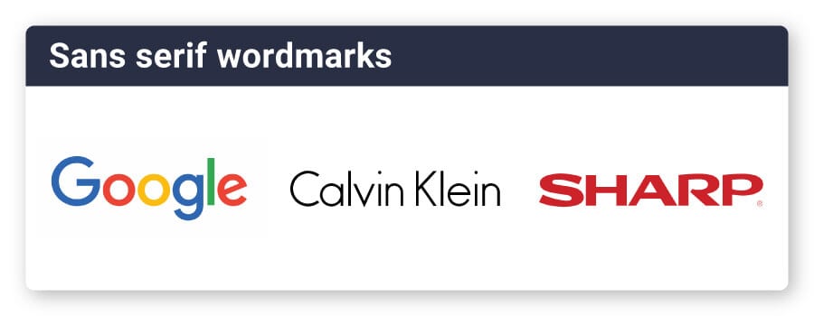
Sans-serif wordmarks are typically used in more modern brands, like Google and Calvin Klein. By definition, these typefaces don’t have the swatches at the ends of their letters.
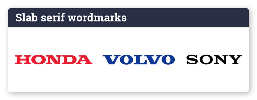
Slab-serif wordmarks, like Honda and Volvo, are block-like and appear sturdy. These are typically used by brands that want to seem bold, strong, and confident.
Script wordmarks have a more elegant, personal touch. They can look like a signature, like the Champion logo, or appear like formal calligraphy, like the Cadillac logo.
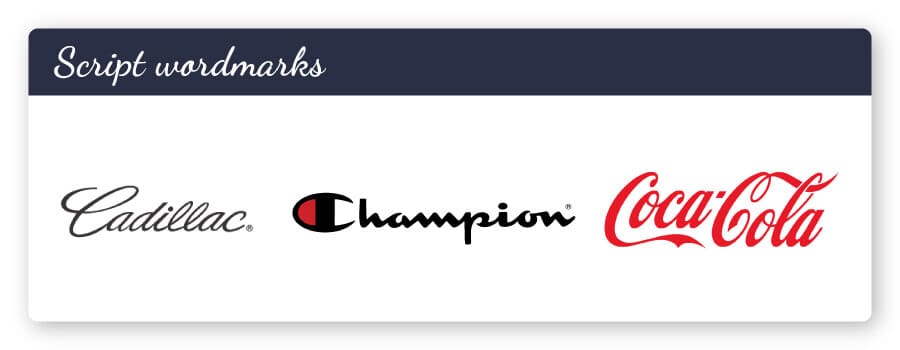
Note that, while most wordmarks gravitate toward traditional serifs or sans serif, scripts and slab serifs can give your logo an elegant and even playful edge.
Before designing your own wordmark logo, it’s worth checking out the competition to see how they use various typefaces to convey their own brand message.
Pay attention to kerning and tracking
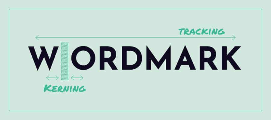
Kerning and tracking are 2 design terms that deal with the spacing of your font, but there are differences between them.
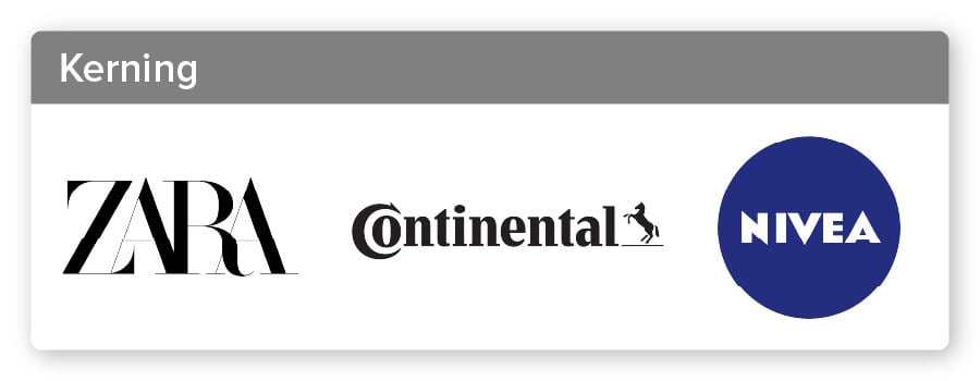
Kerning refers to the spacing between individual letters or characters, with higher kerning putting letters farther apart from one another. The idea is to adjust your font’s kerning so that your wordmark looks proportional and visually pleasing.
See how Zara’s letters are on top of each other, while Nivea has a more sporadic, jagged spacing between the letters? Both of those were done intentionally to preserve the balance of their logo fonts. If you didn’t pick up on that beforehand, it’s okay; we don’t usually notice kerning unless something is off – at which point, you would feel uncomfortable looking at a badly-kerned logo.
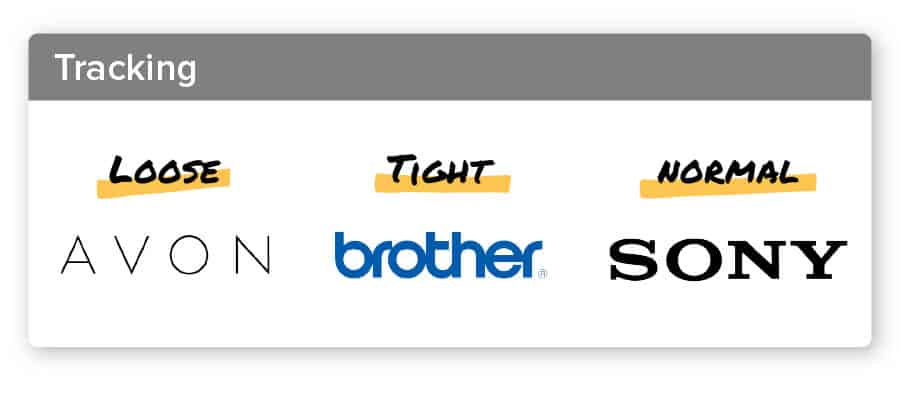
Tracking, on the other hand, refers to the spacing of the overall wordmark (not just the individual letters between them). So, once a logo is properly “kerned”, you can adjust the tracking proportionally – either increasing or decreasing it throughout the entire wordmark.
Tracking can also impact the personality of a wordmark logo. Look at how the loose Avon tracking (further apart) creates such a different effect from the tight Brother tracking; the former has an avant-garde feel, while the latter speaks to a more secure, reliable brand.
When creating a wordmark logo, you’ll want to make sure that both your kerning and tracking make your logo look visually appealing.
Size matters
In the hierarchy of design, things that look bigger capture our attention more quickly than the smaller elements around them.
In this vein, one way to make a wordmark more interesting is to change up the height of some of the letters in your logo. This could mean isolating one letter, like Braun does, putting the brand name on a separate line like The Beatles logo did, or placing the most important part of the business name in larger letters.
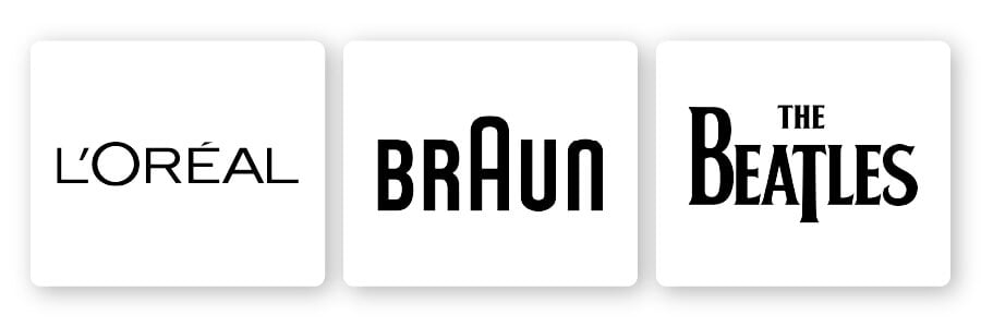
And, if you want to really leap out of the box, you can try going with a font that alternates the size of every other letter.
You can play around with your font size as a way to emphasize an aspect of your logo that you want to first capture your audience’s attention and/or draw their eye to what’s most important about your brand.
Consider a character feature
There’s more to a typeface than just its letters; you have all sorts of characters at your disposal! While punctuating logos is not necessarily a design best practice, there are cases in which it can help your wordmark stand out.
Take the Vans logo; they used an extended ‘V’ line over the entire wordmark in order to give the appearance of forward motion and movement – perfect for a skateboard shoe company. The Hubspot logo, on the other hand, incorporated an actual image into their design – pointing to their multi-tiered marketing platform and how it can help a business grow in all directions.

Note that you can use a character feature as part of your font itself, or by adding an additional image to be incorporated within one of your wordmark’s letters.
Use colors with intention
We’ve been talking a lot about your logo’s font until now, but colors can play an equally important role in designing a memorable wordmark.
The first thing to know is that people associate different colors with different meanings, both consciously and subconsciously. So, when you’re choosing a color palette for your logo, try to first think of the message you want to send with your logo, and only then decide which colors best express that message.
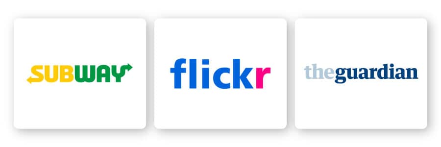
Also, notice how the logos pictured above have a max of 2 colors each? That’s because the fewer colors you have, the easier it will be to convey your message without confusing your audience. Both Subway and Flickr split their logos into 2 colors, in order to distinguish between parts of their logo name and draw your attention to both, while The Guardian went for a single wordmark color and a contrasting background.
Finally, make sure that your color palette complements your font choice. For example, if you choose a playful typeface for your wordmark, consider using more muted colors (and vice versa).
Don’t discard shapes
Last but not least, you can incorporate shapes into your wordmark in order to add some extra personality.
Once again, putting a shape within your business name can help you highlight an aspect of your business that’s particularly important, like the oval does for the ‘Z’ in the LaZboy logo, or the circle does for the “Sho” in Showtime.
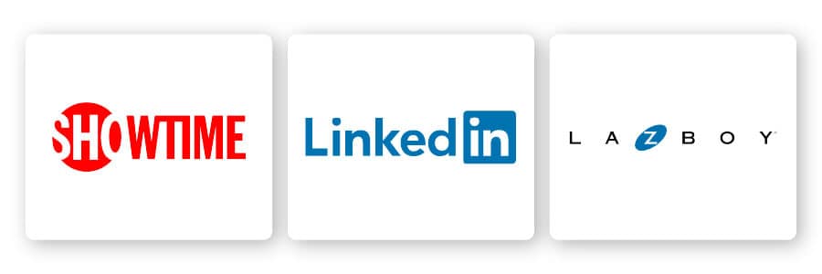
Squares and rectangles help you add an element of boldness and balance. Circles and oval shapes point more to stability and unity, while triangles can mean a whole lot of things depending on how you situate them (upwards-facing triangles indicate momentum, sideways-triangles convey momentum, etc.).
You can also try incorporating vertical or horizontal lines to communicate strength and progressiveness. Play around with different shapes and see if any of them can help you reinforce your brand message; just remember not to clutter your design with too many elements that stand out.
Over to You
Wordmarks are one of the simpler logo types out there, but they shouldn’t be underestimated. With attention to detail and the right font choice in mind, you can create a logo that’s sharp, versatile, and full of personality.
Not sure how to go about it? Try creating your logo design with our logo maker! Just select “text-based logos”, enter your business details, and our AI powered tool will help you design the perfect wordmark for your business.
