Whether you’re a designer or a new small business owner, and whether you’re using a logo maker or design software to create it, choosing the right font for your logo can often seem like an impossible task.
There are scores of great fonts for logos out there, but it can still be difficult to land on the right one for your specific brand; every font has its flavor, just like every color has its calling.
And, the font you choose will add symbolism to your logo in addition to punching up its design. It will help your logo tell your story, which leads to building a successful brand identity.
If you’re ready to create a logo or you’re just trying to get the lay of the font land, we’ve made a list of 50 fonts that any business owner or designer can use and peruse.
But before we dive into the list of cool logo fonts to try, let’s talk a little bit about what fonts actually are and how you can use them to your advantage:
Fonts fall under the big umbrella of typography, which just refers to the art of arranging letters in a specific way.
Within typography, however, there are both “fonts” and “typefaces”. People tend to confuse the 2 terms, and it’s important to understand what each one is and how it can help you.
A typeface basically refers to a set of glyphs, or characters, that share a design. Fonts, on the other hand, are a particular set of glyphs that are included within a typeface. For example, Arial is a typeface. You could have a bold Arial and an Italic Arial, and both of those are considered different fonts – even though they’re part of the same typeface.
The takeaway is that each typeface can have a number of different styles.
If this is confusing for you, don’t worry about it; like we said, most people confuse the terms anyway, and we referred to each typeface in this post as a “font” for that reason!
Just bear in mind that each typeface (font) in our list below may have several different variations that you can choose from.
Now that that’s out of the way, how do you actually choose the perfect font for your logo?
The first thing you should know is that there’s no one “correct” font for logo design, though there are a few rules you should follow when choosing yours.
Firstly, your logo font should be in line with your brand personality – i.e. it should speak directly to the audience you’re trying to reach and reinforce the message of your brand. Your brand personality is the “human” element of your brand; it will help inform the way you talk to your customers and the visual identity you create to represent your business – like your logo!
But how do you know which fonts are right for your specific personality?
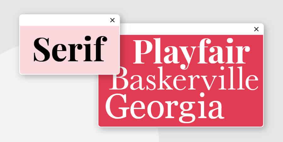
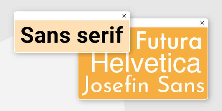
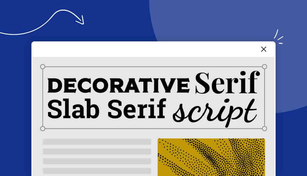
There are 5 main font families, and each family has their own “personality traits”, or messages that they give off. For example, serifs – fonts with little “feet” at the end of the strokes – have a more traditional and timeless feel, while sans-serifs (fonts without the feet) are considered more modern and forward-thinking.
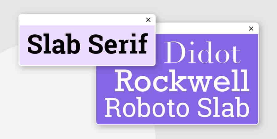
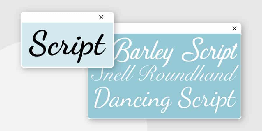
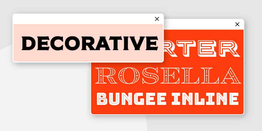
Then there are scripts, which can often have an elegant look and give off the feeling of adding a personal touch, while modern fonts and slab serifs tend to be edgy, contemporary and creative.
So, if your primary audience is hipsters in their thirties who enjoy used books, you might decide that your brand personality is creative, independent, and progressive. To express that in your logo, you could consider going with a vintage-looking script like Belinda or Thirsty Script, or a modern font like One Day or Cooper Hewitt (all of which we’ll show you below!).
And finally, the big question:
In short, you shouldn’t use more than 2 fonts in your logo – and usually, there’s only a need for 1.
The reason for this is simple: Too many fonts will make your logo look cluttered and inconsistent, which will cloud your brand message.
Think that your logo will appear in a bunch of places, and there will often be other text there aside from your logo.
To keep the design consistent (for example, on your website), you’ll need to find a third font for your copy that looks good with both of your logo fonts. Now, imagine if you chose 4 fonts for your logo instead of 2; how the heck would you find a fifth one that looks good with all of them?
Remember, you want your logo to be as clean and versatile as possible, which means that less is usually more.
However, you might want to consider pairing fonts if you have a tagline that goes along with your logo, or if you have several words in your business name and you want to emphasize one over the other.
If you do use multiple fonts, make sure that they complement each other while also being visually distinct. That sounds harder than it actually is; serifs and sans-serifs often pair well together, for example, as do 2 fonts that are from the same family.
Just make sure that you can easily distinguish the fonts from one another, and you’ll be good to go.
On that note, let’s take a look at 50 top logo fonts and see which ones are the best fit for your brand!
Designer: Giambattista Bodoni
Dating back to before the year 1800, Bodoni is a timeless serif that plays with contrast between thick and thin strokes. It has appeared throughout the centuries and still finds its way into established fashion brands, like Calvin Klein and Vogue.
Designer: William Caslon I
One of the most basic and commonly used in the serif family, Caslon’s origins can be traced back to 1725.
It was considered the font of choice for royalty and politics when it first emerged. The type is delicate and straightforward, emphasizing spacing and clear lines to improve legibility. In 1990, the font was revitalized by Carol Twombly and is now known as Adobe Caslon.
Today, the University of Virginia uses Caslon for their logo.
Designer: Jos Buivenga
A font “born by accident,” Calluna was initially an experiment in adding slab serifs to the font Museo (by the same designer). What emerged was a text face in 8 styles, featuring directive strokes that draw attention to the top-right corner of each glyph.
Use this font for crisp, clear text that flows, and for a logo that will carry the eye along the page.
Designers: Father-son duo Linn Boyd Benton and Morris Fuller Benton
This font was created sometime between 1900 and 1904. A slightly bolder and more professional font, Century is a main font of choice for corporate settings. It’s become famous thanks to its legible design and versatility.
Century can be used for logos, of course, and is a standard font in newspapers and magazines.
Designers: Father-son duo Linn Boyd Benton and Morris Fuller Benton
Garamond is another standard in the corporate world created by the familial pair. Its slightly heavier lines and spacing make it easy to read. As a result, it’s also used in presentations, publications, and other longer texts.
McSweeney’s Quarterly, the literary publication, famously uses Garamond exclusively for all their textual needs.
Designers: Tom Rickner and Matthew Carter
The stylish Georgia font is a combination of beauty and simplicity. Unlike its older predecessors, this type was created for the technological generation and designed to ensure readability at low screen resolution. It comes in four main varieties: Regular, bold, italic, and bold italic.
Both Huffington Post and The New York Times still use Georgia extensively.
Designer: Robert Slimbach
A more modern typeface, Minion came to life in 1990 as part of the Adobe Systems font family. Minion fonts are meant to be used for body text and extended reading, as their Renaissance-inspired type is easy on the eyes. They include a range of alphabets and weights, with moderate proportions and simplistic style.
You’ll find that this font is one of the most popular serifs used in books.
Designer: John Baskerville
Designed in the 1750s, this typeface was originally meant to be cut into metal. It was designed with the intent to refine Caslon and other similar fonts of the time, in order to make old-style typefaces more contemporary. Today, Baskerville is still popular in book design, and of course, logo design.
Designers: Eduard Hoffmann and Max Miedinger
The gold standard of sans-serifs, Helvetica is one of the veterans (read: oldest) in the font family. Originally designed in the 1950’s, it falls in the Grotesque family and emphasizes versatility. Its heavy lines are ideal for modification and can be made spaced or condensed as needed.
Helvetica is most notably used by social media giant Facebook.
Designer: Paul Renner
Geometric shapes are at the heart of this 1927 sans-serif. There is little contrast in its strokes, and it gives off the impression of efficiency and forwardness with its elegant lettering. When it was released, the font was used a symbol of modernity, and it has remained that way ever since.
Futura has been used in the movie 2001: A Space Odyssey, the cover of a Prince album, and on the plaque left on the moon in 1969 – among countless other pop culture designs.
Designers: Svet Simov, Ivan Petrov, and Simov Svetoslav
This 2014 font family contains up to 34 typefaces alone and 36 weights. Its rounded shapes give a soft edge to the classic grotesque style, and it’s known for its legibility regardless of medium (in print or on the web).
These fonts look particularly great on printed merchandise – something to think about when designing your logo!
Designer: Rosemary Sassoon
Created in 1995, this sans-serif was intended primarily to be a typeface used in children’s books. It is known for boasting curls and swoops on its letters, and this playfulness makes it perfect for family-friendly brands and logos for businesses that are geared towards children. Its simplicity makes it highly applicable across contexts while also encouraging imagination and mischievousness.
Designer: Hannes von Döhren
Originating in Germany in 2010, this font has a warmer feel than many of its sans-serif cousins. It comes with a number of weights, including thin, light, regular, bold, medium and black – plus an italic version of each weight.
You’ve likely seen Brandon Grotesque on Comedy Central! Consider using for logos that will be displayed on packaging design.
Designer: Mark Simonson
This font is a revamped version of its predecessor, Proxima Sans (now discontinued). One of the most popular typefaces for web design, Proxima Nova includes 48 fonts under its wing with a range of weights and features.
Today, this font is used all over news and media – just look at Buzzfeed, NBC News and Mashable for a glimpse of its modern, geometric letters.
Designer: Adrian Frutiger
A circle-oriented typeface not unlike Futura, this font mostly follows the sans-serif geometric pattern. It was released in 1988 and has since been adapted to include a wider range of weights, widths, and features.
This font can be used in all manners of geographical branding, as evidenced by the lettering of the famous I Amsterdam sign that sits in the center of the city.
Designer: Steve Matteson
This sans-serif was originally created as part of a joint project for IBM and Apple, which should tell you something about the best way to use it. The font is monospaced, which means it has an equal amount of spacing between each of its letters and characters.
Designers: Bitstream staff designers
If you suddenly find yourself thinking about outer space but you don’t know why, it’s because this ‘90’s font is based on the type used in the original Star Trek series! This futuristic sans-serif has jagged angles and sharp curves that lends itself to an avant-garde vibe. You can find it in light, medium, bold, and light italic.
Designer: Morris Fuller Benton
Although originally created in 1903, this font underwent a revamp in the last 20 years when Micah Rich, Tyler Finck, and “Dannci” added extra glyphs and put their own spin on the design. The gothic sans-serif boasts tall letters and is perfect for web typography trying to make a splash.
Case in point: The original Benton version of this font is used for the YouTube logo!
Designers: Robert Slimbach and Carol Twombly
Initially created for Adobe, this font is mainly characterized by the fact that it is highly web-optimized, making it the perfect choice for all sorts of digital branding. That said, it’s made its appearance among corporations as well, and has most notably been used by Apple (until 2017). If you’re looking for a neutral yet innovative font to represent your logo, this might be just the one for you.
Designer: LatinoType
This font was originally intended for printed newspapers, what with its block-like serifs and even spacing. It has since been modified to work well on the web, and it is a particularly apt font for small print (read: body text).
Designer: Jeremy Dooley
With thin weights and contrasting strokes, this slab serif emits an elegance unlike that of its peers. The spacing between the letters is balanced, while its polished, geometric shapes speak to the modernity of the 2013 design.
Consider using this font family for high-end, sophisticated or couture brands.
Designer: Brenan Stetzer
Another slab serif that can stand up to tiny print, Saros is used all across the branding board. Its flexibility stems from its dimensional construction, and it gives off a reliable, personable feel.
Designer: Firmin Didot
Don’t let its modern look fool you: Didot was created in 1799. The design features thick lines with thin curves, as well as thinner, squared, serifs. It is very common in the fashion world, where its different weights give it an air of elegance and creativity.
Today, companies like Armani and the television show America’s Next Top Model still use this typeface, and it doesn’t appear to be going out of style any time soon.
Designer: Nathan Thompson
Chelsea was created in 2016. The font is free for personal use, so you can claim its retro lettering for any project you need!
Designer: Isabella Ahmadzadeh
This font was created as part of a recent graphic design thesis, and we are not mad about it. It was adapted to include four weights (light, regular, bold and extra bold) and is used for both display and body copy. The font pairs well with the sans-serif Leon, and it’s the perfect choice for multilingual design.
Designer: Vernon Adams
Although created in 2012, this typeface is based on a number of predecessors dating back to the late 1700’s and early 1800’s. However, this casual slab serif is good for both display, logo and text type with its pronounced curls and refined edges.
Designers: Veronika Burian & José Scaglione
This lively typeface was released in 2008. Its spirited flourishes and strokes mimic those of human handwriting with large personality. For brands trying to project a youthful, spirited vibe, Bree is the way to go!
Aside from within a range of magazines, books and mobile apps, Bree most notably appears as the font of choice for Breast Cancer Awareness month, in addition to the branding of Peru.
Designer: Daniel Hernández
This font belongs to the Latinotype family and carries 12 styles, all of which are suitable for logo design. A slab serif with rounded edges, Sanchez has confidence and attitude – the markings of an innovative and outgoing brand personality. It came out in 2011 and uses a mix of South American flavor and contemporary design to send its message.
Designer: Morris Fuller Benton
Rockwell fonts emphasize a bolder, heavier line that pushes boundaries. Logos that use Rockwell tend to do so for impact and a sense of clout and confidence. Because of its thick lines, it’s better suited for logos and signs than it is for long texts. IBM’s iconic letter mark is still the best example of Rockwell in use.
Designer: Boy Moch Tomi
Another handwritten font, Variane Script is a cursive with a clean touch. Unlike many scripts, this typeface remains legible while pulling off the curves and connections that give it its elegant feel. This typeface works really well with chic, professional-looking logos, and is definitely worth considering for printing on branded merchandise.
Designer: Mika Melvas
A vintage brush script, Belinda was designed in 2011 and supports sixty-four languages. This typeface sports well-adjusted kerning, which helps to preserve its tasteful feel and prevents the type from looking overdone.
From magazine headers to product packaging, Belinda looks sophisticated on nearly every surface – part of what makes it such a branding favorite!
Designer: Ryan Martinson
This typeface is the bridge between the vintage and the modern font, with its combination of signage scripts and contrasting strokes. As their creator describes it, Thirsty Script contains a “mixture of retro script, modern sans-serif, and a shot of caffeine.”
The font comes in an array of styles and weights, including a range of glyphs and alternating characters that make Thirsty a versatile and multi-purposeful choice.
Designer: Situjuh Nazara
Only a few years old, this 2018 font puts a fun, flirty spin on traditional scripts. It adds exaggerated flourishes to many of its characters, giving a playful feel to whatever text is sporting the type.
Designer: Ania Kruk
A legible, simple script, the 2017 Cookie type takes the ad style of the ‘50’s and modernizes it with softer flourishes. This font is both simple and friendly, both charming and legible. For brands trying to emphasize their storytelling abilities, this typeface is a great way to go.
Designers: Brian J. Bonislawsky and Jim Lyles
It’s not hard to imagine this type – with its upright orientation and classic cursive lettering – on a storefront or as a printed headline. The design was inspired by the title screen in the movie “Cafe Metropole,” in 1937.
Businesses in the baking or holiday industries would do particularly well with a Grand Hotel logo (although this font is certainly not restricted to those niches).
Designer: Gregory Medina
This quirky 2017 script font features decorative letterforms marked by enticing flourishes. Its slightly-forward lean carries the eye, while the lettering itself paints the picture of a brand that is elegant and poised.
Designer: Hendra Maulia
Hoodson Script is full of personality, boasting curves and swashes that bounce as much as they scream “retro”. Not only is this font perfect for logos, but it also makes a strong mark on poster designs and product packaging. Choose this typeface to help create a brand that’s both playful and powerful all at once.
Designer: Brittney Murphy
A laid-back script font, Hickory Jack is ideal for brands that have a similarly chill vibe. With understated flourishes and easy-to-read loops, the typeface is available in two styles and is free for personal use.
Designer: Matt Ellis
This rounded typeface is a sans-serif with a complete character set (think both upper and lowercase, symbols, numerals and accents). The curve of each letter gives a general sense of motion while keeping things light. Regardless of whether for personal or commercial use, you can use this font both for print and online.
Designer: Jos Buivenga
As the name suggests, geometry is the focal point of this 2010 display font. In the original version, there are open wire frames that can either be filled (as in the image above) or left open. There are a total of 16 styles that each cover over 600 glyphs, allowing for a wide range of logo designs with this type.
Designer: Fabian De Smet
Like you can see above, this serif draws inspiration from the Bodoni typefaces (see font #1 on our list). The high contrast lends itself to numerous projects, from large headers on posters and the like to smaller body text.
Designer: Adilson Gonzales de Oliveira Junior
Interestingly enough, this font was originally inspired by airplane models in the ‘40’s. (Of course, it has since been made available for personal use.) An all-caps display font, Ailerons boasts clean, stylish numbers and gives off a sense of exploration, travel, and pioneering genius.
Designer: Nawras Moneer
Another all-caps design, One Day combines rounded forms with slim, broken lines – creating an intriguing, modern effect. You might want to choose this typeface for its versatility, as it can be used effectively across print, digital media, and of course, logo design.
Designers: José Scaglione and Veronika Burian
The 19th century is sprawled all over this contemporary typeface. Merging the sophistication of didones with the traditional weights of slab serifs, Abril Fatface is perfect for creating elegant headlines on both magazines and the web. Because of this, consider using the font for your logo if your business belongs to the editorial world.
Designer: Chester Jenkins
A contemporary sans-serif is just what the doctor ordered for the Cooper Hewitt Smithsonian Design Museum, after they decided to revamp. Like the building, this font’s characters are laden with geometric curves and arches. Its clear lettering comes in 14 styles, and it’s a great fit for logos that want to convey professionalism and reliability.
Designer: Neil Summerour
Sharp serifs and even sharper contrast are what make this typeface ideal for display purposes. Released in 2012, Lust has been described as indulgent, sensual and over-the-top – exactly the types of brands that should grab the font for their logos!
Designer: Radomir Tinkov
Only three years old, this typeface is about as modern as it gets. An all-caps font that comes in 20 weights, Gilroy can also be used in languages other than English – including those that use the Cyrllic alphabet.
Designer: Bang Toyib
A minimalist, uppercase font, Munich is a great choice for both logos and headlines that are meant to pack a punch. If your logo name happens to have a Q or a Z, you may want to consider using this type, as each of these letters have their own unique stamp. And, if you want to add a romantic and charming feel to your logo, this font is your guy!
Designers: Samuel Oakes, Alfredo Marco Pradil and Cristiano Sobral
This geometric typeface doesn’t mess around, giving you a clean and minimalist look.
Available in 4 weights and one style, Orkney is the perfect font for both print and screen – ranging from business websites to printed marketing materials.
Designer: Mathieu Desjardins
This off-geometric font can easily be resized, as it was designed to be versatile; both long paragraphs and large headings can benefit from its style. The typeface has straight-cut lines and low curves, giving it a friendly and accessible feel.
Now that you have so many awesome fonts for logos at your disposal, it’s time to get designing! Start experimenting with logo designs and see what works best for your brand. You can create a logo for free with our tool; only pay if you love your design!
Remember to choose a font that expresses your brand personality, so you can communicate your company’s values and goals to your customers directly through your logo.
Products
Resources
@2024 Copyright Tailor Brands