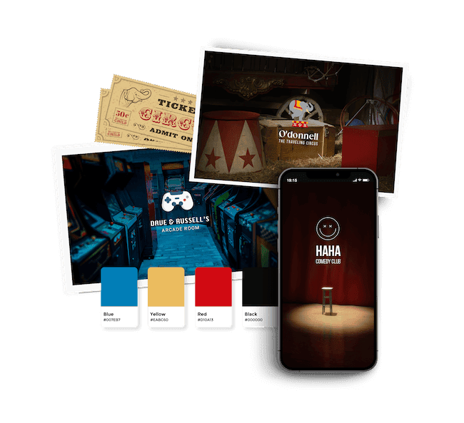
Home » Logo Maker » Ideas » Entertainment Logos
If you’re in the entertainment industry, your logo needs to entertain. The most important thing your entertainment needs to do is build an emotional connection with your audience and show them why they should care about your brand. Especially in such a competitive industry, you need to make sure you have a winning logo.
I’ve gathered some red-carpet-ready logo ideas from other brands in the industry for you to use as inspiration. Keep reading to learn about best practices and tips for creating a stunning logo for your brand.

Create your entertainment logo in 2 minutes, simply by entering your business name and tagline (if relevant) and clicking ‘Design’.

Tell us a little about your entertainment business, select a logo type, and choose the fonts you love, so we can create the perfect logo for your brand!

Customize and make tweaks with our logo editor to bring your vision to life. You can play with fonts, colors, and logo layout – no design skills necessary!
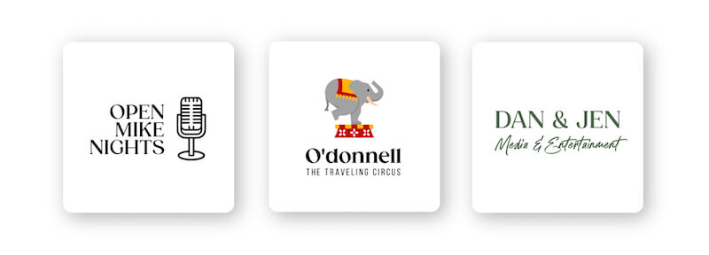
Even without consciously realizing it, we encounter icons on a daily basis. Icons are universal symbols that represent our favorite brands. There are different icons like abstract, geometric, pictorial, crests, emblems, interactive, and custom. How you choose depends on the specific purpose and meaning you want your logo to convey.
Entertainment logos can fulfill your promise to entertain your audience with a unique icon. You can use a piece of industry equipment, such as a TV or microphone. An example is New Line Cinema’s film icon. Another option is to use a star or spotlight icon (like 20th Century Fox) to symbolize celebrity stardom.
On the other hand, you don’t have to use an icon in your logo. You can choose a wordmark logo, which is simply your business name. Some well-known examples include Miramax Films and Lionsgate.

Just like you can play around with various icons to see what you like, you can also experiment with different fonts. It’s important to choose a font that captures the essence of your brand, so do some research to see what each font means (yes, there’s a psychology behind fonts).
For example, fonts in the serif family represent authority, tradition, and respect, and those in the sans-serif family are friendly, clean, and modern. So if you’re looking for a playful font, go with a script or decorative font. But if you want to avoid cluttering your logo, stick with a simple sans-serif font.
Make sure to check that the font you choose is legible so it can be clear no matter how it’s scaled. And last bit of advice: Your logo font should reinforce the message you as a brand are trying to communicate to your audience.
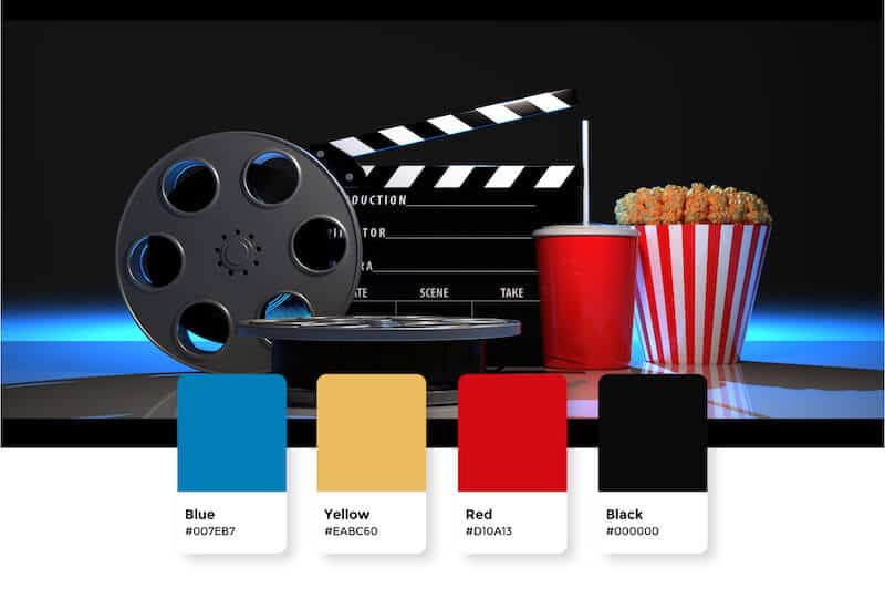
In the entertainment industry, you’re welcome to be as creative as you’d like when it comes to your logo’s color palette. You can use an assortment of colors like NBC (but more on that in a moment) or stick with one color like DreamWorks. Be sure to review color psychology before choosing a color palette to make sure it’s in line with the specific message you want to convey to your audience.
A note about best practice: Ideally, you should stick with 1 to 3 colors max. That isn’t a rule that’s set in stone—just look at NBC’s rainbow logo! It’s all about balance; if you use a distracting font, choose a single, simple color.
A great entertainment logo should be versatile enough to be used across different platforms and easy to resize. You’ll use your logo on marketing materials like business cards, stationery, emails, letterheads, social media, and your website. That means that your logo will be resized and rearranged depending on where it’s being used.
High quality logo files

Website & Domain

Powerful design tools
This portion of our website is for informational or educational purposes only. Tailor Brands is not a law firm, and the information on this website does not constitute legal advice. All statements, opinions, recommendations, and conclusions are solely the expression of the author and provided on an as-is basis. Accordingly, Tailor Brands is not responsible for the information and/or its accuracy or completeness. It also does not indicate any affiliation between Tailor Brands and any other brands, services or logos on this page.
Products
Resources
©2025 Copyright Tailor Brands