Home » Logo Maker » Ideas » Food & Drink Logos
When you’re in the food and drink business, one of the best ways to cook the competition is through building a proper brand. And, regardless if you’re a personal chef, sommelier or the owner of a food truck, a food and drink logo should definitely be on the menu.
If you want your business to be remembered, you’re going to need a logo that’s full of personality and spice. Scroll down for some of the most appetizing food and drink logos in the industry, get inspired by some cool logo ideas, and read on for design tips to help you make a logo that gets customers ready to wine and dine.

Create your food & dring logo in two minutes, simply by entering your business name and tagline (if relevant) and clicking Design.

Tell us a little about your business, select a logo type, and choose the fonts you love, so we can create the perfect logo for your brand!

Customize and make tweaks with our logo editor to bring your vision to life. You can play with fonts, colors, and logo layout – no design skills necessary!
Your icon is an easy way to draw the eye of your audience, by showing them something that’s familiar to them. With food and drink logos, that could mean using an image of the best-selling item on your menu, or going with a more abstract design to convey a quality of your eatery that you want to emphasize.
For example, if you own a brewery, you can go the obvious route–a pitcher of beer with water sloshing out, or two glasses clinking. Another option would be to include an emblem or a crest, which tells your audience that your brand is timeless and established–evoking associations with the past.
If you run a food truck, you might consider using a symbol of the food you want to be best known for, like a hamburger or tacos. Alternatively, you can try to emphasize an aspect of your brand’s personality that you think would appeal to your audience; the hotdog on wheels pictured above is full of fun and energy in addition to clearly communicating what’s being sold.
You can also use an icon that best represents the type of service you offer, like a chef’s hat for gourmet meals, or a cupid to symbolize romantic ambience. Feel free to be creative when choosing an icon for your logo; just remember to look at what competitors in your culinary space are doing, and make sure to differentiate your icon from theirs.

Once you know which icon to go with, you should look for logo typography that has a similar vibe as the image you chose. Typography, or fonts, carry a lot of meaning and can influence the way your potential customers think about your business.
Do you have a diner that’s meant to make customers feel casual and relaxed? If yes, a thick, cursive font will help to create a personalized experience, as will a logo name set in bubble letters.
A restaurant that’s more upscale and elegant, on the other hand, could try a thinner font in the script family in order to impress clients with your class and wisdom. But, if you offer a food experience that’s niche and entertaining, like a cereal bar or charcuterie boards for dogs, go with a slab serif with winged letters for a hip, funky look.
Finally, if you sell a signature packaged food or drink that’s meant to appeal to a young and modern crowd, you can consider a sans-serif that’s simple and easy to read. Whichever font you choose, just make sure it works well together with your icon and doesn’t send conflicting messages.
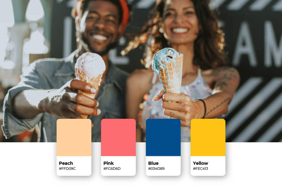
Colors carry their own emotional connotations, making us feel things subconsciously–and often without our awareness. It’s up to you to decide which palettes your customers will most connect with, and that may depend on what kind of food or beverages you offer.
Many food brands choose red for their logo, because it’s known as a color that stimulates appetite and makes us feel energized. Think KFC, McDonald’s, Friendly’s–the list goes on. However, if your competitors already incorporate red in their logos, you may want to go in a different direction.
If you offer vegan or vegetarian products, or you want to emphasize that health is a cornerstone of your brand, then greens are always a good bet. A wine brand might stray more towards deep maroons or violets, whereas seafood restaurants–or brands that want to instill trust–would choose something in the blue family.
Whatever you choose, make sure your colors elicit a quality about your business that you want your customers to think of when first looking at your logo.
When thinking about your logo layout, you should always have scalability in mind. So, where do you envision putting your logo? For most food and drink businesses, menus and product packaging are a given–which means you’ll need a layout that supports printing your logo in all sizes.
That said, don’t discount your online branding, like your social media pages and your website. Your logo should look clean on the screen, so that your audience knows what you offer from a glance. Make sure your icon doesn’t visually overwhelm your business name (and vice-versa), and that every design element is easily visible.
High quality logo files

Website & Domain

Powerful design tools
This portion of our website is for informational or educational purposes only. Tailor Brands is not a law firm, and the information on this website does not constitute legal advice. All statements, opinions, recommendations, and conclusions are solely the expression of the author and provided on an as-is basis. Accordingly, Tailor Brands is not responsible for the information and/or its accuracy or completeness. It also does not indicate any affiliation between Tailor Brands and any other brands, services or logos on this page.
Products
Resources
©2025 Copyright Tailor Brands