Make a Professional
Law Firm Logo
Create your own law firm logo with our logo maker in minutes!

Create your own law firm logo with our logo maker in minutes!

Home » Logo Maker » Ideas » Law Firm Logos
A strong law firm logo design will tell potential clients that you can represent them in any situation. Whether you’re in criminal law or family law, the right logo will help you communicate professionalism, intellect, and accountability.
Before you start making your own logo, it will help to check out some of these law firm logo ideas that have made their mark on the industry and get inspiration. Then, when you’ve finished browsing, scroll down for law logo design best practices and see which elements will work best for your firm.


Create your law firm logo in 2 minutes, simply by entering your business name and tagline (if relevant) and clicking ‘Design’.

Tell us a little about your law firm, select a logo type, and choose the fonts you love, so we can create the perfect logo for your brand!

Customize and make tweaks with our logo editor to bring your vision to life. You can play with fonts, colors, and logo layout–no design skills necessary!
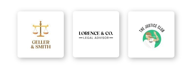
Icons are a symbol that conveys universal values and ideas. If you think about it, we interact with icons all the time. From Twitter’s bird icon and Nike’s swoosh to McDonald’s golden arches, we’ve come to recognize these symbols and the brand behind them instantly.
There are various kinds of icons like abstract, geometric, pictorial, crests, emblems, interactive, and custom. Each type has its own meaning and purpose. Some obvious icon ideas are the scales of justice, gavel, and the Constitution.
With that being said, icons aren’t found in a lot of law firm logos. For instance, 2 of the world’s biggest firms, Kirkland & Ellis and Latham & Watkins, opt for a plain wordmark logo to convey a respectable, serious feeling.
You can also use different shapes in your logo design to create an emotional and psychological connection between your firm and potential clients. Another big law firm, DLA Piper, uses both a square and a circle in their logo to create depth and interest.
It’s worthwhile to research other law firms in your niche before deciding on an icon. Just because it’s not popular among law firms to use an icon doesn’t mean you shouldn’t either. In fact, that might just be a reason to use an icon—in order to stand out.

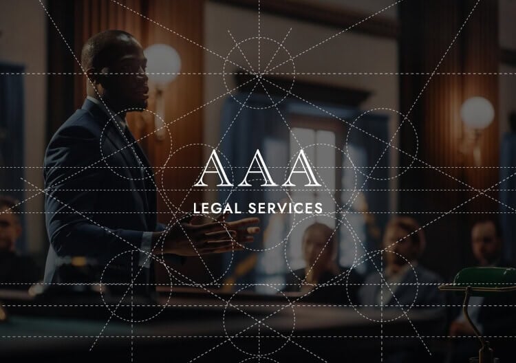
You need to exhibit traits like respectability, intellect, and professionalism in the field of law. There’s no better way to convey that than through your font. This is especially true when you don’t have an icon and your font is the main focus of your logo. There are 5 main font categories: Serif, sans-serif, slab-serif, script, and decorative.
According to the psychology of typography, serif fonts represent authority, tradition, and respect, whereas sans-serif fonts give off a modern, clean, and friendly feeling. Law firms such as Latham & Watkins LLP went with a clean sans-serif, while Kirkland & Ellis LLP chose a classic serif font.
Remember to align your law firm’s values and target audience with a font that matches. It wouldn’t make sense for a criminal defense lawyer to use a decorative font. Remember, your logo font should assure your future clients that you practice law seriously and professionally.
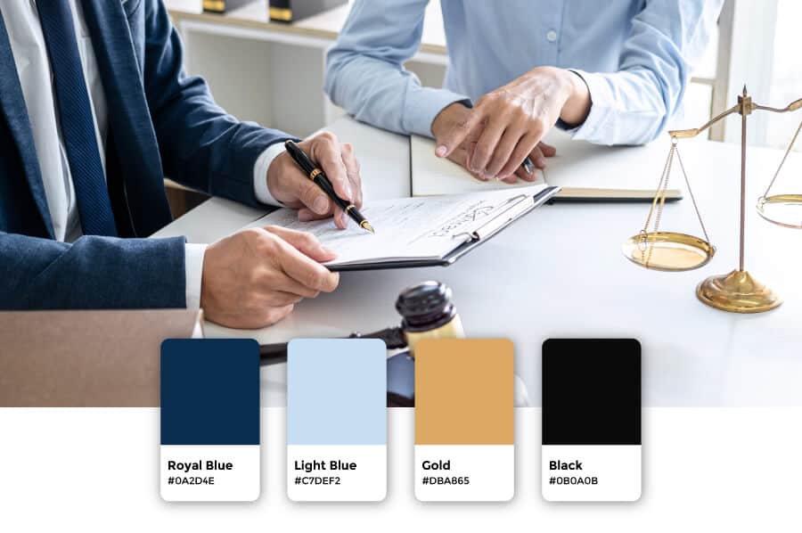
Dependability, professionalism, and confidence are the qualities you want your logo’s color palette to communicate to your audience. Most law firm logos use one color, mainly blue, red, or black. To stand out, aim for color combinations that use blues or blacks with an accent color, but try to choose different shades than your competitors. Be purposeful with the color you chose for your logo as it will express the messages and values of your law firm that your future clients will associate with you.
Business cards can be a strong branding tool for lawyers, as you never know who you’ll meet that will need your services. Go with a logo layout that looks good in print, which means keeping it simple and classic. You’ll also use your logo on your website, email signature, letterheads, presentations, posters and signs, billboards, etc. So your logo must be easy to scale up or down depending on where you’ll place it. Again, the key is to keep it simple.
High quality logo files

Website & Domain

Powerful design tools
This portion of our website is for informational or educational purposes only. Tailor Brands is not a law firm, and the information on this website does not constitute legal advice. All statements, opinions, recommendations, and conclusions are solely the expression of the author and provided on an as-is basis. Accordingly, Tailor Brands is not responsible for the information and/or its accuracy or completeness. It also does not indicate any affiliation between Tailor Brands and any other brands, services or logos on this page.
Products
Resources
©2025 Copyright Tailor Brands