Design a Music logo in Minutes
Create your own music logo with our logo maker in minutes!
Home » Logo Maker » Ideas » Music Logos
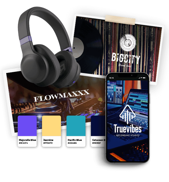
Music logos are a must-have for anyone in the industry, whether you conduct an orchestra, run a record label, or are a performer yourself. As a solo artist who marches to your own beat or a business owner that needs to attract customers, building your music brand is the first step to making a name for yourself in the music world.
If you’re wondering how to create your logo the right way, don’t worry – just scroll down! You’ll find music logos from all types of companies to give you an idea of what kinds of logos will resonate with your audience. Then, keep reading for logo design best practices.
How to make your own music logo

Create your music logo in two minutes, simply by entering your company name and tagline (if relevant) and clicking Design.

Tell us a little about your music business, select a logo type, and choose the fonts you love, so we can create the perfect logo for you!

Customize and make tweaks with our logo editor to bring your vision to life. You can play with fonts, colors, and logo layout – no design skills necessary!
Design your custom-made logo instantly
Music Logo Ideas
Music Logo Design Tips
1. Icons

Adding an icon to your logo can help express something about your personality as a musician or music business owner. Popular band and DJ logos tend to use icons that reflect something about their name, while others use abstract symbols to convey a feeling rather than an object. If you sell musical instruments or production equipment, you may want to go with a symbol of your highest-selling product.
The iconic music note (clef) is also a popular choice because the symbol is so recognizable. Going with such an obvious choice allows your audience to identify who you are and what you do instantly.
But, you can achieve the same effect with other icons, which will help you create a unique logo. For example, a headphones icon combined with music notes, which you often see on sheet music, can also create the same effect, allowing your audience to recognize your music industry business.
Or, you can use a microphone and a pair of lips to show someone singing. Because the music industry is so varied, you’re able to bring your creativity to your logo design to create something that represents you and your brand.
2. Typography

Like with color palettes, your music logo’s typography gives you a lot of wiggle room to express your brand’s personality. For example, the philharmonic would do well with a classic, all-caps serif, to give of a timeless, respectable and sophisticated impression.
Big, spikey fonts are perfect for heavy-metal rockers who really want their logo to pack a punch: The bigger and more edgy the font, the better.
If you want a more personal touch, handwritten fonts are an excellent way to convey your intimate brand while also allowing your creative side to shine through.
When it comes to fonts and typography, there’s a near-endless selection you can use, from gritty punk-rock fonts to modern sans-serif fonts with clean lines and a relaxed aura. Your font will add to your logo’s personality, so don’t just choose the first one you see.
Your font needs to complement your voice while still retaining easy readability across all the different marketing mediums available.
3. Color Palette
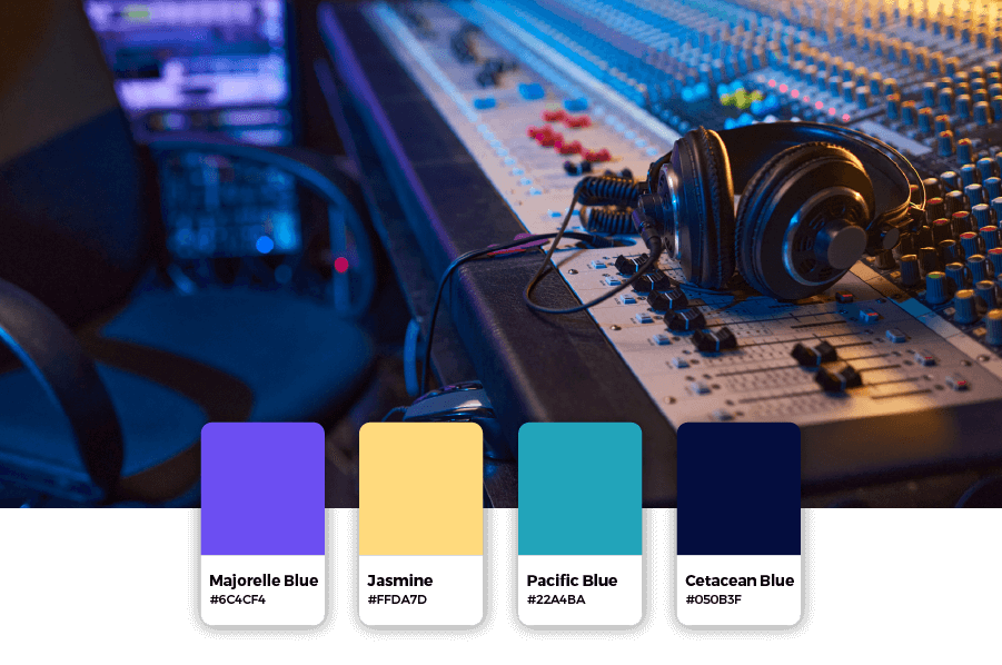
Because music is a creative industry, you have a lot of room to play with color combinations. As different color palettes have varying psychological effects on your audience, you’ll want to choose the colors that project the right vibe. A black and white palette is high-end and confident: orange is full of excitement. Make sure the colors you choose complement your logo’s typography and icon.
Bold colors, like reds, combined with blacks and silvers, work well for the heavy-metal genre as they’re sturdy and impactful.
But above all, your colors need to reverberate well with your audience. Experiment with color combinations and choose one that they’ll respond well to, but also echoes your style of music and personal brand.
If your goal is to entertain, choose blazing, lively primary colors—green, red, yellow, and blue.
If you want your icon to have the loudest impact, then stick with a black and white color combo to allow your other elements to stand out.
If you’re stuck for ideas, use a color wheel to explore combinations you’d never dream of, and you’ll have no problem fine-tuning your music logo.
4. Layout
The best layout for your logo will depend on where you want it to appear. Consider printed items like concert brochures and merchandise, while also taking digital media – like websites and social media pages – into account.
You’ll probably need a high-res logo file that can easily be resized and scales nicely.
Design your custom-made logo instantly
Your logo comes with:
High quality logo files

Website & Domain

Powerful design tools
- Author: Shai Shmarel
- Published Date:
Disclaimer
This portion of our website is for informational or educational purposes only. Tailor Brands is not a law firm, and the information on this website does not constitute legal advice. All statements, opinions, recommendations, and conclusions are solely the expression of the author and provided on an as-is basis. Accordingly, Tailor Brands is not responsible for the information and/or its accuracy or completeness. It also does not indicate any affiliation between Tailor Brands and any other brands, services or logos on this page.