
We’ve all looked at a logo that seemed simple at first, but upon closer examination revealed a clever use of the space around it. It’s not always instantly obvious, but these logos create subtle messaging and add depth by taking advantage of the negative space around them.
In some cases, the empty space around the logo is left unused and designers instead focus on the logo’s main subject—the text or image in the middle. However, by using this empty area, designers can make logos that can communicate with readers on both a direct level and a subtler layer.
There are several demonstrable advantages of utilizing negative space in logo design. These include the added layers you can work with to communicate your brand identity and better composition which helps make designs simpler and more effective. If you think it can be relevant to your logo design, it’s important to comprehend the basics of this crucial design element before you head to the logo creator and start designing, so read on to find out more.
Negative space is the blank or empty space that is left around an illustrated object and ultimately helps define it. In simpler terms, it’s the “unused” space in a picture or design. However, negative space is rarely unused, and plays an important role in design.
At its most basic, negative space is important in composition—how you place different elements in a design. If there are too many components and not enough negative space, designs can appear confusing and look crowded. If there is too much, it can feel as though design was an afterthought and seem
uninteresting.
Additionally, negative space can also be used in logo design taking advantage of the existing subject to add more meaning, or creating subtle “optical illusions” in combination with the text or logo mark.

While not all situations call for extensively using negative space, there are some clear benefits to consider when you create your logo.
It highlights your creativity – Negative space logo designs require a touch of balance and creativity, and this effort pays off when consumers appreciate the whimsical nature. A fun design is a great way to highlight your company’s ability to innovate and think outside the box.
It keeps your logo simple – Instead of inserting more and more elements to your logo to add depth, negative space lets you work with what is already on the page without overcrowding your design. This way, you can create something unique, all while keeping it simple.
It makes your design more memorable – A clever logo is more memorable than one that feels generic, and it can help your company stand. When you use negative space creatively, you can produce a logo that gets people thinking and sticks in their mind.
It engages consumers – Logos that properly employ negative space can create different optical tricks that include “hidden” messages and images in their logos. These are a fun and easy way to engage consumers and drive them toward your brand.
It makes your logo stand out – Most importantly, using negative space can help set your logo apart by giving it a unique twist on a standard design. By incorporating creative elements and using your resources innovatively, you can separate your brand from the pack.
There are several types of negative space, each of which can offer a unique twist or benefit to a logo design. Choosing the right one depends on what your specific logo needs, and the type of logo you are designing.


These logos blend positive and negative space together by using empty spaces within a symbol or text and converting it into a negative space illustration. This results in an image that can be understood two different ways, much like a standard optical illusion.
Take the Guild of Food Writers logo, which uses their negative space to show both a pen for writing and a spoon for food.
There are also logos that use these double entendres to both represent their business name and say something about their offer. For example, you may notice that the Snooty Peacock shows a literal peacock while simultaneously showing a woman’s face, so they can represent their jewelry. The Spartan Golf Club logo takes a similar approach, by showing a “regular” man – who is actually a spartan warrior on second glance – golfing.
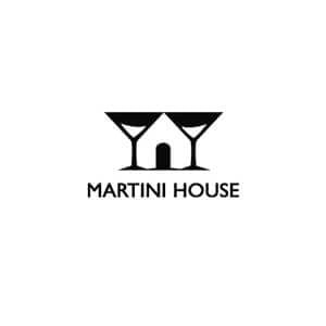
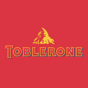

Some logos take advantage of existing negative space in illustrations and designs to hide a relevant image or symbol that adds meaning or connections to their brand.
Toblerone, for instance, hides a bear in its famous mountain logo to commemorate Bern, the company’s home base. If you look between the glasses of the Martini House logo, you’ll see – that’s right – a house! And, Yoga Australia actually captures the shape of Australia in the space where the woman’s arm and leg meet.

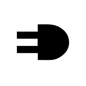

In some cases, you can use empty space to shape the borders of different letters and words that are hidden within the rest of the logo design.
Mister Cooper Ice Cream, for instance, hides the word “ice cream” in the lip-shaped typography of the company’s name. The ElettroDemstici outlet icon doubles as the letter ‘E’, and the Eaton logo uses an alternating blue-and-white color palette to highlight the ‘A’ and ‘O’ in their brand name.
This could be a strategy to use if you want to emphasize a specific letter of your business name that you think your audience will remember, without making it the only central focal point of your logo.


Negative space acts as a border with images, combining with positive space to create the appearance of a full image while keeping the design simple. If that sounds confusing, just take a look at the World Wildlife Fund logo; they’re famous for this with their panda design. Notice how your eye is actually just filling in the remainder of the panda image where the white space is?
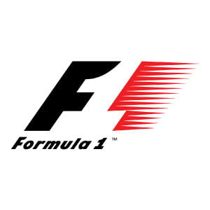
You can also see this idea in the Formula1 logo, which includes a ‘1” in the area between the ‘F’ and the abstract shape indicating speed. And, the Pittsburgh Zoo logo is able to show both an intricately-detailed tree, in addition to 2 animals looking at each other – without cluttering the design or making it too complex to understand.
These are some of our favorite logos that utilize negative space creative. Make sure you look close.

Learn To Embrace Negative Space – It’s easy to forget about empty space on a page when you’re focused on the positive space. However, thinking of negative space simply as a border for your logo can lead you to eliminate a vital design element. By considering how you’re using the negative space, you can reduce the number of items on the page without sacrificing the versatility you require.
Add Negative Space By Subtracting – A common issue in design is dealing with the limited space of a page or canvas and the needs of both positive and negative spaces. After an initial draft, you can be left with a lot of positive space, and very little negative space. This doesn’t necessarily mean that you need to go back to the drawing board. Find parts of your design that can be subtracted and add negative space by removing some of the clutter from the page.
Include Negative Space In Your Earliest Plans – Instead of struggling to find a way to add negative space when your logo design is already complete, include it in your earliest designs. This way, you’ll be able to plan for it, and it will make your logo feel more organic. Consider the different possibilities for the negative space and make sure to avoid cluttering your page.
Think Out Of The Box – Negative space logo designs tend to highlight creativity, but they can also feel generic if the design is too conservative or generic. If you’re going to include unorthodox designs, be bold and think of outrageous, unique ideas. By working to produce something truly creative, you’ll also differentiate your logo and brand.
Consider How Negative Space Is Best Deployed – Different logos have unique needs, so attempting to fit something into your design that doesn’t work can hurt your brand over the long run. Instead, focus on finding the right type of negative space to employ, and the best way to incorporate it. Your brand may not be suited for a double entendre but adding a small hidden image to your logo may be a fun way to add another personal touch.
Negative space is a fun and easy strategy for adding a creative and unique touch to your logos. More than just a border for your designs, it can enhance and help convey your company’s brand personality and values to prospective viewers.
By focusing on negative space from the beginning, you can create a standout logo that engages your customers and leaves them intrigued. Most importantly, it can help your logo separate itself from the pack in any industry.
Products
Resources
@2024 Copyright Tailor Brands