
Coming up with the perfect logo to represent your business isn’t always easy – and sometimes it requires you to put your pen to paper.
The idea of logos being a digital art form actually only came about in the last few decades. Before that, logos were hand-drawn, and many businesses still opt for that style today because of the values and traits that hand-drawn logos are able to convey.
These logos are a great stylistic choice for people across many industries, spanning the neighborhood cafe owner to the Etsy candle seller and a bunch in between. (We’ll go into more detail about which types of logos are suited for different industries below.)
Now, I’m not going to lie: Drawing isn’t for everyone (believe me, I’m the first to know), and you should have an honest assessment of your abilities before you dive into this endeavor.
That said, if you have a little skill with the pen or a good eye for detail, then creating a logo sketch might be the best way to kick off your brand!
But, before we get into how to draw a logo, let’s talk about some of the types of styles that are available to you:
We’ve covered a few of the most common types of hand-drawn logos, so you can start getting some inspiration for how your own logo could look!
Let’s dive in.
Ah, the signature! Hand-lettered wordmarks are a style as old as time, relying on our familiarity with signatures to imply different traits, such as professionalism, friendliness and personalization. Customer-facing businesses – from candle makers and soap sellers to coffee shops, bakeries and consultants – may want to consider a hand-lettered logo, as they act like a signature that automatically gives your brand a personal touch.
And, signature logos are a great way to put a unique spin on your design, since no one else in the world has the same signature as you do!


With hand-lettered logos, you’ll want to focus on choosing a font that best expresses your brand personality. There are 4 main font families – serifs (traditional), sans-serifs (modern), scripts (elegant), and slab serifs (bold) – though you’ll also see hand-lettered logos with a more avant-garde, decorative design. Browse through the different families to get an idea of what type of style makes the most sense for you
If you sell an experience – like adrenaline-inducing video games or a relaxing day at the spa – the complete logo sketch might be just up your alley. What do you want your audience to expect to feel when they come in contact with your brand?

A logo sketch can embody that very experience, creating an atmosphere of a homey cafe or an adventurous tour abroad. You can lay out anything from a scene – think ice-capped mountains – to an object, like this inquisitive cat. Sketches can also range from the finely detailed to a loosely sketched shape that is open to interpretation.
There’s a lot of room to go wild here, though you may want to stick with a minimalist logo if you’re sketching an entire scene. The fewer details you have, the easier it will be to preserve the quality of your design when you resize your logo – which you’ll need to do if you want your logo to look good on small devices (think: mobile phones).
For the cheesemakers, beer brewers, coffee roasters and craftsmen among us, this one’s for you. Artisanal design is often captured by old-fashioned (meant in the best sense), vintage-looking designs, with detailed illustrations in tow. You’ll see a lot of detailed strokes and intricate illustrations, often accompanied by some sort of frame.

Consider using artisanal logo design if you want to emphasize to your audience that you’re dedicated to your craft – implying that you pay the same attention to detail in your work as you do in your logo design.
Last but not least, hand-drawn logos with abstract shapes – also simply known as abstract logos – are a great way to convey feelings rather than on-the-nose icons that have straightforward messages. From intangible things like friendship and creativity to emotions like desire and joy, abstract things are often as fascinating as they are aesthetically pleasing – which is how they can infuse layers of meaning into a logo and leave your design open to several interpretations.

Take the Moucan Photography logo, for example; the shape could represent a color palette, symbolizing that this photographer specializes in color photography, while doubling as an animal coming out of hibernation – or even just reflecting a light prism that just caught its subject.
You could also go with an abstract shape that more closely resembles an object you’d see in real life, like the Lucky Charm icons, in order to guide your audience towards a specific feeling or mood.
Nearly every kind of brand can use an abstract shape effectively, including art studios, entertainment centers, and even businesses in more “down-to-earth” industries, like real estate or insurance.
By now, you’ve hopefully started to get some inspiration for your own logo design, whether you use one of the above types of hand-drawn logos or have a different idea brewing. At this point, you’re ready to start the process of creating your logo! Go through the following steps in order to bring your logo to life:
Every logo design, whether we’re consciously aware of it or not, has a vibe. Before you actually start sketching your logo, it’s important to think about the vibe you want your logo to project – so you can then incorporate design elements that best express that essence.
This might seem a little abstract, but it’ll be easier to understand if you consider what’s at the heart of your brand personality. If your brand could walk and talk, what would it look like or sound like? Who is the person that you want to draw in with your logo? What style would attract them?
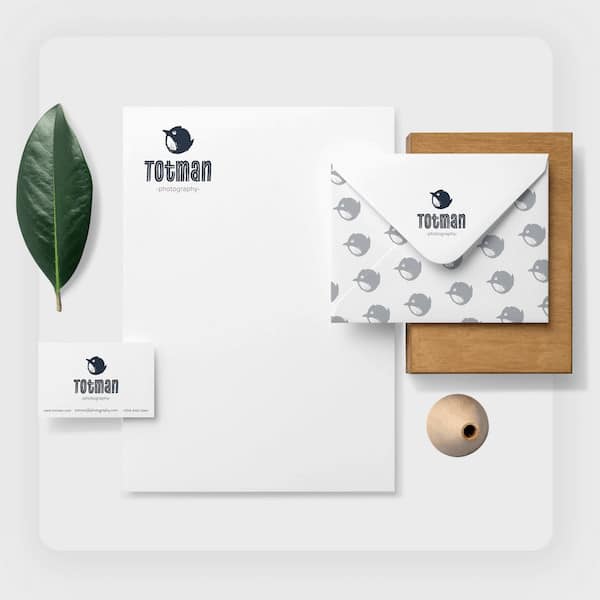
For example, a children’s entertainer would probably have a bright, colorful logo with a rounded and playful font, while a furniture store might use a crisp, traditional font with a muted color palette.
As we saw above, there are different types of logos; some only include a typeface and a single color, while others use icons and a multicolored palette.
Colors have meaning, so try to brainstorm which colors would best express your brand personality (for example, blue symbolizes professionalism and reliability; red contains energy and excitement, etc.), think about a font style that would complement the palette, and then decide whether there’s a shape or object that you could incorporate to help further the message along.
A little inspiration goes a long way, and it’s an arguable must for creating a hand-drawn logo. There are a lot of ways to get logo design inspiration, starting with checking out your competitors! I’m not saying you should copy what they’re doing, but looking at a few brands you want to emulate and seeing what kinds of elements they use could give you a rough idea of the direction to go in.
(You also want to see what’s out there, because it will allow you to come up with a logo design that looks different from your competitors – thus distinguishing yourself from the crowd and upping the chances that your audience will remember you rather than them.)
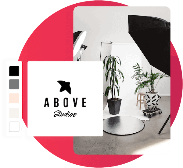
You can always experiment for free with our online logo maker, which will give you dozens of different logo ideas that are automatically created to fit your brand, in just a few clicks. Don’t be afraid to use the editor and play around with different font styles and colors. And again, remember to compare each logo with your brand personality to see whether it’s a good fit.
There are also a bunch of design sites like Dribbble and Behance which feature user-made artwork, and of course, you can check out Pinterest as well; just type in “logo design” or “hand drawn logo” and you’ll get thousands of results from a bunch of different artists that can be applied to any industry.
Once you’ve gotten the lay of the logo land, it’s time to pick up your pencil!
By now, you no doubt have some logo design ideas floating around in your head, and it’s time to get them on paper.
There’s no need to be intimidated by this step; you can start by sketching out a few different logo ideas in a notebook. They can be super basic or intricately detailed – whatever starts to capture your idea.
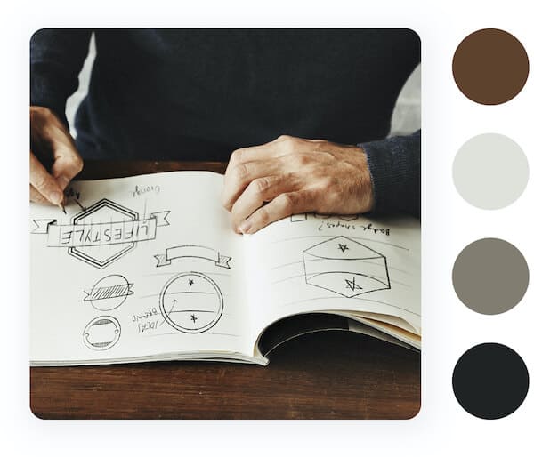
Once you’ve sketched out a few designs, look at them next to each other and try to see if there are patterns or elements that repeat themselves. Does the same type of shape appear over and over? What about the look of the typography? Do any designs stand out?
Take note of the similarities and start mixing and matching. What happens when you put a different font style to that same shape? What about if you draw the same logo outline but test out several color combinations?
Once you have a few designs that you like, again ask yourself which of them best describes your brand personality.
(If you’re not sure about the answer, you can always show these sketches to friends or family to get their feedback before you move on to step 4.)
Now, it’s time to choose your final sketch – which you’ll turn into a digital logo file.
Finally, it’s time to turn your logo into something you can actually use – and that means making it digital. At minimum, you’ll need your logo in a JPEG file, though it would be helpful to have it in a high-resolution file format such as a vector EPS, which will allow you to resize and print your logo without compromising on the quality of the design.
To start with, if you’ve drawn your logo in pencil, go over it with a pen. This will make it easier to see and stand out on the page, in addition to providing contrast. Then, you’ll need to scan your drawing into your tool of choice.
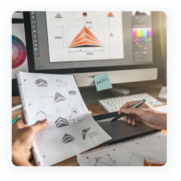
If you don’t have a scanner, there are a few great apps that can help you scan your logo (and refine some of the details, if need be), including TapScanner or Adobe Scan.
You’ll want to scan your drawing at a resolution of at least 600 DPI (dots per inch), so that you can play around with your logo while maintaining good quality.
Now, it’s time to open up an editing tool like Photoshop or Illustrator. Within each of those tools, there are a lot of ways to go about editing your logo.
The first thing to focus on is the contrast; play around with the adjustment layers (brightness, contrast, exposure, and Black & White), until you’re satisfied with the way it looks. And, if you have any messy lines in your drawing, you can add another layer to your design and use the brush tool to get rid of anything that doesn’t belong.
Finally, if you think you’ll want to use your logo on multicolored backgrounds, you can go to Select > Color Range and use the eyedropper tool to isolate the black lines of your drawing and turn your logo background transparent. That’s all there is to it!
If you’re weary of using Photoshop or Illustrator, or you love your logo sketch exactly as it is and don’t want to change a thing, you can try using Adobe Shapes. This app will automatically turn your drawing into a vector file right from your phone, which you can then use however you’d like.
If you’re looking for a logo that has a human touch and has a timeless, vintage feel, a hand-drawn logo is definitely the way to go! Don’t be afraid to play around with a bunch of different sketches until you find the design that speaks most to your brand personality.
And, if you’re nervous about drawing your logo, you can always experiment with our online logo designer to get ideas for what your drawing should look like before you pick up your pen. Whether you go with a personal signature or a detailed artisanal design, work on your design until it sends your audience the exact message that your brand embodies.
Products
Resources
©2025 Copyright Tailor Brands