When you see logos in your day-to-day life, do you ever stop to think about what they’re for?
In short, logos are used to help brands, professionals and products stand out. A great logo will be attractive to the right audience and convey the purpose of whatever they represent.
When representing a game, app or software, a logo will help make the product more appealing and clarify intent; when it’s for a company, organization, location or school, a logo tries to communicate characteristics so the audience has a better grasp of the brand they’re dealing with; and when used by musicians, artists, designers or other professionals, a logo will create a memorable first impression to connect the audience to the resulting products or services.
But in order to create the right logo to represent your brand, you need to follow an in-depth logo development process. Here’s how!
Before you create a logo, there’s a whole process that should go into the ideation of the design. If you jump through the process and don’t follow the steps, your logo is likely going to look like an amateur design and have less of an impact on your audience.
It starts with coming up with a design brief:
Before you begin, you need to make a plan for the plan! You have to stop and define what this logo design process is going to look like and why you need your logo in the first place.
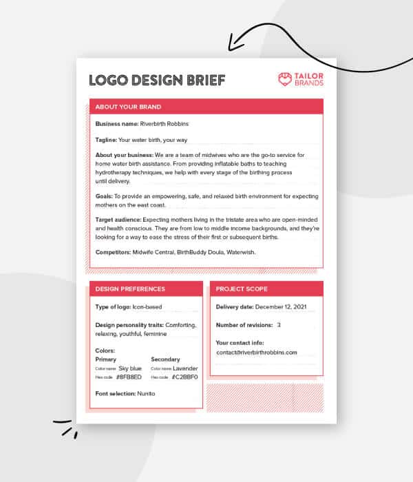
Setting Goals: What is your logo going to be used for? Who is it meant to appeal to (define your buyer personas)? What primary message does it need to convey? Where will it be used—on your website, business cards, billboards, etc.? All of these questions are just to help you start nailing down specifics about your logo needs.
Establishing a Timeline: Establish a timeline for creating rough drafts and final copies. You should not expect your full logo design to come together in just one day.
Understanding the business: Who is your target audience and what moves them? Create your company profile and brand positioning statement to also better understand your brand. What are you trying to say? What will your logo communicate on first glance? What nuanced details in color, shape or imagery will you use to communicate secondary concepts?
Budgeting and Payments: How much can you set aside for the design and production of your logo?
Once you have all of this pinned down, you’re ready to come up with the look and feel of your design.
Before you jump into the actual designing, you should start outlining ideas that aren’t tied down to a concrete image.
Look at other logos in your industry to know what’s already being done. Then, check out examples from brands in other industries with a similar target audience to get some further logo ideas. Look at lots of designs to get inspiration, but be careful not to make anything too similar; you don’t want anyone confusing your brand with someone else’s!
Know the differences between the types of logos. Do you want a logo that’s just your business name (a wordmark), or would you be better off with some kind of icon or shape to help represent your brand? What your logo is used for and who it appeals to is going to impact your design choices.
Color is one of the first things people notice, and logo colors convey a bunch of different meanings, depending on how they’re used. Choose your color scheme to stand out and give off the vibes you want to represent your company with. And, make sure not to choose more than 3 colors, as too many colors can clutter your design and confuse its message.
There are so many options when it comes to fonts, and sometimes it can be overwhelming to choose the right one. So, start with determining the type of font that would best represent your brand (script, sans serif, slab serif, etc.) before trying to choose an individual font. Your fonts need to be readable at very small sizes, so when in doubt, simple and straightforward is best!
Another thing people will subconsciously notice right away is the shape of your logo. Check out the psychology of shapes to understand why a circle logo is going to express something different than a triangle logo, and which shape will help you best convey your message.
Are you going to include animals, objects, scenes or people within your logo? Not all logos have imagery to help convey their brand message, but some do. You may want to gather a list of potential illustrations that could be included within the design.
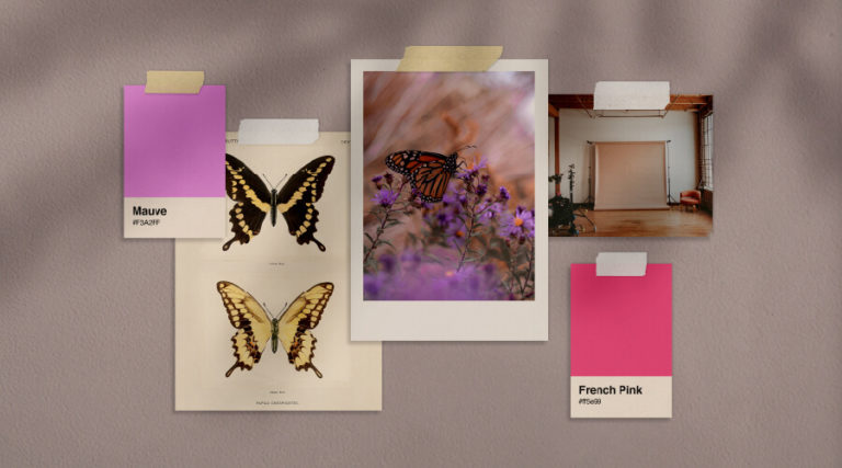
Finally, create a physical collage with a mood board to illustrate the overarching feelings you want your logo to communicate on behalf of your brand. A mood board contains no logo sketching or finalized design elements at this point; it’s strictly used to help inspire a design that really hits the mark. Use existing brand material, inspiring images, descriptive brand words, and your color palette and font choice.
Once you have your ideas established, you may start to get a better feel for what you want to include in your logo. Here are a few more things you need to consider:
The first step is to use your ideas and create a LOT of tiny (extremely rough) ideas. These small sketches (about 1” square) don’t include any details; they just focus on layout, shape and imagery. At this point, you’re trying to decide things like whether you like the animal on the left or the right… whether you want an enclosed circle or prefer it to be implied by the shapes within the design… whether you think text will fit in the actual design or not…etc.
You may come up with a number of completely different design ideas that can all continue on to the next stage.
It shouldn’t take long before certain design themes that you like best in your thumbnail brainstorming phase begin to rise to the top as your best options.
Start with sketching 3-5 very different thumbnails into roughs. You still aren’t focusing on details, but you’re starting to make it a little more concrete, to really pin down your direction. Choose the rough you think has the most potential to create your final design.
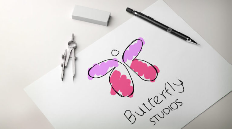
Now that you have your final design direction, develop it! You’re going to include colors, fonts and actual imagery. As the details come together, try to really pin down your design. You might try very slight variations in color, placement, imagery hierarchy, size, shape, line thickness and other elements of your logo.
Making small detail changes may have a huge impact on the overall look of your logo. When you’re ready, choose your favorite version to refine your logo.
Using a program like illustrator, you can take your design to the next level. Illustrator is one program that creates vector designs—meaning the shapes and colors can stretch indefinitely.
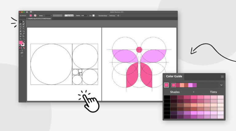
Unlike raster-based designs that become pixilated with size, a vector-based logo can be as big as a billboard without any trouble. Illustrator also gives you control over your letter spacing, angles, line thickness, gradients and more. That said, it can be a learning curve if you’ve never used it. Take the time to understand how it works, so you can turn your designs into a usable logo.
That brings us to:
Once you have your design completely finished, you’ll want to create final print files (EPS, SVG, AI, and PDF), and web files (JPEG, PNG, GIF). This will give you the right size and compression based on where you’re using your logo.
You don’t want a slow-loading web page because you tried to use a large file format, and you don’t want a pixilated logo because you tried to print with a compressed file format. Make sure to grab all of your files from the get-go, and save them for use down the line.
Your logo, brand colors, fonts, and other branding design elements that surround your logo should be clearly defined. Setting up a basic style guide helps clarify how your logo should be used to represent your brand consistently.
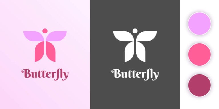
A good style guide is going to help keep your brand appearance cohesive across all platforms. It should include details like:
Make sure to clearly define all these points, so you—and anyone you work with—has a clear idea of what’s acceptable when using your logo across different media and backgrounds.
At the end of the day, your logo is going to be as powerful as you choose to make it. The more you put into this little identity badge, the more you’ll be able to get out of it. This is not one area you want to skimp on!
If you’re ready to start creating your roughs and final designs, our logo design tool can help. It offers a step-by-step guide to help streamline the design process and give you a bunch of awesome logo options. Using the tool is free, so try it out today!
Products
Resources
©2025 Copyright Tailor Brands