An icon is a symbol (typically part of a brand’s logo) which can represent a concept, idea, operation or action related to your brand. Think the Twitter bird or Snapchat ghost.

When you’re first starting to build a brand for your business, it can be easy to get bogged down in some of the dense design terminology that exists out there. RGB what? DPI who?
You’re not alone in this – the first time I heard the word “kerning,” I thought it referred to a type of corn. (And, if this sounds about right to you, you definitely need to keep reading!)
Below, we’ve broken down some technical design terms into basic explanations, bringing you a personalized design terms glossary.
So, scroll down to learn all about 31 common design terms that you may come across in your brand-building journey!
Here are some branding basics to be aware of right from the get-go:

A logo is a graphic design element that incorporates a recognizable symbol, letters, or combination of the two and helps to represent a brand.
An icon is a symbol (typically part of a brand’s logo) which can represent a concept, idea, operation or action related to your brand. Think the Twitter bird or Snapchat ghost.
A vector file or EPS (Encapsulated PostScript) is a scalable file used by designers to create any type of graphic. This file is composed of points, lines, shapes and curves rather than pixels.
Due to their extreme flexibility, vector files can be easily resized and stretched, which makes them the perfect file for printing on just about anything!
A manual (whether physical or online) that keeps track of a company’s branding assets. Your Brand Book helps to inform all employees and designers how to utilize your logo, assets, fonts, colors, and maintain a consistent brand voice.
The look and feel of your brand, with elements ranging from color scheme to font, style, etc.
DPI stands for dots per inch (sometimes you’ll also see PPI, or pixels per inch), and it indicates how many pixels are in one inch of your image.
72 DPI is enough for images to look good on websites; 300 DPI images are recommended for print (except for billboards and large posters – they should go with vectors!)

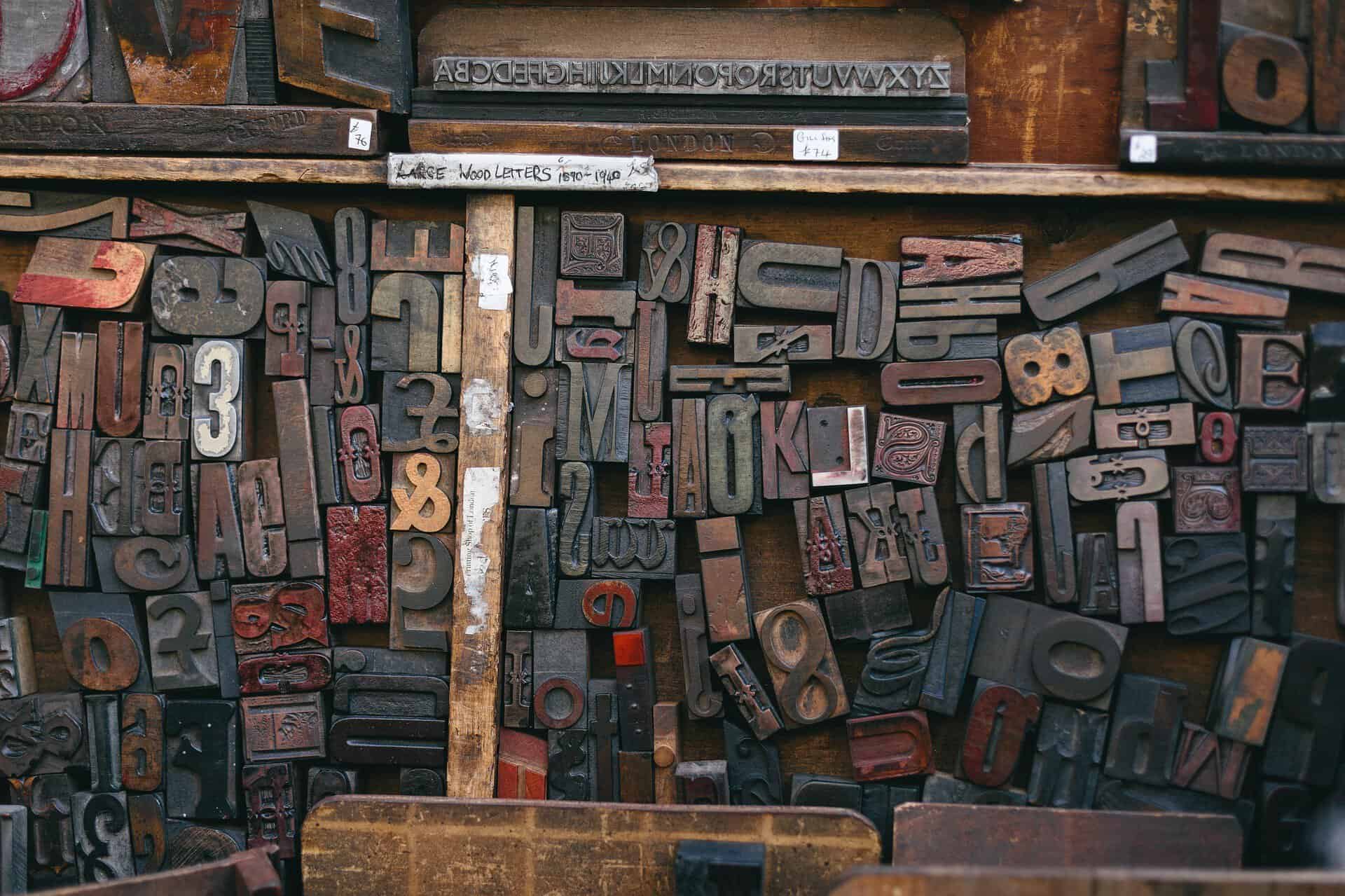
The visual art of the written word – i.e. how your letters are arranged on the page, including spacing, length of lines, etc.
The design of a collection of letters, numbers and characters – what we are often prone to associating with the word font.
This refers to the level of thinness or thickness of a typeface, ranging between 100-900. (For reference, a “normal” font is 400 and 700 is considered bold).
The spacing between a pair of letters or characters. Kerning is something to take into consideration when pairing fonts in a way that is visually pleasing.
Adjusting the uniform amount of space between an entire section of text, such as a line, paragraph or page.
What you know as a letter, number, or mark of punctuation; characters are symbols that make up a typeface or complete character set.
A specific or alternate form of a character; for example, letters with an accent mark.
This is a tilted version of a typeface or font, usually sloping from left to right.
Part of a lowercase letter that rises above the average height of the letters. You’ll see this with letters like “h” or “k”.
Part of a lowercase letter that extends below the line on which the rest of the characters sit.
The imaginary line on which most characters and letters rest. Curved letters and descenders may extend slightly below the baseline.
Look at the height of your capital letters – that is considered the font’s cap line, or the upper boundary of your font’s characters.
Look at the height of the letter “X” in any given font – that is considered the font’s X-height, or the average height of lowercase letters.

Also known as a hex triplet or HTML color code, a hex code is a six-digit representation of a single color. Hex codes are the dominant form in which colors are defined and displayed on the web.
The range of colors you choose to use for a project.
The color you perceive when looking at an object; this also can refer to the shade of a specific color.
A color scheme that comes from one hue but varies in shades and tints (for example, the colors pink, red and maroon).
This is a color combination that uses colors that are directly next to each other on the color wheel.
This is a color scheme in which three different colors are evenly spaced from one another on the color wheel.
Complementary colors are those that sit directly across from one another on the color wheel (red and green, blue and orange, purple and yellow).
Another color model in which Red, Green, and Blue are added together to produce other colors. The amount of color variations are endless, and each color is produced through mixing different amounts of R, G, and B – just like in the good old days.
Yet another color model, CMYK (Cyan, Magenta, Yellow, Black) is used in printing. In contrast to RGB, this is a subtractive color model, which means that the primary colors (red, yellow and blue) are subtracted from white light to arrive at these four remaining colors.
Slow transitions in color tone between two specified colors. This could be a gradual change from left to right (a linear gradient) or from the center of a frame to the edges (a radial gradient).
How transparent an element is, on a scale from 0-1. An opacity level of 0 would mean the item is invisible, while a level of 1 means it’s completely solid.
The intensity of color. Low saturation is generally faded and dull-looking, while high saturation appears vibrant and rich in color.
Products
Resources
@2024 Copyright Tailor Brands