The 1980s were a period characterized by vibrant colors, funky geometric shapes, and bold patterns. Distinctive ‘80s style trends heavily impacted popular branding visuals like logos. Across various industries, logos featured similar design elements, such as bigger font, bolder geometric shapes, and brighter color palettes. This post will take a look back at famous logos as they appeared back in the 1980s.
Let’s take a look back at some totally rad logos from the ‘80s.
There are 2 elements in NBC’s logo that are worth noting. First, it’s a study in the art of using negative space in logo design. If you look carefully, you’ll see the outline of a peacock in the white space between the colorful “feathers.”
Second, sometimes it’s worthwhile to break the rules. According to logo design best practices, it’s best to stick with 2 to 3 colors max. But NBC chose many colors for their design not only in reference to their mascot but also to remind their customers back in the ‘80s that the network was a leader in color broadcasting.
Founded in 1980 by Ted Turner, CNN started with a simple monochrome to mimic the black and white television programs being broadcasted at the time.
By the mid-1980s, CNN made a small yet important change to their logo to reflect the times: They decided to use color. And not just any color! According to color psychology, red signifies motivation, passion, and leadership; traits that are important in the news industry.
HBO’s wordmark logo has looked pretty much the same since the company was founded in 1972. The design team drew a small circle inside the letter “O” to represent a camera lens. Clever, right?
And I’d just like to say that we have HBO to thank for household names like Ellen DeGeneres, Bill Maher, and Martin Lawrence. HBO’s stand-up series called “One Night Stand” aimed to spotlight up-and-coming comedians of the time.
You might be surprised to learn that the beloved video game company started out selling playing cards. Despite the company’s success, the brand logo has remained more or less the same since 1967 with only minor alterations to the original.
Just like the makeup popularly worn in the ‘80s, Nintendo’s red color palette is unnaturally bold and colorful. It remained that way until around 2004 when they changed it from red to gray. In 2016, Nintendo phased out of its gray variant and reintroduced the red color. This time the brand placed the logo within a red box, an elongated oval designed like a racetrack.
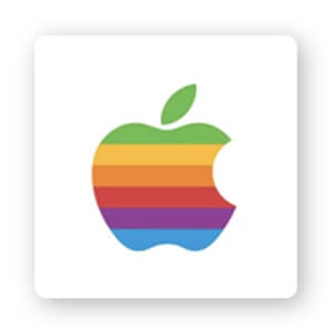
We all know Apple’s characteristic half-bitten fruit logo. But there are a lot of people (me) who weren’t around to remember the joyous rainbow colored apple of the ‘80s. On the one hand, it suits the time period because what’s more ‘80s than big, bright, and colorful, right? The color palette was a nod to the world’s first colored-displayed computer.
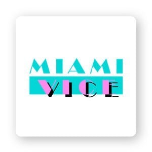
If you ask anyone who watched tv in the 1980s what their favorite show was, most would say Miami Vice. The NBC mega-hit was a vibe—imagine excessive jewelry, fanny packs, and neon colors.
The Miami Vice logo is so perfectly quintessential of the ‘80s. The 2 different fonts (Broadway Regular for the top line, Broadway Stencil for the bottom) vary between thick and thin lines. And the bright contrasting magenta and aquamarine color combination completes the ‘80s logo look. The overall logo design looks like a giant neon sign.
Even if you aren’t an AT&T customer, you’d probably be able to recognize the blue and white striped globe icon. The ‘80s AT&T logo doesn’t look all that different from the current design.
The ‘80s vibe was all about grabbing attention and being visible. But for many businesses like AT&T that want to evoke a sense of professionalism, they use geometric shapes and bold colors.
While the design may look basic, the red and orange color palette of ESPN’s logo holds symbolic significance. Red symbolizes power and passion; orange symbolizes thrill, success, and determination. Red is also known to increase your heart rate and jumpstart your appetite. These things explain why the color choice is the best match for the ESPN logo.
As with many corporate logos from the 1980s, this design utilizes a bright color palette based on Scandinavian countries’ flags. Instead of standing vertically, the colorful thick bands were drawn on a slant like a plane moving forward or the tail of a plane where the flag is showcased.
Founded in 1965, the United Colors of Benetton is a global fashion brand based in Italy. The minimalistic uppercase sans-serif font is set against a green rectangle background. The United Colors of Benetton logo is a great example of a sophisticated ‘80s logo that is timeless enough to last for years.
Despite its retro ‘80s logo design, even if you took out the wordmark, IKEA’s logo is instantly recognizable even today. In keeping with its Swedish heritage, the company’s colors are an ‘80s appropriate shade of blue and yellow. The blocky, high-impact lettering ensures maximum visibility even from a distance. The ‘80s logo looks mostly like the one we know today with just a few minor changes in shape and shades of color in 2019.
Founded in 1983 in Switzerland, Swatch is a world-famous watchmaking company. The brand is renowned for its affordable prices, higher quality, and unique watch designs and is sold in hundreds of stores across the globe.
The visual identity of Swatch is something that is very important for the brand, and it has not changed since 1983, despite the fact that the brand keeps introducing a new colorful design every year. In not redesigning their logo, Swatch created an iconic symbol associated with stylish watches for decades.

Guess is one of the most recognizable U.S. clothing brands around, selling a range of clothes, watches, jewelry, and shoes. The inverted triangle logo was created when the Marciano brothers would drive past a McDonald’s billboard every day that read “Guess what’s in our new Big Mac?” As a result, Guess became the official name of the company. A great example of using inspiration from your everyday life!
Marvel’s X-Men is one of the most popular superhero comics. The first issue featuring the mutants was published in 1963 and a single wordmark was used for the first X-Men logo in 1987. The logo was executed in a bright yellow and red 3-dimensional wordmark with straight lines and sharp angles. The color combination reflects the power and energy the X-Men hold.
That concludes this wrap-up of famous 1980s logos that characterized the era. From 3-dimension graphics to bright color palettes, the logos back then definitely had their own unique style. And, you might’ve noticed that most of these famous logos didn’t change much from then to today. The ‘80s design style continues to influence logo design today, and I hope these logos help inspire your own design.
The information provided on this page is for information, educational, and/or editorial purposes only. It is not intended to indicate any affiliation between Tailor Brands and any other brand or logo identified on this page.
Products
Resources
@2024 Copyright Tailor Brands